Wellology Co. packaging
Wellology Co. specializes in scientifically formulated health supplements, emphasizing clean, modern packaging to reinforce its credibility in the anti-aging and wellness segment. Their packaging approach favors minimalist design and secure, functional structures tailored for direct-to-consumer e-commerce distribution.
Packaging Portfolio
Wellology Co.'s packaging portfolio primarily consists of rigid, opaque white plastic bottles with screw-on caps, strategically chosen for supplement protection and compliance. The use of glossy finishes and wraparound labels ensures both durability and high visual clarity, while paperboard carton boxes add retail versatility for certain SKUs. Label design is consistent, prioritizing legibility for nutritional facts and certifications, and all packaging formats are tailored for secure e-commerce shipping and shelf display. This approach balances pharmaceutical-grade safety requirements with modern consumer packaging aesthetics.
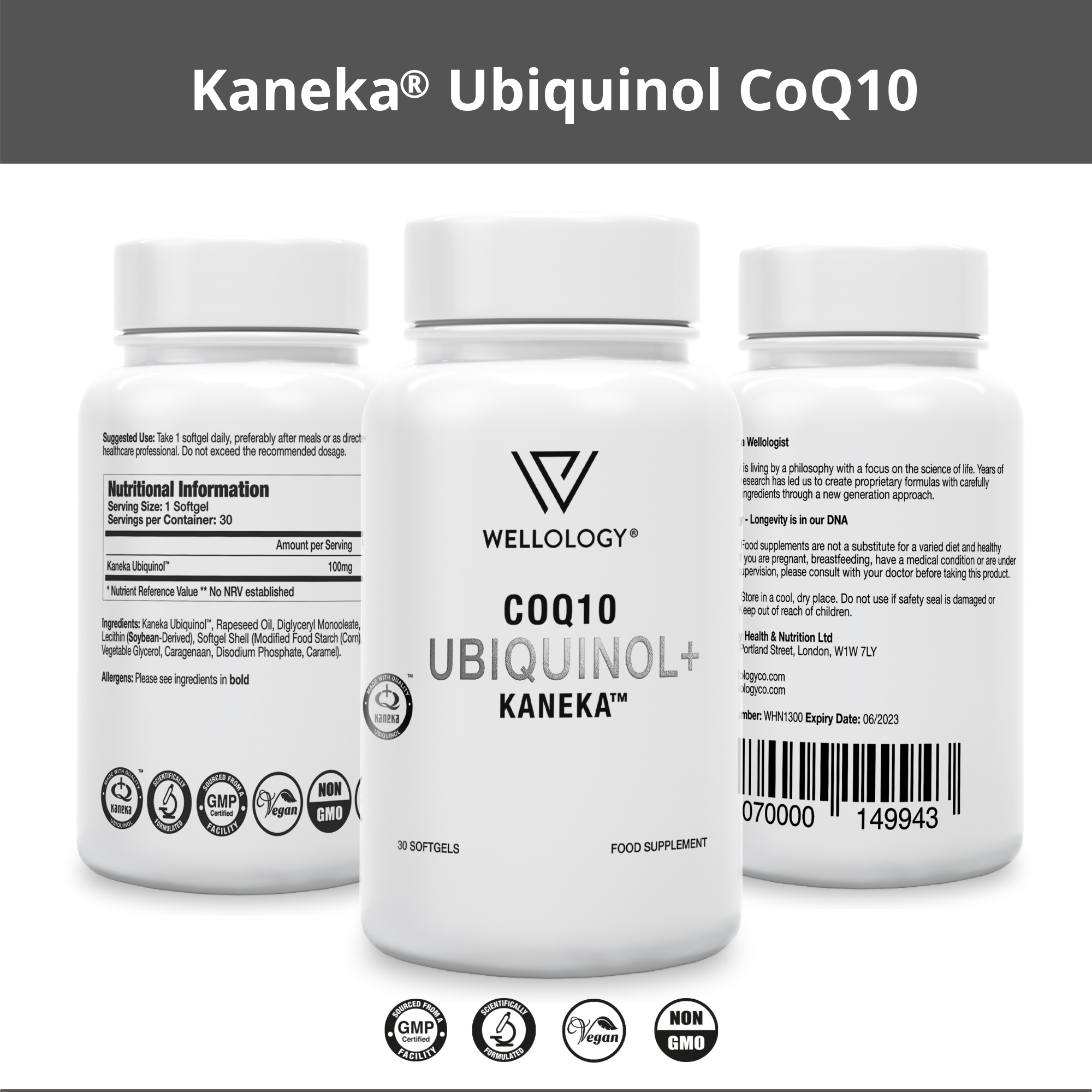
The packaging consists of a cylindrical bottle made of opaque plastic with a smooth surface. The bottle has a white color with a glossy finish, featuring a screw-on cap. The front label displays the product name 'Kaneka® Ubiquinol CoQ10' prominently, along with a logo and additional product information. The sides of the bottle contain nutritional information and usage instructions in a clear, legible font. The overall design is clean and professional, with a focus on health and wellness.
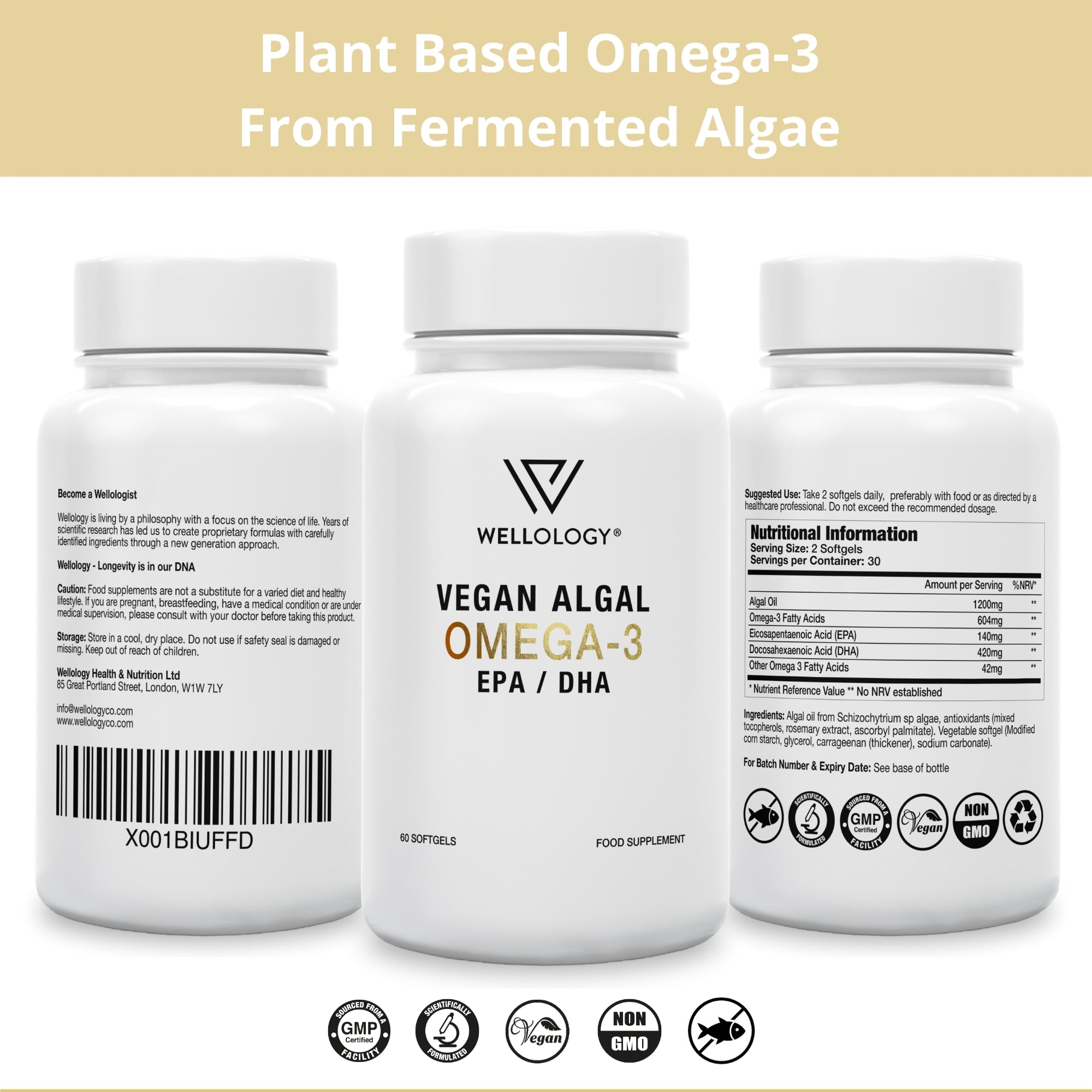
The packaging consists of a white plastic bottle with a smooth, cylindrical shape. The bottle features a screw-on cap and is designed for holding dietary supplements. The surface is clean and glossy, with a matte finish on the label. The label wraps around the bottle, displaying product information, nutritional facts, and branding elements. The overall appearance is sleek and modern, suitable for health-conscious consumers.

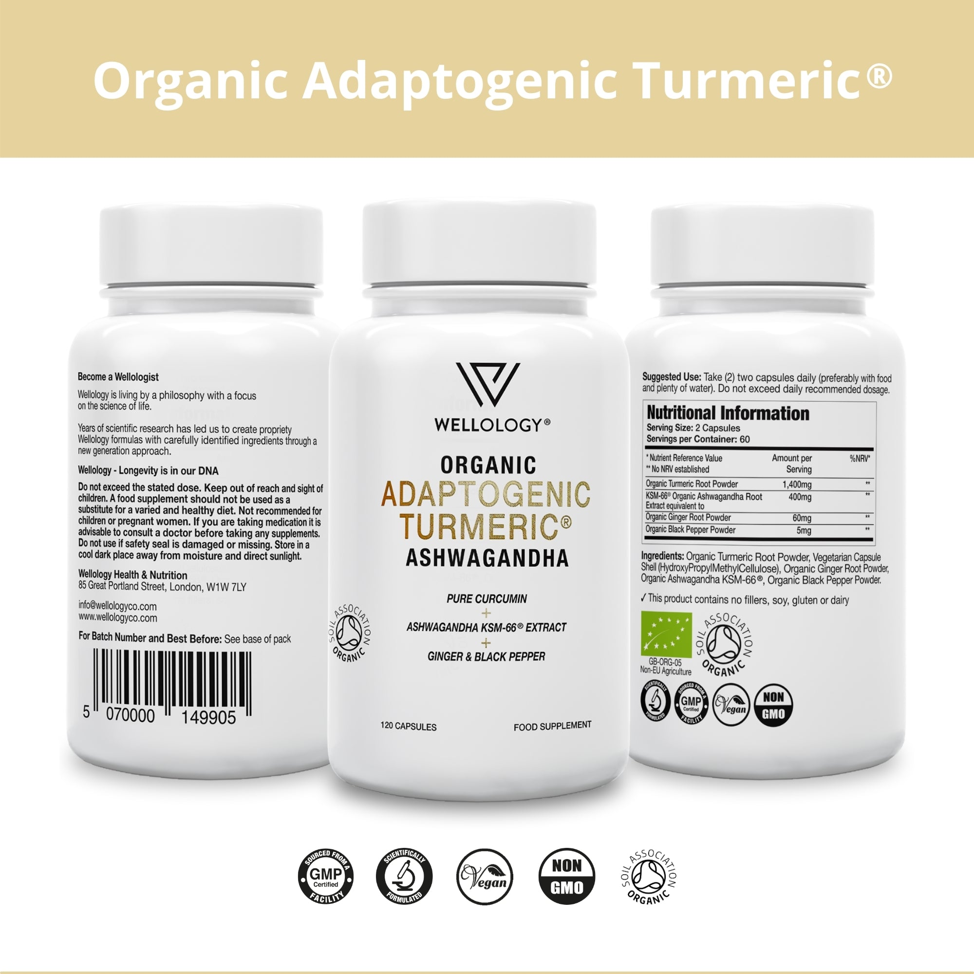
The packaging is a cylindrical bottle made of opaque white plastic, featuring a smooth surface with a glossy finish. The bottle has a rounded body and a wide mouth, allowing for easy access to the contents. The cap is a screw-on type, providing a secure closure. The overall design is minimalist, with a focus on clarity and simplicity.
The packaging consists of a cylindrical container made of thick, sturdy plastic, typical for supplement bottles. It features a white base color with a glossy finish. The bottle has a clean, smooth surface with no visible seams or fluted layers, indicating a rigid construction. The top is fitted with a white screw-on cap, which provides a secure closure. The front label displays the product name in bold, black font, along with a logo and other essential information. The back label contains nutritional information and ingredients in smaller text.
The packaging consists of a smooth, flat construction typical of folding cartons. It features a white paperboard base with a clean, precise edge and fold design. The front displays the brand name 'WELLOLOGY' prominently, alongside product information and a graphic of the supplement capsules. The overall appearance is lightweight and suitable for retail display.
About the Brand
Wellology Co. operates within the premium health supplement sector, focusing on supplements that support healthy aging and cellular function. Their packaging strategy leverages minimalist, pharmaceutical-grade designs to align with their science-driven brand identity and to meet consumer expectations for quality and purity.
The company utilizes high-purity, lab-verified ingredients and manufactures under GMP standards, which is reflected in their packaging choices—favoring opaque, sturdy plastic bottles and occasionally carton boxes to maximize product integrity and shelf presence. The consistent use of white, glossy finishes and clear labeling underscores their commitment to transparency and trust, while also supporting efficient logistics for e-commerce fulfillment.
Key Differentiator: Wellology Co.'s packaging distinctly integrates scientific credibility, clarity, and product security, setting it apart in a crowded supplement market where trust and efficacy are paramount.
Design System
Visual Style
Typography is clean and sans-serif, supporting a clinical, modern aesthetic. The color palette is predominantly white with black and limited accent colors, reinforcing a sense of purity and simplicity. Overall, the design approach is minimalistic and professional.
Brand Identity
Logo usage is consistent and prominent on all packaging. Iconography is restrained, favoring clarity and trustworthiness over decoration. Visual consistency is maintained across the lineup, supporting strong brand recall.
Packaging Design
Material choices focus on sturdy, opaque plastics and recyclable paperboard for cartons. Structural design prioritizes product safety, tamper evidence, and ease of use, reflecting supplement industry best practices.
User Experience
Packaging is designed for straightforward unboxing and immediate product identification, supporting a seamless customer journey. The emphasis on clarity and accessibility aligns with the brand’s science-driven positioning and enhances overall consumer confidence.
Company Metrics
Business insights for Wellology Co. based on available data
Market Positioning
Brand Values & Focus
Key Competitors
Target Market: Health-conscious consumers seeking premium, science-backed supplements with a focus on longevity, healthy aging, and plant-based ingredients. The brand primarily targets direct-to-consumer buyers in urban, wellness-oriented markets.
Packaging Assessment
Overall Grade
Visual appeal and presentation quality
Packaging durability and protection
Eco-friendliness and recyclable materials
Cost efficiency and value for money
Packaging assessment for Wellology Co. based on industry standards and best practices
Frequently Asked Questions
What types of packaging does Wellology Co. primarily use?
Wellology Co. predominantly uses rigid plastic bottles with screw-on caps and select carton boxes for retail display. These formats are chosen for durability, product protection, and compliance with supplement industry standards.
How does Wellology Co. address sustainability in its packaging?
While the company uses recyclable plastics and paperboard, the primary focus appears to be on product safety and purity. There is some emphasis on recyclable materials, but limited evidence of advanced eco-friendly or biodegradable packaging initiatives.
How does the packaging reinforce Wellology Co.'s brand values?
The minimalist, clinical design, prominent logo placement, and clear labeling reinforce Wellology Co.'s emphasis on science, transparency, and consumer trust.
Discover other Health companies
Explore more companies in the health industry and their packaging strategies
EVO Nutrition
Health
EVO Nutrition specializes in premium health supplements, providing a wide range of vitamins and nutritional products to support well-being.
Comvita
Health
Comvita is a New Zealand-based company specializing in high-quality Mānuka honey and natural health products. Established in 1974, it aims to connect people with the healing power of nature.
Smart Protein
Health
Smart Protein is dedicated to transforming nutrition by providing a range of health and wellness products focused on protein supplements and vitamins.