Weingut Markus Molitor packaging
Weingut Markus Molitor specializes in premium Riesling wines and employs a packaging strategy that emphasizes high-quality materials and brand authenticity. Their packaging solutions reflect a blend of tradition and modernity, directly supporting the winery’s positioning in the competitive German wine sector.
Packaging Portfolio
Weingut Markus Molitor’s packaging portfolio consists of classic wine bottle labels with textured finishes, rigid wooden boxes for higher-end or gift wines, folding carton boxes for retail display, and corrugated cardboard boxes for secure shipping. Materials are chosen to balance protection, brand visibility, and sensory impact, with a clear preference for minimalist yet premium design aesthetics. The portfolio demonstrates a layered approach—distinct differentiation between everyday and premium offerings via packaging complexity and material upgrades.
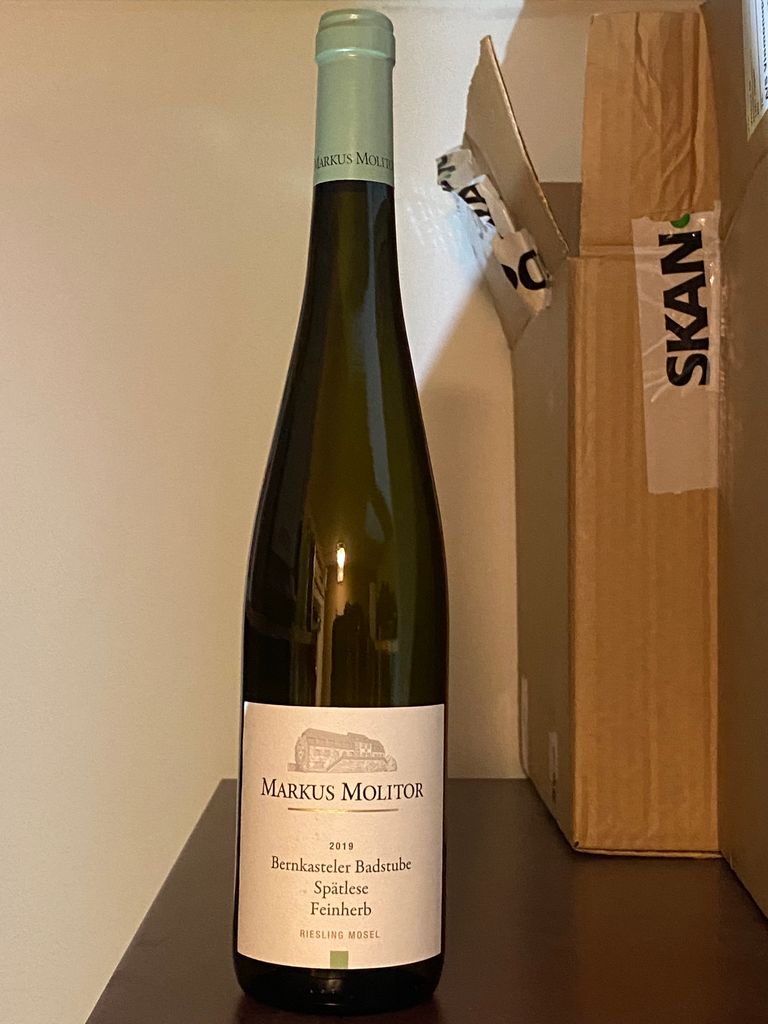
The image shows a corrugated box partially visible in the background, with a wine bottle prominently displayed in the foreground. The box has a typical brown kraft color and displays visible fluted edges when viewed from the side. It appears to be used for shipping, likely containing the wine bottle, and may have shipping tape or labels attached. The box shows slight signs of wear and handling, indicating it has been used for transport.

The packaging is a rectangular folding carton designed for wine. It features a smooth, flat construction without visible fluted layers, indicating it is made from single-layer paperboard. The exterior is a soft green color with a matte finish, providing a clean and elegant appearance. The edges are precise, and the folds are well-defined, typical of retail packaging. The front displays the brand name 'MARKUS MOLITOR' prominently in bold black letters, along with the product name 'SCHIEFER RIESLING' in a smaller font. The overall design is minimalistic, focusing on the brand identity.
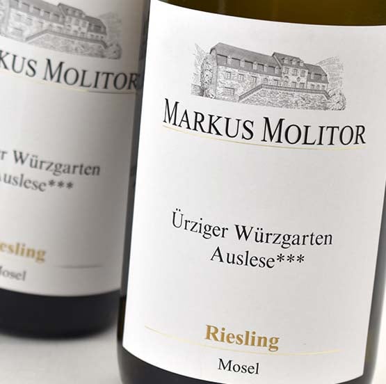
The packaging consists of a wine bottle with a prominent label. The label features a classic design with a textured white background. The top section includes the brand name 'MARKUS MOLITOR' in bold, elegant black font. Below the brand name, there is additional text indicating the wine type 'Ürziger Würzgarten Auslese***' and grape variety 'Riesling Mosel', presented in a smaller, refined font. The label has a clean and sophisticated appearance, typical for premium wine packaging.
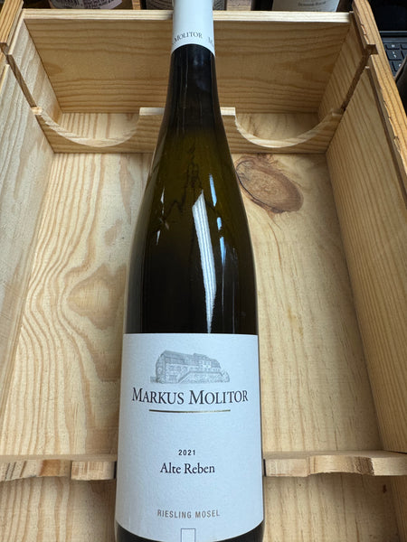
The packaging consists of a sturdy wooden box with a smooth, natural wood finish. The interior is designed to securely hold a wine bottle, with cutouts that fit the bottle snugly. The exterior features a clean and minimalist design, showcasing the natural grain of the wood. The box has a simple, elegant appearance, emphasizing the premium nature of the product it contains.

The packaging consists of a wooden box containing several wine bottles. Each bottle is securely placed in the box, which has a sturdy construction. The bottles are labeled with a white paper label featuring black text and a logo. The box itself has a natural wood finish, providing a rustic and premium appearance.
About the Brand
Weingut Markus Molitor is a German winery known for its exceptional Riesling wines, with packaging that underscores quality and provenance. The company leverages classic label designs, rigid wooden boxes, and functional shipping cartons to reinforce its premium market positioning.
The packaging approach at Weingut Markus Molitor integrates tactile and visual cues—such as textured labels and minimalist wood finishes—designed to communicate heritage and exclusivity. Each packaging component is selected to optimize wine protection, brand recognition, and customer experience from purchase through unboxing. Sustainability practices are evident in the use of recyclable paperboard and reusable rigid boxes, though the overall environmental impact is tempered by the use of premium materials.
Key Differentiator: Distinctive use of minimalist, heritage-driven packaging design that aligns with the brand’s Mosel Valley origins and focus on premium Riesling.
Design System
Visual Style
Typography employs elegant serif fonts with high legibility, predominantly black on white or muted backgrounds. The color palette is restrained, featuring white, natural wood tones, and occasional soft greens, supporting a clean and sophisticated visual identity.
Brand Identity
Logo and brand name are consistently presented on all labels and packaging, with minimal use of iconography. Visual consistency is maintained through uniform label layouts, clear product naming, and a cohesive hierarchy of information.
Packaging Design
Materials include textured paper for labels, natural-finish wood for rigid boxes, and recyclable paperboard for cartons. Structural design focuses on secure bottle placement, protection during transit, and an elevated tactile experience for the end user.
User Experience
Design supports a seamless customer journey—offering a high-impact unboxing experience for premium tiers, clear product information, and robust protection during shipping, all contributing to an elevated perception of both product and brand.
Company Metrics
Business insights for Weingut Markus Molitor based on available data
Market Positioning
Brand Values & Focus
Key Competitors
Target Market: Premium wine consumers seeking authentic German Riesling, wine collectors, and international customers valuing both product quality and presentation.
Packaging Assessment
Overall Grade
Visual appeal and presentation quality
Packaging durability and protection
Eco-friendliness and recyclable materials
Cost efficiency and value for money
Packaging assessment for Weingut Markus Molitor based on industry standards and best practices
Frequently Asked Questions
What types of packaging does Weingut Markus Molitor use for its wines?
The winery employs classic paper labels, rigid wooden boxes for gifting or premium products, folding carton boxes for retail, and corrugated boxes for shipping. Each format is selected based on product tier and logistics needs.
How does the packaging strategy support the brand’s positioning?
Packaging choices reinforce the premium image through elegant design, material quality, and clear branding, delivering a cohesive experience from shelf presence to unboxing.
Is the packaging eco-friendly?
The company uses recyclable paperboard and wooden boxes with reusable potential, but overall sustainability is moderate due to the emphasis on premium, resource-intensive materials.
Discover other Food & Drink companies
Explore more companies in the food & drink industry and their packaging strategies
Teegschwendner GmbH
Food & Drink
Teegschwendner GmbH is a specialty tea company based in Germany, offering a wide selection of high-quality teas and tea-related accessories. They focus on providing unique tea experiences through carefully sourced and curated products.
ruf lebensmittelwerk kg
Food & Drink
RUF Lebensmittelwerk KG is a German food production company specializing in a variety of baking mixes and drink products. Founded in 1920, the company is known for its high-quality ingredients and innovative food solutions.
Thés de la Pagode
Food & Drink
Thés de la Pagode is a French company specializing in organic teas and infusions, focusing on health and well-being. Established in 1987, they prioritize sustainable practices and high-quality ingredients sourced through fair trade.