VivanMN packaging
VivanMN specializes in NMN supplements targeting cellular health, utilizing meticulously branded bottle packaging with a minimalist, science-driven aesthetic. Their packaging strategy emphasizes clarity, consumer trust, and modern visual appeal aligned with health industry standards.
Packaging Portfolio
VivanMN’s packaging portfolio is dominated by cylindrical, rigid plastic bottles with screw-on caps, optimized for supplement containment and dosage consistency. Labels employ a matte finish and light blue color palette for clear, legible product information and strong brand identity. The use of plastic ensures product safety during shipping but presents moderate sustainability, with no visible adoption of recycled or biodegradable materials. Packaging is purpose-driven, supporting both logistical efficiency and a clinical, science-forward shelf presence.

The packaging is a cylindrical bottle with a white plastic body and a white screw-on cap. The bottle features a smooth surface with a matte finish, giving it a clean and modern look. The label wraps around the bottle, displaying product information and branding elements. The overall shape is typical for dietary supplements, designed for easy handling and storage.
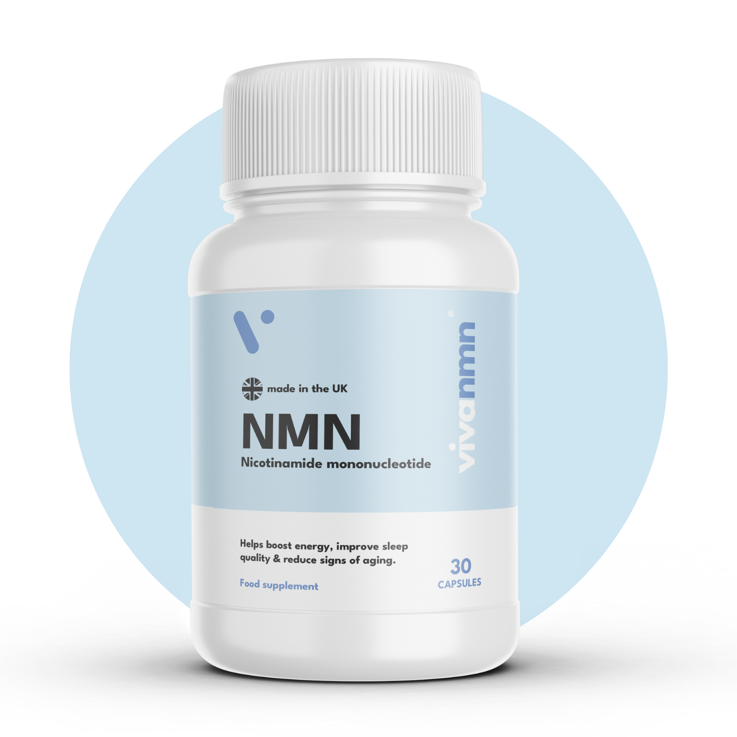
The packaging is a cylindrical bottle with a smooth, glossy surface. It features a white body with a light blue label. The label includes the product name 'NMN' prominently displayed, along with a brief description of its benefits. The cap is a standard screw-on type, matching the bottle's color scheme. The overall design is clean and modern, with a minimalist aesthetic.

The packaging is a white plastic bottle with a smooth surface and a screw-on cap. The bottle is cylindrical in shape, with a slightly tapered neck. The label features a light blue background with white text and graphics, including the product name 'NMN' and a brief description of its benefits. The label appears to be printed with a matte finish, giving it a clean and modern look. The overall design is simple yet effective, focusing on clarity and ease of reading.

The packaging is a cylindrical bottle with a smooth surface, typically made of plastic. It features a white body with a light blue label. The label has a clean design with rounded edges and a matte finish. The front of the bottle displays the product name 'NMN' prominently, along with the full name 'Nicotinamide mononucleotide' and a note about the quantity of capsules. The cap is a standard screw-on type, matching the bottle color. There are no visible flaps or tabs, and the overall appearance is sleek and modern, suitable for a dietary supplement.
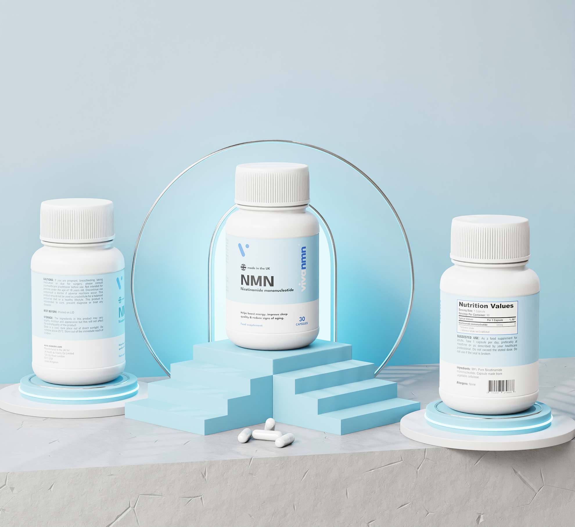
The packaging consists of three white plastic bottles, each with a screw-on cap. The bottles are cylindrical with a smooth surface and a matte finish. The front of the central bottle prominently displays the product name 'NMN' in bold lettering, with a clean and modern design. The side of the bottles includes nutritional information and other product details in a smaller font. The overall appearance is sleek and professional, aimed at health-conscious consumers.
About the Brand
VivanMN operates within the health supplement sector, providing NMN-based products through a direct-to-consumer model. The brand prioritizes product quality, transparency, and scientific validation, with packaging reflecting a clean and clinical visual identity.
The company's packaging approach is characterized by cylindrical, matte-finish bottles with light blue labeling, emphasizing readability and modern design. Consistency in visual branding across all SKUs reinforces consumer recognition and positions VivanMN within the premium supplement segment. Packaging choices are driven by the need for both logistical protection and a professional, health-focused presentation.
Key Differentiator: VivanMN’s packaging stands out through its strong alignment with scientific credibility, transparency, and minimalist design—elements that directly support the brand’s emphasis on trust and product efficacy.
Design System
Visual Style
Typography is sans-serif, prioritizing clarity and readability; the color palette centers on white and light blue, reinforcing a clinical, trustworthy image. Overall aesthetic is minimalist and modern, with an emphasis on whitespace and logical information hierarchy.
Brand Identity
Consistent use of the 'vivanmn' logo and product name on all packaging; iconography is minimal, focusing on functional clarity. Brand visuals adhere strictly to health and science cues, with high contrast and clean lines for instant recognition.
Packaging Design
Material selection favors rigid plastic bottles for durability and protection; structural design is straightforward, prioritizing user convenience and shelf stability. Labeling is wrap-around, maximizing space for regulatory and educational content.
User Experience
Design prioritizes easy identification, clear dosage instructions, and a reassuring clinical appearance, enhancing consumer confidence at every touchpoint. The unboxing process is efficient and professional, supporting the brand’s promise of quality and reliability.
Company Metrics
Business insights for VivanMN based on available data
Market Positioning
Brand Values & Focus
Key Competitors
Target Market: Health-conscious consumers in the UK seeking scientifically formulated anti-aging and wellness supplements; typically adults aged 30-65 with an interest in longevity and proactive self-care.
Packaging Assessment
Overall Grade
Visual appeal and presentation quality
Packaging durability and protection
Eco-friendliness and recyclable materials
Cost efficiency and value for money
Packaging assessment for VivanMN based on industry standards and best practices
Frequently Asked Questions
What type of packaging does VivanMN use for its NMN supplements?
VivanMN utilizes cylindrical, white plastic bottles with screw-on caps and matte-finish, light blue labels. The packaging is designed for both product protection and a clean, professional visual impact.
How does the packaging support product safety during shipping?
The rigid bottle structure and secure screw-on caps provide effective containment and protection, minimizing risk of damage or contamination during logistics.
Is VivanMN’s packaging environmentally sustainable?
VivanMN’s packaging primarily uses plastic materials, which offer durability but present moderate sustainability. There is limited evidence of recycled content or advanced eco-friendly materials in current use.
Does the unboxing experience enhance brand perception?
The minimalist, science-inspired design and clear branding contribute to a high-quality first impression, though the experience is functional rather than luxurious or highly experiential.
Discover other Health companies
Explore more companies in the health industry and their packaging strategies
EVO Nutrition
Health
EVO Nutrition specializes in premium health supplements, providing a wide range of vitamins and nutritional products to support well-being.
Bio-Synergy
Health
Bio-Synergy is a UK-based company specializing in health and fitness products, including nutritional supplements and DNA testing kits. Their mission is to support individuals in achieving their health and fitness goals through innovative products and personalized insights.
Smart Protein
Health
Smart Protein is dedicated to transforming nutrition by providing a range of health and wellness products focused on protein supplements and vitamins.