Vitaminecompleet packaging
Vitaminecompleet specializes in direct-to-consumer dietary supplements with a packaging strategy that emphasizes modern aesthetics, secure containment, and visible brand identity. Their packaging combines clean visual design with practical structures to support product safety and consistent user experience.
Packaging Portfolio
Vitaminecompleet's packaging portfolio includes single-layer carton folding boxes for retail display and robust plastic containers with screw-on lids for primary product containment. The use of gradient color palettes and bold typography aids in product segmentation and brand recall. Materials are selected for balance between visual appeal and protection, with carton boxes providing a smooth, glossy finish and plastic containers ensuring moisture resistance and integrity. Labeling is consistently applied across all formats, incorporating ingredient imagery and clear product identification.
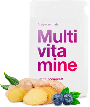
The packaging is a cylindrical bottle with a smooth surface and a white exterior. The bottle has a wide mouth and a screw-on cap. The label is prominently displayed on the front, featuring a gradient color scheme transitioning from pink to purple. The text is bold and modern, indicating the product name 'Multivitamine' in large font. Below the product name, the brand name 'vitaminecomplete' is printed in smaller text. The label includes images of ginger and blueberries, suggesting the ingredients or benefits of the supplement. The overall design is clean and minimalistic, appealing to a health-conscious audience.
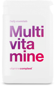
The packaging is a rectangular plastic container with a smooth surface and rounded edges. It features a white background with a gradient color scheme transitioning from purple to pink. The top of the container has a flat lid that is likely screw-on, providing a secure closure. The overall design is minimalistic, focusing on the product name and brand.
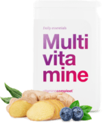
The packaging is a smooth, flat construction typical of folding cartons. It features a clean, white exterior with vibrant colors and a glossy finish. The front displays the product name 'Multivitamine' in large, bold font, with a gradient from purple to pink. Below the product name, there are images of ginger and blueberries, adding a fresh and appealing visual element. The edges are precise, and the overall form is rectangular, designed for retail display.
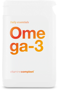
The packaging is a smooth, white plastic container with a rectangular shape and rounded edges. It features a screw-on lid and a label that wraps around the body of the container. The surface is glossy, giving it a clean and modern appearance. The label has a gradient color scheme transitioning from orange to yellow, with the product name 'Omega-3' prominently displayed in a bold, modern font. The text is clear and easy to read, with 'Daily essentials' printed above the product name in a smaller font. The overall design is minimalistic and appealing.
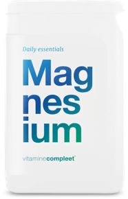
The packaging is a white plastic container with a smooth surface and a rectangular shape. It features a wide mouth for easy access, and the lid appears to be screw-on. The container has a clean design with rounded edges, providing a modern aesthetic. The front displays the product name 'Magnesium' in a large, bold font, with a gradient color scheme transitioning from blue to green. The text 'Daily essentials' is positioned above the product name in smaller font. The overall appearance is minimalistic and professional.
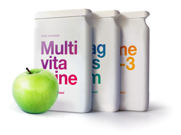
The packaging consists of three individual boxes that are smooth and flat, made from a single layer of paperboard. Each box has a clean, precise construction with no visible fluted layers. The boxes are predominantly white with colorful text, indicating a modern and minimalistic design. The edges are sharp and well-defined, suggesting high-quality manufacturing. The boxes are designed to stand upright and are likely intended for retail display.
About the Brand
Vitaminecompleet operates within the health supplement sector, providing vitamins, minerals, and wellness products through an online D2C model. The company deploys a cohesive packaging approach that leverages both carton boxes and plastic containers, balancing shelf presence with logistical efficiency.
With a curated product line and small team, Vitaminecompleet focuses on packaging formats that maximize visual impact and functional reliability. Their use of gradient color schemes and minimalistic layouts aligns with contemporary health branding, while secure closures and upright retail-ready designs address practical demands of e-commerce fulfillment and retail merchandising. Packaging is consistently branded and designed to be easily recognizable within the health and wellness market.
Key Differentiator: High design consistency across all packaging formats, with prominent brand elements and a minimalistic, modern visual language tailored for digitally engaged, health-focused consumers.
Design System
Visual Style
Modern sans-serif typography, vibrant gradient color palettes (e.g., purple-pink, orange-yellow, blue-green), and minimalistic layouts prioritize clarity and shelf impact. White backgrounds and sharp contrasts reinforce a clinical, health-oriented aesthetic.
Brand Identity
Consistent logo and brand name placement on all packaging; product names are bold and prominent, supported by ingredient iconography for quick recognition. Visual hierarchy and color coding differentiate product lines while maintaining overall brand coherence.
Packaging Design
Material selection focuses on rigid single-layer carton and high-grade plastic for structural stability and protection. Structural design emphasizes upright, stackable formats with secure closures to prevent contamination and spillage, suitable for both e-commerce and retail.
User Experience
Packaging design supports an intuitive, welcoming customer journey with easy-to-read labels, tactile closures, and visually distinct products. The unboxing process is streamlined, enhancing perceived value and reinforcing the brand's commitment to quality and clarity.
Company Metrics
Business insights for Vitaminecompleet based on available data
Market Positioning
Brand Values & Focus
Key Competitors
Target Market: Health-conscious consumers in the Netherlands seeking natural dietary supplements through digital channels.
Packaging Assessment
Overall Grade
Visual appeal and presentation quality
Packaging durability and protection
Eco-friendliness and recyclable materials
Cost efficiency and value for money
Packaging assessment for Vitaminecompleet based on industry standards and best practices
Frequently Asked Questions
What types of packaging does Vitaminecompleet use for its supplements?
Vitaminecompleet utilizes a mix of single-layer carton boxes and plastic containers with screw-on lids, each featuring high-contrast labels and gradient color schemes for product differentiation and brand recognition.
How does Vitaminecompleet ensure product safety during shipping?
Packaging structures are designed for durability, with rigid carton and plastic formats providing impact protection and secure closures, minimizing risk of contamination or damage during transit.
Is sustainability addressed in Vitaminecompleet's packaging?
While the use of recyclable carton contributes positively, the prevalence of plastic containers limits overall eco-friendliness. The packaging approach is moderately sustainable but could be improved by increasing recycled content or alternative materials.
Discover other Health companies
Explore more companies in the health industry and their packaging strategies
Comvita
Health
Comvita is a New Zealand-based company specializing in high-quality Mānuka honey and natural health products. Established in 1974, it aims to connect people with the healing power of nature.
Bio-Synergy
Health
Bio-Synergy is a UK-based company specializing in health and fitness products, including nutritional supplements and DNA testing kits. Their mission is to support individuals in achieving their health and fitness goals through innovative products and personalized insights.
EVO Nutrition
Health
EVO Nutrition specializes in premium health supplements, providing a wide range of vitamins and nutritional products to support well-being.