Vapure packaging
Vapure specializes in health and wellness products, notably shower bombs and aromatherapy accessories, with a focus on natural ingredients and artisanal production. Their packaging strategy employs both flexible sachets and carton boxes, emphasizing brand visibility, aesthetic appeal, and an accessible unboxing experience.
Packaging Portfolio
Vapure’s packaging portfolio includes flexible sachets for single-use products, stand-up pouches with resealable closures for multi-packs, and carton boxes for both retail and bundled presentations. Materials primarily consist of laminated flexible films and coated paperboard, offering a balance of durability and visual appeal. Structural formats are optimized for compactness, retail visibility, and e-commerce shipping, with matte and glossy surface finishes to enhance tactile and visual perception. Branding is consistently prioritized through bold color schemes, clear typography, and prominent logo placement on all packaging types.

The packaging is a smooth, flat construction made of single-layer paperboard. It features clean, precise edges and folds, typical of retail packaging. The box is predominantly white with a gradient effect transitioning to a light pink. The front displays the brand name 'VAPURE' in bold, uppercase letters, with a stylized logo above it. The bottom section includes the word 'sativa' in a smaller font, indicating the product type. The overall design is minimalistic and modern.
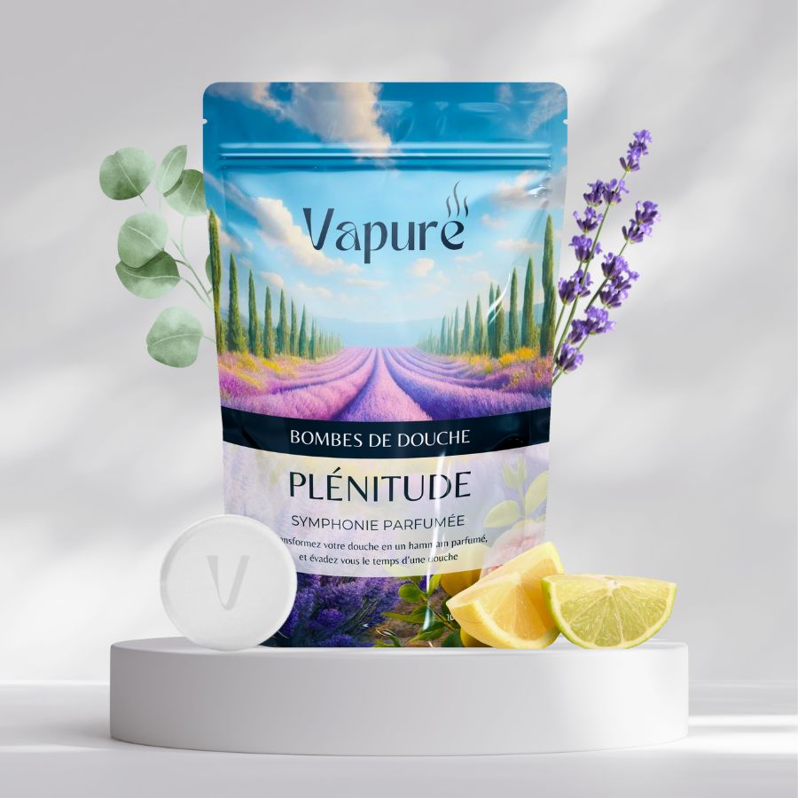
The packaging is a stand-up pouch made from a flexible material that allows it to maintain an upright position. The front features a vibrant graphic design with a scenic landscape of lavender fields, complemented by images of lemon and lime slices. The top of the pouch has a resealable zipper closure, allowing for easy access and storage. The overall shape is rectangular with a slightly curved base, enhancing its stability when standing.
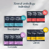
The packaging consists of multiple individual sachets arranged in a visually appealing layout. Each sachet is labeled with different colors corresponding to the product flavors (Eucalyptus, Rose, Lavender, Citron). The overall design is clean with a modern aesthetic, featuring a dark background that contrasts with the vibrant colors of the sachet labels. The edges of the packaging are smooth and well-defined, indicating a precise folding technique typical of folding cartons.
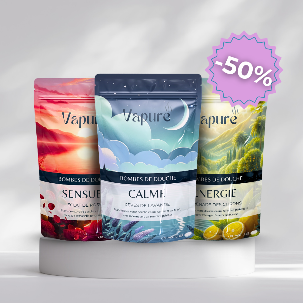
The image features three stand-up pouches, each with a distinct design. The pouches have a smooth, glossy finish and are made from a flexible material that allows them to stand upright. Each pouch has a resealable top, which is common in flexible packaging. The front of each pouch displays vibrant graphics and colors, with images that suggest the product's scent or theme. The pouches are clearly labeled with the product name and branding elements.

The packaging consists of multiple individual sachets arranged in a visually appealing layout. Each sachet features a smooth, flat construction without any visible fluted layers, indicating a single-layer paperboard or plastic material. The sachets are primarily rectangular in shape, with rounded corners, and are sealed on all sides. The surface finish appears to be matte, with a slight sheen that enhances the visual appeal. The colors used are vibrant, with a mix of pastel and bold hues, including turquoise, lavender, and yellow, indicating a focus on aesthetics. The front of each sachet prominently displays the brand name 'Vapure' in a stylish font, alongside product descriptors such as 'Purifiant', 'Calme', and 'Energie'.

The packaging is a folding carton made of smooth, single-layer paperboard. It features a vibrant, gradient color scheme transitioning from pink to blue, with a glossy finish. The edges are clean and precise, indicating a well-constructed design. The front displays the brand name 'VAPURE' prominently in a bold, modern font, with additional text stating 'let loose' in a smaller font. The overall design is eye-catching and aligns with contemporary retail aesthetics.
About the Brand
Vapure is a Swiss-based beauty and wellness company offering a curated line of shower bombs and aromatherapy products, primarily sold direct-to-consumer. The brand prioritizes natural formulations, customer experience, and strong visual branding across its packaging assets.
Founded in 2023, Vapure operates a small-scale, artisanal manufacturing process located in France, delivering wellness products crafted with 90% natural ingredients. The company’s packaging approach leverages both flexible sachets for individual products and premium carton boxes for multi-pack presentations. Strategic use of color, typography, and brand consistency is evident in all formats, enhancing consumer perception and shelf differentiation. The D2C model, coupled with a robust e-commerce platform, supports frequent packaging updates and responsive design iterations.
Key Differentiator: Vapure’s key differentiator lies in its fusion of artisanal quality with accessible, visually compelling packaging that reinforces a premium, natural wellness positioning.
Design System
Visual Style
The visual design employs a contemporary aesthetic with sans-serif typography, a vibrant and pastel color palette (turquoise, lavender, yellow, pink), and minimalistic layout structures. The mix of bold hues with clean lines supports both shelf impact and digital representation.
Brand Identity
Brand identity is maintained through consistent logo placement, recurring iconography, and unified color schemes. Packaging features the Vapure logo and product descriptors front and center, ensuring immediate recognition and reinforcing trust.
Packaging Design
Material selection favors flexible laminates for sachets and robust, coated paperboard for cartons, supporting both product protection and premium presentation. Structural design emphasizes resealable closures for freshness and multi-pack formats for gifting or discovery.
User Experience
The design system prioritizes easy-open features, tactile finishes, and clear product labeling to enhance the customer journey from unboxing to use. Cohesive visual cues and clear segmentation of product lines streamline navigation and reinforce the brand’s wellness positioning throughout the user experience.
Company Metrics
Business insights for Vapure based on available data
Market Positioning
Brand Values & Focus
Key Competitors
Target Market: Health-conscious consumers seeking affordable luxury and natural wellness experiences, primarily in Switzerland and broader European D2C e-commerce markets.
Packaging Assessment
Overall Grade
Visual appeal and presentation quality
Packaging durability and protection
Eco-friendliness and recyclable materials
Cost efficiency and value for money
Packaging assessment for Vapure based on industry standards and best practices
Frequently Asked Questions
What types of packaging formats does Vapure use?
Vapure utilizes flexible packaging for individual sachets and stand-up pouches, as well as carton boxes for multi-pack and retail displays. All formats are designed to maximize visual impact and brand recognition.
How does Vapure address sustainability in its packaging?
While Vapure emphasizes natural ingredients and uses paperboard and flexible formats that can support recyclability, the overall sustainability is moderate due to potential plastic content in flexible pouches and limited transparency on sourcing or end-of-life management.
What is the primary branding approach on Vapure packaging?
Vapure prioritizes prominent logo placement, consistent use of color palettes, and bold typography to ensure immediate brand recognition and a cohesive customer experience throughout its packaging.
Discover other Beauty & Fitness companies
Explore more companies in the beauty & fitness industry and their packaging strategies
Pure Altitude
Beauty & Fitness
Pure Altitude specializes in high-quality beauty and skincare products that leverage the expertise of spa treatments to enhance daily routines. The brand offers a diverse range of products tailored for both facial and body care.
Owari
Beauty & Fitness
Owari specializes in 100% natural beauty and fitness products, designed to enhance health and wellness. The company proudly offers its products made in France, emphasizing quick delivery and customer support.
Institut Karité Paris
Beauty & Fitness
Institut Karité Paris specializes in luxury beauty products made with natural Shea Butter, offering a wide range of skincare and body care solutions. The brand combines Parisian heritage with a commitment to quality and creativity in its offerings.