UniHerbal packaging
UniHerbal specializes in natural supplements, herbal teas, and cosmetics, prioritizing plant-based formulations and transparent ingredient sourcing. Their packaging strategy leverages retail-grade cartons and plastic containers to balance product integrity, brand communication, and consumer safety.
Packaging Portfolio
UniHerbal’s packaging portfolio is characterized by the use of single-layer folding cartons for liquids and retail beverages, and cylindrical plastic containers or bottles for powders and capsules. These structures prioritize protection and compliance, with paperboard offering lightweight durability and the plastic formats maximizing shelf life for sensitive contents. Design elements such as glossy finishes, vivid color palettes, and health-focused iconography ensure clear differentiation on shelf and reinforce product benefits. The overall approach emphasizes brand clarity, regulatory transparency, and ease of use, while maintaining moderate sustainability standards through the use of recyclable substrates.
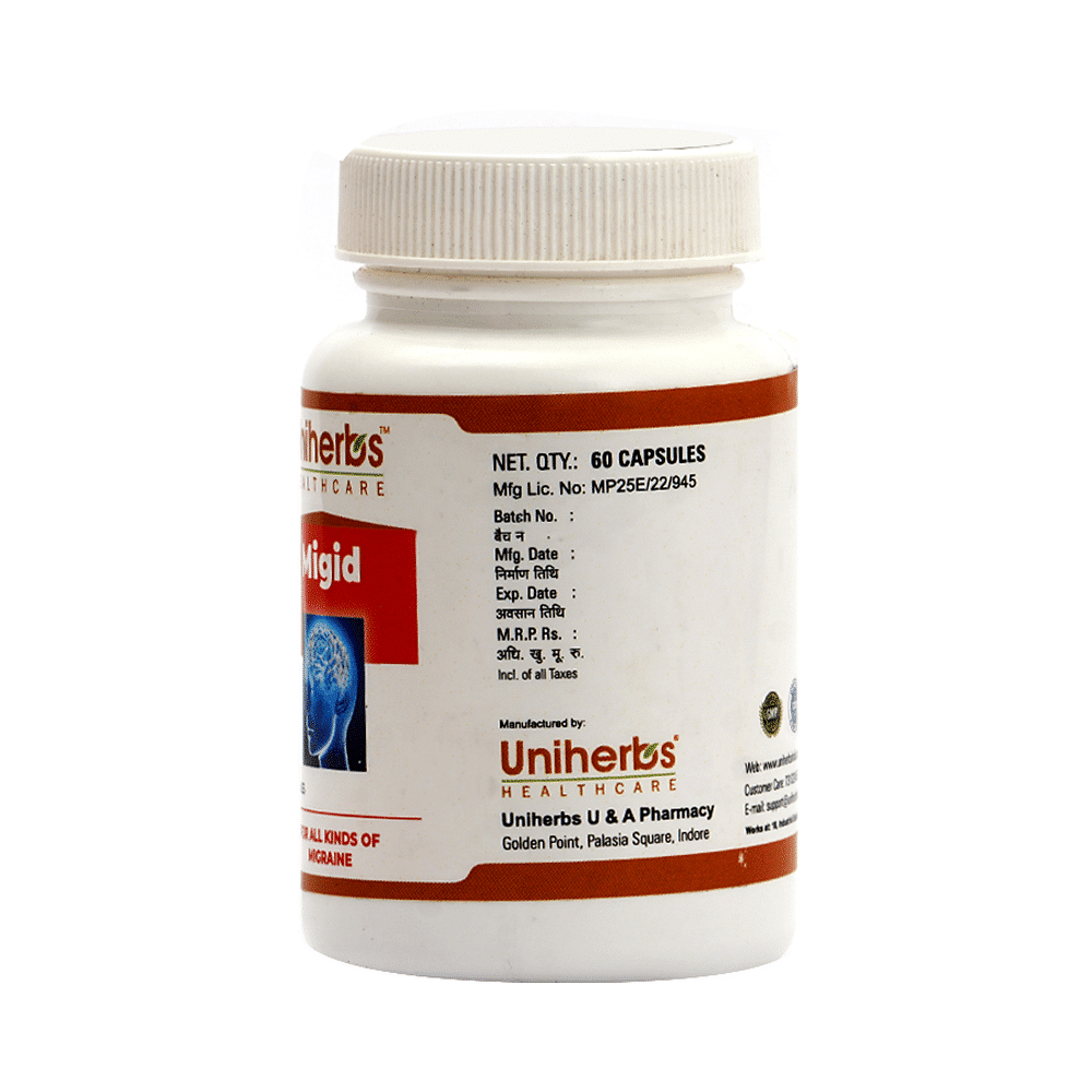
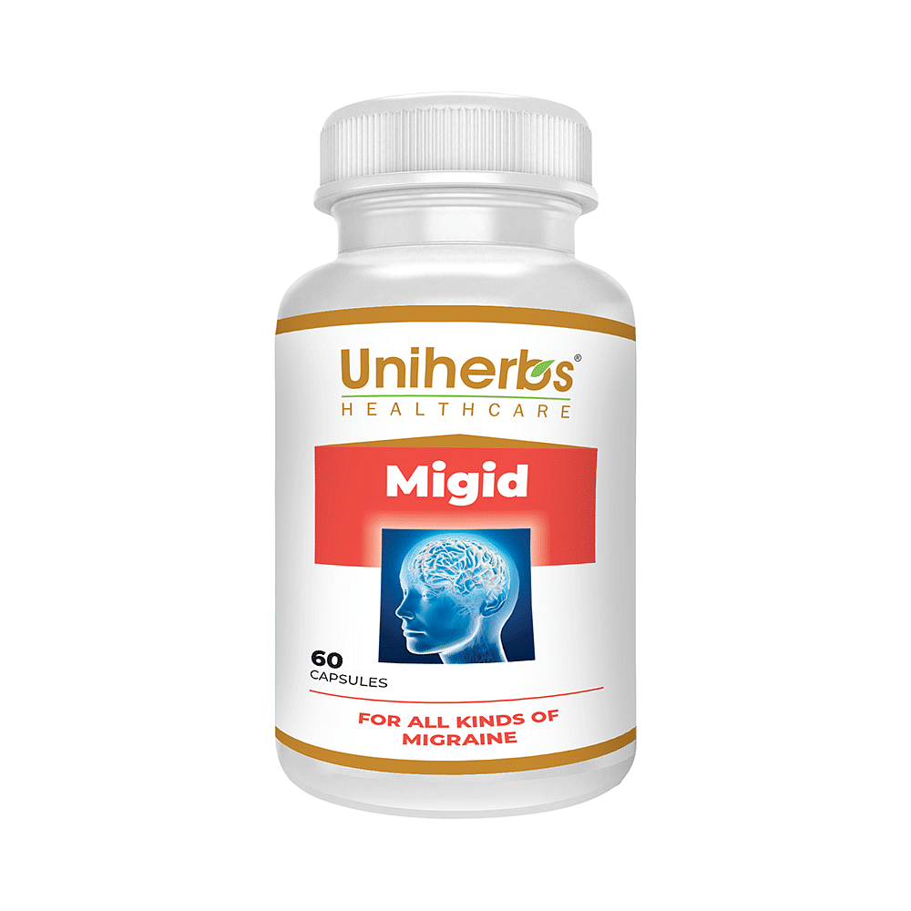
The packaging consists of a cylindrical plastic container with a white screw-on lid. The container is opaque with a smooth surface and features a label wrapped around its body. The label includes product information and branding elements.

The packaging consists of a tall, rectangular carton designed to hold a 200 ml syrup bottle. The carton features a smooth, flat construction without any visible fluted layers, indicating it is made of single-layer paperboard. The exterior is predominantly white with vibrant colors used for branding and product information. The edges are clean and precise, and the overall appearance is lightweight yet sturdy. The front displays the product name 'P.C.Clear' prominently, along with a graphic representation of the female reproductive system, which aligns with the product's purpose. The back and sides contain additional information about the product's benefits and ingredients, printed in a clear, legible font.
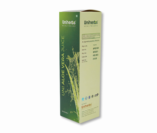
The packaging is a tall, rectangular carton with a smooth, flat construction. It features a clean design with precise edges and folds, indicative of a folding carton. The exterior is primarily green with a gradient effect, transitioning to a lighter shade, and includes graphics of aloe vera and water droplets, suggesting a refreshing beverage. The top of the carton has a tuck flap closure, typical for retail packaging.
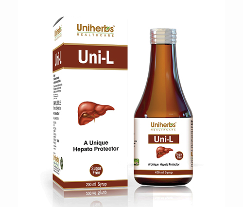
The packaging is a tall, rectangular folding carton designed to hold a bottle of syrup. The carton has a smooth, flat construction without any visible fluted layers, indicating it is made from single-layer paperboard. The exterior features a glossy finish with vibrant colors, predominantly white with red and yellow accents. The front displays the product name 'Uni-L' prominently, along with a graphic of a liver, emphasizing its function as a hepato protector. The carton has clean, precise edges and folds, typical of retail packaging.
The packaging consists of a clear plastic bottle with a white screw-on cap. The bottle is cylindrical and has a smooth surface. The label wraps around the body of the bottle, displaying product information, branding, and graphics. The label has a glossy finish and features a prominent image related to the product's purpose.
About the Brand
UniHerbal operates in the health sector, delivering a diverse product portfolio that includes dietary supplements, herbal teas, and plant-based cosmetics. The brand is recognized for its commitment to natural ingredients and its integration of traditional herbal knowledge with contemporary scientific standards.
The company employs a direct-to-consumer (D2C) business model and maintains a robust online presence across Europe, ensuring efficient delivery of health products. Packaging at UniHerbal is tailored to meet regulatory requirements and consumer expectations for safety, with each solution supporting secure transit, clear product identification, and shelf appeal. The emphasis on eco-friendly practices is evident in their selection of recyclable materials and minimalist design choices.
Key Differentiator: UniHerbal's unique position stems from its exclusive focus on 100% natural ingredient formulations, supported by transparent sourcing and a holistic wellness philosophy reflected in both product and packaging design.
Design System
Visual Style
Typography is clean and sans-serif, supporting readability and a clinical aesthetic. The color palette emphasizes whites, greens, and accent colors (red, yellow) to reflect natural health cues and product functionality. Overall, the visual approach is modern, professional, and health-oriented.
Brand Identity
Brand logos and product names are consistently displayed on all packaging, with supporting taglines and health graphics. Iconography is used to signal product benefits and natural ingredients, ensuring high visual consistency and immediate brand recognition.
Packaging Design
Material choices favor recyclable single-layer paperboard for cartons and PET/HDPE plastic for bottles and containers. Structures are lightweight for cost efficiency yet sturdy enough for logistics safety. The design philosophy supports product protection, regulatory compliance, and accessible consumer information.
User Experience
Packaging is engineered for straightforward unboxing, clear product identification, and easy disposal. Label layouts and graphics guide consumers through usage, ingredients, and benefits, reinforcing the brand’s focus on transparency and natural wellness throughout the customer journey.
Company Metrics
Business insights for UniHerbal based on available data
Market Positioning
Brand Values & Focus
Key Competitors
Target Market: Health-conscious European consumers seeking natural wellness solutions, including dietary supplements, herbal teas, and organic cosmetics.
Packaging Assessment
Overall Grade
Visual appeal and presentation quality
Packaging durability and protection
Eco-friendliness and recyclable materials
Cost efficiency and value for money
Packaging assessment for UniHerbal based on industry standards and best practices
Frequently Asked Questions
What types of packaging formats does UniHerbal use for its products?
UniHerbal utilizes folding cartons for liquid supplements and beverages, as well as cylindrical plastic containers and bottles for capsules and powders, all featuring branded labels and product-specific graphics.
How does UniHerbal address sustainability in their packaging?
The company incorporates recyclable paperboard and plastic components, with a focus on minimizing excess material and supporting eco-friendly practices in line with their brand values.
What measures are taken to ensure product safety during shipping?
Packaging structures are designed for protection during transit, employing sturdy single-layer paperboard and robust plastic containers to limit damage and preserve product integrity.
Discover other Health companies
Explore more companies in the health industry and their packaging strategies
EVO Nutrition
Health
EVO Nutrition specializes in premium health supplements, providing a wide range of vitamins and nutritional products to support well-being.
Comvita
Health
Comvita is a New Zealand-based company specializing in high-quality Mānuka honey and natural health products. Established in 1974, it aims to connect people with the healing power of nature.
Bio-Synergy
Health
Bio-Synergy is a UK-based company specializing in health and fitness products, including nutritional supplements and DNA testing kits. Their mission is to support individuals in achieving their health and fitness goals through innovative products and personalized insights.