Ulric de Varens packaging
Ulric de Varens specializes in accessible fragrances and personal care products, leveraging bold branding and retail-oriented packaging. Their packaging strategy centers on visually engaging carton boxes designed for both shelf impact and efficient product protection.
Packaging Portfolio
Ulric de Varens’ packaging portfolio is dominated by folding carton boxes constructed from single-layer, glossy-finished paperboard. The packaging structure is optimized for retail display, featuring clean folds, precise edges, and upright orientation to showcase product branding. Visual differentiation is achieved through bold color schemes—such as black, red, and pink—and prominent use of metallic and embossed typography. While the packaging provides essential product protection and high shelf impact, its lightweight construction is best suited for in-store sales, with moderate adaptation for direct-to-consumer logistics.

The packaging consists of a smooth, flat construction with a folding carton design. The box is primarily rectangular, featuring a glossy finish that enhances its visual appeal. The front displays the product name 'UDY FOR MEN' prominently, with a stylized font that appears embossed or raised. The color scheme includes dark tones, likely black or dark gray, with silver accents. The sides of the box are clean and feature minimal text, focusing on the brand and product information. The top has a flap closure that is neatly folded and secured, indicating a well-constructed carton.
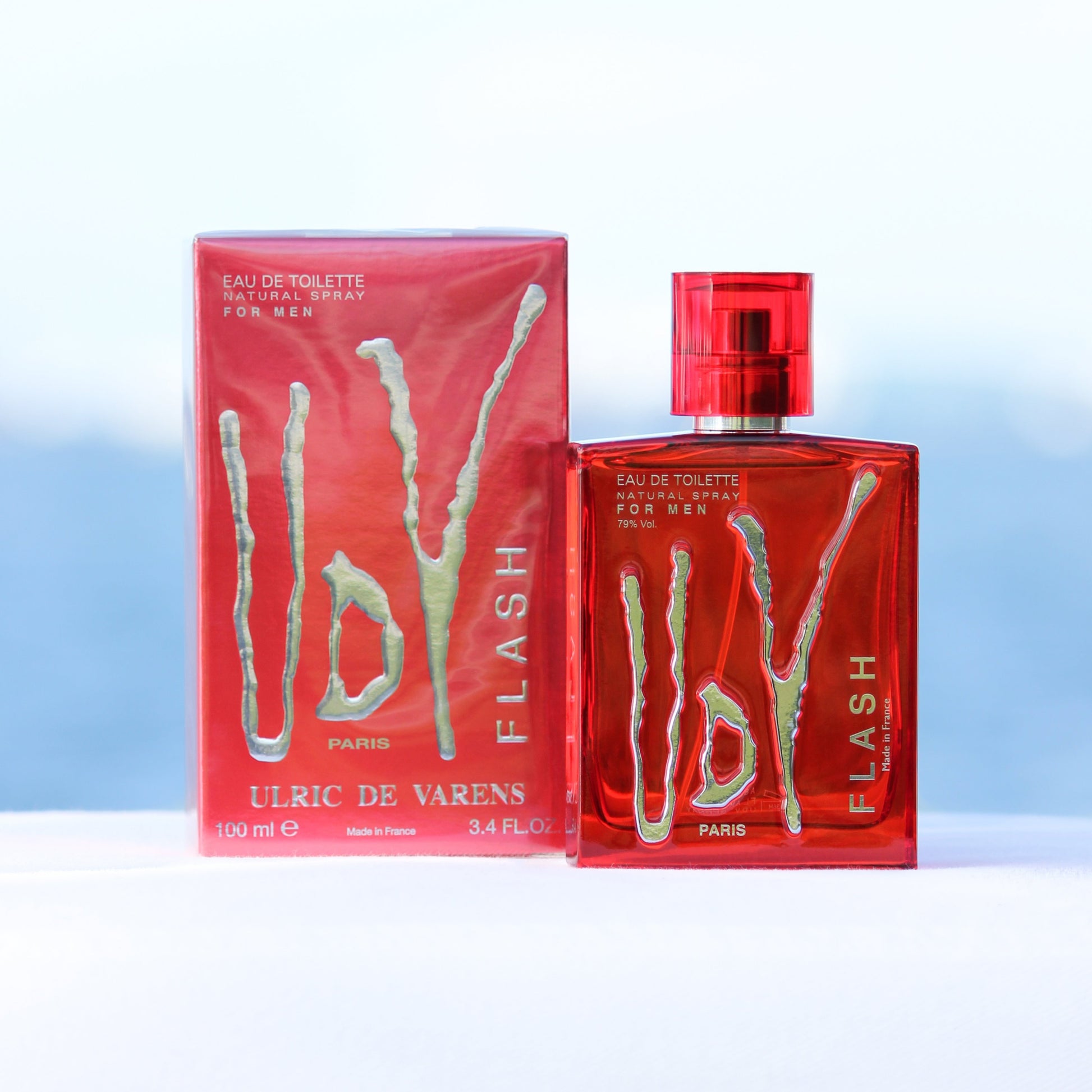
The packaging consists of a folding carton that houses a fragrance bottle. The carton is made of smooth, single-layer paperboard with a vibrant red color. It features clean, precise edges and folds, typical of retail packaging. The front of the carton displays the product name 'UdV FLASH' in bold, stylized text, along with the brand name 'ULRIC DE VARENS' and the location 'PARIS'. The design includes a glossy finish that enhances visual appeal. The back of the carton likely contains product information and ingredients, although this is not visible in the image.

The packaging is a folding carton with a smooth, flat construction. It features a vibrant pink color scheme with a glossy finish. The front displays the product name 'CHIC-ISSIME' prominently, along with the brand name 'ULRIC DE VARENS' in a stylish font. The design includes an image of the perfume bottle and deodorant, both elegantly arranged. The edges are clean and precise, indicative of high-quality manufacturing. The carton is designed to stand upright, showcasing the products inside.
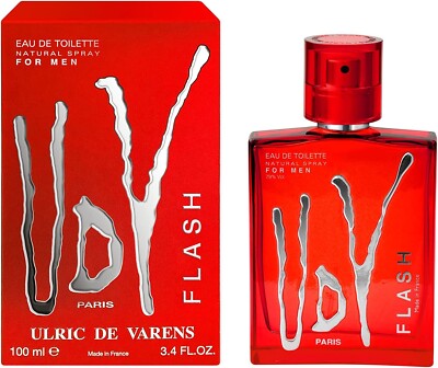
The packaging is a folding carton made of smooth, flat paperboard with a vibrant red exterior. The front features a bold, stylized logo in silver with the product name 'UDV FLASH' prominently displayed. The edges are clean and precise, indicating high-quality construction. The carton has a glossy finish that enhances its visual appeal, making it suitable for retail display. The overall shape is rectangular, designed to hold a fragrance bottle securely.
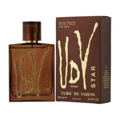
The packaging consists of a flat, smooth, single-layer paperboard carton that houses a glass bottle of fragrance. The carton features clean, precise edges and folds, with a glossy finish that enhances its visual appeal. The front displays a bold, stylized logo and product name in gold lettering against a brown background, while the sides and back contain additional product information and branding elements.

The packaging consists of a flat, smooth, single-layer paperboard carton. It features a clean, rectangular shape with precise edges and folds. The exterior is predominantly black with a glossy finish, showcasing a modern and sleek design. The front displays the brand name 'Ulric de Varens' in a stylized, embossed silver font, which adds a premium touch. The back of the carton likely contains product information and regulatory details, though not visible in the image. The overall appearance is lightweight and suitable for retail display.
About the Brand
Ulric de Varens is a French fragrance company recognized for its affordable, diverse range of perfumes and body care products. Their packaging approach emphasizes retail-ready carton boxes with strong visual branding, targeting mass-market consumers seeking value and style.
The company integrates modern design elements—such as glossy finishes, vibrant color palettes, and prominent logo placement—across its packaging lineup. With a focus on cost-conscious production, Ulric de Varens utilizes single-layer paperboard cartons that balance shelf appeal with basic functional protection. The packaging consistently reflects the brand’s playful and creative identity while ensuring clear product differentiation among SKUs.
Key Differentiator: Ulric de Varens stands out for combining highly recognizable, visually striking packaging with aggressive price positioning in the fragrance sector, appealing to budget-conscious consumers without sacrificing brand identity.
Design System
Visual Style
Typography is modern and bold, often utilizing embossed or metallic fonts for product names and brand logos. The color palette focuses on vibrant hues (reds, pinks, blacks) with glossy finishes, creating strong visual contrast and contemporary appeal.
Brand Identity
Logo and brand name are consistently featured on all packaging faces, supported by stylized iconography such as product line identifiers and Parisian references. Visual consistency is maintained across SKUs through standardized font usage and layout structures.
Packaging Design
Material selection centers on single-layer, recyclable paperboard with high-gloss coatings. Structural design emphasizes clean, rectangular forms and retail-optimized presentation, prioritizing branding and display over heavy-duty protection.
User Experience
Packaging is designed for immediate shelf recognition and ease of opening, supporting an enjoyable unboxing experience. The visual language reinforces the brand’s playful and accessible ethos, enhancing consumer engagement at point of sale and during product use.
Company Metrics
Business insights for Ulric de Varens based on available data
Market Positioning
Brand Values & Focus
Key Competitors
Target Market: Budget-conscious consumers seeking trendy, accessible fragrances and personal care products, primarily in France and broader European markets.
Packaging Assessment
Overall Grade
Visual appeal and presentation quality
Packaging durability and protection
Eco-friendliness and recyclable materials
Cost efficiency and value for money
Packaging assessment for Ulric de Varens based on industry standards and best practices
Frequently Asked Questions
What types of packaging does Ulric de Varens use for their products?
Ulric de Varens primarily uses single-layer paperboard folding cartons for fragrances and personal care items, emphasizing visually appealing designs with vibrant colors and glossy finishes.
How does Ulric de Varens ensure product protection during shipping?
Their carton boxes provide moderate protection suitable for retail environments; however, additional protective measures may be necessary for e-commerce shipments to minimize transit-related risks.
Is Ulric de Varens packaging environmentally sustainable?
The packaging uses recyclable paperboard materials, but the inclusion of glossy finishes may impact recyclability. Overall, the sustainability profile is moderate relative to industry standards.
Discover other Beauty & Fitness companies
Explore more companies in the beauty & fitness industry and their packaging strategies
Cultiv Cosmetique
Beauty & Fitness
Cultiv Cosmetique is a French skincare brand that provides organic and eco-friendly beauty products inspired by nature. They focus on effective skincare solutions for various skin concerns.
Orris Paris
Beauty & Fitness
Orris Paris specializes in creating artisanal skincare products that combine potent botanical ingredients with modern cleansing rituals. The company emphasizes natural, holistic practices in its formulations.
Big Moustache
Beauty & Fitness
Big Moustache specializes in shaving and grooming products tailored for men, providing a hassle-free subscription service for razor blades and skincare essentials.