Turmeric Vitality packaging
Turmeric Vitality is a UK-based D2C health supplement brand specializing in turmeric-focused nutrition. Their packaging strategy employs a mix of glass, plastic, flexible pouches, and cartons with high-impact labeling to reinforce product quality and support logistics for direct-to-consumer fulfillment.
Packaging Portfolio
Turmeric Vitality’s packaging portfolio spans dark glass bottles for liquid supplements, HDPE or PET plastic bottles for capsules, flexible resealable pouches for powdered or loose products, and folding cartons for secondary or retail packaging. Labels are consistently applied with high-contrast colors and bold typography for ingredient visibility and regulatory compliance. Material choices prioritize product stability and shelf life, while resealable features on pouches add convenience and reduce waste. Structural formats are optimized for e-commerce fulfillment, balancing protection with shipping efficiency.

The packaging is a flat pouch with a glossy black exterior and a yellow label prominently displaying the product name 'TURMERIC VITALITY'. The pouch has a clean, smooth surface with no visible fluted layers, indicating it is made from a flexible material rather than corrugated or rigid construction. The top of the pouch features a resealable closure, and the overall shape is rectangular with a slight taper towards the bottom.
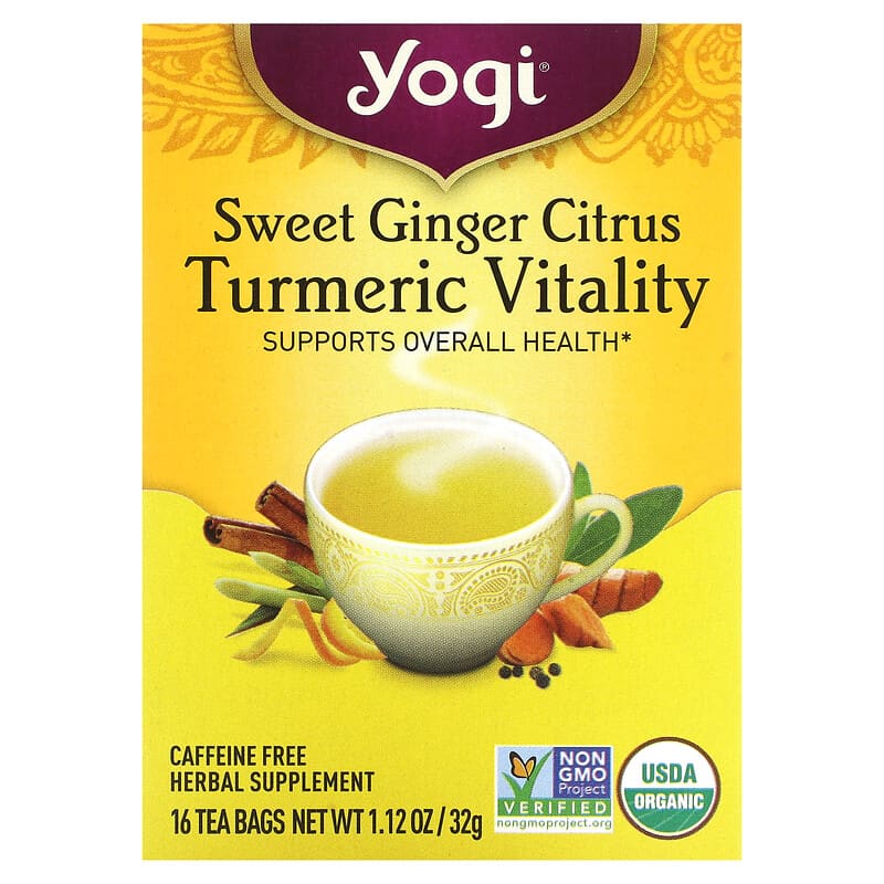
The packaging is a folding carton made of smooth, single-layer paperboard. It features a bright yellow background with a decorative border and floral designs. The front displays the product name 'Sweet Ginger Citrus Turmeric Vitality' prominently in bold, dark font, along with a visual of a cup of tea. The sides and back contain nutritional information and branding elements. The edges are clean and precise, indicating a well-constructed carton.
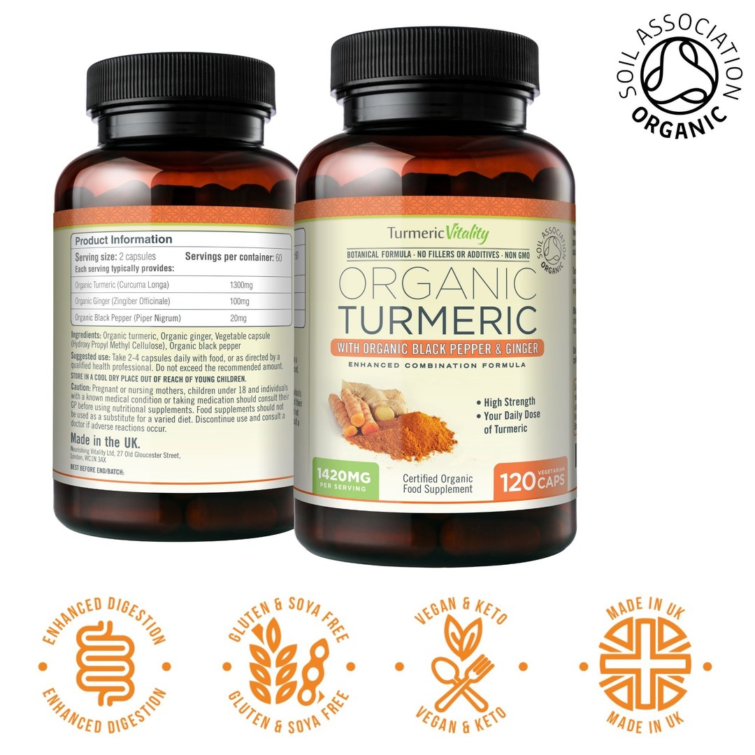
The packaging consists of a dark plastic bottle with a screw-on lid. The front label features a clean design with a white background, prominently displaying the product name 'Organic Turmeric' in bold lettering. Below the product name, there are details about the ingredients, including 'with Organic Black Pepper & Ginger'. The back label includes product information, serving sizes, and certifications, all printed in a clear, legible font. The overall design is modern and professional, appealing to health-conscious consumers.

The image features two dark glass bottles of liquid supplements, each with a white label. The labels prominently display the product name 'Turmeric' along with additional descriptive text. The bottles are surrounded by various fruits and turmeric roots, suggesting a natural and health-focused theme. The labels have a clean design with vibrant colors that highlight the ingredients.

The packaging consists of two dark glass bottles with a rounded shape, each containing a liquid supplement. The labels are colorful and feature vibrant graphics, including images of turmeric and fruits. The labels are predominantly white with colored accents, and the text is bold and clear, indicating the product's name and key features.
About the Brand
Turmeric Vitality delivers turmeric-centric health supplements designed for bioavailability and wellness. Their product line spans capsules, liquids, and oils, appealing to a health-conscious UK customer base through a strong e-commerce presence.
The company leverages natural ingredient claims and science-backed formulations, with packaging that underscores purity, efficacy, and trust. With a small team and steady monthly revenue, Turmeric Vitality relies on custom-labeled bottles and pouches to maintain a consistent, premium shelf presence and ensure safe product delivery in the online retail landscape. Their visual identity is driven by clarity, ingredient transparency, and a modern, clean aesthetic that resonates with the wellness market.
Key Differentiator: The use of bio-fermented turmeric and a focus on enhanced absorption distinguish Turmeric Vitality, along with a packaging approach that prioritizes both visual credibility and functional product protection.
Design System
Visual Style
Uses bold, clear sans-serif typography combined with vibrant accent colors (yellows, oranges) against white or black backgrounds. Imagery includes ingredient illustrations and health cues, supporting a modern, clean, and approachable aesthetic.
Brand Identity
Consistent logo placement on all packaging, with a focus on clear brand name visibility. Product icons and ingredient motifs reinforce category and benefits. Visual consistency is maintained across SKUs and formats for strong shelf and digital presence.
Packaging Design
Prefers recyclable glass and plastic bottles for product integrity, complemented by flexible pouches with resealable closures. Cartons are used for retail and gift formats, utilizing smooth paperboard with vivid printing. Structural choices prioritize protection, compliance, and consumer usability.
User Experience
Design choices ensure legibility, quick product identification, and easy opening. Packaging supports the D2C customer journey by maximizing product safety during transit and creating a trustworthy first impression through clear labeling and quality cues.
Company Metrics
Business insights for Turmeric Vitality based on available data
Market Positioning
Brand Values & Focus
Key Competitors
Target Market: Health-conscious UK consumers seeking natural supplements with a focus on efficacy and ingredient transparency, primarily shopping online through direct-to-consumer channels.
Packaging Assessment
Overall Grade
Visual appeal and presentation quality
Packaging durability and protection
Eco-friendliness and recyclable materials
Cost efficiency and value for money
Packaging assessment for Turmeric Vitality based on industry standards and best practices
Frequently Asked Questions
What types of packaging does Turmeric Vitality use for its supplements?
Turmeric Vitality utilizes a range of packaging formats including dark glass bottles, plastic supplement bottles, flexible resealable pouches, and paperboard cartons. Each is selected for optimal product protection, shelf life, and consumer convenience.
How does Turmeric Vitality address sustainability in its packaging?
While the brand uses recyclable materials such as glass and certain plastics, there is limited evidence of advanced sustainability initiatives like compostable materials or a holistic environmental policy. Packaging choices balance protection with some recyclable content.
What is the unboxing experience like for Turmeric Vitality customers?
The unboxing experience features visually appealing, clearly branded labels with vibrant graphics, ingredient imagery, and a focus on health cues. However, the experience is more functional than luxurious, emphasizing clarity and trust over elaborate presentation.
Discover other Health companies
Explore more companies in the health industry and their packaging strategies
Lily & Loaf
Health
Lily & Loaf specializes in high-quality health and nutrition products, offering a range of supplements and vitamins aimed at supporting an active lifestyle. The company focuses on providing natural solutions for health and beauty.
Doctor Seaweed
Health
Doctor Seaweed specializes in natural, plant-based nutritional supplements derived from seaweed, aimed at promoting overall wellness.
EVO Nutrition
Health
EVO Nutrition specializes in premium health supplements, providing a wide range of vitamins and nutritional products to support well-being.