Titanic Brewery packaging
Titanic Brewery specializes in craft beer production, distributing both flagship and limited-edition brews via cask, bottle, and can formats. Their packaging strategy employs branded containers and shipping boxes, prioritizing visual consistency and protective structures to maintain product integrity from brewery to consumer.
Packaging Portfolio
Titanic Brewery’s packaging portfolio comprises primary containers—dark glass bottles and aluminum cans—featuring vibrant labels with consistent nautical branding and product differentiation. Secondary packaging includes custom-printed corrugated boxes designed for shipping, retail, and gift purposes, often with clear handling instructions and prominent brand marks. The use of mixed-material formats (glass, metal, cardboard) supports logistics efficiency and product safety, while limited editions and mixed packs leverage packaging as a storytelling device. Overall, the approach balances visual branding, structural protection, and channel-specific requirements.

The image features three beer bottles with a consistent design. Each bottle is made of dark glass, showcasing a classic beer bottle shape with a slightly curved neck and a standard cap. The labels are prominently displayed on the front, featuring a mix of colors and graphics that include a logo and product information.

The packaging is a sturdy shipping box made of corrugated cardboard. It features a brown kraft exterior with a prominent logo and text printed on the front. The edges of the box are visible and show the characteristic fluted inner layer of corrugated material when viewed from the side. The box has a square shape with a top flap that is folded down and secured, and it includes a label indicating 'I'M FRAGILE' for handling instructions.

The image features a collection of bottles and cans arranged on a table, with a branded glass and coasters. The bottles are dark glass, while the cans are metallic with colorful labels. The background includes a cardboard box that appears to contain the beverages. The overall arrangement suggests a promotional display or a gift set.
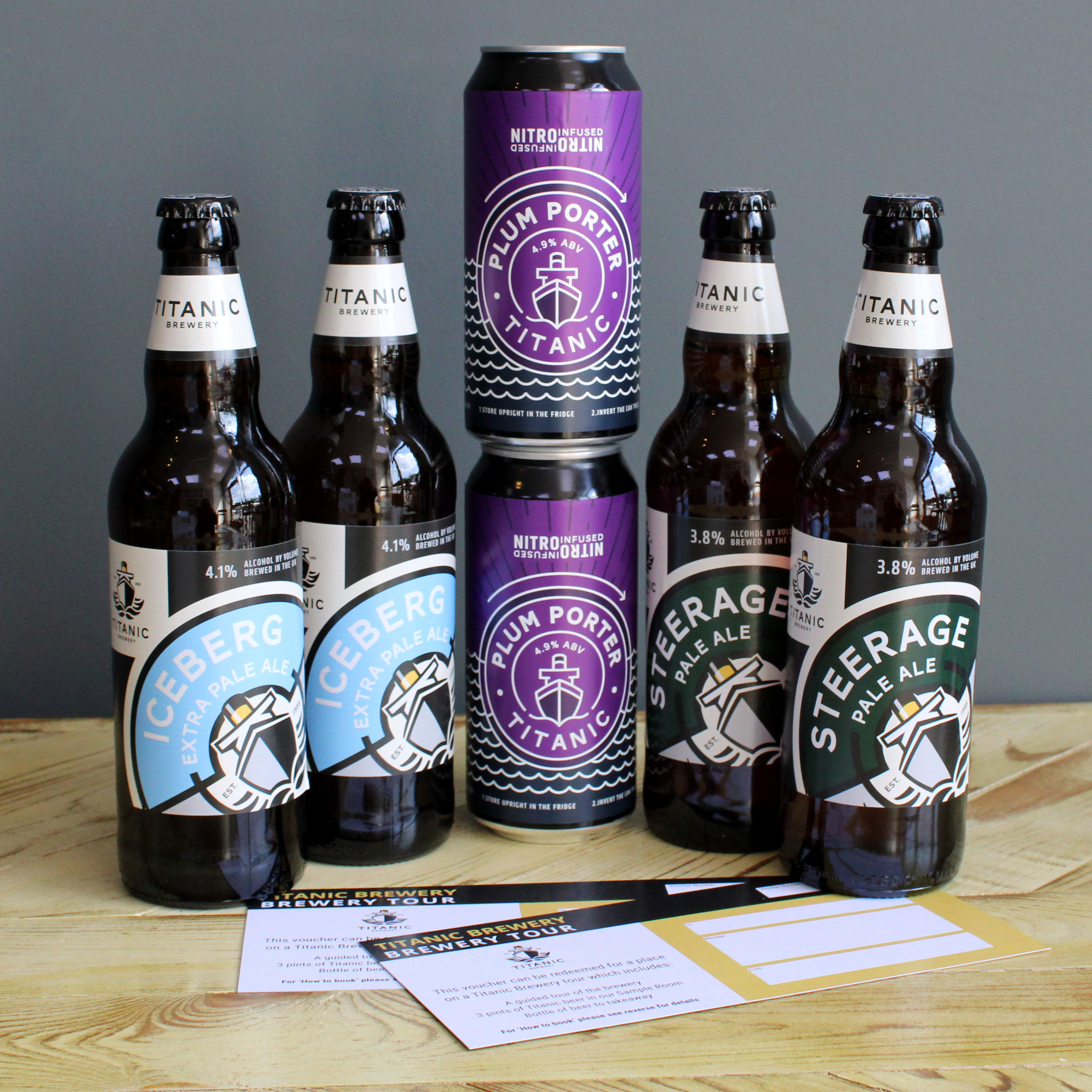
The image features a collection of beer bottles and a can, prominently displaying their labels. The bottles are dark glass with a standard neck and a twist-off cap, while the can is aluminum with a tall, cylindrical shape. The labels on the bottles and can showcase vibrant colors and graphics, including logos and product names. The arrangement is visually appealing, with the bottles placed upright and the can slightly elevated.

The packaging is an aluminum can with a cylindrical shape, featuring a glossy finish. The can is predominantly blue with gold and white accents. The design includes a prominent label that displays the product name 'CENTURY Anniversary Ale' in bold, stylized typography. The label also features a graphic of a ship, which is central to the branding. The can has a standard pull-tab closure at the top and is designed for beverage storage.
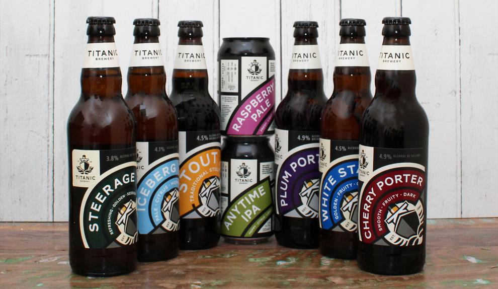
The image features a variety of beverage containers, including glass bottles and aluminum cans. The bottles are dark brown with labels, while the cans are metallic with colorful graphics. The labels on the bottles are predominantly white with black and colored accents, showcasing the brand name and product type. The cans have vibrant colors and distinct designs for each flavor.
About the Brand
Titanic Brewery is a UK-based craft brewery known for its award-winning beers and strong regional presence, operating a network of pubs and cafes. Their packaging approach leverages both branded primary containers (bottles, cans) and robust corrugated secondary packaging for logistics and gifting. The brand’s packaging consistently emphasizes heritage and local engagement while balancing cost and durability.
With a diverse beer portfolio and active e-commerce operation, Titanic Brewery employs packaging solutions geared toward both retail and direct-to-consumer channels. Their use of dark glass bottles, aluminum cans, and custom-printed corrugated boxes demonstrates a focus on product protection and shelf appeal. Packaging design aligns closely with the brewery’s identity, utilizing nautical themes and celebratory editions (e.g., Century Anniversary Ale) to reinforce brand storytelling. Sustainability appears to be a stated value, though packaging materials are primarily conventional (glass, aluminum, cardboard) with limited evidence of advanced eco-initiatives.
Key Differentiator: Integration of consistent branding across multiple packaging formats combined with community-driven narratives and special edition releases.
Design System
Visual Style
Uses bold, sans-serif typography for clarity and impact; color palette is dominated by deep blues, whites, and metallic accents to evoke nautical themes; overall aesthetic is clean yet traditional, reflecting both heritage and premium positioning.
Brand Identity
Consistent application of the Titanic Brewery logo across all materials; iconography includes ship graphics and anniversary motifs; strict adherence to brand color schemes ensures high shelf recognition and visual cohesion.
Packaging Design
Material selection favors dark glass for UV protection and product preservation, aluminum cans for lightweight distribution, and corrugated cardboard for robust shipping; structures are standard but enhanced with branded elements and protective features for e-commerce resilience.
User Experience
Packaging is designed to deliver a cohesive brand journey, from initial online purchase through unboxing; visual cues and tactile materials enhance perceived value, while gift and mixed packs support special occasion and repeat purchase behaviors.
Company Metrics
Business insights for Titanic Brewery based on available data
Market Positioning
Brand Values & Focus
Key Competitors
Target Market: Craft beer consumers in the UK seeking premium, branded products; retail partners; and online shoppers purchasing for gifting or personal consumption.
Packaging Assessment
Overall Grade
Visual appeal and presentation quality
Packaging durability and protection
Eco-friendliness and recyclable materials
Cost efficiency and value for money
Packaging assessment for Titanic Brewery based on industry standards and best practices
Frequently Asked Questions
What types of packaging does Titanic Brewery use for its beers?
Titanic Brewery utilizes dark glass bottles, aluminum cans, and custom-printed corrugated boxes for both single product and mixed gift sets. These formats are selected for both visual branding and product protection.
How does Titanic Brewery balance branding and logistics in its packaging?
The brewery maintains branding consistency across all formats, leveraging prominent logos and color schemes, while also employing durable shipping boxes to ensure safe transit, particularly in e-commerce and gift markets.
Is sustainability a focus in Titanic Brewery’s packaging?
While standard recyclable materials are used (glass, aluminum, cardboard), there is limited evidence of advanced sustainability initiatives such as lightweighting, compostable materials, or return schemes.
Discover other Food & Drink companies
Explore more companies in the food & drink industry and their packaging strategies
Thés de la Pagode
Food & Drink
Thés de la Pagode is a French company specializing in organic teas and infusions, focusing on health and well-being. Established in 1987, they prioritize sustainable practices and high-quality ingredients sourced through fair trade.
Teegschwendner GmbH
Food & Drink
Teegschwendner GmbH is a specialty tea company based in Germany, offering a wide selection of high-quality teas and tea-related accessories. They focus on providing unique tea experiences through carefully sourced and curated products.
Terres de Café
Food & Drink
Terres de Café is a specialty coffee retailer based in Paris, France, known for its commitment to sustainability and high-quality coffee sourcing.