Time 4 Nutrition packaging
Time 4 Nutrition delivers evidence-based nutritional supplements with a focus on quality and performance. Their packaging strategy utilizes modern, branded formats such as flexible pouches and rigid containers to ensure product integrity and consumer trust.
Packaging Portfolio
Time 4 Nutrition employs a diverse range of packaging formats tailored to supplement product requirements, utilizing flexible stand-up pouches for powders, rigid plastic containers for high-density products, and paperboard cartons for retail presentation. The portfolio favors resealable features and robust materials to support product preservation and consumer convenience. Visual branding is consistently applied across all formats, with high-contrast graphics and clear product information. However, packaging sustainability efforts appear to be limited to standard industry practices, without significant adoption of eco-innovations or recycled content.
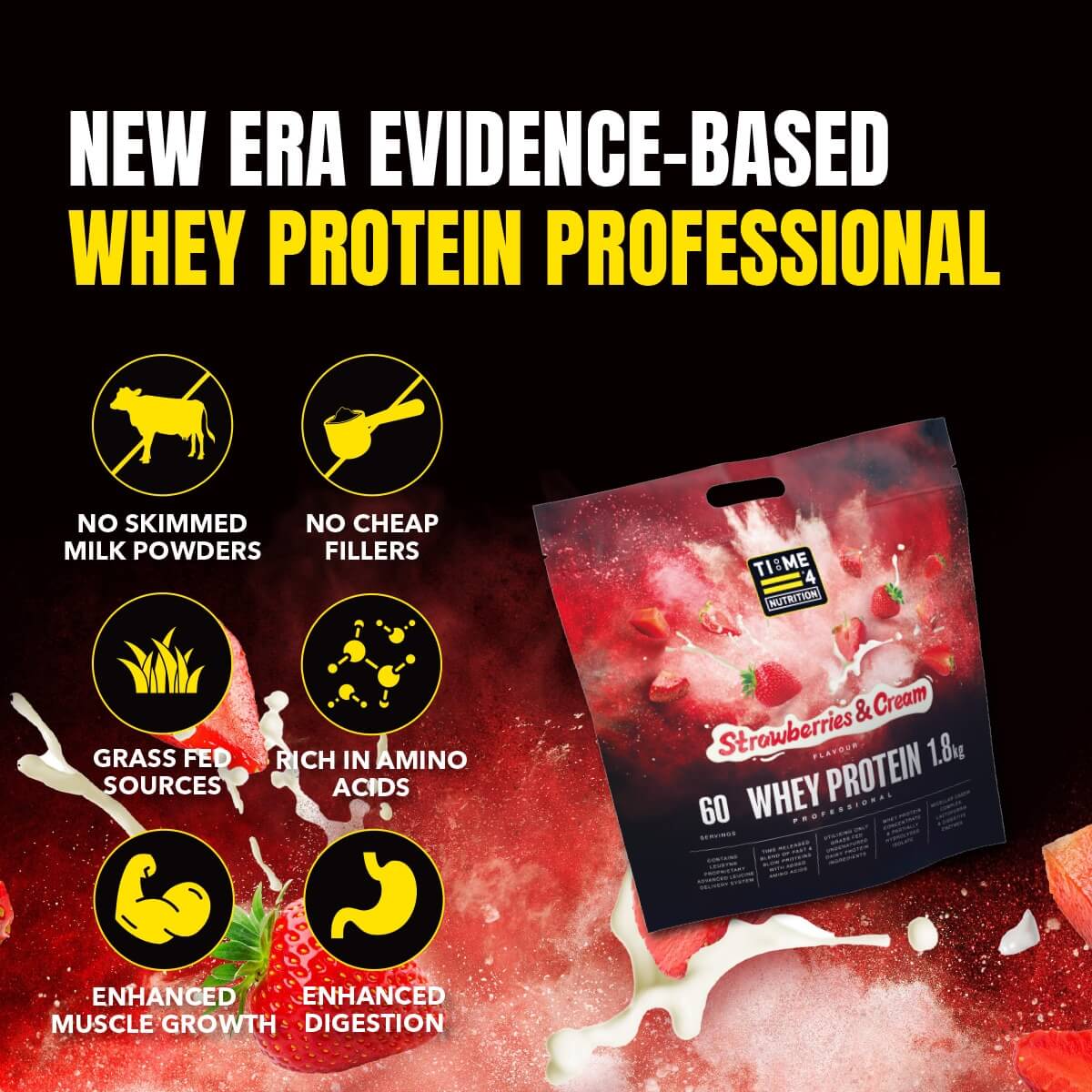
The packaging is a stand-up pouch made from a flexible material that allows it to maintain an upright position. The front features a vibrant black background with bold yellow text stating 'NEW ERA EVIDENCE-BASED WHEY PROTEIN PROFESSIONAL'. The product name is prominently displayed in white, with a graphic of strawberries and cream at the bottom. The overall design is eye-catching, with a glossy finish that enhances the colors.
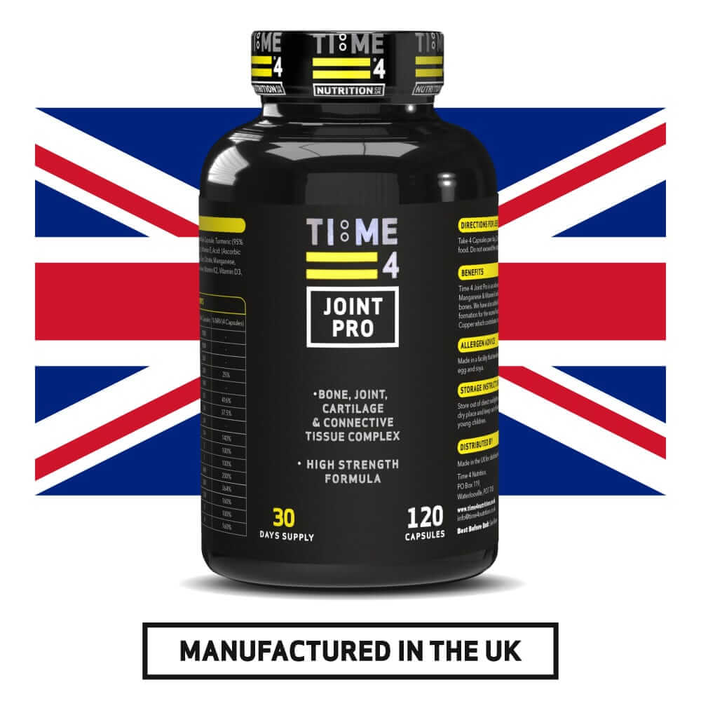
The packaging is a black plastic bottle with a screw-on lid. The bottle is cylindrical and has a glossy finish. The label wraps around the bottle and features a predominantly black background with yellow and white text. The front of the label includes the product name 'JOINT PRO' prominently displayed, along with key benefits such as 'BONE, JOINT, CARTILAGE & CONNECTIVE TISSUE COMPLEX'. There are also icons indicating the number of capsules and supply duration. The back of the label contains detailed product information, including ingredients and usage instructions.
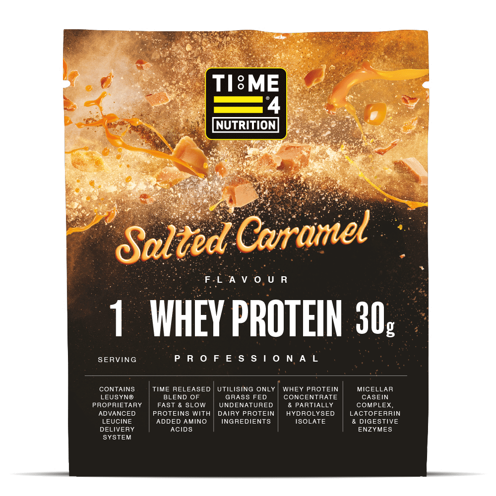
The packaging is a stand-up pouch made from a flexible material that allows it to maintain an upright position. The front features a vibrant design with a background of orange and gold, suggesting a flavor of salted caramel. The text is prominently displayed in bold white and black fonts, indicating '1 WHEY PROTEIN 30g' and 'PROFESSIONAL'. The top of the pouch has a resealable zipper, allowing for easy access and storage. The overall design is clean and modern, appealing to health-conscious consumers.
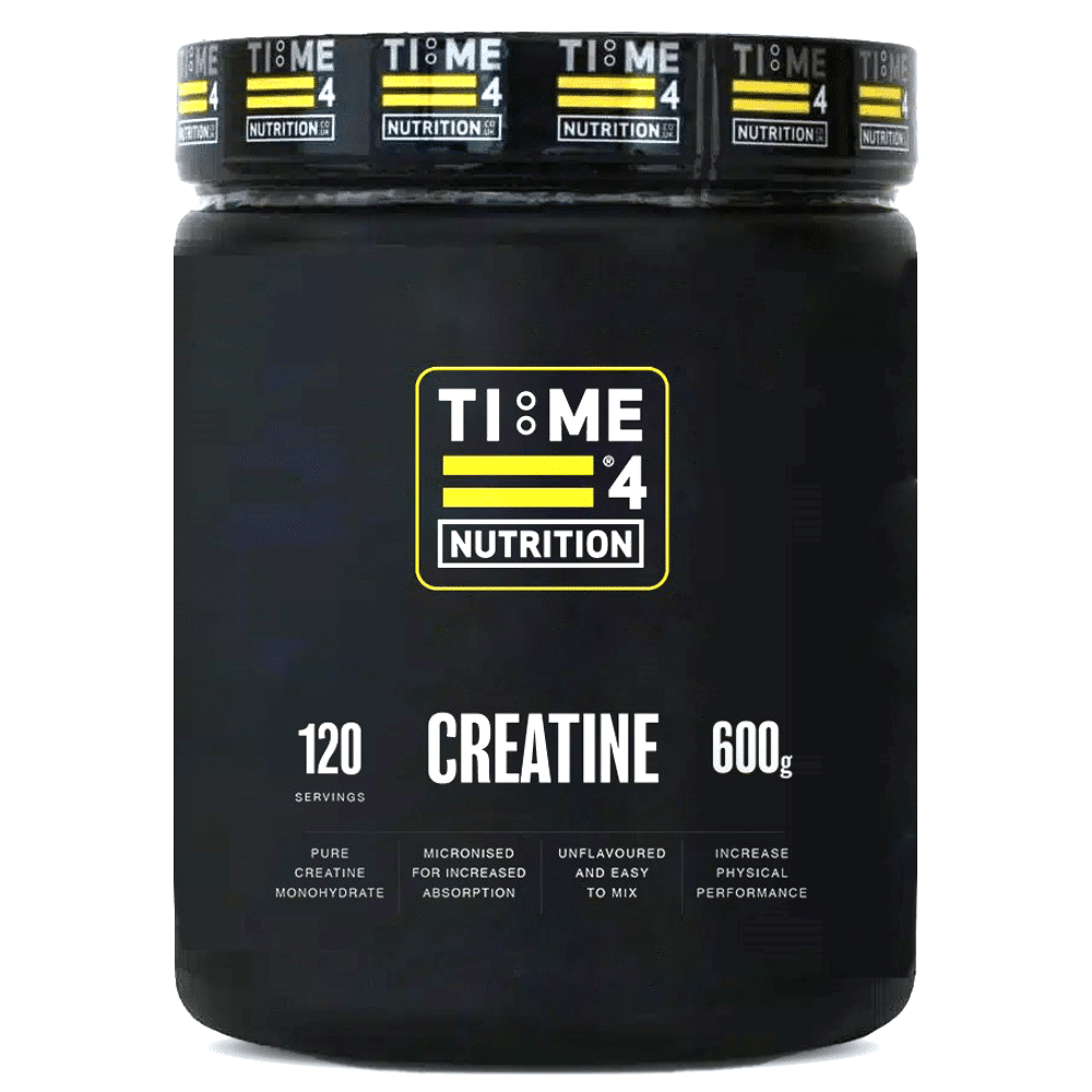
The packaging is a cylindrical container with a matte black finish. It features a wide mouth opening with a screw-on lid. The surface is smooth without any visible flutes or layers, indicating it is made from a sturdy plastic material. The container has a clean, modern design with minimalistic graphics. The lid is black with a textured surface for grip, and it has a prominent logo and product information printed on the body.
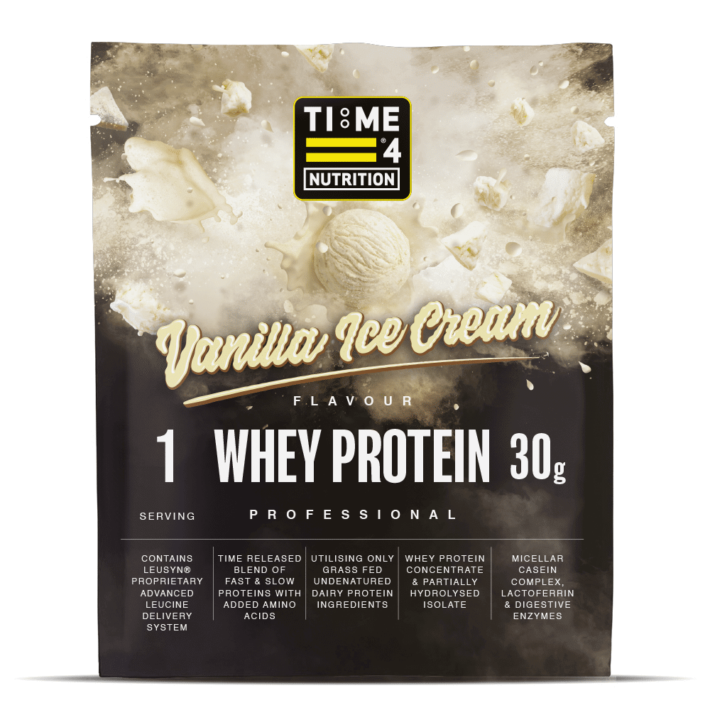
The packaging is a stand-up pouch with a flat bottom that allows it to stand upright. It features a matte finish with a smooth surface. The front displays a large, bold graphic of the product name 'Whey Protein' alongside the flavor 'Vanilla Ice Cream'. The design includes a splash effect, suggesting the product's creamy texture. The color scheme is predominantly white with accents of beige and brown, creating a clean and appealing look. The top edge of the pouch has a resealable zipper, which is a common feature in flexible packaging for convenience.
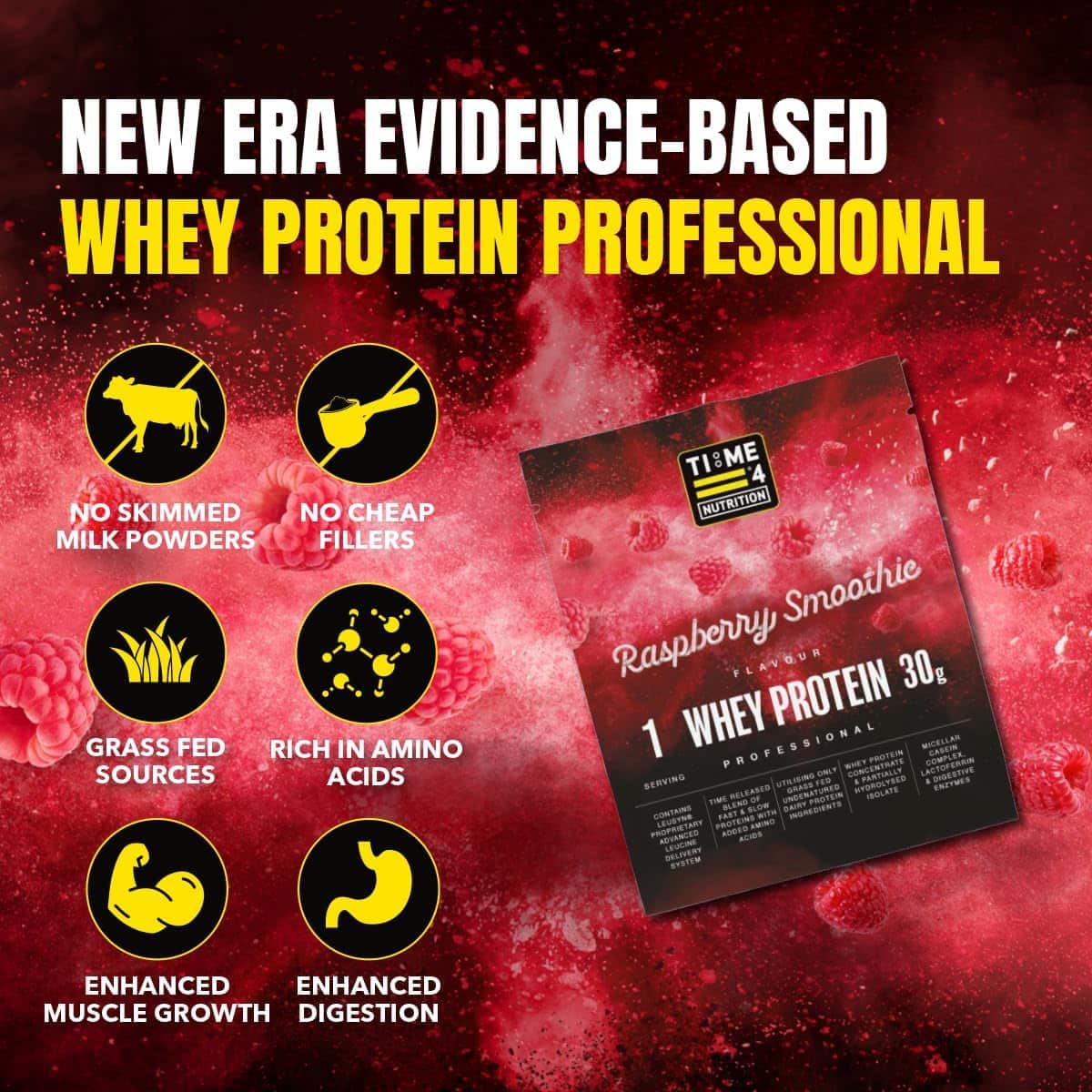
The packaging is a flat, rectangular box made of single-layer paperboard. It features a smooth surface with a glossy finish, predominantly in black and yellow colors. The front displays bold text and graphics, including the product name 'Raspberry Smoothie' and nutritional claims. The edges are clean and precise, with well-defined folds. There are no visible fluted layers, indicating it is not corrugated. The design includes vibrant images of raspberries, enhancing visual appeal.
About the Brand
Time 4 Nutrition specializes in premium supplements targeting health-conscious consumers and athletes. Their packaging approach emphasizes secure, branded, and user-friendly solutions designed for both product safety and shelf appeal.
The company's packaging portfolio includes stand-up pouches, rigid supplement containers, and retail cartons, each tailored to the unique needs of their protein powders, amino acids, and vitamin products. Packaging choices reflect an emphasis on resealability, clear product labeling, and a consistent visual identity, ensuring compliance with industry best practices in both direct-to-consumer and retail channels.
Key Differentiator: Time 4 Nutrition stands out through its science-backed formulations and cohesive, professional packaging design that reinforces brand credibility and supports product differentiation in the competitive UK supplement market.
Design System
Visual Style
Bold sans-serif typography, high-contrast color palettes (black, white, yellow, and accent colors aligned to flavors), and a clean, modern aesthetic with matte and glossy finishes.
Brand Identity
Consistent use of the 'TIME 4 NUTRITION' logo, prominent placement of product names, and supporting iconography for product benefits. Visual consistency is maintained through color schemes and graphic treatments across all SKUs.
Packaging Design
Material selection prioritizes durability and product safety, with flexible laminates for pouches and HDPE or PET for rigid containers. Structural design focuses on resealability, shelf-stability, and efficient stacking for logistics.
User Experience
Packaging is designed to facilitate intuitive opening, product dosing, and resealing, enhancing the overall customer journey from first impression through daily use. Clear labeling and prominent nutrition facts support informed consumer decisions and regulatory compliance.
Company Metrics
Business insights for Time 4 Nutrition based on available data
Market Positioning
Brand Values & Focus
Key Competitors
Target Market: Fitness enthusiasts, athletes, and health-conscious consumers in the UK seeking evidence-based nutritional supplements.
Packaging Assessment
Overall Grade
Visual appeal and presentation quality
Packaging durability and protection
Eco-friendliness and recyclable materials
Cost efficiency and value for money
Packaging assessment for Time 4 Nutrition based on industry standards and best practices
Frequently Asked Questions
What types of packaging does Time 4 Nutrition use for its supplements?
Time 4 Nutrition utilizes a mix of flexible stand-up pouches, rigid plastic containers, and retail carton boxes, each selected based on product category and required protection.
How does Time 4 Nutrition’s packaging contribute to product safety?
The packaging employs resealable closures, robust materials, and secure lids to minimize contamination and damage risk during shipping and storage.
Is Time 4 Nutrition’s packaging environmentally sustainable?
While most materials are standard in the supplement industry, there is limited evidence of advanced sustainable packaging solutions or recycling initiatives beyond baseline compliance.
How does packaging support Time 4 Nutrition’s brand identity?
Packaging design leverages consistent logo placement, color schemes, and clear typography to reinforce brand recognition and consumer trust.
Discover other Health companies
Explore more companies in the health industry and their packaging strategies
Comvita
Health
Comvita is a New Zealand-based company specializing in high-quality Mānuka honey and natural health products. Established in 1974, it aims to connect people with the healing power of nature.
EVO Nutrition
Health
EVO Nutrition specializes in premium health supplements, providing a wide range of vitamins and nutritional products to support well-being.
Bio-Synergy
Health
Bio-Synergy is a UK-based company specializing in health and fitness products, including nutritional supplements and DNA testing kits. Their mission is to support individuals in achieving their health and fitness goals through innovative products and personalized insights.