The Spice Lab packaging
The Spice Lab specializes in high-quality spices and culinary blends, utilizing a diverse packaging strategy that emphasizes product visibility and brand consistency. Their approach integrates clear labeling, premium materials, and cohesive design to support both retail and e-commerce channels.
Packaging Portfolio
The Spice Lab's packaging portfolio demonstrates a clear emphasis on premiumization and product differentiation. The use of transparent glass jars and rigid plastic containers allows consumers to visually assess product quality, while shaker tops and pour spouts add functional value. Stand-up pouches with resealable zippers are utilized for bulk and specialty blends, balancing shelf presence with cost efficiency. Gift sets and multipacks feature custom-printed folding cartons with window cut-outs, enhancing appeal for special occasions. Corrugated boxes are employed for shipping, offering durability and protection during transit.
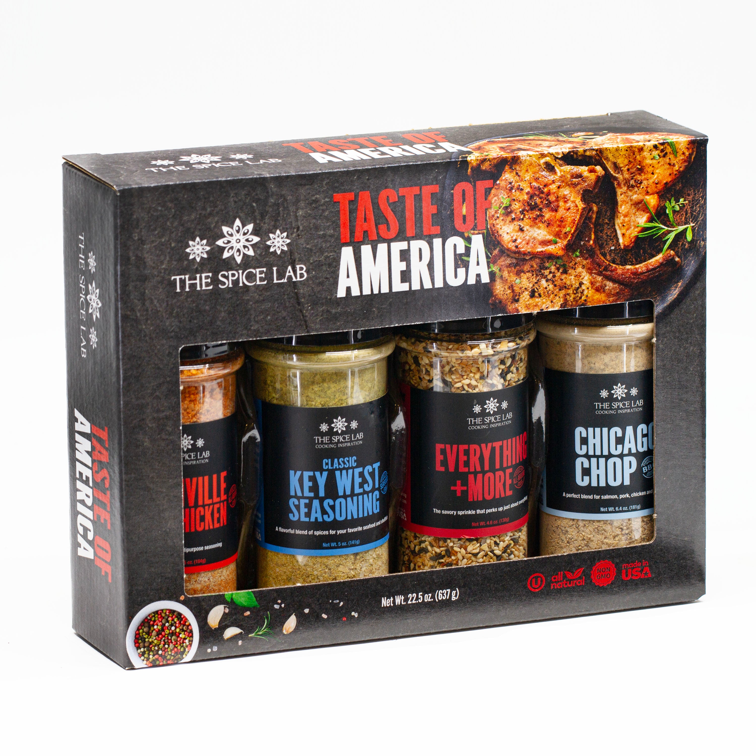
The packaging is a folding carton that houses four spice jars. It features a smooth, flat construction without any visible fluted layers, indicating it is made from single-layer paperboard. The exterior is predominantly black with colorful labels on each jar, showcasing a clean and precise design. The overall shape is rectangular, with a window cut-out on the front to display the jars inside. The edges are neatly folded, and the carton appears lightweight yet sturdy.

The packaging consists of a folding carton designed to hold three spice jars. It features a smooth, flat construction with clean edges and folds. The exterior is printed with vibrant colors and graphics, showcasing the spice names and a decorative design. The box has a rectangular shape with a lid that folds over the top, providing easy access to the jars inside.

The packaging consists of cylindrical containers with clear plastic bodies and screw-on lids. Each container is filled with a different type of sugar, showcasing a transparent view of the contents. The labels are prominently displayed, featuring bold text and colorful graphics that represent the product inside. The overall appearance is clean and modern, with a consistent design across all containers.
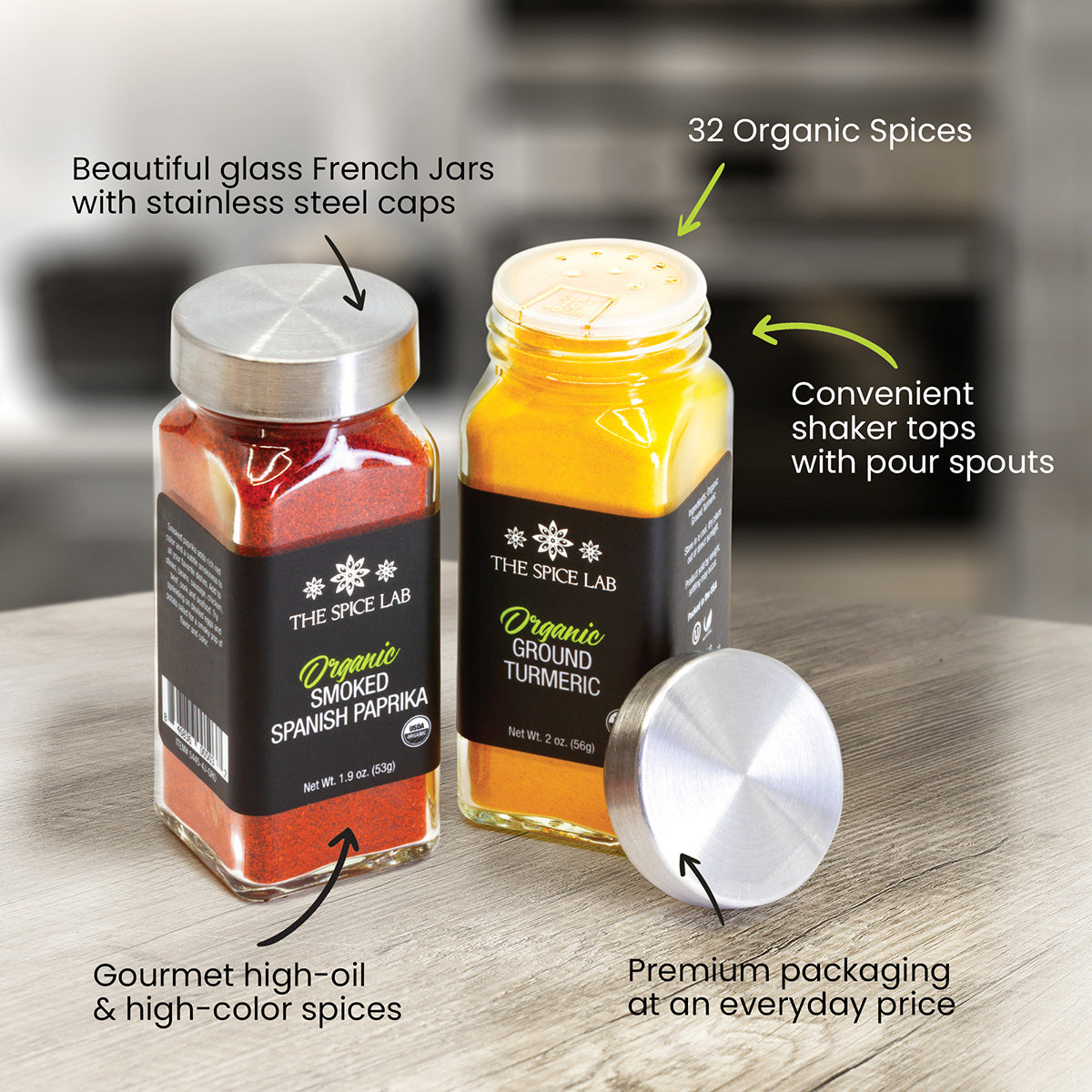
The packaging consists of two glass jars, one containing organic smoked Spanish paprika and the other organic ground turmeric. Each jar has a stainless steel shaker top with pour spouts for easy dispensing. The jars are cylindrical in shape, with a clear glass body that allows visibility of the contents. The lids are metallic, providing a premium look and feel. The labels on the jars feature a dark background with white text, showcasing the product name and details.

The packaging consists of two stand-up pouches made from a flexible material. Each pouch features a matte black background with a glossy finish around the central graphics. The top of the pouches has a resealable zipper closure, and they are designed to stand upright on shelves. The front displays vibrant graphics and text, while the back is likely plain or contains additional product information.
About the Brand
The Spice Lab operates in the premium spice and seasoning sector, offering a wide range of blends, salts, and sugars to consumers and culinary professionals. The firm leverages a combination of rigid containers, glass jars, flexible pouches, and printed cartons for its product lines, ensuring shelf appeal and functional performance.
With a business model focused on direct-to-consumer e-commerce and retail, The Spice Lab implements packaging solutions that prioritize product protection, transparency, and branding. Their packaging choices reflect an emphasis on quality, using glass and premium plastics for retail, and corrugated solutions for logistics. The consistency in design and labeling across SKUs strengthens brand recognition and supports a streamlined customer experience.
Key Differentiator: Distinctive for its cohesive visual brand language and use of premium, transparent packaging materials that highlight product quality while supporting logistics efficiency.
Design System
Visual Style
Modern and clean typography with bold sans-serif fonts, a color palette dominated by black, white, and accent colors coordinated to product types, and a consistent aesthetic that emphasizes product clarity and gourmet appeal.
Brand Identity
Frequent use of The Spice Lab logo and company name on all packaging formats, with high-contrast iconography and cohesive graphic elements; strict adherence to visual consistency across SKUs reinforces brand recognition.
Packaging Design
Focus on rigid and glass materials for product integrity and shelf impact, with structural choices favoring visibility (clear bodies, window cartons) and user convenience (shaker tops, resealable pouches); logistics packaging prioritizes strength and stackability.
User Experience
Packaging design supports intuitive product identification and use, with clear labeling and ergonomic dispensers. Unboxing is enhanced through attractive presentation and consistent branding, while structural choices minimize risk of product damage during delivery.
Company Metrics
Business insights for The Spice Lab based on available data
Market Positioning
Brand Values & Focus
Key Competitors
Target Market: Culinary enthusiasts, home cooks, and gourmet consumers seeking premium spice blends in the US and select international markets.
Packaging Assessment
Overall Grade
Visual appeal and presentation quality
Packaging durability and protection
Eco-friendliness and recyclable materials
Cost efficiency and value for money
Packaging assessment for The Spice Lab based on industry standards and best practices
Frequently Asked Questions
What packaging formats does The Spice Lab primarily use?
The Spice Lab utilizes a mix of rigid plastic containers, glass jars with shaker tops, stand-up flexible pouches, printed folding cartons, and corrugated boxes for shipping.
How does The Spice Lab address sustainability in its packaging?
While glass and cardboard components offer recyclability, the presence of plastic and composite materials may limit overall sustainability. The company focuses more on product protection and shelf impact than on eco-innovation.
How are products protected during shipping?
Logistics packaging relies on corrugated boxes and secure inner containers, providing robust protection for glass and rigid plastic jars, minimizing breakage and spillage risk.
Discover other Food & Drink companies
Explore more companies in the food & drink industry and their packaging strategies
PrepMyMeal
Food & Drink
PrepMyMeal is a food production company specializing in high-protein meal delivery services. They offer a variety of natural, nutritious meals designed for fitness enthusiasts and those seeking convenience in meal preparation.
Terres de Café
Food & Drink
Terres de Café is a specialty coffee retailer based in Paris, France, known for its commitment to sustainability and high-quality coffee sourcing.
ruf lebensmittelwerk kg
Food & Drink
RUF Lebensmittelwerk KG is a German food production company specializing in a variety of baking mixes and drink products. Founded in 1920, the company is known for its high-quality ingredients and innovative food solutions.