The Nature of Things packaging
The Nature of Things specializes in premium natural wellness products with a packaging strategy centered on aesthetic presentation and material quality. Their packaging integrates botanical themes and sustainable carton formats, reflecting the brand’s emphasis on both visual appeal and eco-consciousness.
Packaging Portfolio
The Nature of Things employs a diverse packaging portfolio centered on custom-designed folding cartons and rigid gift boxes. The materials predominantly include single-layer paperboard with matte finishes and specialty rigid board for premium sets, often complemented by internal cushioning such as straw or molded inserts. Structural formats focus on tuck-top closures, flat and rectangular profiles, and detailed print graphics featuring botanical and natural motifs. The result is packaging that achieves high shelf appeal, consistent branding, and adequate product protection for both single-unit and multi-product sets.
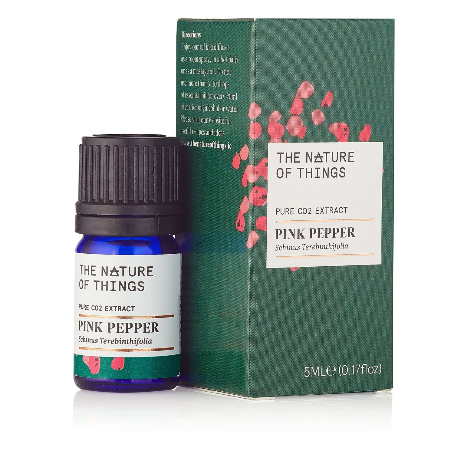
The packaging is a small, rectangular folding carton designed for retail display. It features a smooth, flat construction without any visible fluted layers, indicating it is made from single-layer paperboard. The exterior has a matte finish with a predominantly green background and white accents. The front of the carton displays the product name 'PINK PEPPER' in bold, modern typography, accompanied by a smaller text indicating 'PURE CO2 EXTRACT'. There are small red dots scattered across the surface, possibly representing the product's natural ingredients. The edges are cleanly cut, and the folds are precise, suggesting a high-quality manufacturing process. The packaging has a tuck tab closure at the top, allowing for easy opening and resealing.
The packaging consists of a thick, sturdy box with a premium appearance. It features a decorative exterior with floral and abstract designs in soft colors, including light blue, yellow, and orange. The box has a lid that fits snugly over the base, showcasing a clean and elegant design. The interior appears to be well-finished, accommodating smaller items like bottles or products within.

The packaging consists of several small, rectangular boxes, each with a smooth, flat construction. The boxes are made of single-layer paperboard, featuring clean edges and precise folds. Each box has a distinct color and design, with botanical illustrations and product names prominently displayed. The overall appearance is light and retail-friendly, suitable for cosmetics or essential oils.
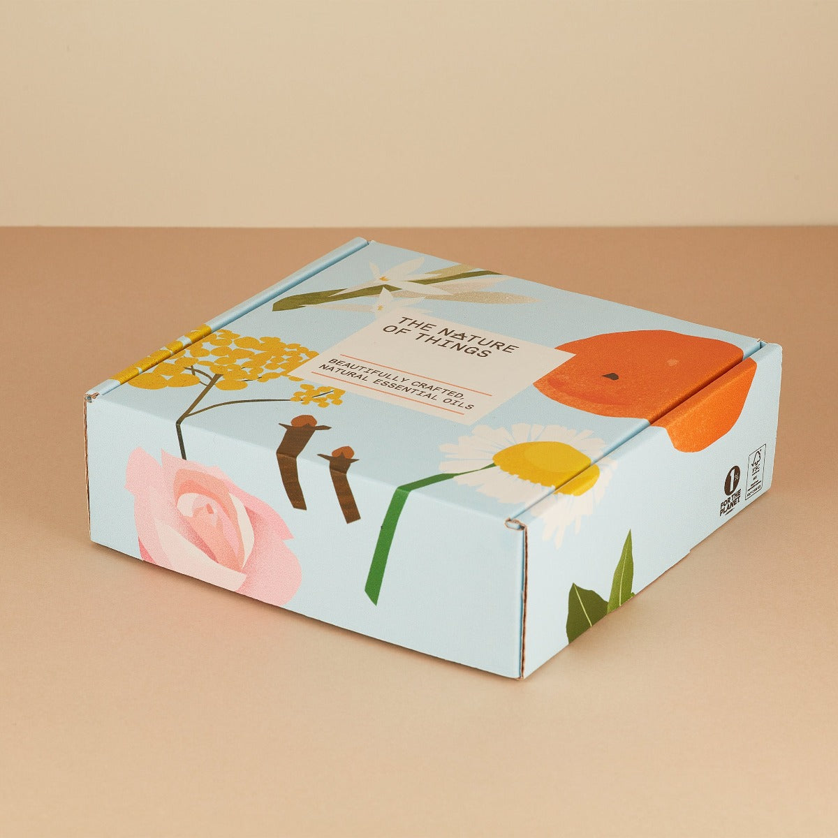
The packaging is a flat, rectangular box with smooth, flat construction. It features a light blue background adorned with colorful floral graphics, including roses, daisies, and an orange. The edges are clean and precise, indicative of a folding carton design. The box has a matte finish, giving it a soft appearance. The top flap is slightly raised, suggesting it is a tuck-top style box.

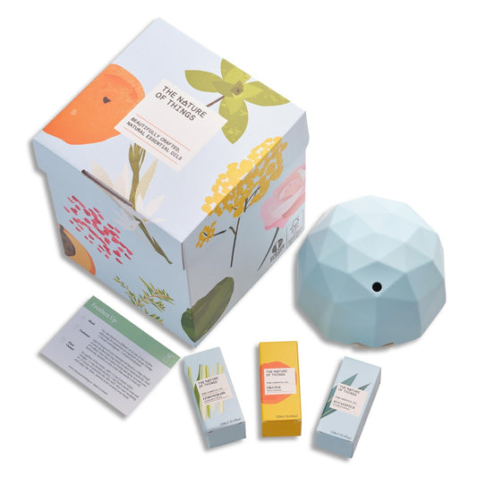
The packaging is a folding carton with a smooth, flat construction. It features a white exterior with colorful printed graphics on the sides, including illustrations of various natural elements. The box has a tuck-top closure and is designed to hold multiple small bottles securely. The interior is filled with straw-like material for cushioning. The edges are clean and precise, indicating a high-quality finish.

The packaging is a folding carton with a smooth, flat construction. It features a colorful design with floral graphics and a light blue background. The edges are clean and precise, indicating a well-constructed box. The box is lightweight and has a retail appearance, suitable for displaying products. There are no visible fluted layers, confirming it is not corrugated.
About the Brand
The Nature of Things is a Dublin-based direct-to-consumer brand delivering essential oils, room sprays, and wellness items. Their packaging approach leverages custom-designed carton and rigid boxes to reinforce a natural, holistic brand identity while ensuring product integrity.
Operational as a small e-commerce retailer, The Nature of Things utilizes a combination of folding carton and rigid box packaging with an emphasis on tactile finishes and botanical illustrations. This packaging strategy underscores product differentiation in the crowded natural beauty segment and aims to balance premium perception with practical considerations for e-commerce logistics.
Key Differentiator: Distinctive nature-inspired packaging design, high visual consistency, and a strong alignment between material choices and brand values set The Nature of Things apart in the wellness packaging space.
Design System
Visual Style
Typography leverages modern, sans-serif fonts with high legibility; the color palette features botanical greens, soft blues, and floral accents, creating a cohesive and calming visual language. The overall aesthetic emphasizes natural imagery and minimalistic layouts.
Brand Identity
Consistent logo placement on all packaging, use of product-specific iconography and botanical illustrations, and a unified visual approach across SKUs reinforce brand recognition and trust.
Packaging Design
Material selection prioritizes recyclable carton and rigid board, with an emphasis on tactile finishes, precise folds, and structural stability. Design philosophy balances premium feel with environmental considerations and retail readiness.
User Experience
Packaging is optimized for an engaging unboxing process with clean presentation and clear product information, supporting a premium customer journey from first visual contact through product use. Design choices facilitate both gift-giving and personal use scenarios, aligning the packaging experience with brand promises of wellness and natural quality.
Company Metrics
Business insights for The Nature of Things based on available data
Market Positioning
Brand Values & Focus
Key Competitors
Target Market: Health-conscious consumers seeking premium, natural, and aesthetically presented wellness products, primarily in Europe and e-commerce markets.
Packaging Assessment
Overall Grade
Visual appeal and presentation quality
Packaging durability and protection
Eco-friendliness and recyclable materials
Cost efficiency and value for money
Packaging assessment for The Nature of Things based on industry standards and best practices
Frequently Asked Questions
How does The Nature of Things ensure packaging protects its products during shipping?
The brand uses rigid and high-quality folding cartons with precise construction, internal cushioning materials, and secure closures, which contribute to effective protection of fragile items such as essential oil bottles during transit.
What materials are commonly used in The Nature of Things' packaging?
Primary materials include single-layer paperboard for folding cartons and reinforced rigid board for gift sets, both frequently featuring matte finishes and printed botanical graphics.
How sustainable is The Nature of Things' packaging?
Their focus on recyclable carton materials and minimal use of plastic components results in a sustainability profile above the industry average, though further transparency regarding sourcing and end-of-life disposal could enhance their eco-credentials.
Discover other Beauty & Fitness companies
Explore more companies in the beauty & fitness industry and their packaging strategies
Pure Altitude
Beauty & Fitness
Pure Altitude specializes in high-quality beauty and skincare products that leverage the expertise of spa treatments to enhance daily routines. The brand offers a diverse range of products tailored for both facial and body care.
Institut Karité Paris
Beauty & Fitness
Institut Karité Paris specializes in luxury beauty products made with natural Shea Butter, offering a wide range of skincare and body care solutions. The brand combines Parisian heritage with a commitment to quality and creativity in its offerings.
Orris Paris
Beauty & Fitness
Orris Paris specializes in creating artisanal skincare products that combine potent botanical ingredients with modern cleansing rituals. The company emphasizes natural, holistic practices in its formulations.