The Bottle Club packaging
The Bottle Club is a UK-based e-commerce retailer specializing in alcoholic beverages, with a packaging strategy focused on branded, premium carton and rigid box formats. Their approach emphasizes both presentation and protection, leveraging custom designs to reinforce brand identity and customer experience.
Packaging Portfolio
The Bottle Club employs a portfolio centered on custom-printed folding carton boxes and rigid boxes, primarily constructed from paperboard and designed for both retail and gifting. The packaging formats include matte black, kraft, and specialty finishes, often with gold foil accents and bold typography to reinforce brand identity. Seasonal and event-themed cartons (e.g., 'Mother's Day', 'Gin O'Clock') are regularly incorporated, demonstrating agile adaptation to market trends. The structural design prioritizes both ease of assembly and product protection during transit.

The packaging is a sturdy, thick-walled box with a premium appearance. It features a smooth, matte black exterior with a gold foil logo prominently displayed on the front. The box has clean edges and corners, indicating high-quality construction. There are no visible flaps or tabs, suggesting it is a lift-off lid design. The overall shape is rectangular, suitable for holding a bottle or similar product.
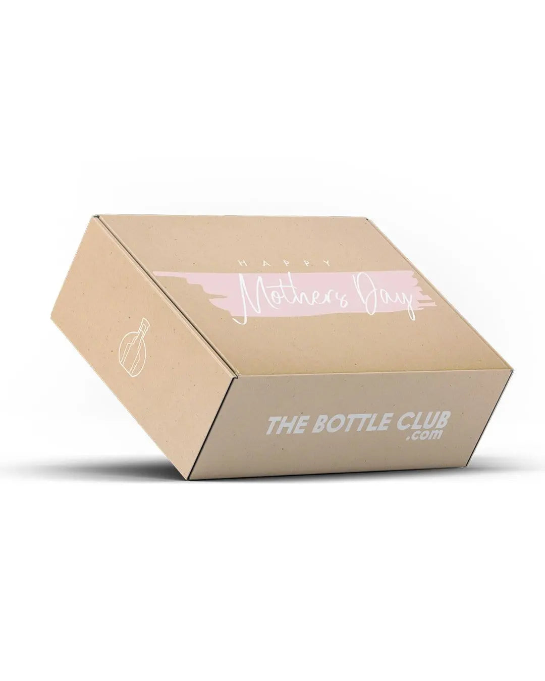
The packaging is a folding carton made of single-layer paperboard. It features a smooth, flat construction with clean edges and folds. The exterior is a kraft color with a printed design on the top, including the text 'Happy Mother's Day' in a light pink font. The bottom side displays the brand name 'THE BOTTLE CLUB .com' in bold white letters. The overall shape is rectangular with a slight slant, indicating a tuck-top closure.
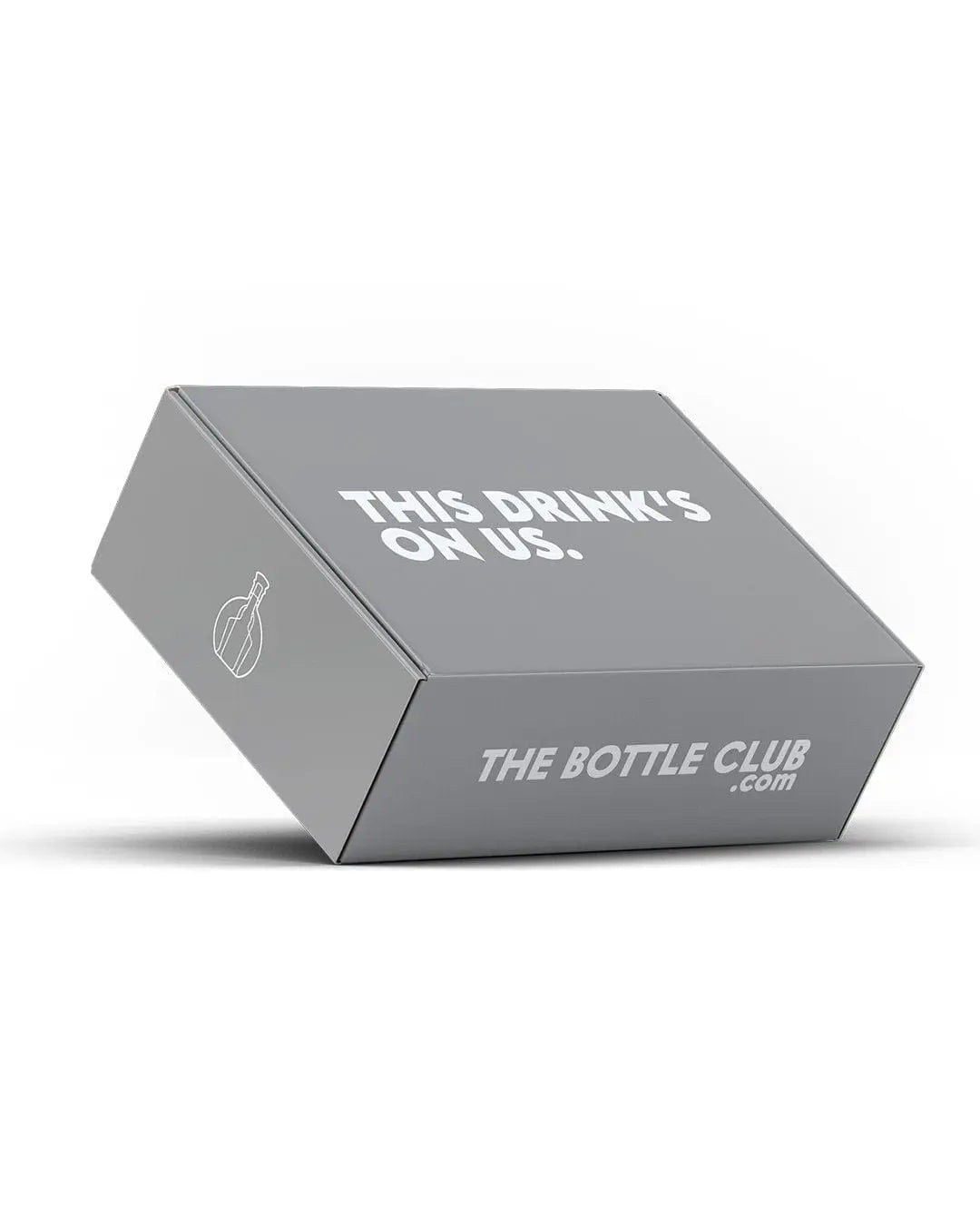
The packaging is a folding carton with a smooth, flat construction. It features a gray exterior with a matte finish, giving it a clean and modern appearance. The edges are precise, and the folds are well-defined, indicating a high-quality manufacturing process. The front of the box displays white text and a simple graphic element, suggesting a minimalist design approach.
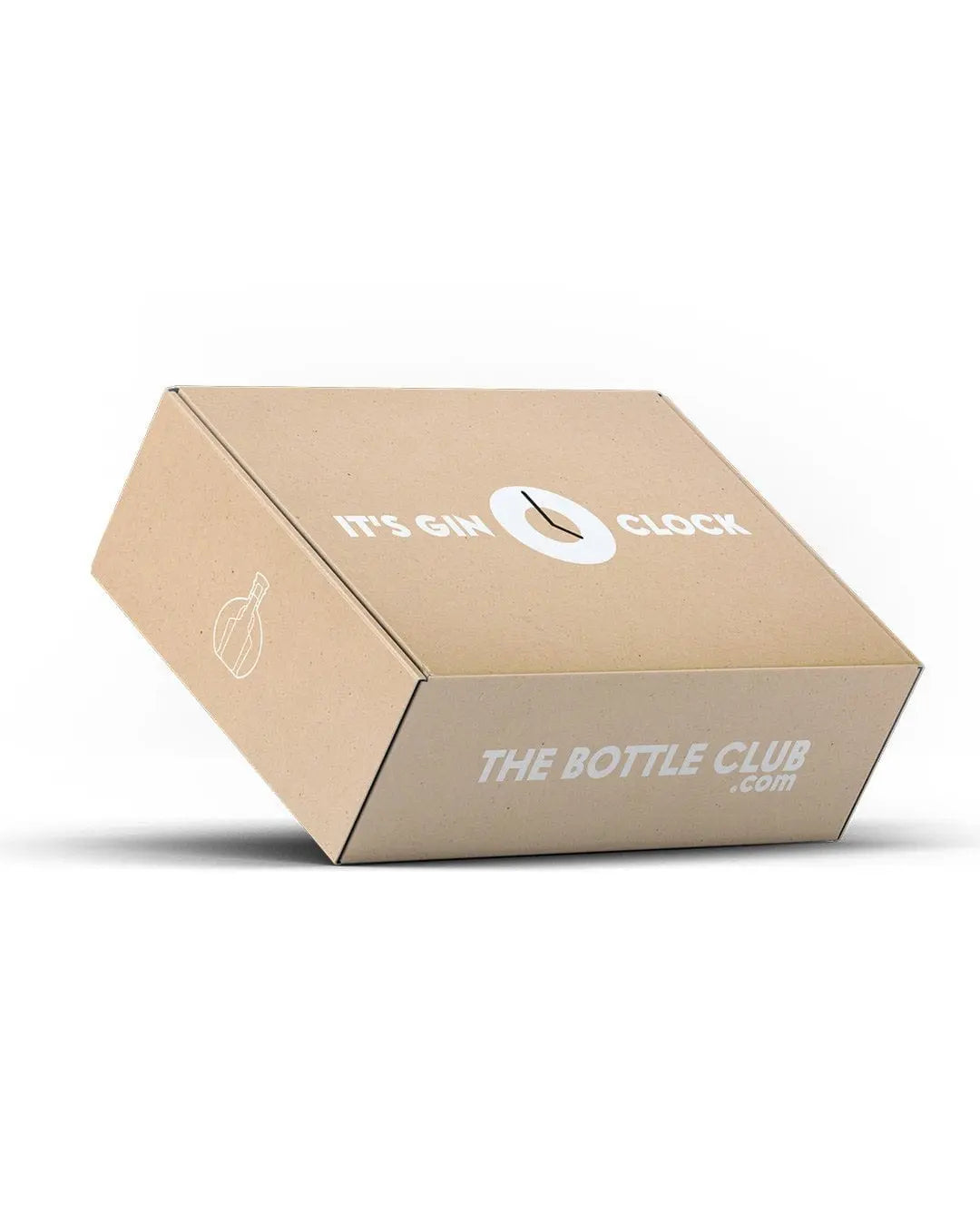
The packaging is a folding carton made from a single layer of paperboard. It features a smooth, flat construction with clean edges and folds. The exterior is predominantly kraft brown with white printed text. The box has a slightly angled top, giving it a distinctive appearance. The front displays the phrase 'IT'S GIN O'CLOCK' and the website 'THE BOTTLE CLUB.com' in bold, white lettering, which contrasts with the kraft background.
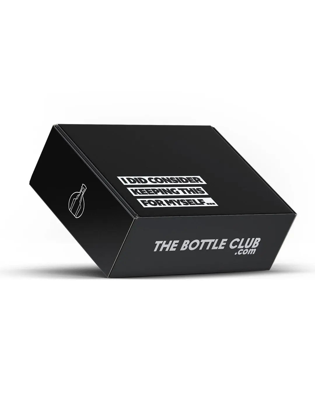
The packaging is a flat, rectangular box made from a single layer of paperboard. It features a smooth, matte black exterior with clean edges and precise folds. The box has a slightly lightweight appearance, typical of retail packaging. The top displays a humorous message in white text, while the side includes the brand name in a bold, prominent font.
About the Brand
The Bottle Club operates in the online alcoholic beverages market, delivering a wide range of spirits, wines, and beers directly to consumers. Their packaging solutions prioritize both brand visibility and gift-appropriate presentation, utilizing custom-printed carton and rigid boxes across their portfolio.
Founded in 2014 and based in England, The Bottle Club targets B2C customers with a specialized selection of mainstream and limited-edition alcohol products. Packaging is a core component of the customer journey, integrating both functional protection and consistent brand messaging. Their use of custom-printed boxes for seasonal events and gifting occasions demonstrates a flexible, market-responsive packaging strategy.
Key Differentiator: The Bottle Club distinguishes itself through consistent, high-impact branded packaging aligned with a premium gifting and unboxing experience, tailored to the alcoholic beverage sector.
Design System
Visual Style
Typography is bold and modern, with sans-serif fonts used for both branding and messaging. The color palette prominently features matte black, kraft brown, metallic gold, and white, creating a premium yet approachable aesthetic. Minimalist layouts and clean lines dominate, with occasional playful or celebratory messaging.
Brand Identity
Logo and brand name are consistently displayed on primary packaging surfaces, with iconography limited to simple motifs and event-specific graphics. Visual consistency is maintained through repeated use of the brand's core color palette and typographic hierarchy across all packaging touchpoints.
Packaging Design
Material choices focus on single-layer and rigid paperboard for both folding cartons and premium gift boxes. The structural design prioritizes product stability, protection, and gifting presentation, with emphasis on clean folds, precise edges, and secure closures. Event-based limited editions are integrated through print design rather than structural changes.
User Experience
Packaging is designed to deliver a cohesive brand experience from unboxing to product reveal, supporting the gifting use case and enhancing emotional impact. Clear branding and visually appealing presentation facilitate customer recognition and encourage repeat engagement, while practical design ensures product safety and ease of handling.
Company Metrics
Business insights for The Bottle Club based on available data
Market Positioning
Brand Values & Focus
Key Competitors
Target Market: B2C consumers in the UK seeking alcoholic beverages for personal use, gifting, and special occasions, with an emphasis on premium and limited-edition selections.
Packaging Assessment
Overall Grade
Visual appeal and presentation quality
Packaging durability and protection
Eco-friendliness and recyclable materials
Cost efficiency and value for money
Packaging assessment for The Bottle Club based on industry standards and best practices
Frequently Asked Questions
What types of packaging does The Bottle Club use for its products?
The Bottle Club primarily uses custom-printed folding carton boxes and rigid gift boxes, designed for both product protection and elevated unboxing experiences. Packaging is tailored for gifting, seasonal events, and brand consistency.
How does The Bottle Club address sustainability in its packaging?
The Bottle Club employs recyclable paperboard and carton materials in most packaging formats, but there is limited public data on the use of advanced sustainable practices or certifications. The focus is on balancing visual appeal and basic recyclability.
How does packaging enhance The Bottle Club's brand identity?
Packaging prominently features The Bottle Club's logo, website, and brand color palette, supporting a consistent and recognizable presentation across all customer touchpoints, especially for gift and special edition products.
Discover other Food & Drink companies
Explore more companies in the food & drink industry and their packaging strategies
Teegschwendner GmbH
Food & Drink
Teegschwendner GmbH is a specialty tea company based in Germany, offering a wide selection of high-quality teas and tea-related accessories. They focus on providing unique tea experiences through carefully sourced and curated products.
ruf lebensmittelwerk kg
Food & Drink
RUF Lebensmittelwerk KG is a German food production company specializing in a variety of baking mixes and drink products. Founded in 1920, the company is known for its high-quality ingredients and innovative food solutions.
Thés de la Pagode
Food & Drink
Thés de la Pagode is a French company specializing in organic teas and infusions, focusing on health and well-being. Established in 1987, they prioritize sustainable practices and high-quality ingredients sourced through fair trade.