Teaveda packaging
Teaveda specializes in premium teas and coffees sold via a direct-to-consumer e-commerce model, emphasizing quality and a curated customer experience. The brand employs visually distinctive, retail-focused packaging solutions that reinforce its premium and sustainable positioning.
Packaging Portfolio
Teaveda’s packaging portfolio is dominated by single-layer paperboard folding cartons and rigid cylindrical boxes. The retail cartons are engineered for lightweight protection and feature high-gloss finishes with vibrant, nature-inspired graphics, supporting both shelf impact and brand storytelling. Rigid cylindrical boxes are reserved for luxury SKUs, offering enhanced structural integrity and a premium tactile experience. All formats are optimized for recyclability, with minimal use of plastics. The portfolio demonstrates careful alignment between functional requirements for e-commerce and visual cues critical for premium food & drink branding.
The packaging is a flat, rectangular folding carton made from a single layer of paperboard. It features a smooth surface with clean edges and precise folds. The exterior is predominantly colored with a vibrant design, showcasing a blend of green and orange hues, with images of tea and natural ingredients. The front displays the brand name 'Tata Tea Teaveda' prominently, along with descriptive text about the product. The overall appearance is lightweight and designed for retail display.
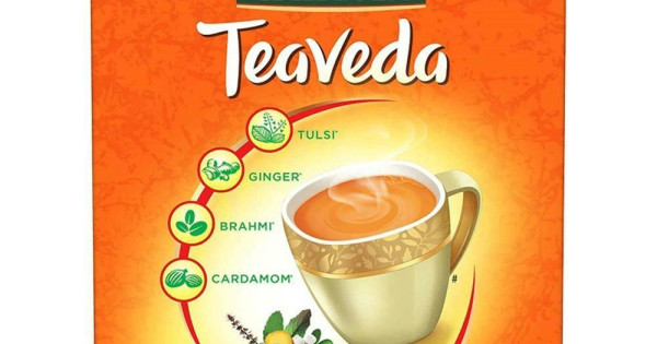
The packaging is a flat, rectangular carton box made of single-layer paperboard. It features a smooth surface with vibrant colors, predominantly orange, and is printed with images and text. The edges are clean and precise, indicating a well-constructed folding carton. The front displays a graphic of a cup of tea with steam rising, surrounded by icons representing the ingredients: Tulsi, Ginger, Brahmi, and Cardamom. The overall design is eye-catching and suitable for retail display.

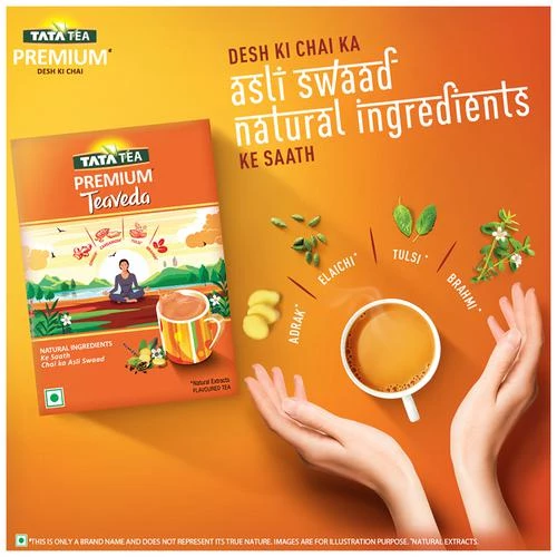
The packaging is a rectangular folding carton made of single-layer paperboard. It features a smooth, flat construction with clean edges and precise folds. The exterior is predominantly orange with a glossy finish, showcasing vibrant graphics and text. The front displays an illustration of a person sitting by a river with a cup of tea, surrounded by natural elements like tea leaves and spices. The product name and brand logo are prominently featured at the top.

The packaging is a rectangular folding carton made from a single layer of paperboard. It features a smooth, flat surface with clean edges and precise folds. The exterior is predominantly orange with green accents, showcasing a vibrant design that includes illustrations of tea ingredients. The top flap is folded down, and the carton has a tuck closure at the top, typical for retail packaging.
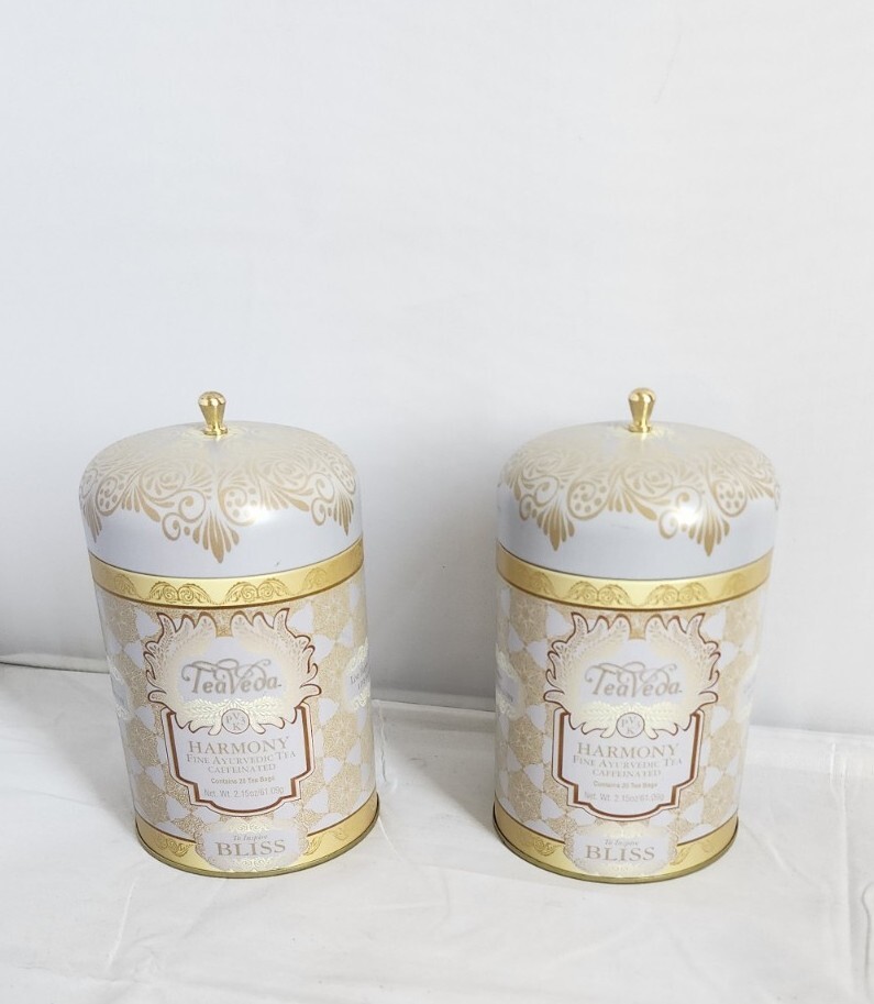
The packaging consists of two cylindrical canisters with a smooth, glossy surface. Each canister features a domed lid with a decorative golden knob. The body of the canisters is adorned with intricate gold and white patterns, giving a luxurious appearance. The labels on the front provide product information, including the name 'Teaveda' and the flavor 'Harmony Bliss', printed in elegant fonts.

The packaging is a flat, rectangular box made of single-layer paperboard. It features a smooth surface with a glossy finish. The front displays vibrant colors, primarily orange and green, with an illustration of a woman meditating in a natural setting. The box has clean, precise edges and folds, typical of retail packaging. The top flap is designed to tuck into the box, ensuring it remains closed. The sides of the box include additional graphics and text, providing product information and branding.
About the Brand
Teaveda operates as an online retailer of specialty teas and coffees, targeting discerning beverage consumers who prioritize quality and ethical sourcing. The company leverages visually impactful retail carton and rigid box formats to deliver a cohesive brand experience.
With a focus on small-batch, premium beverage products, Teaveda aligns its packaging strategy to appeal to both connoisseurs and casual drinkers. The packaging features bold color palettes and detailed illustrations, designed to communicate natural ingredients and artisanal craftsmanship. As a young business in the early growth stage, Teaveda's package selections are optimized for retail shelf visibility and efficient e-commerce fulfillment.
Key Differentiator: Teaveda's packaging demonstrates a high degree of brand integration, balancing visual appeal and premium cues with messaging around sustainability and ethical sourcing.
Design System
Visual Style
Teaveda’s visual style leverages bold, saturated hues—primarily orange and green—paired with illustrative graphics and a glossy finish to maximize retail impact. Typography is clean and contemporary, supporting readability and premium cues.
Brand Identity
Logos are prominently placed on all primary packaging surfaces, with consistent use of iconography representing natural ingredients. Visual consistency is maintained through a unified color palette, structured layouts, and repetition of brand motifs.
Packaging Design
Material selection prioritizes paperboard for folding cartons and rigid board for canisters, both chosen for their printability and recyclability. Structural design focuses on efficient folding, secure closure mechanisms, and maximized brand real estate.
User Experience
Packaging is designed for intuitive unboxing, clear product communication, and a sensory-rich first impression. The tactile quality of rigid boxes and detailed illustrations foster brand engagement and reinforce core values during the customer journey.
Company Metrics
Business insights for Teaveda based on available data
Market Positioning
Brand Values & Focus
Key Competitors
Target Market: Health-conscious and quality-driven consumers in Germany and Europe seeking premium, ethically sourced teas and coffees via direct-to-consumer channels.
Packaging Assessment
Overall Grade
Visual appeal and presentation quality
Packaging durability and protection
Eco-friendliness and recyclable materials
Cost efficiency and value for money
Packaging assessment for Teaveda based on industry standards and best practices
Frequently Asked Questions
What types of packaging formats does Teaveda use?
Teaveda primarily utilizes single-layer paperboard retail cartons and rigid cylindrical boxes for its tea and coffee products. These formats are chosen for their combination of shelf presence, protection, and suitability for premium positioning.
How does Teaveda address sustainability in its packaging?
Teaveda's packaging portfolio leverages paperboard materials that are generally recyclable and focuses on minimizing unnecessary packaging components. Visual cues on packaging and product messaging emphasize natural ingredients and eco-friendly values.
Is Teaveda’s packaging suitable for e-commerce distribution?
Teaveda’s packaging is structurally sound for retail display and provides moderate protection for e-commerce shipping. While folding cartons offer adequate product security, further reinforcement may be beneficial for long-distance fulfillment.
Discover other Food & Drink companies
Explore more companies in the food & drink industry and their packaging strategies
Teegschwendner GmbH
Food & Drink
Teegschwendner GmbH is a specialty tea company based in Germany, offering a wide selection of high-quality teas and tea-related accessories. They focus on providing unique tea experiences through carefully sourced and curated products.
ruf lebensmittelwerk kg
Food & Drink
RUF Lebensmittelwerk KG is a German food production company specializing in a variety of baking mixes and drink products. Founded in 1920, the company is known for its high-quality ingredients and innovative food solutions.
Thés de la Pagode
Food & Drink
Thés de la Pagode is a French company specializing in organic teas and infusions, focusing on health and well-being. Established in 1987, they prioritize sustainable practices and high-quality ingredients sourced through fair trade.