Sweaty Betty packaging
Sweaty Betty is a UK-based women's activewear brand recognized for its premium, performance-driven apparel. The company leverages a strategic packaging approach that emphasizes brand visibility, sustainability, and elevated customer experience across both e-commerce and retail channels.
Packaging Portfolio
Sweaty Betty’s packaging portfolio includes custom carton boxes, rigid luxury gift boxes, retail shopping bags, and drawstring bags. Primary materials are high-quality paperboard, chipboard, and lightweight textiles, with a focus on clean lines, matte finishes, and tactile surfaces. Structural formats are optimized for both e-commerce and in-store retail, balancing protective function and visual appeal. Branding is consistently applied through bold typography, minimal color palettes, and prominent placement of the Sweaty Betty name, ensuring strong shelf presence and memorable customer interaction.
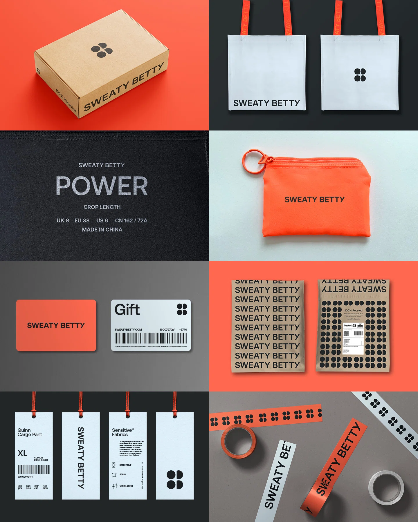
The packaging consists of a flat, smooth, single-layer paperboard box with clean edges and folds. The exterior is a kraft brown color, with a printed logo and text in contrasting colors. The box is designed for retail use, likely for clothing or accessories, and has a lightweight appearance. There are no visible fluted layers, indicating it is not corrugated. The box may have a glossy finish due to the printing.
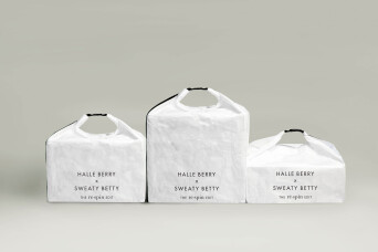
The packaging consists of three white carton boxes with a smooth, flat construction. Each box has a clean, rectangular shape with rounded handles at the top. The edges are precise, and the boxes appear to be made from a single layer of paperboard. The surface is matte, giving it a soft texture. The boxes are adorned with printed text in a bold, modern font, indicating the brand name 'SWEATY BETTY' prominently on each box, along with the name 'HALLE BERRY' and the website URL.

The packaging is a soft drawstring bag made of a lightweight, possibly nylon or polyester material. It features a smooth surface with a matte finish. The bag is primarily gray in color, with a contrasting bright orange drawstring at the top. The text 'Sweaty Betty' is prominently displayed in a bold, dark font, with 'LONDON' beneath it in a smaller font. The bottom of the bag includes the text 'BRITISH DESIGN SINCE 1996' in a smaller size, indicating the brand's heritage.

The packaging is a white retail shopping bag with a structured cube shape. It features a textured surface that resembles crumpled paper, giving it a unique aesthetic. The bag has a black handle that is integrated into the design, allowing for easy carrying. The front displays the brand name 'SWEATY BETTY' prominently, along with the collaboration name 'HALLE BERRY' in a clean, modern font. The overall look is minimalistic and stylish, appealing to a fashion-conscious audience.

The packaging features a sturdy, thick-walled box with a premium finish. It is covered in a decorative outer layer, likely a textured paper, giving it a luxurious appearance. Inside, the contents are wrapped in white tissue paper, which is neatly folded and secured. A card is attached to the tissue, providing product details and a QR code. The overall design is elegant and sophisticated, aligning with high-end retail aesthetics.
About the Brand
Sweaty Betty operates in the women's athletic apparel sector, offering a diverse range of activewear designed for performance and style. Their packaging strategy combines clean, modern aesthetics with practical structures, supporting both retail and direct-to-consumer channels. Packaging formats include custom-branded carton boxes, luxury rigid boxes, and branded retail bags, all tailored to deliver a cohesive brand experience.
Founded in 1998 and headquartered in the UK, Sweaty Betty targets a global, fitness-minded audience. The company’s D2C model relies heavily on robust e-commerce and retail packaging solutions to reinforce brand identity, enhance unboxing experiences, and ensure product protection during transit. Emphasizing both sustainability and premium presentation, their packaging integrates minimalist designs, high-quality materials, and prominent branding elements to support their positioning in the competitive activewear market.
Key Differentiator: Sweaty Betty’s packaging stands out through a combination of minimalist luxury design, consistent brand messaging, and a demonstrated commitment to sustainability, aligning with consumer expectations in the premium activewear segment.
Design System
Visual Style
Sweaty Betty’s visual design emphasizes minimalist typography, predominantly sans-serif in bold weights, set against neutral or muted backgrounds such as white, kraft brown, or soft gray. Accent colors like orange appear in details (e.g., drawstrings), with consistent use of matte and textured finishes for a tactile, premium aesthetic.
Brand Identity
The brand identity relies on clear, large-type company name placement, occasional use of the logo, and collaboration-specific iconography (e.g., with celebrities). Visual consistency is maintained through uniform color schemes, restrained use of graphics, and standardized branding elements across all packaging forms.
Packaging Design
Material choices prioritize recyclable paperboard, chipboard, and durable textiles, reflecting a commitment to sustainability and high perceived value. Structural design is functional yet elegant, with features such as integrated handles, precise folds, and layered rigid construction for giftable SKUs.
User Experience
The packaging design supports the customer journey by delivering a strong first impression, easy product access, and clear branding at every touchpoint. Unboxing is elevated through tactile materials, thoughtful presentation (e.g., tissue wraps, enclosed cards), and cohesive visual storytelling that aligns with Sweaty Betty’s brand promise.
Company Metrics
Business insights for Sweaty Betty based on available data
Market Positioning
Brand Values & Focus
Key Competitors
Target Market: Global women’s activewear consumers seeking premium, stylish, and sustainable fitness apparel; primary focus on digitally native and retail shoppers in Tier I markets.
Packaging Assessment
Overall Grade
Visual appeal and presentation quality
Packaging durability and protection
Eco-friendliness and recyclable materials
Cost efficiency and value for money
Packaging assessment for Sweaty Betty based on industry standards and best practices
Frequently Asked Questions
What types of packaging does Sweaty Betty use for its products?
Sweaty Betty utilizes a mix of carton boxes, rigid luxury gift boxes, and branded retail and drawstring bags. These formats are chosen to balance product protection, brand presentation, and sustainability requirements across various sales channels.
How does Sweaty Betty address sustainability in its packaging?
Sweaty Betty incorporates recyclable materials and streamlined, minimalist designs to reduce environmental impact. While some packaging uses luxury materials, the company’s overall approach favors eco-friendly substrates and responsible sourcing.
How does the brand's packaging impact the customer experience?
The packaging is designed to create a premium unboxing experience, featuring clean lines, tactile finishes, and clear brand cues. This supports customer expectations for quality and contributes to brand loyalty and differentiation.
Discover other Apparel companies
Explore more companies in the apparel industry and their packaging strategies
Alexander Shorokhoff
Apparel
Alexander Shorokhoff is a luxury watch manufacturer that specializes in creating unique and artistic timepieces. Their products blend traditional craftsmanship with modern designs, appealing to discerning customers worldwide.
ALTI
Apparel
ALTI specializes in unique, handcrafted silver jewelry designed by skilled artisans in Sweden. The company offers a range of customizable options and promotes a tranquil lifestyle through its jewelry collections.
Compressport International
Apparel
Compressport International specializes in high-end compression garments and sports accessories designed for athletes. Founded in 2008 and based in Geneva, Switzerland, the company caters to the needs of trail runners, triathletes, and other fitness enthusiasts.