Super Human Super Foods packaging
Super Human Super Foods delivers nutritious snack products with a direct-to-consumer model, employing branded packaging solutions that emphasize both sustainability and product protection. Their packaging strategy utilizes a mix of flexible wrappers and corrugated or carton boxes to balance shelf presence, logistics efficiency, and environmental responsibility.
Packaging Portfolio
Super Human Super Foods employs a multi-tiered packaging approach, utilizing flexible film wrappers for individual bar protection and portion control, retail-optimized folding cartons for consumer-facing displays, and corrugated cardboard boxes for shipping robustness. Materials are selected for food safety, shelf stability, and recyclability, with external partnerships supporting end-of-life recycling. Structural packaging is designed for efficient stacking and transport, while graphic design emphasizes brand visibility and product transparency.
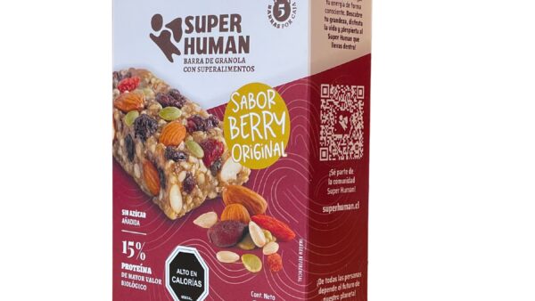
The packaging is a folding carton made from a single layer of paperboard. It features a smooth, flat construction with clean edges and folds. The box is predominantly white with colorful graphics and text. The front showcases a vibrant design with images of nuts and fruits, along with the product name and flavor. The sides contain additional product information and branding elements. The overall shape is rectangular, typical for food products.
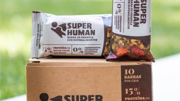
The packaging consists of a sturdy corrugated box that is brown in color, featuring a visible fluted inner layer when viewed from the side. The box is designed to hold granola bars, with a clean, rectangular shape and a top flap that is folded down. The exterior shows minimal wear, indicating it is likely new or lightly handled. There are also granola bars displayed on top of the box, wrapped in a thin paper-like material.

The packaging is a large, rectangular shipping box made of corrugated cardboard. It features visible fluted edges when viewed from the side, indicating its sturdy construction. The box is primarily brown with printed graphics in black and yellow. The surface is smooth with a matte finish, and there are no glossy coatings. The box has been secured with plastic strapping, which is common for shipping purposes. There are printed instructions and a QR code on one side, along with the brand name 'SUPER HUMAN' prominently displayed.

The packaging consists of a tall, rectangular carton box with a smooth, flat construction. The box features a vibrant purple color with a matte finish. The front displays the brand name 'SUPER HUMAN' prominently in bold, red letters, along with a circular logo. The sides of the box are adorned with product information, including the product name 'Sweet Dreams Ahead' and details about the contents. The edges are clean and precise, indicating high-quality manufacturing. The box appears to be designed for retail display, with no visible flaps or tabs for closure.

The packaging consists of two individually wrapped snack bars. Each wrapper features a smooth, flat construction typical of flexible packaging. The wrappers are primarily made of a thin, flexible film that is likely a composite material designed for food safety. The surface finish is matte with a slight sheen, indicating a protective coating. The colors are vibrant, with one wrapper in a light gray with green accents and the other in a dark brown with red accents. Both wrappers display the brand name 'SUPER HUMAN' prominently in bold, black font, with additional text detailing nutritional information and product features.
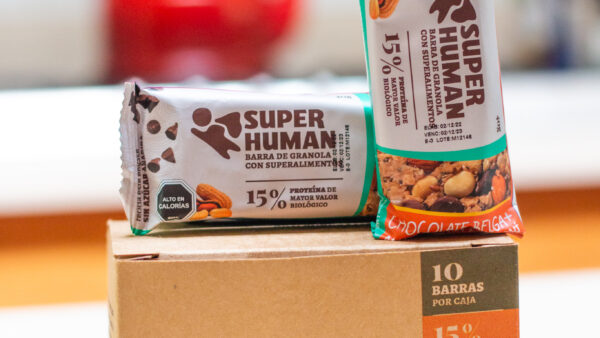
The packaging consists of a rectangular carton box with a smooth, flat construction. The box is primarily brown in color with printed text and graphics. The edges are clean and precise, indicating a well-constructed folding carton. The front of the box features a prominent logo and product information, while the sides contain additional details. The box is designed to hold multiple granola bars, as indicated by the '10 BARRAS POR CAJA' text.
About the Brand
Super Human Super Foods is a Santiago-based D2C food company specializing in energy bars and nutritious snacks, targeting health-conscious consumers seeking convenient, real-ingredient products. Their packaging approach combines brand-focused design elements with operational efficiency and environmental considerations.
Founded in 2018, Super Human Super Foods operates with a lean team and modest monthly revenue, positioning itself as a premium yet accessible health snack provider. Their packaging portfolio includes flexible wrappers for individual bars, retail folding cartons, and robust corrugated shippers, each tailored to product type and distribution channel. The company partners with recycling initiatives to address end-of-life packaging impact, integrating sustainability messaging into both product and shipping materials.
Key Differentiator: Super Human differentiates through its strong emphasis on sustainability partnerships and consistent, health-centric packaging design that reinforces its brand positioning in the wellness food segment.
Design System
Visual Style
The visual design leverages bold, sans-serif typography, a palette of earthy browns, greens, and vibrant accent colors, and matte finishes to convey a natural, health-oriented image. Imagery of ingredients and clean layouts support product clarity.
Brand Identity
Logo application is consistent across all formats, with prominent placement on both primary and secondary packaging. Iconography is minimal, focusing on product attributes and sustainability messaging. Visual coherence is achieved through repeated color schemes and typographic standards.
Packaging Design
Material choices prioritize food-grade flexible films for bars, paperboard for folding cartons, and corrugated cardboard for shipping. Structures are optimized for protection, visibility, and efficient distribution, reflecting a balance of cost, sustainability, and branding.
User Experience
Packaging is designed for intuitive access and positive tactile interaction, supporting a seamless unboxing journey. Clear labeling and QR codes facilitate consumer education, while aesthetic consistency reinforces trust and brand recall at every touchpoint.
Company Metrics
Business insights for Super Human Super Foods based on available data
Market Positioning
Brand Values & Focus
Key Competitors
Target Market: Health-focused consumers, athletes, and busy professionals in Chile seeking convenient, nutritious snack options with transparent ingredient sourcing and environmentally responsible packaging.
Packaging Assessment
Overall Grade
Visual appeal and presentation quality
Packaging durability and protection
Eco-friendliness and recyclable materials
Cost efficiency and value for money
Packaging assessment for Super Human Super Foods based on industry standards and best practices
Frequently Asked Questions
What types of packaging does Super Human Super Foods use?
They utilize a combination of flexible wrappers for individual snack bars, retail-ready folding cartons, and corrugated shipping boxes, aligning material choice and structure with product protection, branding, and sustainability objectives.
How does Super Human address packaging sustainability?
The company partners with external recycling programs and uses recyclable materials where feasible, focusing on minimizing environmental impact while maintaining food safety and shelf stability.
How is the brand identity represented through packaging?
Packaging features prominent brand logos, clear nutritional information, and a cohesive color palette, ensuring visual consistency and reinforcing the company’s health and wellness messaging.
Discover other Food & Drink companies
Explore more companies in the food & drink industry and their packaging strategies
kerex - terre exotique
Food & Drink
Kerex - Terre Exotique specializes in the international trade of gourmet food and drink products, offering a unique selection of spices and culinary ingredients.
Teegschwendner GmbH
Food & Drink
Teegschwendner GmbH is a specialty tea company based in Germany, offering a wide selection of high-quality teas and tea-related accessories. They focus on providing unique tea experiences through carefully sourced and curated products.
Terres de Café
Food & Drink
Terres de Café is a specialty coffee retailer based in Paris, France, known for its commitment to sustainability and high-quality coffee sourcing.