Sunday packaging
Sunday is a health and nutrition company specializing in premium vitamins and dietary supplements, distributed through a direct-to-consumer e-commerce model. Their packaging strategy prioritizes minimalism, premium material choices, and clear branding alignment with a focus on natural health.
Packaging Portfolio
Sunday employs a diversified packaging portfolio tailored to the needs of the health supplement sector. Their solutions include flexible stand-up pouches with resealable closures for powders, rigid paperboard gift boxes for premium sets, amber glass bottles for light-sensitive supplements, and retail cartons with minimalist branding. Material selection emphasizes a combination of recyclability (kraft paper, glass) and product protection (dark glass, sturdy rigid boxes). This multi-format strategy supports both product integrity and a refined, natural brand presentation, while also considering e-commerce logistics and sustainability requirements.

The packaging is a rectangular rigid box with a sturdy construction. It features a matte black exterior with a smooth finish, giving it a premium appearance. The interior is a soft beige color, providing a contrasting backdrop for the contents. The box is designed to hold four glass bottles, each filled with supplements, securely in place. The edges are clean and precise, indicating high-quality manufacturing.
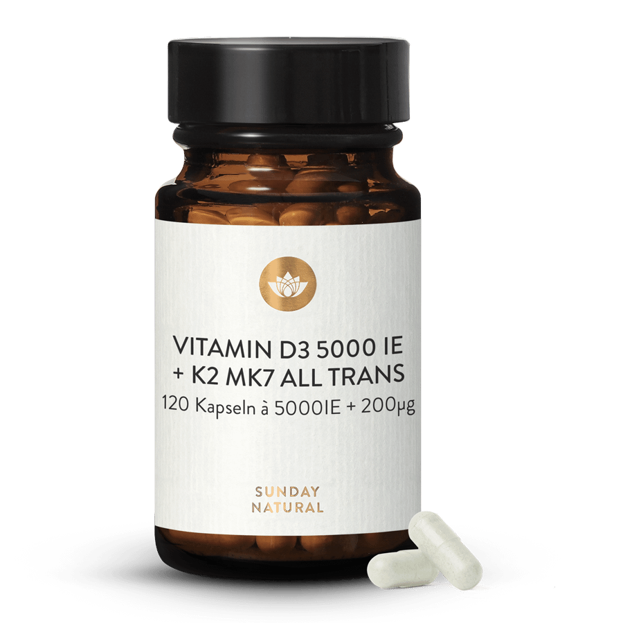
The packaging is a cylindrical bottle made of dark amber glass with a white label. The label features a clean design with a matte finish. The top of the bottle is sealed with a black plastic cap. The label includes product information, such as the vitamin type and dosage, along with a logo and brand name. The overall appearance is sleek and professional, indicative of a health supplement product.
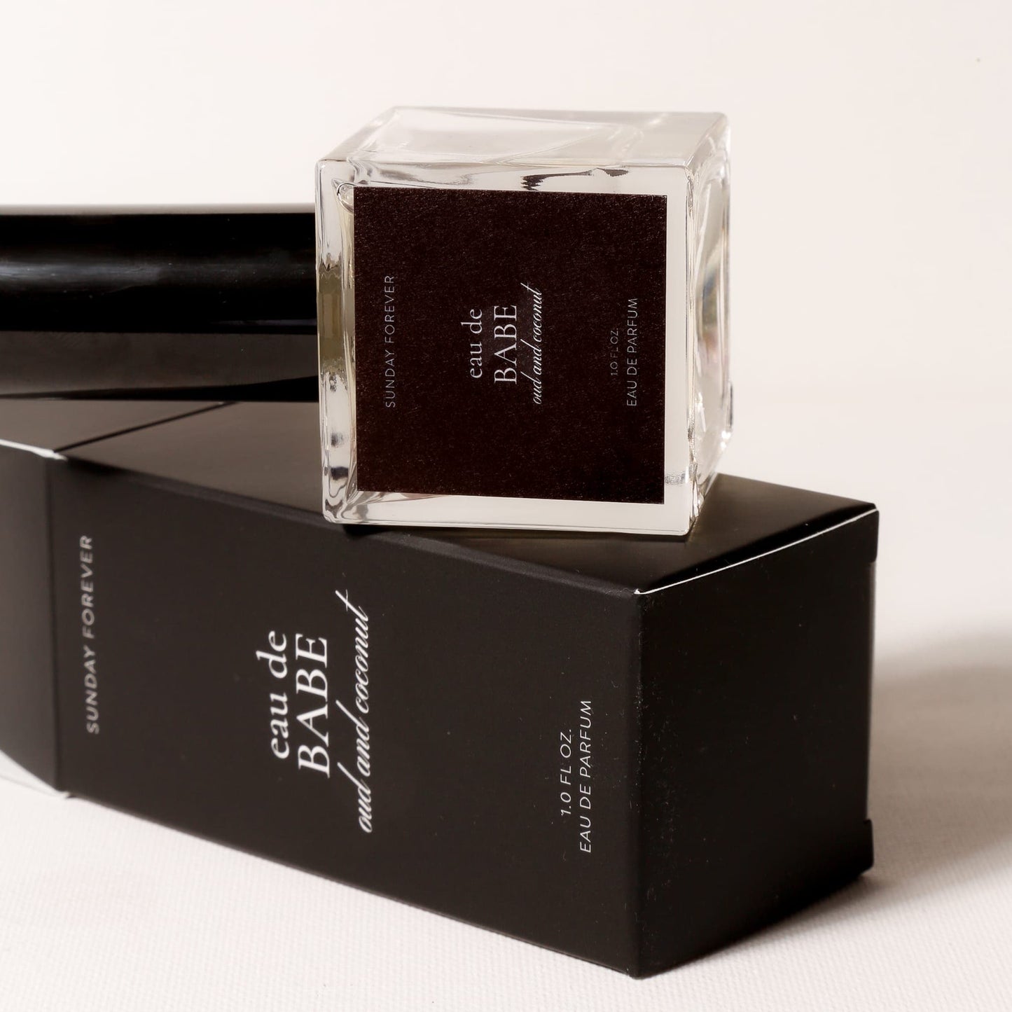
The packaging consists of a sleek, black folding carton that houses a glass perfume bottle. The carton features a smooth, flat construction with clean edges and folds, indicative of single-layer paperboard. The exterior has a matte finish with a slight sheen, enhancing its premium appearance. The front displays the product name 'eau de BABE' in a stylish font, while the brand name 'SUNDAY FOREVER' is also prominently featured. The overall design is minimalistic yet elegant, aligning with luxury fragrance packaging standards.

The image features several cans of beverages with a clean, modern design. Each can has a smooth, cylindrical shape, typical of beverage containers. The cans are predominantly white with colorful graphics representing the flavors, including images of fruits. The tops of the cans are standard metal with a pull-tab opening. The overall aesthetic is minimalist and appealing, with a focus on the product's natural ingredients.

The packaging is a stand-up pouch made of a smooth, matte-finish material that appears to be a composite of paper and plastic. The exterior is a kraft brown color, giving it a natural look. The pouch has a flat bottom allowing it to stand upright, and it features a resealable top closure. The front of the pouch is dominated by a large white label with minimalistic text and a logo, while the back is likely plain or has additional information.
About the Brand
Sunday operates as a leading German provider of nutritional supplements, offering a broad product range that emphasizes natural ingredients and innovative formulations. Their packaging approach is defined by a balance of visual clarity, protection, and eco-conscious materials.
With over 1500 SKUs in vitamins, minerals, and specialty nutrition, Sunday leverages a D2C e-commerce model requiring packaging that excels in both logistics performance and customer experience. Their portfolio includes stand-up pouches, rigid boxes, supplement bottles, and specialized containers, all designed to highlight product quality and support the brand’s commitment to transparency and natural health. The use of matte finishes, earthy colors, and minimalist labeling reinforces Sunday’s market positioning while accommodating the practical demands of shipping and storage.
Key Differentiator: Sunday’s unique value lies in the integration of premium, health-focused product design with sustainable, minimalist packaging that elevates the unboxing experience while maintaining operational efficiency.
Design System
Visual Style
Minimalist sans-serif typography, earthy and neutral color palette (matte black, kraft brown, white, gold accents), and a clean, uncluttered aesthetic emphasizing premium health and wellness cues.
Brand Identity
Consistent usage of the 'SUNDAY' or 'SUNDAY NATURAL' logo, minimal iconography, and disciplined visual hierarchy. Packaging features clear, prominent product names and dosage information, with restrained decorative elements.
Packaging Design
Material choices prioritize recyclability and product protection—kraft paper, matte laminated board, and amber glass. Structural design favors rigid formats for premium perception and flexible pouches for efficiency, supporting both logistics and shelf presence.
User Experience
Packaging is designed to create a positive, trustworthy unboxing experience through tactile finishes, easy-open features, and clear labeling. The approach reinforces the brand’s premium positioning and fosters consumer confidence throughout the customer journey.
Company Metrics
Business insights for Sunday based on available data
Market Positioning
Brand Values & Focus
Key Competitors
Target Market: Health-conscious consumers in Germany seeking premium, natural dietary supplements, with a focus on direct-to-consumer e-commerce convenience.
Packaging Assessment
Overall Grade
Visual appeal and presentation quality
Packaging durability and protection
Eco-friendliness and recyclable materials
Cost efficiency and value for money
Packaging assessment for Sunday based on industry standards and best practices
Frequently Asked Questions
How does Sunday ensure the protection of its nutritional products during shipping?
Sunday utilizes a combination of rigid boxes, dark glass bottles, and resealable pouches to safeguard product integrity, particularly for sensitive supplements. Material choices such as amber glass and sturdy paperboard are selected to protect against light, moisture, and impact.
What sustainability practices are reflected in Sunday’s packaging?
Sunday’s packaging features recyclable materials such as kraft paper and glass, as well as minimalist designs that reduce excess packaging. The brand also emphasizes responsible sourcing and material transparency.
How does Sunday’s packaging design contribute to its brand identity?
The visual approach incorporates minimalist typography, a natural color palette, and consistent logo placement to create a cohesive, premium brand experience that aligns with health and wellness values.
Discover other Health companies
Explore more companies in the health industry and their packaging strategies
Lily & Loaf
Health
Lily & Loaf specializes in high-quality health and nutrition products, offering a range of supplements and vitamins aimed at supporting an active lifestyle. The company focuses on providing natural solutions for health and beauty.
EVO Nutrition
Health
EVO Nutrition specializes in premium health supplements, providing a wide range of vitamins and nutritional products to support well-being.
Doctor Seaweed
Health
Doctor Seaweed specializes in natural, plant-based nutritional supplements derived from seaweed, aimed at promoting overall wellness.