StriVectin Operating Company packaging
StriVectin Operating Company delivers advanced skincare solutions with a focus on anti-aging, leveraging a direct-to-consumer model. The brand employs high-visibility, structurally robust packaging that emphasizes visual consistency and premium positioning within the beauty industry.
Packaging Portfolio
StriVectin's packaging portfolio is anchored by high-gloss folding carton boxes for retail, rigid jars for creams, and cylindrical bottles for serums, all constructed from smooth, coated paperboard or durable plastics. The use of color-coding and consistent typography enhances product differentiation and shelf presence. Packaging formats are engineered for both aesthetic impact and product protection, with a strong emphasis on brand recognition through prominent logo display and uniform design language. Multilingual labeling and detailed usage instructions address regulatory and consumer needs in North America.
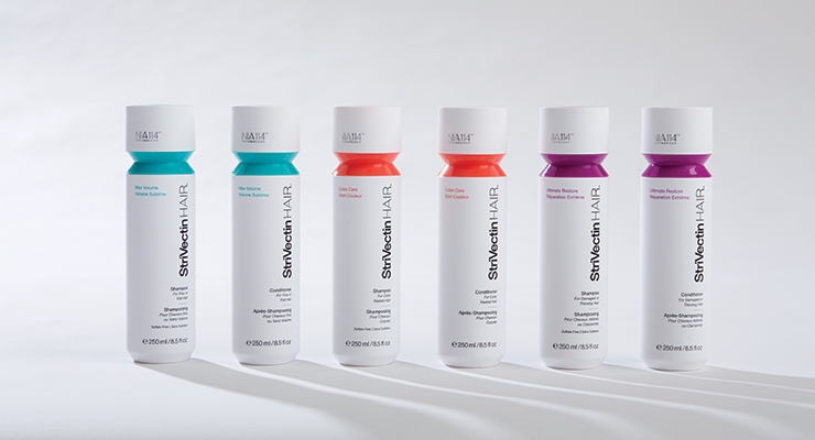
The image features a series of cylindrical bottles with a smooth, glossy finish. Each bottle is predominantly white with a colored cap that corresponds to the product type. The labels are clean and feature minimalistic design elements, including product names and branding. The bottles are arranged in a line, showcasing their uniform shape and size.
The packaging is a folding carton made of smooth, flat paperboard. It has a clean, precise construction with sharp edges and folds. The exterior is predominantly white with vibrant yellow accents. The front features a large logo and product name, while the sides contain detailed product information and usage instructions. The box has a glossy finish, giving it a polished appearance.

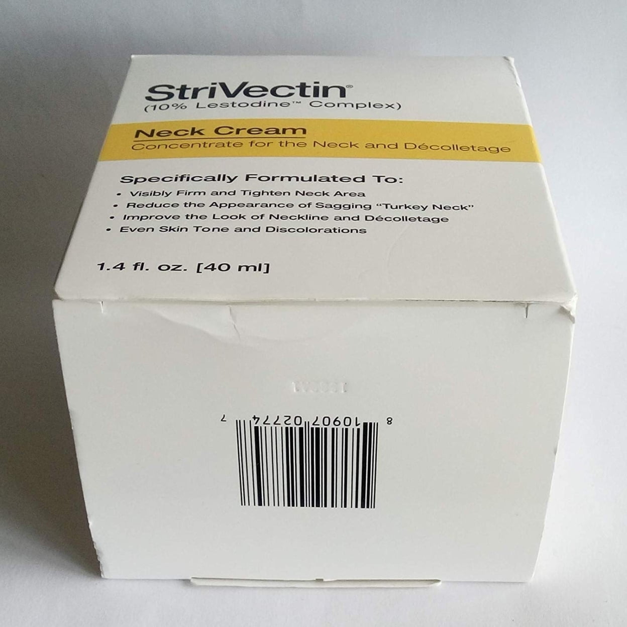
The packaging is a folding carton made of smooth, flat paperboard. It features a clean, precise construction with sharp edges and folds. The box is primarily white with yellow accents, showcasing a professional and modern appearance. The front displays product information clearly, including the product name and usage instructions. The surface is likely coated for a glossy finish, enhancing visual appeal.
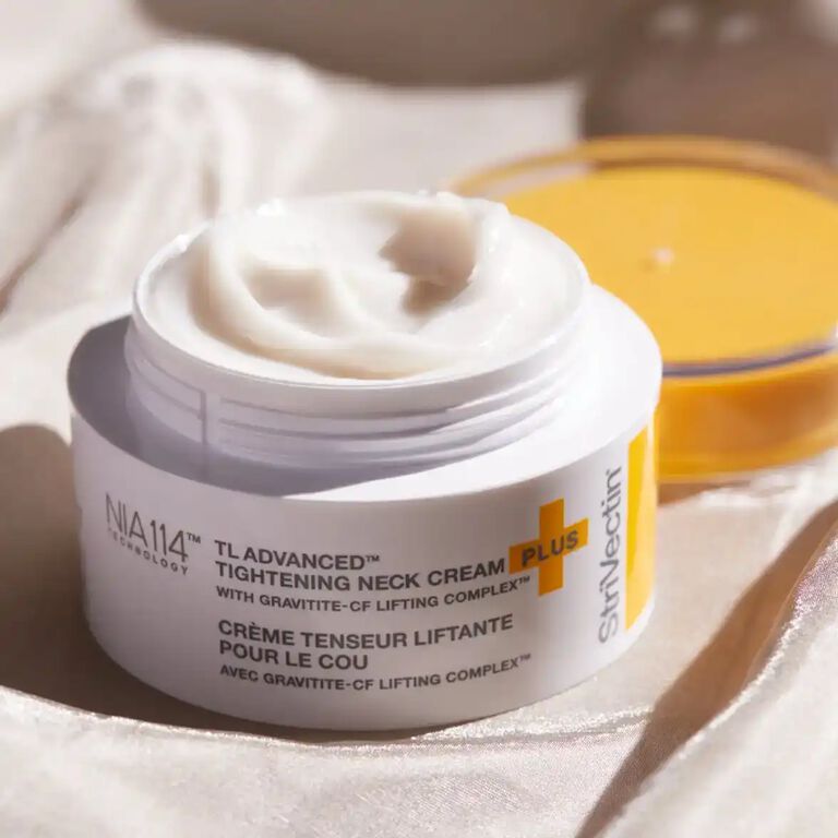
The packaging is a round, rigid jar with a thick, sturdy base and a smooth, glossy finish. The lid is a contrasting color, likely yellow, which adds a premium look. The jar has a clean, modern design with a wide opening, making it easy to access the product inside. The overall appearance is sleek and luxurious, indicative of high-end cosmetic packaging.
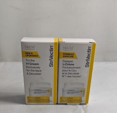
The packaging consists of two folding cartons, each made from a single-layer paperboard. The cartons are smooth and flat, with clean edges and precise folds. The exterior features a glossy finish with vibrant colors, predominantly white with yellow accents. The front displays product information and branding prominently, with a clear depiction of the product inside. The sides contain additional text in both English and French, indicating the product's features.

The packaging is a folding carton made of smooth, flat paperboard. It features a clean, precise construction with sharp edges and folds. The exterior is predominantly yellow with white and gray accents, showcasing product images and text. The design is vibrant and appealing, aimed at retail display. The carton has a glossy finish, enhancing its visual appeal.
About the Brand
StriVectin specializes in science-backed skincare products targeting facial and body care, with a strong emphasis on anti-aging solutions. Their packaging strategy centers on retail-ready carton boxes and rigid cosmetic containers designed for both protection and brand impact.
Operating from Johnson City, Tennessee, StriVectin leverages a robust D2C platform, serving North American consumers with a diverse portfolio of serums, creams, and targeted treatments. The packaging architecture is tailored for shelf impact, utilizing coated paperboard, rigid jars, and color-coded bottles to reinforce product differentiation within a crowded premium beauty market.
Key Differentiator: A data-driven approach to clinical efficacy is mirrored in StriVectin's packaging: high-gloss finishes, consistent branding, and material choices that balance shelf appeal with product security.
Design System
Visual Style
Modern sans-serif typography, a palette dominated by white, yellow, and gray tones, and a glossy, high-contrast finish for enhanced shelf visibility. Product lines utilize color-coded accents to differentiate SKUs within the portfolio.
Brand Identity
The StriVectin logo is consistently featured on all packaging, paired with standardized icons and minimalistic product labeling. Visual consistency is maintained through signature colorways and uniform font usage across both primary and secondary packaging.
Packaging Design
Material selection prioritizes coated paperboard for retail cartons and thick-walled plastic for jars and bottles, emphasizing structural integrity and tactile quality. Structural design favors precise folds, sharp edges, and ergonomic shapes for ease of use and enhanced perceived value.
User Experience
Packaging design is tailored to guide the customer journey from unboxing to application, leveraging clear product information, intuitive opening mechanisms, and a premium tactile feel to reinforce trust and satisfaction at every interaction.
Company Metrics
Business insights for StriVectin Operating Company based on available data
Market Positioning
Brand Values & Focus
Key Competitors
Target Market: Affluent skincare consumers in North America seeking clinically-proven, premium anti-aging solutions through direct-to-consumer and retail channels.
Packaging Assessment
Overall Grade
Visual appeal and presentation quality
Packaging durability and protection
Eco-friendliness and recyclable materials
Cost efficiency and value for money
Packaging assessment for StriVectin Operating Company based on industry standards and best practices
Frequently Asked Questions
What types of packaging materials does StriVectin primarily use?
StriVectin primarily utilizes folding carton paperboard for retail packaging, glossy rigid jars for creams, and cylindrical bottles with color-coded caps for serums and treatments. Materials are selected for durability, visual appeal, and alignment with premium brand positioning.
How does StriVectin address sustainability in its packaging?
While StriVectin's packaging demonstrates high visual quality and brand consistency, the use of coated paperboard and rigid plastics suggests moderate integration of recyclable materials. There is an opportunity for further enhancement in sustainability through increased use of post-consumer recycled content and reduced plastic components.
How does StriVectin's packaging influence the customer experience?
Their packaging design focuses on a premium unboxing experience, leveraging vibrant colors, glossy finishes, and detailed product information to evoke trust and satisfaction at the first touchpoint.
Discover other Beauty & Fitness companies
Explore more companies in the beauty & fitness industry and their packaging strategies
Pure Altitude
Beauty & Fitness
Pure Altitude specializes in high-quality beauty and skincare products that leverage the expertise of spa treatments to enhance daily routines. The brand offers a diverse range of products tailored for both facial and body care.
Orris Paris
Beauty & Fitness
Orris Paris specializes in creating artisanal skincare products that combine potent botanical ingredients with modern cleansing rituals. The company emphasizes natural, holistic practices in its formulations.
Owari
Beauty & Fitness
Owari specializes in 100% natural beauty and fitness products, designed to enhance health and wellness. The company proudly offers its products made in France, emphasizing quick delivery and customer support.