Stride packaging
Stride delivers health management solutions through direct-to-consumer genetic and biomarker testing, personalized supplements, and digital health programs. Their packaging strategy centers on recyclable carton boxes and flexible pouches that reflect a modern, science-driven brand identity.
Packaging Portfolio
Stride's packaging portfolio is dominated by folding carton boxes constructed from kraft and white paperboard, optimized for retail display and direct shipment. These cartons feature clean structural folds, matte finishes, and minimalistic graphics that reinforce the brand’s scientific ethos. The use of flexible metallic pouches for single-serve nutrition combines shelf impact with product freshness, though it introduces mixed-material sustainability challenges. Consistent compartmentalization and branded interiors enhance both product protection and the consumer’s unboxing experience. Across all formats, packaging is lightweight and tailored for efficient shipping.
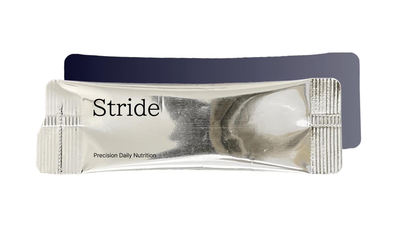
The packaging is a sleek, elongated pouch with a smooth, shiny surface. It features a metallic finish that reflects light, giving it a premium appearance. The edges are sealed tightly, indicating a hermetic closure, and there are no visible flaps or tabs. The overall shape is rectangular with rounded ends, designed for easy handling and consumption.
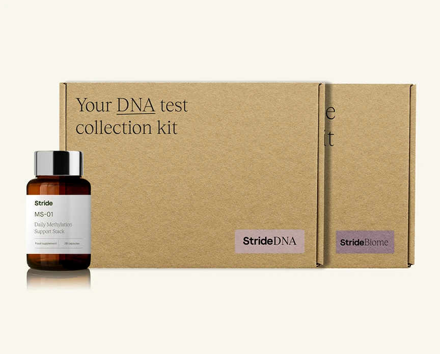
The packaging consists of two folding cartons, one containing a glass bottle and the other serving as the outer box. The cartons are made of smooth, flat paperboard with clean edges and folds. The exterior is a kraft brown color, typical for retail packaging, and features a matte finish. The design includes printed text and logos in contrasting colors, enhancing visibility and branding.
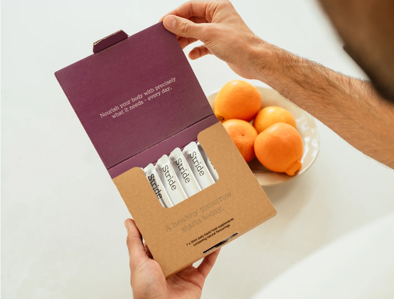
The packaging is a folding carton with a smooth, flat construction. It features a two-tone design with a kraft brown exterior and a purple interior. The carton opens from the top, revealing compartments for individual products. The edges are clean and precise, indicative of high-quality paperboard. The exterior has a matte finish, while the interior may have a slight sheen. The packaging is lightweight and designed for retail display.
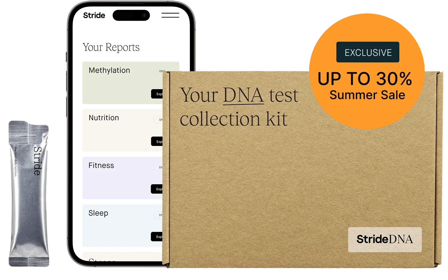
The packaging is a flat, rectangular box made of single-layer paperboard, featuring a smooth surface with clean edges and folds. The box is primarily kraft brown in color, with printed text and graphics on the exterior. It has a simple design with a large circular promotional sticker indicating a summer sale. The box is lightweight and appears to be designed for retail display.
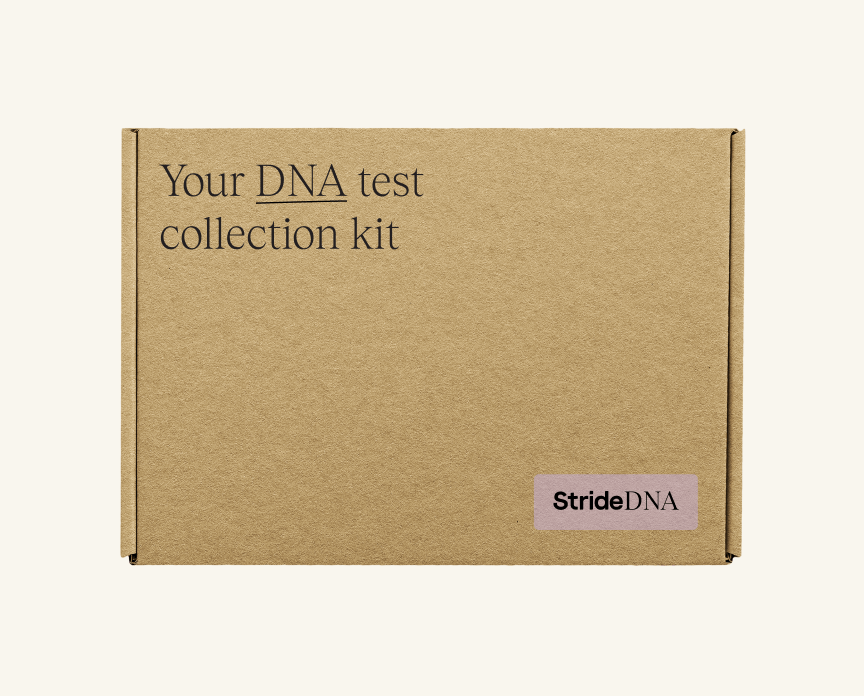
The packaging is a flat, rectangular box made of single-layer paperboard. It has a smooth, flat construction with clean edges and folds. The exterior is a kraft brown color, typical of paperboard, and features minimal graphics. The front displays the text 'Your DNA test collection kit' in a modern, sans-serif font, with the word 'DNA' emphasized in a larger size. The lower right corner has a rectangular label with the brand name 'StrideDNA' in a contrasting color. The box appears lightweight and is designed for retail display.
About the Brand
Stride is a health optimization company specializing in direct-to-consumer DNA, gut, and blood testing, coupled with personalized nutritional supplements. Their packaging choices emphasize product integrity and user experience, aligning with their digitally enabled, research-driven approach to health management.
Stride’s product offerings require packaging that balances protection, branding, and sustainability. The company utilizes folding carton boxes for test kits and supplements, as well as flexible pouches for single-serve nutrition, prioritizing both consumer convenience and a premium unboxing experience. Visual branding is consistently integrated across packaging formats, enhancing recognition and reinforcing their positioning as a premium player in the health sector.
Key Differentiator: Stride’s key differentiator lies in the integration of personalized health data with tailored packaging solutions that communicate scientific credibility and modern aesthetics while maintaining a strong focus on customer experience.
Design System
Visual Style
Stride employs a modern, minimalist visual style with sans-serif typography, a neutral kraft brown and white color palette accented by bold purples, and restrained graphic elements to convey scientific credibility and approachability.
Brand Identity
The Stride logo is consistently displayed in clean, high-contrast applications. Product names and sub-brands (e.g., StrideDNA) are clearly differentiated with uniform iconography and tagline integration. Visual consistency is maintained through alignment, color repetition, and sparse, data-focused layouts.
Packaging Design
Material selection prioritizes lightweight, recyclable paperboard for most cartons, with an emphasis on precise folds and compartmentalization for safety and organization. Flexible pouches leverage metallic films for barrier properties. Structural design is informed by the need for product protection, premium presentation, and efficient e-commerce fulfillment.
User Experience
Packaging is designed to guide the customer seamlessly from unboxing to use, with intuitive compartment layouts, clear labeling, and a premium tactile feel. This supports the D2C digital-first purchasing journey, building trust and reinforcing the brand promise of personalized, science-backed health.
Company Metrics
Business insights for Stride based on available data
Market Positioning
Brand Values & Focus
Key Competitors
Target Market: Digitally engaged, health-conscious consumers seeking personalized health optimization solutions in the UK and other Tier I markets.
Packaging Assessment
Overall Grade
Visual appeal and presentation quality
Packaging durability and protection
Eco-friendliness and recyclable materials
Cost efficiency and value for money
Packaging assessment for Stride based on industry standards and best practices
Frequently Asked Questions
What types of packaging does Stride use for their products?
Stride primarily utilizes folding carton boxes for test kits and supplement bottles, along with flexible pouches for single-serve nutritional products. All packaging is designed to align with the brand’s clean, minimalist aesthetic and to ensure product protection and ease of use.
How does Stride incorporate sustainability into its packaging?
Stride favors recyclable paperboard materials for its cartons and minimalist graphic design to reduce ink usage. However, the presence of metallic or plastic flexible pouches may limit overall recyclability compared to fully paper-based solutions.
How does the packaging support the Stride customer experience?
Stride’s packaging is designed to enhance the unboxing experience, with clear compartmentalization, branded interiors, and consistent visual elements that communicate health, science, and trust. This approach supports the company’s D2C digital-first model by reinforcing the perceived value upon delivery.
Discover other Health companies
Explore more companies in the health industry and their packaging strategies
EVO Nutrition
Health
EVO Nutrition specializes in premium health supplements, providing a wide range of vitamins and nutritional products to support well-being.
Bio-Synergy
Health
Bio-Synergy is a UK-based company specializing in health and fitness products, including nutritional supplements and DNA testing kits. Their mission is to support individuals in achieving their health and fitness goals through innovative products and personalized insights.
Smart Protein
Health
Smart Protein is dedicated to transforming nutrition by providing a range of health and wellness products focused on protein supplements and vitamins.