Skon Cosmetics packaging
Skon Cosmetics operates in the beauty and fitness sector, delivering a diverse range of personal care products via a direct-to-consumer model. Their packaging strategy emphasizes branded carton boxes, premium cosmetic containers, and eco-conscious pouches to reinforce product quality and elevate the customer experience.
Packaging Portfolio
Skon Cosmetics employs a packaging portfolio anchored in premium folding carton boxes, rigid cosmetic containers, and custom fabric pouches. Materials are selected for their smooth finishes, durability, and recyclability, with a clear emphasis on high-fidelity print and tactile quality. Structural designs feature precise folds, protective inlays, and secure closures, supporting both product safety and shelf presence. Branded elements are consistently applied across all formats, reinforcing identity and driving cohesive consumer recognition.

The packaging is a folding carton box with a smooth, flat construction. It features a pastel gradient color scheme transitioning from pink to blue. The front displays the product name 'PIMPLE POTION' in bold, modern typography, along with the brand name 'SKÖN COSMETICS' prominently at the top. The box has clean, precise edges and folds, indicative of high-quality paperboard. The surface appears to have a glossy finish, enhancing the visual appeal. There are no visible flaps or tabs, as it is designed to open from the top.

The packaging consists of a smooth, flat construction with a clean and precise design. It features a white paperboard base with colorful graphics and text. The overall shape is rectangular, with a foldable design that allows it to be easily opened and closed. The front displays product information and branding elements prominently, while the back contains additional details and instructions. The edges are neatly folded, indicating a well-constructed carton.

The packaging consists of various cosmetic containers with a smooth, cylindrical shape. They feature a matte pink finish with black lids. The containers are designed for retail display and have a premium appearance, suggesting a luxury product. The branding is prominently displayed on the front of each container.

The packaging consists of a smooth, flat construction made from single-layer paperboard. It features a light pink exterior with a glossy finish. The edges are clean and precise, indicating high-quality manufacturing. The front of the box displays a circular logo in gold, surrounded by a decorative line, along with product information in a clear, modern font. The back of the box includes additional product details and instructions, printed in a contrasting color for readability.
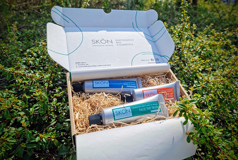
The packaging is a folding carton with a smooth, flat construction. It features a white exterior with a subtle design of blue lines. The carton opens from the top and contains two tubes of cosmetics nestled in shredded paper filler. The interior is designed to hold the products securely, with cutouts for the tubes.

The packaging is a small cosmetic pouch made from a natural fabric blend, featuring a zipper closure at the top. The pouch has a light beige color with a textured burlap bottom section. The front displays a simple, minimalist design with line drawings of plants and the brand name 'SKÖN COSMETICS' prominently featured at the top. The overall shape is rectangular with rounded edges, providing a compact and portable design.
About the Brand
Skon Cosmetics specializes in cosmetics, skincare, and fitness-related body care, leveraging digital channels to reach health-conscious consumers. The brand’s packaging approach is characterized by a blend of aesthetic design, protective structures, and visible branding, aligning with evolving consumer expectations in the beauty industry.
With a business model centered on e-commerce, Skon Cosmetics integrates packaging as a core element of its brand strategy. Packaging formats include folding carton boxes, rigid cosmetic containers, and branded fabric pouches, each designed to optimize visual appeal, shelf impact, and unboxing experience. Recent packaging iterations show a shift towards eco-friendly materials and minimalistic, contemporary visuals, supporting both sustainability and luxury cues.
Key Differentiator: Distinctive packaging that combines premium branding with practical, eco-conscious formats, positioning Skon Cosmetics as a forward-thinking player in the beauty and fitness segment.
Design System
Visual Style
The design system utilizes modern sans-serif typography, a pastel-dominated color palette (pinks, blues, whites), and minimalist layouts with clean lines. Glossy and matte finishes provide tactile interest, while restrained decorative elements maintain a premium, uncluttered look.
Brand Identity
Logo placement is prominent and consistent, often accompanied by circular motifs or botanical illustrations. Iconography is minimal and used selectively to reinforce core brand attributes. Visual consistency is maintained through uniform color usage, font hierarchy, and structured label layouts.
Packaging Design
Packaging materials are primarily recyclable paperboard and natural fabrics, with a focus on lightweight yet protective structures. The design philosophy prioritizes sustainability, precise die-cuts, and modular components for product security and ease of assembly.
User Experience
Packaging is designed to facilitate a seamless customer journey from first touch to product use. Clear labeling, easy-open structures, and visually engaging presentations support both functional needs and emotional engagement, reinforcing brand loyalty and perceived value.
Company Metrics
Business insights for Skon Cosmetics based on available data
Market Positioning
Brand Values & Focus
Key Competitors
Target Market: Digitally engaged beauty and wellness consumers seeking high-quality, visually appealing, and sustainably packaged cosmetics and skincare products.
Packaging Assessment
Overall Grade
Visual appeal and presentation quality
Packaging durability and protection
Eco-friendliness and recyclable materials
Cost efficiency and value for money
Packaging assessment for Skon Cosmetics based on industry standards and best practices
Frequently Asked Questions
What packaging materials does Skon Cosmetics primarily use?
Skon Cosmetics predominantly utilizes single-layer paperboard for carton boxes, rigid cosmetic containers with matte finishes, and natural-fabric pouches, balancing visual appeal with protection and sustainability.
How does Skon Cosmetics address sustainability in its packaging?
The brand is increasingly adopting recyclable materials and reusable pouches, with a clear emphasis on reducing environmental impact and aligning with ethical sourcing principles.
What is the focus of Skon Cosmetics' unboxing experience?
Their unboxing experience relies on visually cohesive branding, clean lines, and protective inlays, enhancing emotional engagement and reinforcing a premium brand perception.
Discover other Beauty & Fitness companies
Explore more companies in the beauty & fitness industry and their packaging strategies
Institut Karité Paris
Beauty & Fitness
Institut Karité Paris specializes in luxury beauty products made with natural Shea Butter, offering a wide range of skincare and body care solutions. The brand combines Parisian heritage with a commitment to quality and creativity in its offerings.
Cultiv Cosmetique
Beauty & Fitness
Cultiv Cosmetique is a French skincare brand that provides organic and eco-friendly beauty products inspired by nature. They focus on effective skincare solutions for various skin concerns.
Pure Altitude
Beauty & Fitness
Pure Altitude specializes in high-quality beauty and skincare products that leverage the expertise of spa treatments to enhance daily routines. The brand offers a diverse range of products tailored for both facial and body care.