Seven Bro7hers Brewery packaging
Seven Bro7hers Brewery specializes in craft beer production, combining traditional brewing with modern flavor profiles. Their packaging approach leverages branded aluminum cans and robust carton solutions to enhance consumer experience and safeguard product quality.
Packaging Portfolio
Seven Bro7hers Brewery employs a combination of aluminum cans for primary packaging, single-layer paperboard cartons with die-cut windows for retail presentation, and corrugated boxes for multi-unit shipping. The portfolio emphasizes lightweight, recyclable substrates—aluminum and kraft paperboard—balancing product protection with visual impact. Retail cartons often incorporate transparent windows for product visibility, while shipping cartons are designed for durability and stacking efficiency. The visual and structural coherence across formats supports both brand recognition and operational efficiency.

The image displays three aluminum cans, each featuring vibrant and colorful artwork. The cans are cylindrical in shape, with a smooth surface finish and a metallic sheen. Each can has a distinct design, showcasing various colors and patterns, including geometric shapes and illustrations. The tops of the cans are sealed with a standard pull-tab opening, typical for beverage containers. The labels wrap around the cans, providing a seamless appearance.
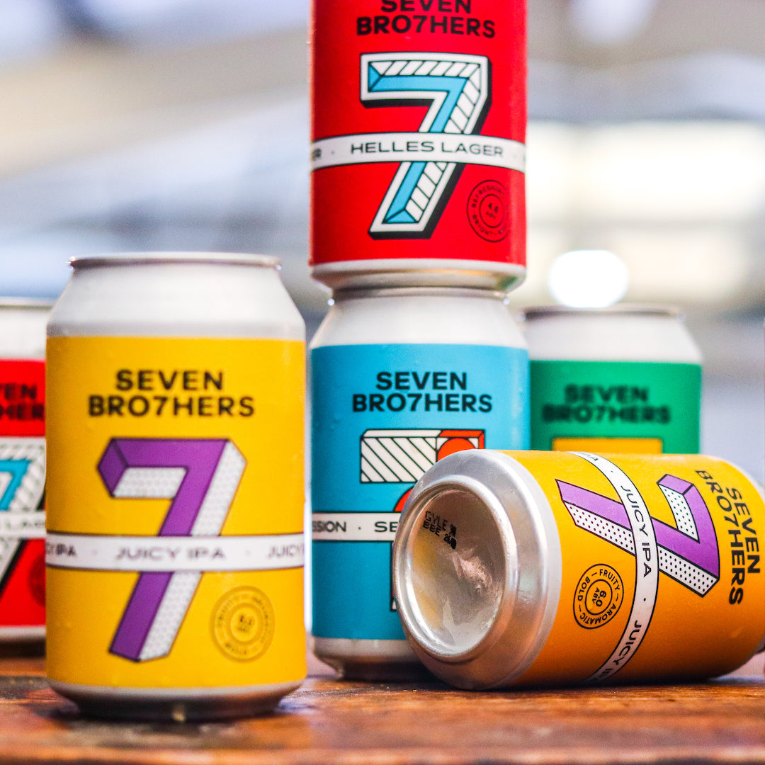
The image features several aluminum beverage cans with vibrant colors and distinct designs. Each can has a smooth, metallic surface with a glossy finish. The cans are cylindrical in shape with a standard pull-tab closure at the top. The labels are printed with bold graphics and text, showcasing various beer styles. The cans are stacked and positioned at different angles, creating a dynamic visual effect.

The packaging is a cylindrical aluminum can, prominently featuring a colorful design with a glossy finish. The can is adorned with vibrant graphics that include a mix of geometric patterns and bold colors, primarily in shades of red, green, and gold. The front label displays the brand name 'SEVEN BRO7HERS' in a large, stylized font, along with product details like 'CHOCOLATE HONEYCOMB STOUT'. The can's surface is smooth and shiny, indicating a high-quality print finish. The top of the can has a standard pull tab for opening, and the bottom is flat, typical for beverage cans. The overall design is eye-catching and aligns with contemporary branding trends.

The packaging consists of a flat, smooth construction made of single-layer paperboard. It features a rectangular shape with a clear plastic window that showcases the three cans inside. The exterior has a kraft brown color with vibrant, colorful graphics on the visible cans, including various patterns and designs. The edges are clean and precise, indicating a well-constructed folding carton. The packaging appears lightweight and is designed for retail display.

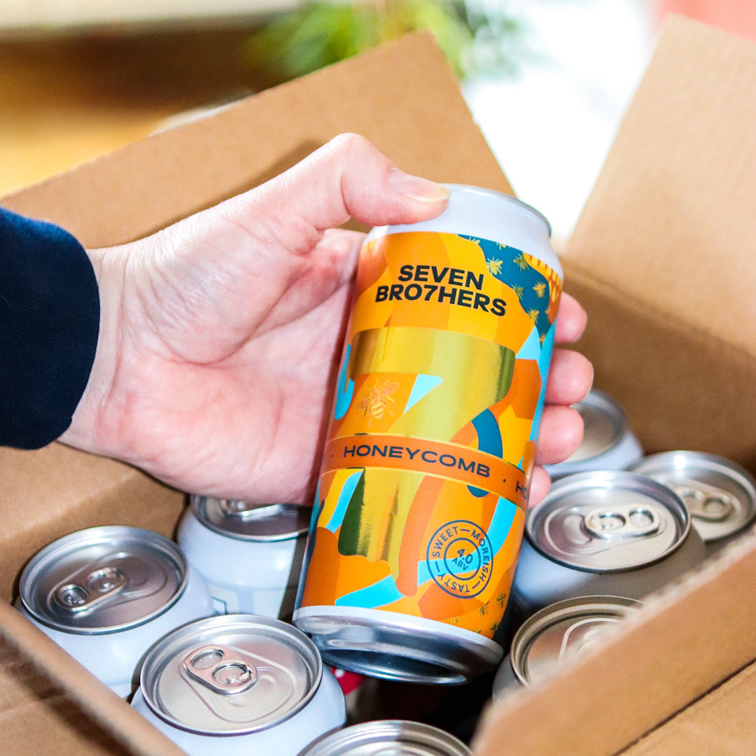
The image features six beverage cans, each with distinct colors and designs. The cans are cylindrical with a smooth surface and a metallic finish. They display vibrant colors such as orange, yellow, and blue, with bold graphics and text. The tops of the cans have standard pull-tab openings, and there are no visible fluted layers, indicating they are not corrugated. Each can features a prominent logo and product name, with some having additional design elements like patterns or illustrations.
The packaging is a brown corrugated box, showing visible fluted edges when viewed from the side. It contains multiple beverage cans, which are visible from the top. The box has a sturdy construction, suitable for shipping, and displays signs of handling, such as slight crushing on the edges. The exterior is primarily kraft brown, typical for corrugated boxes, and may have shipping tape or labels attached.
About the Brand
Seven Bro7hers Brewery is a Salford-based craft beer producer with a direct-to-consumer business model, prioritizing community engagement and quality through both their taproom and online sales channels.
Founded by seven siblings, the company focuses on delivering a diverse range of craft beers and branded merchandise. Their operational model emphasizes a combination of small-batch production and scalable e-commerce capabilities. Packaging is integral to their strategy, serving as both a functional logistics solution and a key brand touchpoint, with attention given to visual consistency and product differentiation.
Key Differentiator: The integration of a family-driven narrative with visually distinct, consumer-centric packaging positions Seven Bro7hers Brewery as a recognizable player in the UK craft beer segment.
Design System
Visual Style
Typography is bold and modern, typically using sans-serif fonts for enhanced readability. The color palette consists of vibrant, saturated hues paired with kraft brown neutrals, reflecting the brand's energetic and contemporary image. Overall, the aesthetic is playful and graphic-driven, with geometric motifs and pattern overlays.
Brand Identity
Logo usage is prominent on all packaging types, reinforced by consistent iconography and the recurring use of the 'SEVEN BRO7HERS' wordmark. Visual consistency is maintained through repeated color schemes and graphic styles across product lines, supporting immediate brand recognition.
Packaging Design
Material choices focus on recyclable aluminum for cans and paper-based substrates for secondary packaging. Structural design prioritizes protection for logistics (corrugated boxes) and shelf appeal for retail (windowed cartons), with clean lines and functional die-cuts.
User Experience
Packaging design is optimized for both visual engagement and practical usability, facilitating easy opening and product identification. The use of transparent windows and clear labeling enhances the customer journey from unboxing to consumption, aligning with the brand’s accessible and community-focused philosophy.
Company Metrics
Business insights for Seven Bro7hers Brewery based on available data
Market Positioning
Brand Values & Focus
Key Competitors
Target Market: UK-based and online craft beer consumers seeking authentic, small-batch experiences; includes both retail and direct e-commerce purchasers.
Packaging Assessment
Overall Grade
Visual appeal and presentation quality
Packaging durability and protection
Eco-friendliness and recyclable materials
Cost efficiency and value for money
Packaging assessment for Seven Bro7hers Brewery based on industry standards and best practices
Frequently Asked Questions
What materials does Seven Bro7hers Brewery use for beer packaging?
The company utilizes aluminum cans for primary beverage containment, complemented by single-layer paperboard cartons for retail and corrugated boxes for logistics and shipping.
How does the packaging design support the brand identity?
Packaging features bold colors, geometric patterns, and prominent brand logos, ensuring strong shelf presence and reinforcing the modern, vibrant brand image.
Is sustainability a focus in Seven Bro7hers Brewery's packaging?
While the use of recyclable aluminum cans and paper-based cartons indicates a degree of sustainability, there is limited evidence of advanced eco-friendly initiatives such as compostable materials or carbon-reduction measures.
Discover other Food & Drink companies
Explore more companies in the food & drink industry and their packaging strategies
PrepMyMeal
Food & Drink
PrepMyMeal is a food production company specializing in high-protein meal delivery services. They offer a variety of natural, nutritious meals designed for fitness enthusiasts and those seeking convenience in meal preparation.
ruf lebensmittelwerk kg
Food & Drink
RUF Lebensmittelwerk KG is a German food production company specializing in a variety of baking mixes and drink products. Founded in 1920, the company is known for its high-quality ingredients and innovative food solutions.
Terres de Café
Food & Drink
Terres de Café is a specialty coffee retailer based in Paris, France, known for its commitment to sustainability and high-quality coffee sourcing.