Sawade Berlin packaging
Sawade Berlin is a heritage confectionery brand specializing in premium chocolates, pralines, and truffles. Their packaging strategy leverages rigid boxes, metal tins, and retail cartons to reinforce a luxury gifting and unboxing experience aligned with artisanal quality standards.
Packaging Portfolio
Sawade Berlin employs a diverse packaging portfolio centered on rigid chipboard boxes, decorative metal tins, and single-layer carton boxes. Rigid formats offer enhanced protection and a tactile, premium feel, while metal tins provide reusability and strong gift appeal. Color palettes range from muted pastels to vibrant greens and corals, with consistent use of matte and glossy finishes. Packaging is structurally robust, often incorporating compartmentalized trays and paper liners for product separation and protection. Berlin-centric iconography and elegant typography reinforce brand identity across all retail and gift-oriented formats.

The packaging is a rectangular rigid box with a thick, sturdy construction. The exterior is a soft pink color with a glossy finish, while the interior is gold, providing a luxurious contrast. The box features a hinged lid that opens to reveal a tray holding individual chocolate pieces, each placed in its own paper cup. The edges are cleanly cut, and the box has a smooth surface with no visible fluted layers.
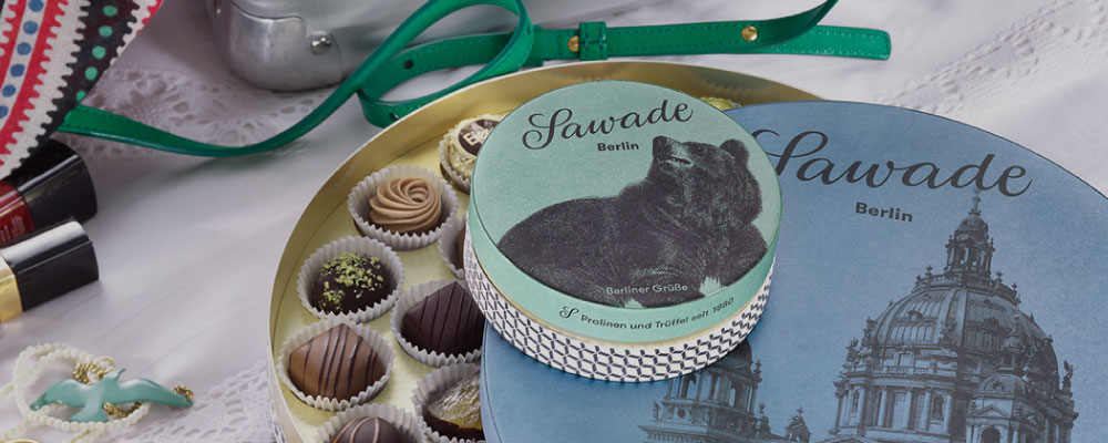
The packaging consists of a round, sturdy box made from thick chipboard material. The box features a decorative exterior with a matte finish, showcasing a soft color palette. The lid fits snugly on the base, indicating a premium construction. The overall design is elegant, with a smooth surface and clean edges.

The packaging consists of a premium green cylindrical box and a rectangular carton box. The cylindrical box has a smooth, matte finish with a vibrant green color, featuring a prominent logo and product name printed in elegant, cursive font. The rectangular carton box is kraft-colored with a clean, flat construction, showcasing a minimalist design. Both boxes are well-constructed, indicating a high-quality presentation suitable for luxury items.

The packaging is a rectangular box with a sturdy construction, featuring a thick chipboard material. The exterior is a smooth, matte finish in a soft coral color, with the brand name 'Sawade' elegantly printed in a dark, cursive font. The interior is lined with a gold-colored base, enhancing the luxurious appearance. The box opens from the top, revealing individual compartments for assorted chocolates, each placed in white paper liners. The overall design is sophisticated and premium, suitable for gifting.
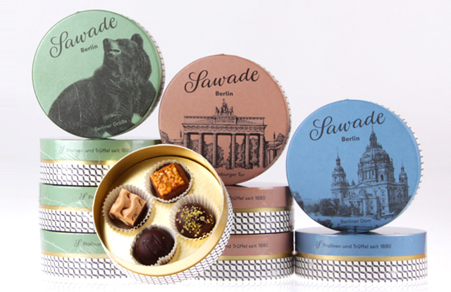
The packaging consists of round tin boxes with a sturdy construction. Each box features a smooth, metallic surface with a decorative printed design on the lid. The lids are flat and fit securely onto the base, providing a tight closure. The boxes are adorned with various colors and images, including illustrations of landmarks and a bear, indicative of the brand's connection to Berlin. The overall appearance is premium, suggesting a gift or luxury item.
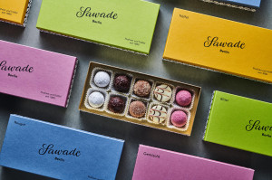
The packaging consists of several flat, rectangular boxes made from single-layer paperboard. Each box has a smooth, flat construction with clean edges and folds. The boxes are presented in various pastel colors, including blue, pink, yellow, and green, with a matte finish. The brand name 'Sawade' is prominently displayed in a stylish, cursive font, along with product names printed in a smaller, sans-serif font. The boxes are designed to hold assorted confectionery items, with one box showing a clear window revealing the contents inside. The overall aesthetic is modern and appealing, suitable for retail display.
About the Brand
Sawade Berlin operates in the premium confectionery segment, focusing on high-quality chocolates and pralines with a strong emphasis on Berlin heritage. The company utilizes sophisticated packaging formats to communicate quality and enhance the product's gifting appeal.
Operating since 1880, Sawade Berlin combines traditional chocolate-making expertise with contemporary design sensibilities in its packaging. The brand employs a range of rigid boxes, decorative tins, and pastel-colored cartons—each meticulously constructed to reflect luxury and ensure product protection. Packaging plays a central role in Sawade's market positioning, supporting both retail and corporate gifting channels.
Key Differentiator: Sawade Berlin differentiates itself through consistent use of premium, structurally robust packaging formats that enhance both shelf impact and the unboxing experience, emphasizing Berlin heritage and artisanal craftsmanship.
Design System
Visual Style
Typography primarily utilizes elegant, cursive script for the 'Sawade' brand name, paired with clean sans-serif fonts for product descriptions. The color palette features pastels (pink, blue, yellow, green), accented by deep greens and corals, with matte and occasional glossy finishes creating a refined, modern appearance.
Brand Identity
Logo usage is consistent across all packaging, prominently featuring the 'Sawade' script and Berlin references. Iconography includes local Berlin motifs (e.g., bears, landmarks). There is strong visual consistency in layout, color, and font usage, reinforcing brand recognition.
Packaging Design
Material selections prioritize rigid chipboard for structural integrity and visual impact, with metal tins for specialty gifting and paperboard cartons for retail. The design philosophy centers on creating durable, aesthetically pleasing formats that support both protection and premium positioning.
User Experience
Unboxing is designed to be emotionally engaging, with layered reveals, gold interiors, and individual product compartments enhancing the sense of luxury. The packaging supports the customer journey from initial purchase through gifting, maximizing perceived value and brand affinity.
Company Metrics
Business insights for Sawade Berlin based on available data
Market Positioning
Brand Values & Focus
Key Competitors
Target Market: Sawade Berlin targets premium chocolate consumers, gift shoppers, and corporate clients seeking artisanal confectionery with luxury presentation, primarily within Germany and select international markets.
Packaging Assessment
Overall Grade
Visual appeal and presentation quality
Packaging durability and protection
Eco-friendliness and recyclable materials
Cost efficiency and value for money
Packaging assessment for Sawade Berlin based on industry standards and best practices
Frequently Asked Questions
What packaging materials does Sawade Berlin primarily use?
Sawade Berlin predominantly uses rigid chipboard boxes, decorative metal tins, and high-quality paperboard cartons to ensure product protection and deliver a premium unboxing experience.
How does Sawade Berlin's packaging support its brand identity?
The packaging features elegant typography, pastel color palettes, and Berlin-inspired iconography, ensuring strong brand visibility and a cohesive luxury aesthetic across all formats.
Is Sawade Berlin's packaging environmentally sustainable?
While the packaging demonstrates high-quality materials and reusability (notably in tins and rigid boxes), there is limited evidence of explicit eco-certifications or use of recycled content, indicating moderate sustainability performance typical for luxury confectionery brands.
Discover other Food & Drink companies
Explore more companies in the food & drink industry and their packaging strategies
PrepMyMeal
Food & Drink
PrepMyMeal is a food production company specializing in high-protein meal delivery services. They offer a variety of natural, nutritious meals designed for fitness enthusiasts and those seeking convenience in meal preparation.
ruf lebensmittelwerk kg
Food & Drink
RUF Lebensmittelwerk KG is a German food production company specializing in a variety of baking mixes and drink products. Founded in 1920, the company is known for its high-quality ingredients and innovative food solutions.
Teegschwendner GmbH
Food & Drink
Teegschwendner GmbH is a specialty tea company based in Germany, offering a wide selection of high-quality teas and tea-related accessories. They focus on providing unique tea experiences through carefully sourced and curated products.