Santaverde packaging
Santaverde is a natural skincare brand specializing in aloe vera-based formulations and vegan cosmetics. Their packaging strategy centers on minimalist, functional designs with an emphasis on sustainability and brand clarity.
Packaging Portfolio
Santaverde’s packaging portfolio consists chiefly of matte-finish plastic cosmetic tubes and upright folding cartons fabricated from single-layer paperboard. These solutions are optimized for retail display, product protection, and user convenience, utilizing clean structural designs with minimal excess material. The packaging emphasizes clarity, recyclability, and alignment with sustainability standards, while supporting visual consistency across product lines. The use of lightweight materials and compact formats also contributes to efficient logistics and reduced environmental footprint.
The packaging is a cylindrical tube made of plastic, designed for dispensing cream. It has a smooth surface with a matte finish, predominantly white in color. The tube features a flip-top cap at the bottom for easy access to the product. The design is minimalistic, with the brand name 'SANTAVERDE' prominently displayed in a bold, purple font on the front, along with product information in smaller text. There are no visible graphics or images, maintaining a clean aesthetic.
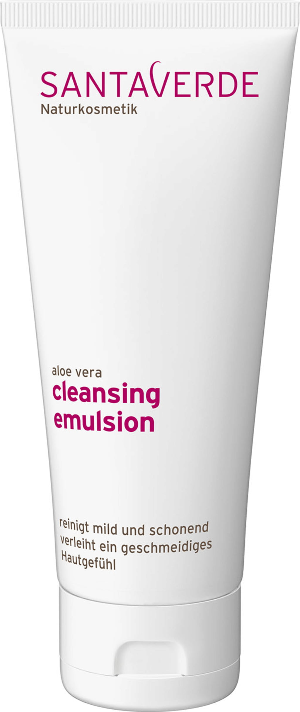
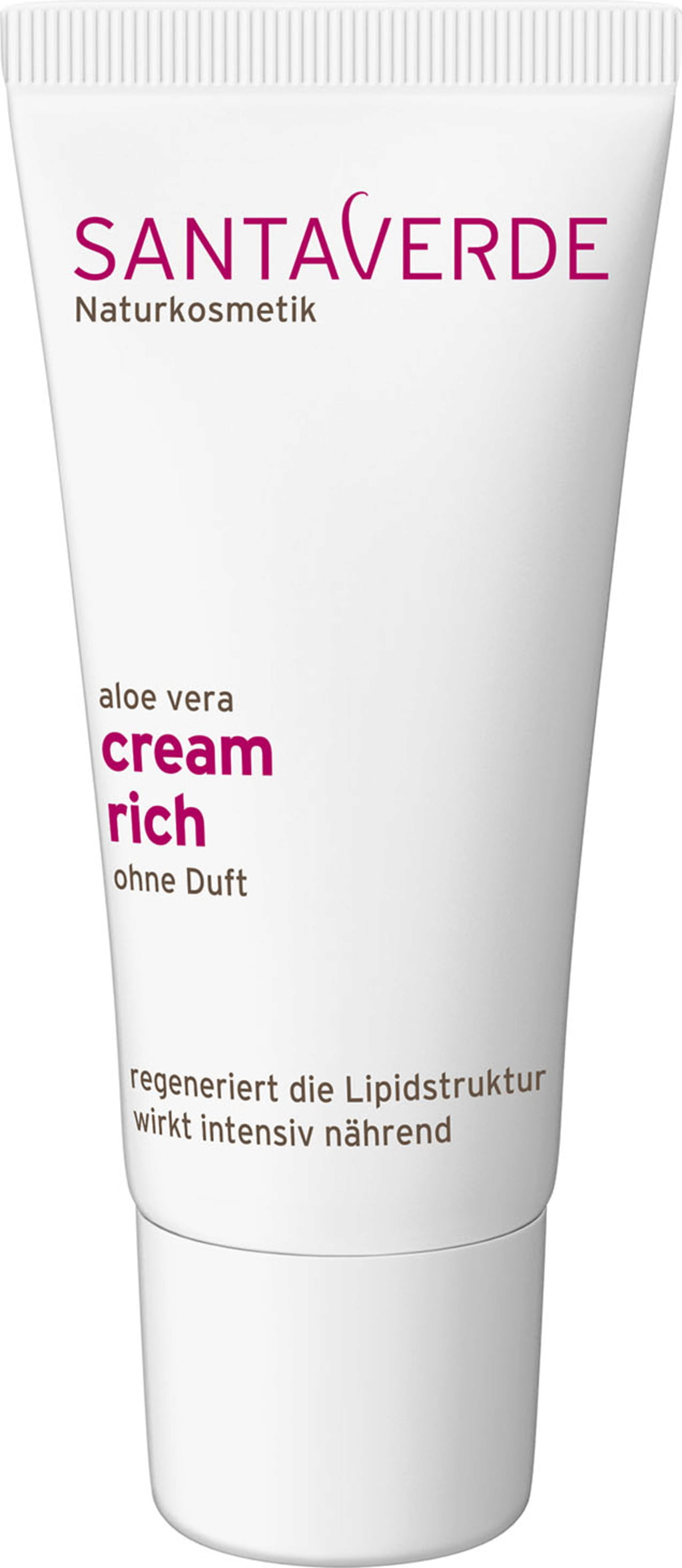
The packaging is a squeezable tube made of a flexible plastic material, featuring a cylindrical shape that tapers slightly toward the opening. The tube has a smooth surface with a matte finish, predominantly white in color. The front displays the product name in bold, pink lettering, with the brand name 'SANTAVERDE' prominently placed at the top in uppercase letters. The overall design is minimalist and clean, emphasizing the product's natural and gentle qualities.
The packaging is a slender, upright carton box designed for retail display. It features smooth, flat construction without any visible fluted layers, indicating it is made from single-layer paperboard. The box has a clean, precise edge and fold, with a matte finish that gives it a sophisticated appearance. The color is a soft, muted cream, enhancing its aesthetic appeal for cosmetic products. The front of the box prominently displays the product name and brand in a clear, modern font, while the sides contain additional product information and instructions.
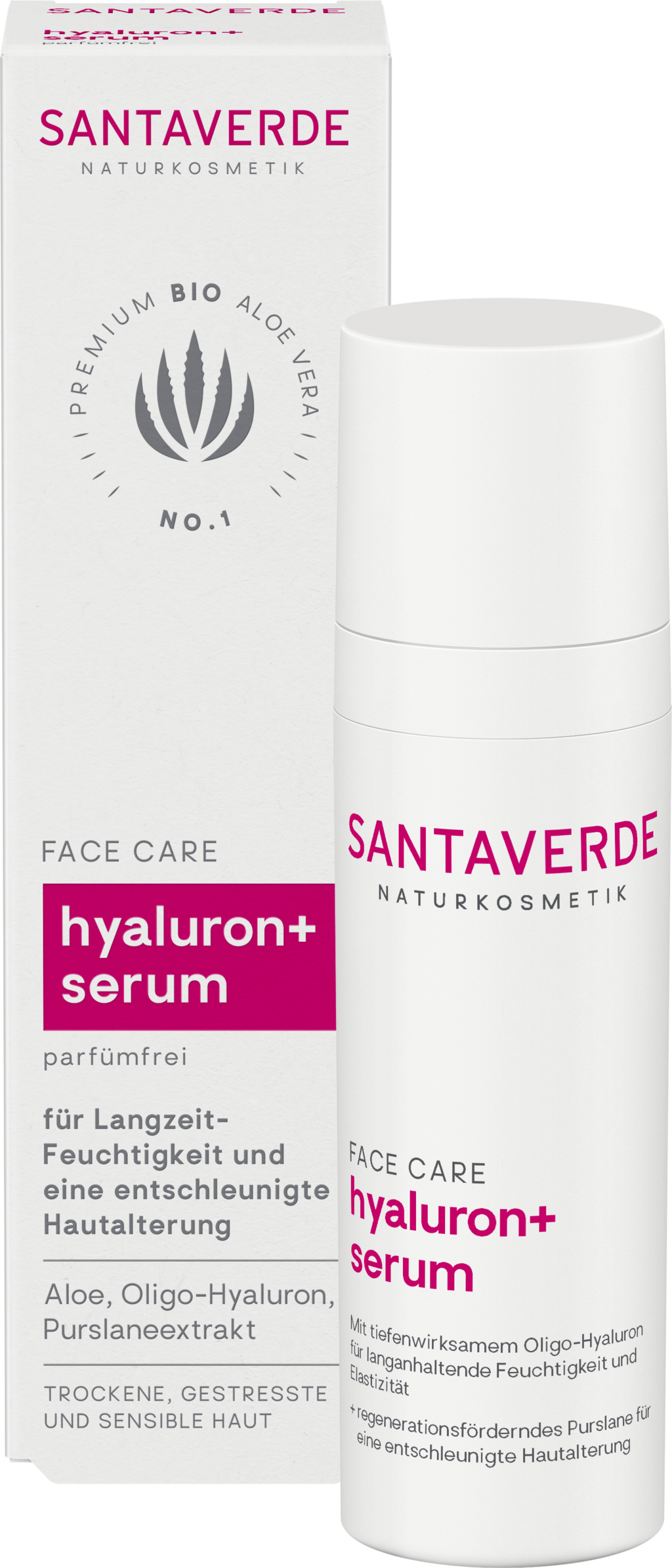
The packaging is a rectangular folding carton made of smooth, flat paperboard. It features clean edges and precise folds, typical of retail packaging. The exterior is predominantly white with colorful graphics and text. The front displays the product name 'hyaluron+ serum' prominently, along with the brand name 'SANTAVERDE' in a bold font. There are additional details in smaller text about the product's benefits and ingredients. The overall design is sleek and modern, appealing to a cosmetic market.
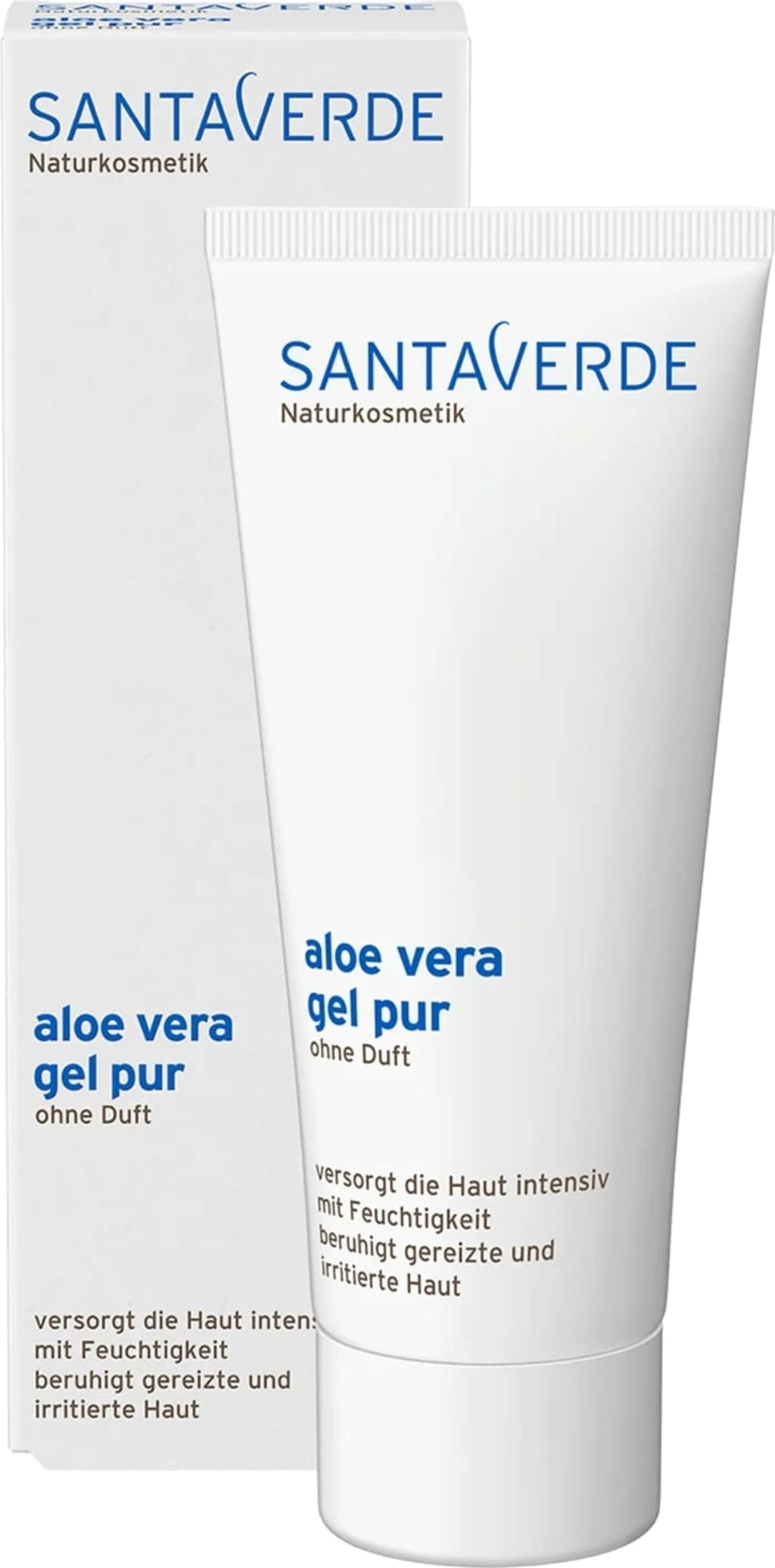
The packaging consists of a smooth, flat construction made from single-layer paperboard. It features precise edges and folds, with a predominantly white exterior and blue text. The box is designed to hold a tube of aloe vera gel, indicating its use for retail display. The overall appearance is clean and modern, suitable for cosmetic products.
About the Brand
Santaverde operates in the premium segment of the natural cosmetics market, producing skincare products that leverage organic aloe vera as a core ingredient. Their packaging reflects a commitment to clean aesthetics, product integrity, and ethical standards.
The company's packaging consistently utilizes matte-finished cosmetic tubes and single-layer paperboard cartons, prioritizing ease of use, clear product communication, and protection. The visual identity is cohesive, aligning with Santaverde’s focus on purity and natural beauty while supporting their direct-to-consumer business model. Sustainability considerations are evident, though packaging materials are primarily plastic and paperboard, with a focus on recyclability and minimalism.
Key Differentiator: Santaverde uniquely integrates hand-harvested, organic aloe vera juice from their own farm not only into product formulations but also into their branding and packaging, emphasizing authenticity and traceability.
Design System
Visual Style
Santaverde employs a minimalistic visual approach with ample white space, sans-serif typography, and restrained use of accent colors (purples, blues, and soft creams) to distinguish product variants. The aesthetic is modern, emphasizing simplicity and purity.
Brand Identity
The brand identity is reinforced through prominent, consistent logo placement and uniform typographic hierarchy. Product names and descriptors are clearly displayed, with minimal iconography to maintain a clean presentation. Visual consistency is achieved through repeated color usage and layout structure.
Packaging Design
Material selection prioritizes recyclable plastics for tubes and paperboard for cartons, reflecting a balance between product protection and sustainability. Structural designs are straightforward, focusing on ease of use, storage, and efficient shipping. Secondary packaging is minimized.
User Experience
The design system supports the customer journey by delivering a clear, uncluttered unboxing experience. Packaging facilitates straightforward product identification, easy dispensing, and a premium tactile feel, reinforcing the brand’s commitment to natural beauty and responsible practices.
Company Metrics
Business insights for Santaverde based on available data
Market Positioning
Brand Values & Focus
Key Competitors
Target Market: Eco-conscious consumers seeking premium, vegan, and natural skincare solutions; primarily direct-to-consumer buyers in Europe with an interest in sustainability and ingredient traceability.
Packaging Assessment
Overall Grade
Visual appeal and presentation quality
Packaging durability and protection
Eco-friendliness and recyclable materials
Cost efficiency and value for money
Packaging assessment for Santaverde based on industry standards and best practices
Frequently Asked Questions
What packaging materials does Santaverde use for its skincare products?
Santaverde primarily utilizes plastic cosmetic tubes for creams and emulsions, paired with retail-ready single-layer paperboard cartons. The materials are chosen for product protection, display appeal, and recyclability.
How does Santaverde's packaging strategy support sustainability?
Santaverde employs minimalist designs, predominantly recyclable materials, and avoids excess packaging. This approach reduces environmental impact while maintaining product integrity and presentation.
What is the visual style of Santaverde’s packaging?
The visual style is minimal, clean, and predominantly white, featuring bold typography and subtle color accents that reflect product lines and ingredients.
Who are Santaverde’s main competitors in natural skincare packaging?
Key competitors include Dr. Hauschka, Weleda, Lavera, Annemarie Börlind, and Primavera.
Discover other Beauty & Fitness companies
Explore more companies in the beauty & fitness industry and their packaging strategies
Cultiv Cosmetique
Beauty & Fitness
Cultiv Cosmetique is a French skincare brand that provides organic and eco-friendly beauty products inspired by nature. They focus on effective skincare solutions for various skin concerns.
Pure Altitude
Beauty & Fitness
Pure Altitude specializes in high-quality beauty and skincare products that leverage the expertise of spa treatments to enhance daily routines. The brand offers a diverse range of products tailored for both facial and body care.
Owari
Beauty & Fitness
Owari specializes in 100% natural beauty and fitness products, designed to enhance health and wellness. The company proudly offers its products made in France, emphasizing quick delivery and customer support.