Sampar Paris packaging
Sampar Paris is a French skincare brand specializing in innovative beauty solutions with a strong emphasis on hydration and radiance. Their packaging strategy centers on premium folding carton boxes with distinct visual branding, designed for both retail display and direct-to-consumer fulfillment.
Packaging Portfolio
Sampar Paris employs a portfolio of custom folding carton boxes constructed from single-layer, glossy-finished paperboard. These cartons are engineered for retail shelf appeal and e-commerce compatibility, featuring clean edges, precise folds, and occasional die-cut windows for product visibility. The packaging consistently incorporates brand-specific colors (pink, white, black), bold typographic treatments, and thematic graphics—such as city skylines or travel motifs—to enhance consumer engagement and reinforce product narratives. Multilingual product information and ingredient listings support international distribution requirements.
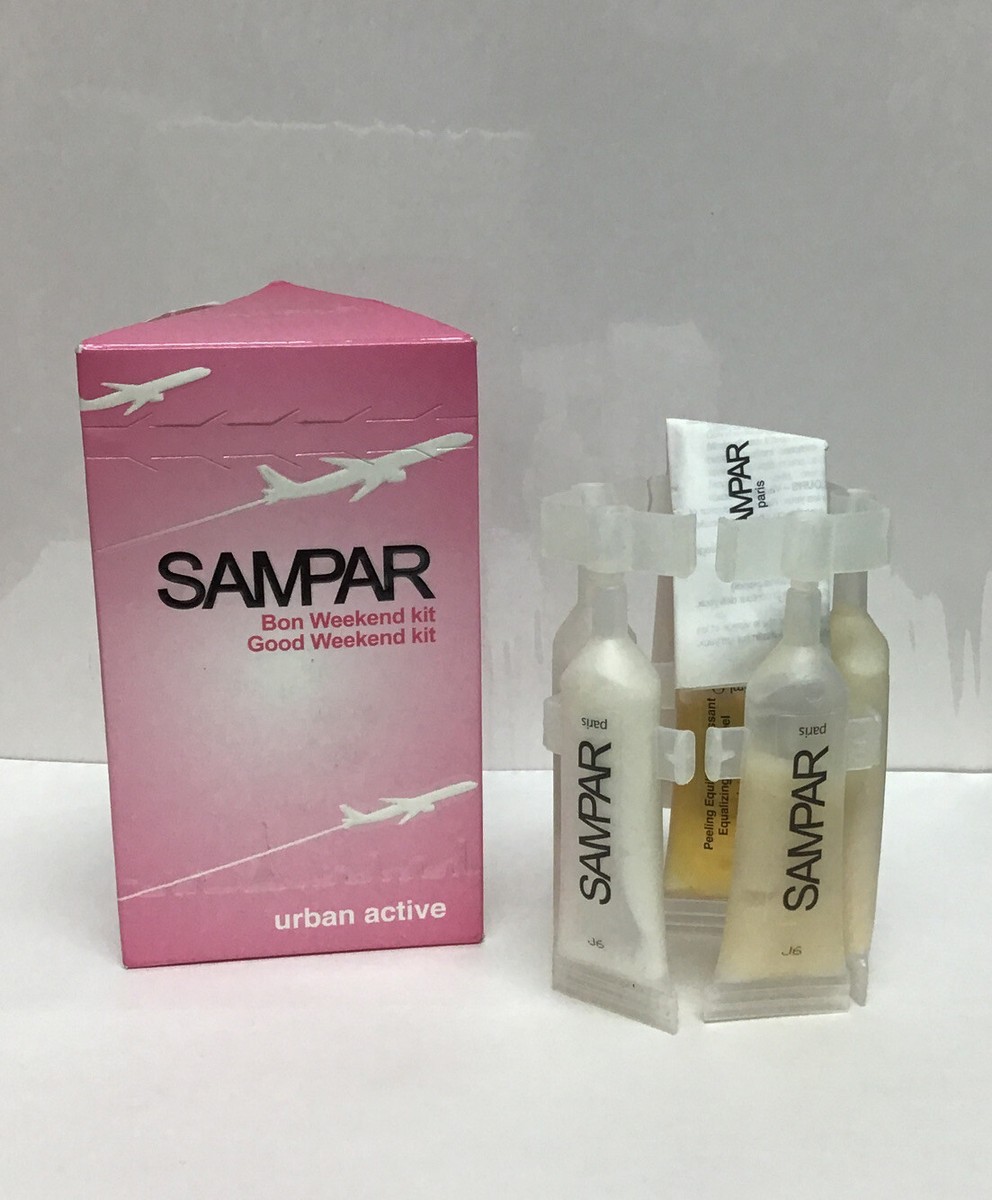
The packaging consists of a folding carton box that is primarily pink with white graphics. The box features a smooth, flat construction without any visible fluted layers, indicating it is made from single-layer paperboard. The front of the box displays the brand name 'SAMPAR' prominently in a bold font, along with the product name 'Bon Weekend Kit' and the tagline 'Good Weekend Kit'. The design includes airplane graphics, suggesting a travel theme. The box has clean edges and precise folds, typical of retail packaging. Inside, there are three transparent vials containing product samples, which are arranged neatly.
The packaging consists of a smooth, flat construction with clean edges and folds. The exterior is predominantly white with a glossy finish, featuring a pink and black design. The front displays the brand name 'SAMPAR' prominently, along with product information and a stylized graphic of a city skyline at the bottom. The box has a rectangular shape with a top flap that folds down to close.
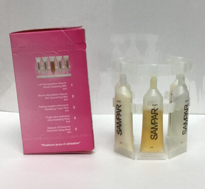
The packaging consists of a rectangular folding carton made from a single layer of paperboard. The exterior features a vibrant pink color with glossy finish, while the interior is white. The carton has a smooth surface with clean edges and precise folds. The front displays a clear window showcasing the product inside, which consists of several small tubes. The back of the carton contains product information, including usage instructions and a list of included items. The overall construction is lightweight and designed for retail display.

The packaging consists of a flat, smooth, single-layer paperboard structure. It features a pink exterior with a glossy finish, displaying a clean and precise design. The edges are well-defined, and the folds are neat, indicating a well-constructed folding carton. The front of the packaging prominently displays the brand name 'SANPAR' in bold, black lettering, along with product information and graphics that suggest a cosmetic or skincare product.

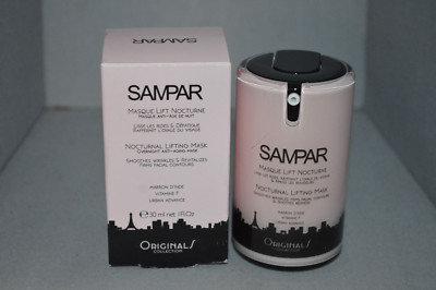
The packaging is a folding carton made of single-layer paperboard, featuring a smooth, flat construction without any visible fluted layers. The exterior is predominantly pink with white graphics and text. The edges are clean and precise, indicating high-quality manufacturing. The carton is designed to hold a beauty product, likely a mask, as suggested by the graphics and text on the back. There are instructions on how to use the product in both English and French, along with ingredient information.

The packaging is a folding carton made of smooth, flat paperboard. It features clean edges and folds, with a predominantly white exterior and pink accents. The front displays the brand name 'SAMPAR' prominently, along with product information and a graphic element suggesting a city skyline at the bottom. The overall design is sleek and modern, typical for cosmetic retail packaging.
About the Brand
Sampar Paris operates in the premium skincare segment, offering a range of products that leverage advanced formulations and distinctive French-Korean ingredient sourcing. The company utilizes visually consistent, custom-designed folding cartons as its primary packaging format.
Founded in 2004 and based in Paris, Sampar Paris has built a reputation for quality and customer satisfaction through a direct-to-consumer model. Packaging decisions are closely aligned with brand positioning, focusing on a high-end unboxing experience and consistent visual communication across product lines. The small team structure enables agile adaptation to seasonal trends and consumer preferences, with packaging playing a key role in product differentiation.
Key Differentiator: Sampar’s packaging stands out through cohesive branding, modern design, and a tactile unboxing experience that reinforces its premium positioning in the beauty industry.
Design System
Visual Style
Modern typography with bold sans-serif fonts; primary color palette of pink, white, and black; glossy finishes for heightened shelf presence; minimalist layouts with strong geometric alignment.
Brand Identity
Prominent logo placement on all packaging faces; use of consistent iconography and cityscape motifs; high visual uniformity across SKUs for immediate brand recognition.
Packaging Design
Preference for recyclable paperboard materials; folding carton structures optimized for lightweight protection and efficient storage; window cutouts used selectively for product display; emphasis on precision in folds and edges.
User Experience
Packaging is designed for tactile, visually impactful unboxing, with easy-open flaps and clear information hierarchy. The approach supports a premium brand perception and guides users seamlessly from purchase to product use, enhancing overall satisfaction and repeat engagement.
Company Metrics
Business insights for Sampar Paris based on available data
Market Positioning
Brand Values & Focus
Key Competitors
Target Market: Premium skincare consumers in France and international D2C e-commerce shoppers seeking effective, well-branded beauty solutions.
Packaging Assessment
Overall Grade
Visual appeal and presentation quality
Packaging durability and protection
Eco-friendliness and recyclable materials
Cost efficiency and value for money
Packaging assessment for Sampar Paris based on industry standards and best practices
Frequently Asked Questions
What types of packaging materials does Sampar Paris use?
Sampar Paris primarily utilizes high-quality, single-layer paperboard folding cartons with glossy finishes for its skincare and cosmetic products. These materials are chosen for their printability, durability, and suitability for retail and e-commerce channels.
How does Sampar Paris ensure packaging aligns with its brand identity?
All cartons feature a consistent pink-and-white color palette, bold logo placement, and modern graphic motifs, creating strong visual alignment across product lines and reinforcing the brand’s luxury skincare positioning.
Is sustainability a consideration in Sampar Paris packaging?
While the primary packaging material—paperboard—offers recyclability, there is limited evidence of advanced eco-friendly initiatives such as the use of recycled content or certifications. Environmental impact is moderate relative to industry standards.
Discover other Beauty & Fitness companies
Explore more companies in the beauty & fitness industry and their packaging strategies
Owari
Beauty & Fitness
Owari specializes in 100% natural beauty and fitness products, designed to enhance health and wellness. The company proudly offers its products made in France, emphasizing quick delivery and customer support.
Cultiv Cosmetique
Beauty & Fitness
Cultiv Cosmetique is a French skincare brand that provides organic and eco-friendly beauty products inspired by nature. They focus on effective skincare solutions for various skin concerns.
Pure Altitude
Beauty & Fitness
Pure Altitude specializes in high-quality beauty and skincare products that leverage the expertise of spa treatments to enhance daily routines. The brand offers a diverse range of products tailored for both facial and body care.