Saint James packaging
Saint James is a Hamilton-based food and coffee establishment focused on locally sourced, high-quality offerings. Their packaging strategy leverages a mix of retail-ready beverage cartons and premium rigid boxes, reflecting a strong emphasis on brand consistency and product presentation.
Packaging Portfolio
Saint James’s packaging portfolio is characterized by the use of recyclable paperboard beverage cartons (Tetra Pak and similar formats) and rigid chipboard boxes for premium products. These solutions provide a balance of structural integrity and shelf impact, supporting both the logistical needs of beverage distribution and the experiential demands of specialty product gifting. Consistent use of clean, glossy finishes and color-coded flavor differentiation enhances brand recognition. Material choices reflect a prioritization of sustainability, while the packaging structures are optimized for both retail display and safe transport.

The packaging is a tall, rectangular rigid box with a premium finish. The exterior is predominantly black with a glossy texture, featuring embossed elements and a vibrant orange window that showcases the product inside. The box has a clean, elegant design with sharp edges and a sturdy construction, indicative of high-quality chipboard material. The top of the box has a slight overhang, creating a sophisticated look.

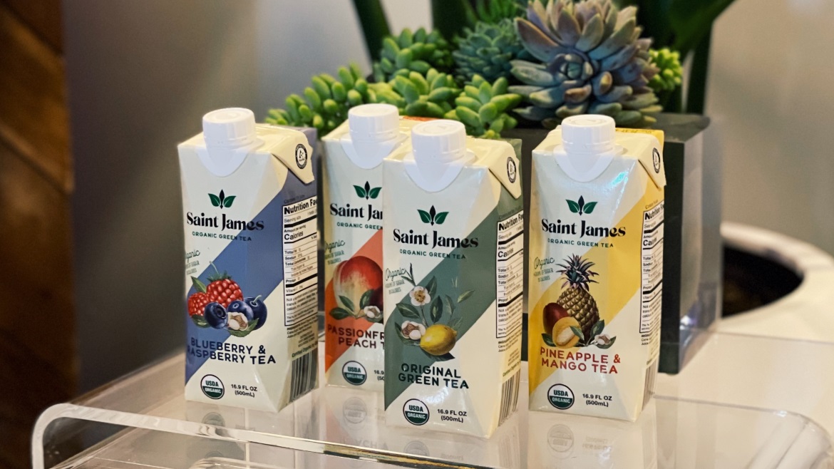
The packaging consists of three individual beverage cartons, each with a smooth, flat construction made from single-layer paperboard. The cartons are rectangular in shape and feature clean, precise edges and folds. Each carton has a glossy finish, enhancing visual appeal. The top of the cartons is designed for easy pouring, with a screw cap closure. The overall design is vibrant and colorful, featuring images of fruits and clear labeling.
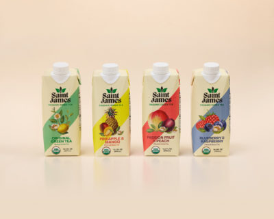
The packaging consists of four beverage cartons, each with a rectangular shape and a tapered top featuring a screw cap. The cartons are made of a smooth, single-layer paperboard with a glossy finish. Each carton has a distinct color scheme and graphics representing different flavors of tea. The edges are clean and precise, with no visible fluted layers, indicating they are not corrugated. The overall appearance is lightweight and suitable for retail display.

The packaging consists of multiple beverage cartons, each featuring a smooth, flat construction typical of folding cartons. The cartons are primarily white with colorful graphics representing different flavors. The edges are clean and precise, indicating a well-manufactured product. Each carton has a spout for pouring, which is a common feature for liquid packaging.
The packaging consists of rectangular, upright cartons with a smooth, flat construction. Each carton features a spout at the top for easy pouring. The cartons are predominantly white with vibrant colors representing the flavors, and they have a glossy finish that enhances the visual appeal. The edges are clean and precise, indicative of high-quality folding carton construction.

The packaging is a Tetra Pak-style beverage carton with a smooth, flat construction. It features a rectangular shape with a tapered top and a screw cap closure. The exterior is predominantly white with vibrant graphics depicting mangoes and flowers, suggesting a tropical theme. The carton has a matte finish with a slight sheen in areas where the graphics are printed. The edges are clean and precise, indicative of high-quality manufacturing.
About the Brand
Saint James operates within the food and beverage sector, specializing in both in-restaurant dining and retail beverage products. Their packaging portfolio predominantly utilizes single-layer paperboard cartons (Tetra Pak-style) and luxury rigid boxes, aligning with a premium yet sustainable brand image.
With a focus on community engagement and a commitment to locally sourced ingredients, Saint James employs packaging that balances visual appeal, product safety, and environmental considerations. Their designs consistently integrate brand elements such as the Saint James logo and organic certification symbols, supporting a cohesive retail and on-premise experience. The use of recyclable materials and clear flavor differentiation positions Saint James competitively in the regional market.
Key Differentiator: Saint James distinguishes itself through a combination of community-focused branding and consistent, visually engaging packaging formats that emphasize organic and locally sourced messaging.
Design System
Visual Style
The visual design system employs modern sans-serif typography, a predominantly white and neutral color palette with vibrant accent colors denoting flavors, and a clean, minimalist aesthetic. Glossy and matte finishes are strategically used to elevate perceived quality.
Brand Identity
Saint James’s branding is anchored by a bold, easily recognizable logo, consistent iconography for organic certifications, and disciplined placement of brand and product elements. Visual consistency is maintained across all SKUs, reinforcing brand cohesion.
Packaging Design
Material selection prioritizes recyclable single-layer paperboard for cartons and high-quality rigid chipboard for specialty boxes. Structural design emphasizes clean lines, functional closures (screw caps, spouts), and retail-ready formats with high print fidelity for flavor differentiation.
User Experience
The design system supports user experience by facilitating easy identification of flavors, secure product handling, and an appealing unboxing process that aligns with the brand’s premium positioning and community-focused values.
Company Metrics
Business insights for Saint James based on available data
Market Positioning
Brand Values & Focus
Key Competitors
Target Market: Local consumers in Hamilton, Ontario seeking premium food and beverage experiences, with a focus on quality, sustainability, and community connection.
Packaging Assessment
Overall Grade
Visual appeal and presentation quality
Packaging durability and protection
Eco-friendliness and recyclable materials
Cost efficiency and value for money
Packaging assessment for Saint James based on industry standards and best practices
Frequently Asked Questions
What types of packaging does Saint James use for its beverages?
Saint James primarily utilizes Tetra Pak-style beverage cartons for retail drinks and premium rigid boxes for specialty products, both of which support product protection and visual branding.
How sustainable are Saint James's packaging materials?
The majority of Saint James's packaging is recyclable paperboard, with an emphasis on minimizing environmental impact, though the use of mixed materials in some rigid boxes may affect overall recyclability.
Does the packaging design support Saint James’s brand identity?
Yes, the packaging consistently incorporates the Saint James logo, color-coded flavor schemes, and organic certification marks, maintaining strong visual alignment with the brand’s values.
Discover other Food & Drink companies
Explore more companies in the food & drink industry and their packaging strategies
ruf lebensmittelwerk kg
Food & Drink
RUF Lebensmittelwerk KG is a German food production company specializing in a variety of baking mixes and drink products. Founded in 1920, the company is known for its high-quality ingredients and innovative food solutions.
PrepMyMeal
Food & Drink
PrepMyMeal is a food production company specializing in high-protein meal delivery services. They offer a variety of natural, nutritious meals designed for fitness enthusiasts and those seeking convenience in meal preparation.
Terres de Café
Food & Drink
Terres de Café is a specialty coffee retailer based in Paris, France, known for its commitment to sustainability and high-quality coffee sourcing.