Roberto Verino packaging
Roberto Verino specializes in premium apparel and accessories, employing packaging solutions that focus on visual elegance and brand reinforcement. Their packaging approach emphasizes luxury materials and refined structural formats to deliver a cohesive brand experience.
Packaging Portfolio
Roberto Verino deploys a packaging portfolio centered on high-quality carton boxes and rigid boxes, particularly for fragrances and accessories. The materials used are predominantly single-layer paperboard and sturdy rigid board, offering both visual elegance and structural protection. The packaging formats include rectangular and square boxes, with finishes such as gloss, matte, and selective foil stamping to elevate perceived value. Branding is executed through minimalist typography and restrained use of logos, enabling strong shelf appeal and a consistent luxury presence across both retail and e-commerce channels.
The packaging is a smooth, flat construction without any visible fluted layers, indicating it is made from single-layer paperboard. The box features clean, precise edges and folds, typical of retail packaging. The exterior is predominantly white with a glossy finish, giving it a premium appearance. The front displays the product name 'EAU DE VERINO' in elegant gold lettering, while the brand name 'ROBERTO VERINO' is also present, contributing to a luxurious feel. The overall shape is rectangular, designed to hold a fragrance bottle securely.
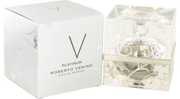
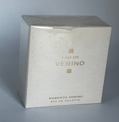
The packaging features a thick, sturdy construction typical of rigid boxes, with a premium appearance. The box is primarily white with intricate silver floral patterns embossed on the surface, giving it a luxurious feel. The lid is separate from the base, allowing for easy opening and closing. The box has clean, precise edges and a smooth finish, indicative of high-quality materials. The overall shape is square, designed to hold a perfume bottle securely.

The packaging features a tall, rectangular box with a thick, sturdy construction. The exterior is predominantly black with a glossy finish, showcasing a minimalist design. The front displays a prominent 'W' logo in red, accompanied by the brand name 'ROBERTO VERINO' in white, positioned below the logo. The box has clean, precise edges and corners, indicating high-quality craftsmanship. The top of the box is open, revealing a transparent plastic cap that covers the fragrance bottle inside.
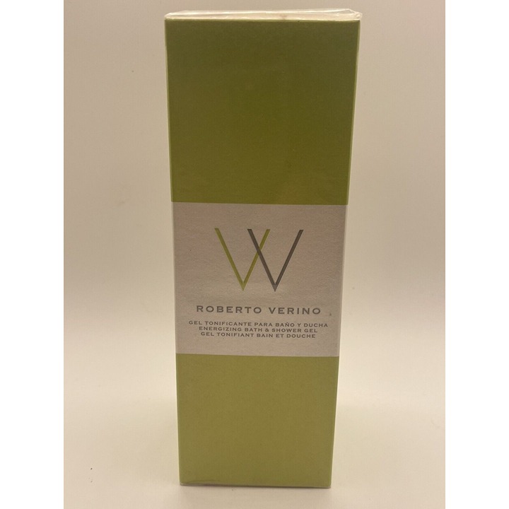
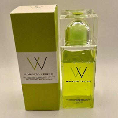
The packaging is a tall, slender box with a smooth, flat construction. It features a clean design with a predominantly green exterior and a white band around the middle. The box has precise edges and folds, indicative of a folding carton. The surface appears to have a matte finish, giving it a refined look. The front displays the brand name 'ROBERTO VERINO' in a modern font, along with product information.
The packaging consists of a tall, rectangular carton box with a smooth, flat construction. The box is primarily white with a glossy finish, featuring a vibrant green color accent at the top. The edges are clean and precise, indicative of high-quality paperboard. The front of the box displays the brand name 'ROBERTO VERINO' prominently in a bold font, accompanied by a stylized 'W' logo. The overall design is modern and minimalistic, appealing to a luxury market.
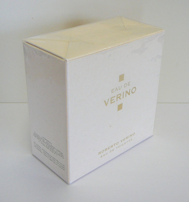
The packaging is a square-shaped box with thick walls, indicative of a rigid box construction. The exterior is a smooth, white paperboard with a subtle texture, giving it a premium appearance. The top flap is slightly raised, suggesting a magnetic closure or a tuck flap. The box features minimalistic gold foil text that reads 'EAU DE VERINO' prominently on the front, with 'ROBERTO VERINO' and 'EAU DE TOILETTE' printed below in smaller font. The overall design is elegant and sophisticated, aligning with luxury fragrance packaging.
About the Brand
Roberto Verino is a Spanish fashion brand recognized for its quality-driven apparel and accessories collections. The company strategically utilizes packaging to reinforce its premium positioning and support its retail and e-commerce channels.
Founded in 1982 and headquartered in Ourense, Spain, Roberto Verino serves a diverse clientele through both physical stores and a robust e-commerce platform. The brand's packaging is characterized by the use of luxury cartons and rigid boxes, often featuring minimalist branding and high-end finishes. This approach aligns with the company’s focus on timeless design, quality craftsmanship, and a seamless consumer experience.
Key Differentiator: Consistent use of luxury rigid and carton packaging with minimalist branding to reinforce a premium, high-authenticity market position.
Design System
Visual Style
The visual design emphasizes minimalism, with clean sans-serif typography and a restrained color palette featuring whites, blacks, metallic golds, silvers, and occasional accent greens. The aesthetic is modern and understated, reinforcing a luxury positioning.
Brand Identity
Logo usage is deliberate and consistent, often paired with a stylized 'W' or 'V' iconography. Brand and product names are placed prominently but with subtlety, supporting high recognizability without overwhelming the packaging. Visual consistency is maintained through uniform alignment, color usage, and high-quality print finishes.
Packaging Design
Material selection prioritizes smooth, premium paperboards and rigid boards for enhanced product protection and tactile quality. Structural design favors clean lines, sharp edges, and secure closures such as magnetic flaps or fitted lids, reflecting an emphasis on both durability and refined presentation.
User Experience
The unboxing process is crafted to elicit a sense of anticipation and luxury, with easy-open features and layered reveals. Branding elements guide the consumer journey from initial visual contact to product access, reinforcing both tactile and emotional engagement with the Roberto Verino brand.
Company Metrics
Business insights for Roberto Verino based on available data
Market Positioning
Brand Values & Focus
Key Competitors
Target Market: Fashion-conscious consumers seeking premium apparel and accessories in Spain and international e-commerce markets.
Packaging Assessment
Overall Grade
Visual appeal and presentation quality
Packaging durability and protection
Eco-friendliness and recyclable materials
Cost efficiency and value for money
Packaging assessment for Roberto Verino based on industry standards and best practices
Frequently Asked Questions
What types of packaging does Roberto Verino use for its products?
Roberto Verino primarily utilizes high-quality carton boxes and rigid boxes, particularly for fragrance and accessory products. The packaging features premium materials, elegant finishes, and consistent brand elements.
How does Roberto Verino’s packaging strategy support its brand identity?
The packaging incorporates minimalist design, subtle color palettes, and precise typography to reflect the brand's luxury positioning and commitment to authenticity. Consistent logo placement and material quality support a cohesive and elevated unboxing experience.
Is sustainability a focus in Roberto Verino’s packaging?
While the brand uses recyclable carton and paperboard materials, there is limited public evidence of advanced sustainability initiatives such as post-consumer recycled content or fully compostable solutions.
Discover other Apparel companies
Explore more companies in the apparel industry and their packaging strategies
Alexander Shorokhoff
Apparel
Alexander Shorokhoff is a luxury watch manufacturer that specializes in creating unique and artistic timepieces. Their products blend traditional craftsmanship with modern designs, appealing to discerning customers worldwide.
ALTI
Apparel
ALTI specializes in unique, handcrafted silver jewelry designed by skilled artisans in Sweden. The company offers a range of customizable options and promotes a tranquil lifestyle through its jewelry collections.
Compressport International
Apparel
Compressport International specializes in high-end compression garments and sports accessories designed for athletes. Founded in 2008 and based in Geneva, Switzerland, the company caters to the needs of trail runners, triathletes, and other fitness enthusiasts.