Reishunger packaging
Reishunger specializes in premium rice, pasta, and cooking accessories, delivering food products directly to consumers with a strong focus on quality and culinary inspiration. Their packaging approach utilizes branded, modern materials designed to reinforce product freshness, visual appeal, and a consistent brand identity.
Packaging Portfolio
Reishunger’s packaging portfolio is characterized by the use of kraft paper stand-up pouches, retail carton boxes, and flexible food bags, all designed for visual impact and functional performance. The packaging solutions leverage recyclable paper-based substrates for most SKUs, with structural formats such as flat-bottom pouches and foldable cartons to optimize shelf stability and logistics. Branded elements like bold typography, color coding, and organic certification symbols are consistently integrated, supporting both consumer trust and regulatory compliance in the European food sector.
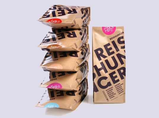
The image features several stacked food packaging bags made of a flexible material, likely a type of paper or plastic composite. Each bag has a distinct color-coded label at the top, with a large, bold brand name 'REISHUNGER' prominently displayed in dark purple against a kraft background. The bags have a flat bottom, allowing them to stand upright, and are sealed at the top with a fold-over closure. The overall appearance is clean and modern, with a focus on the brand name and product variety.

The packaging is a flat, folded carton made from a single layer of paperboard. It features a smooth, brown kraft exterior with a matte finish. The edges are clean and precise, indicating a well-constructed fold. The design includes bold, dark brown typography that reads 'REISHUNGER' prominently across the front, with a circular logo at the top. There are no visible fluted layers, confirming it is not corrugated. The overall shape is rectangular, designed for easy stacking and display.

The packaging is a flat paper bag made from kraft paper, featuring a simple and functional design. The bag has a rectangular shape with a fold-over top, and the sides are smooth without any visible fluted layers. The exterior is predominantly brown with large, bold orange text that reads 'REISHUNGER' and 'BIO SUSHI REIS', indicating it contains organic sushi rice. The overall appearance is clean and minimalistic, suitable for retail display.
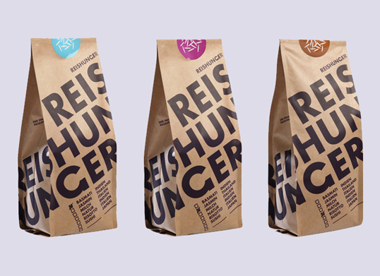
The packaging consists of three stand-up pouches made from a kraft paper material. Each pouch has a flat bottom allowing it to stand upright. The pouches feature a matte finish with a natural brown color. The front of each pouch prominently displays the brand name 'REISHUNGER' in bold, black letters. Above the brand name, there are colored circular labels indicating different product types. The pouches have a clean and modern design with a minimalist aesthetic.

The packaging is a stand-up pouch made from a single-layer paper material with a kraft finish. It features a flat bottom allowing it to stand upright. The edges are smooth and well-defined, with a slight taper towards the top. The surface has a matte texture with a natural look, typical of kraft paper. The front of the pouch prominently displays the brand name 'REISHUNGER' in bold, black typography, along with product information and a logo. The back of the pouch likely contains additional product details, though not visible in the image.

The image features various food packaging items, including bags and cartons. The bags are made of a smooth paper-like material, likely paperboard, with vibrant colors and graphics. The cartons have a clean, flat construction with precise edges and folds, showcasing a glossy finish. The overall design is modern and appealing, with clear branding elements and product information prominently displayed.
About the Brand
Reishunger is a German food and beverage company focused on delivering specialty rice, pasta, and cooking products to a broad consumer base. Their approach to packaging emphasizes brand recognition, product protection, and market differentiation through modern design and functional materials.
Reishunger’s packaging solutions reflect a blend of eco-conscious materials and strong visual branding. With a portfolio that includes carton boxes, kraft paper pouches, and flexible stand-up bags, the company ensures durability during transit while using recyclable substrates. Their minimalist, bold graphics support swift product identification and reinforce a premium positioning within the competitive food retail landscape.
Key Differentiator: Distinctive visual branding combined with sustainable, functional packaging formats that cater to both logistics efficiency and consumer unboxing experience.
Design System
Visual Style
Minimalist typography using bold, sans-serif fonts; a color palette featuring natural kraft browns, deep purples, and accent colors for product differentiation; overall aesthetic is modern, clean, and organic-focused.
Brand Identity
High-frequency logo usage, prominent brand name on each package, consistent iconography for certifications, and disciplined application of visual branding across all SKUs to ensure strong shelf visibility and brand recall.
Packaging Design
Material choices favor recyclable kraft paper and paperboard for primary and secondary packaging; structural design emphasizes stand-up pouches and stackable cartons for retail efficiency; a focus on simplicity and function over ornamentation supports both sustainability and logistics.
User Experience
Design elements facilitate an intuitive customer journey, from clear product identification to an appealing and tactile unboxing experience; packaging supports brand storytelling and enhances perceived value at every consumer touchpoint.
Company Metrics
Business insights for Reishunger based on available data
Market Positioning
Brand Values & Focus
Key Competitors
Target Market: Health-conscious consumers and home cooks seeking premium rice, pasta, and cooking accessories through direct-to-consumer and online retail channels, primarily in Germany and broader European markets.
Packaging Assessment
Overall Grade
Visual appeal and presentation quality
Packaging durability and protection
Eco-friendliness and recyclable materials
Cost efficiency and value for money
Packaging assessment for Reishunger based on industry standards and best practices
Frequently Asked Questions
What materials are primarily used in Reishunger’s packaging?
Reishunger utilizes a mix of kraft paper, paperboard carton, and flexible pouch materials to balance sustainability, shelf impact, and product protection.
How does Reishunger address sustainability in packaging?
The brand employs recyclable kraft paper and paperboard materials in most packaging formats, aligning with industry trends for reduced environmental impact.
What role does packaging design play in Reishunger’s brand strategy?
Packaging design is central to Reishunger’s brand strategy, using bold typography, color-coded labels, and consistent branding to create strong shelf presence and facilitate consumer trust.
Discover other Food & Drink companies
Explore more companies in the food & drink industry and their packaging strategies
ruf lebensmittelwerk kg
Food & Drink
RUF Lebensmittelwerk KG is a German food production company specializing in a variety of baking mixes and drink products. Founded in 1920, the company is known for its high-quality ingredients and innovative food solutions.
Thés de la Pagode
Food & Drink
Thés de la Pagode is a French company specializing in organic teas and infusions, focusing on health and well-being. Established in 1987, they prioritize sustainable practices and high-quality ingredients sourced through fair trade.
Terres de Café
Food & Drink
Terres de Café is a specialty coffee retailer based in Paris, France, known for its commitment to sustainability and high-quality coffee sourcing.