Puro Labs packaging
Puro Labs operates in the health and wellness sector, delivering nutritional supplements with a focus on clean ingredients and effective formulations. Their packaging strategy emphasizes professional presentation, brand consistency, and retail-ready formats to support their direct-to-consumer business model.
Packaging Portfolio
Puro Labs employs a dual-format packaging portfolio, primarily utilizing rigid PET bottles for individual supplement units and folding carton boxes for multi-product bundles and retail display. The use of matte finishes, precise folding, and clean structural integrity underscores attention to tactile quality and visual uniformity. Cartons often integrate printed messaging and compartmentalized interiors, enhancing both presentation and product stability during transit. This approach balances branding requirements, logistical efficiency, and retail shelf presence.

The packaging consists of three rigid containers, each with a clean, rectangular shape and a sturdy construction. The bottles are made of thick plastic, providing a premium feel. Each bottle has a white body with a colored label corresponding to the product inside. The labels feature a matte finish, giving them a smooth texture. The tops of the bottles are flat with a slight curve, and they have a wide opening for easy access. The overall design is simple yet elegant, emphasizing the product inside.
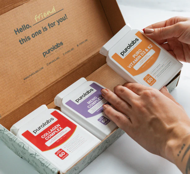
The packaging is a folding carton with a smooth, flat construction. It features a light brown kraft exterior with a printed design. The interior has a printed greeting message and product compartments for three supplement boxes. The edges are clean and precise, indicating a well-constructed fold. The carton is lightweight and has a matte finish.

The packaging is a sturdy, rectangular container with a thick, rigid construction. It features a clean, white exterior with a matte finish. The container has a wide, flat base and a slightly tapered top, which is characteristic of rigid boxes. The lid is a screw-on type, ensuring a secure closure. The front displays a large, bold logo and product name, while the sides contain additional product information and usage instructions.

The packaging consists of three distinct folding cartons, each containing dietary supplements. Each carton has a smooth, flat construction with clean edges and folds. The cartons are predominantly white, featuring vibrant colored accents in orange and green. The front of each carton displays the product name in bold, clear fonts, with additional product information and dosage details. The overall design is modern and appealing, suitable for retail display.

The packaging is a flat, rectangular box with smooth, clean edges and folds. It features a bright blue background with white text and graphics. The front displays the product name 'BIOTIC COMPLEX' prominently, along with a description of its benefits. The box has a matte finish, giving it a modern and professional appearance. The top flap is folded neatly, and there are no visible signs of wear or damage.

The packaging consists of three individual cartons, each with a smooth, flat construction. The cartons are primarily white with colored accents on the front panels. Each carton features a clean design with rounded corners and precise folds. The front displays the product name in bold fonts, along with a graphic representation of the supplement type. The overall appearance is lightweight and retail-friendly, suitable for display on shelves.
About the Brand
Puro Labs specializes in high-quality nutritional supplements, targeting health-conscious consumers across the UK. The company leverages a direct-to-consumer model to maintain control over product quality and customer experience, underpinned by a robust e-commerce presence.
With a product range that includes vitamins, probiotics, and collagen-based supplements, Puro Labs demonstrates a commitment to transparency in ingredient sourcing and product formulation. Their packaging portfolio features a mix of rigid bottles and carton boxes, each reflecting a minimalist yet clinically inspired design ethos. The brand's approach to packaging prioritizes both shelf impact and logistical efficiency, ensuring products arrive in optimal condition while supporting a premium unboxing experience.
Key Differentiator: Puro Labs' distinctive edge lies in the alignment of clean, modern packaging with a science-driven, transparent brand identity, reinforced by consistent visual design and customer-centric logistics.
Design System
Visual Style
Minimalist typography with sans-serif fonts, a palette dominated by white, muted blues, and vibrant accent colors, and a matte, clinical finish that conveys modernity and trust.
Brand Identity
Consistent logo placement, clear product naming, and sparse iconography; visual elements are repeated across SKUs for strong brand cohesion and immediate shelf recognition.
Packaging Design
Preference for recyclable carton board and durable PET plastics, with structural choices that prioritize product security, easy openability, and retail readiness. The design philosophy emphasizes clear, uncluttered layouts and functional compartmentalization.
User Experience
The packaging supports a seamless customer journey by enabling easy identification, intuitive unboxing, and clear access to dosage and product information, directly reinforcing the brand’s values of transparency and wellness.
Company Metrics
Business insights for Puro Labs based on available data
Market Positioning
Brand Values & Focus
Key Competitors
Target Market: Health-conscious UK consumers seeking effective, science-backed nutritional supplements, with a preference for clean ingredients and direct-to-consumer purchasing.
Packaging Assessment
Overall Grade
Visual appeal and presentation quality
Packaging durability and protection
Eco-friendliness and recyclable materials
Cost efficiency and value for money
Packaging assessment for Puro Labs based on industry standards and best practices
Frequently Asked Questions
What types of packaging does Puro Labs use for its supplements?
Puro Labs utilizes a combination of rigid plastic bottles for capsules and tablets, complemented by folding carton boxes for bundled products and retail display. Each packaging type is chosen to optimize product protection, branding, and consumer usability.
How does Puro Labs address sustainability in its packaging?
Puro Labs incorporates recyclable materials in its carton boxes and uses lightweight, durable plastics for its supplement containers. While not fully plastic-free, the brand’s packaging demonstrates moderate sustainability efforts compared to industry benchmarks.
Does Puro Labs' packaging support a premium unboxing experience?
Yes, the packaging is designed with clean lines, matte finishes, and internal organization, offering a visually appealing and emotionally positive unboxing experience that aligns with the brand's wellness positioning.
Discover other Health companies
Explore more companies in the health industry and their packaging strategies
Comvita
Health
Comvita is a New Zealand-based company specializing in high-quality Mānuka honey and natural health products. Established in 1974, it aims to connect people with the healing power of nature.
Bio-Synergy
Health
Bio-Synergy is a UK-based company specializing in health and fitness products, including nutritional supplements and DNA testing kits. Their mission is to support individuals in achieving their health and fitness goals through innovative products and personalized insights.
EVO Nutrition
Health
EVO Nutrition specializes in premium health supplements, providing a wide range of vitamins and nutritional products to support well-being.