Pupa Milano packaging
Pupa Milano operates in the beauty and fitness sector, offering a wide range of cosmetic and skincare products with a strong emphasis on design-driven, branded packaging. Their approach leverages premium materials and vibrant visual elements to reinforce brand identity and enhance consumer engagement.
Packaging Portfolio
Pupa Milano’s packaging portfolio is defined by the extensive use of rigid boxes, cylindrical containers, and luxury gift set formats, emphasizing structural integrity and premium tactile finishes. Most solutions feature multi-layered paperboard for enhanced durability, high-gloss coatings, and decorative patterns such as florals and branded color schemes. The packaging is designed both for in-store shelf impact and optimal e-commerce presentation, with interior compartments and secure closures to safeguard products. While visual branding and consumer experience are prioritized, the use of recyclable substrates indicates a moderate commitment to sustainability.
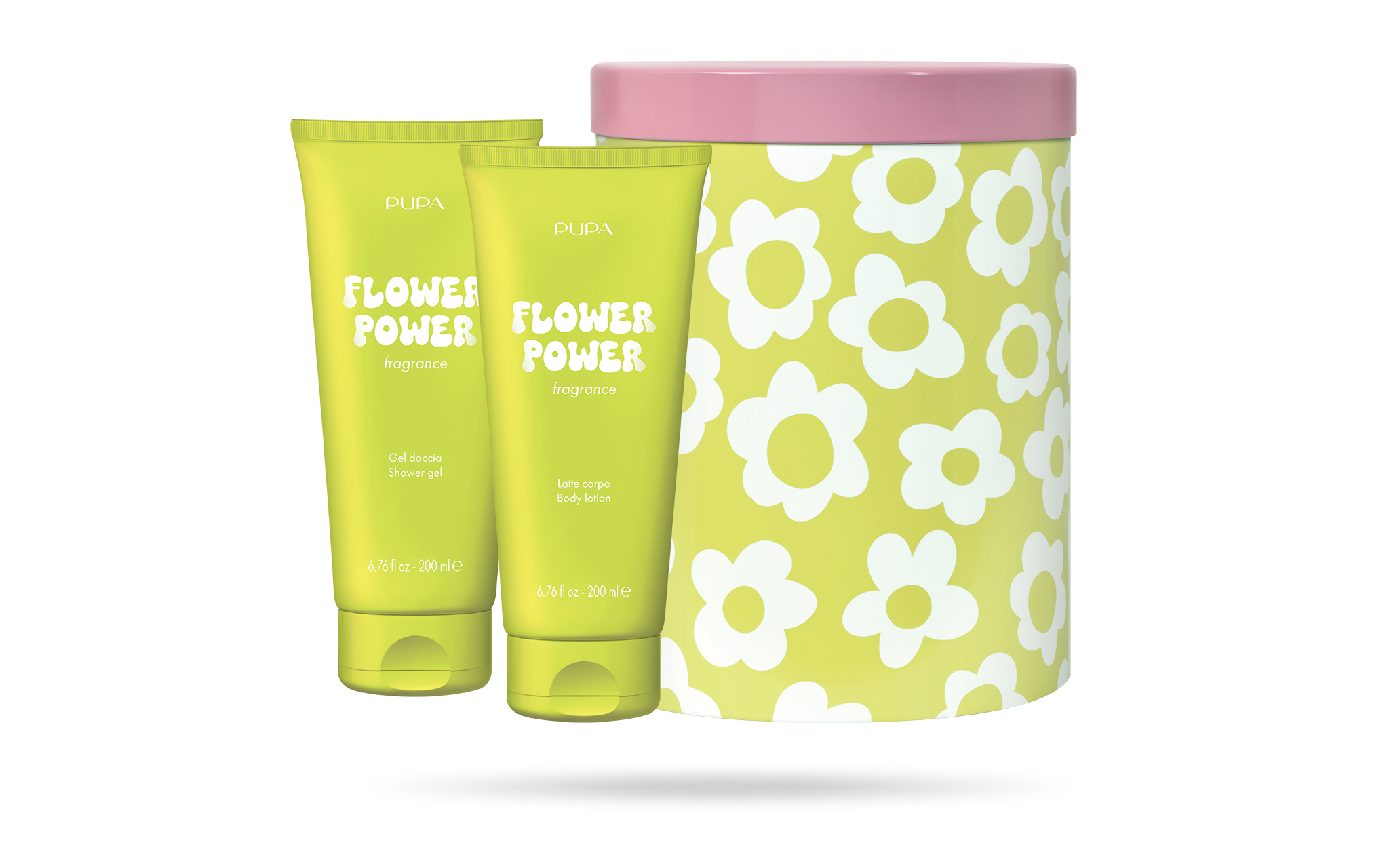
The packaging consists of a cylindrical rigid box with a pink lid and a vibrant yellow base featuring a floral pattern. Inside, there are two cosmetic tubes, one for shower gel and the other for body lotion, both in matching yellow packaging. The tubes have a smooth finish and are labeled with the product name 'Flower Power' in bold, playful typography. The overall appearance is bright and cheerful, suitable for a cosmetic gift set.
The packaging consists of a sturdy, thick-walled box with a decorative exterior featuring a floral pattern in pink and white. The box has a premium appearance, indicative of high-quality construction. The lid appears to fit snugly over the base, suggesting a secure closure. The overall shape is rectangular, designed to hold multiple cosmetic products.
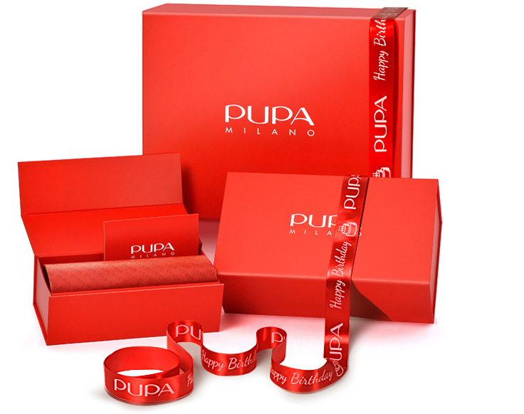
The packaging consists of a thick, sturdy box with a premium appearance. The box is predominantly red, featuring a smooth, glossy finish that enhances its luxurious feel. It has clean, precise edges and folds, indicative of high-quality construction. The interior is lined with a decorative pattern, adding to the overall aesthetic. A ribbon with the brand name 'PUPA' is elegantly wrapped around the box, contributing to its gift-like presentation.
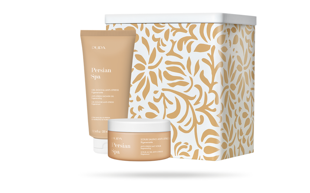
The packaging features a sturdy, thick-walled box with a decorative exterior. The box is adorned with a floral pattern in gold on a cream background, suggesting a premium aesthetic. The box has a clean, structured form with sharp edges and a lid that fits securely on top. The interior is likely designed to hold cosmetic products, as indicated by the accompanying tubes and jars.
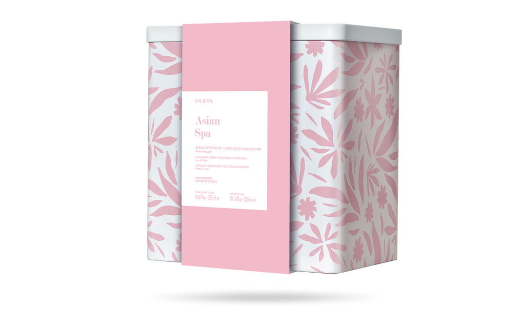
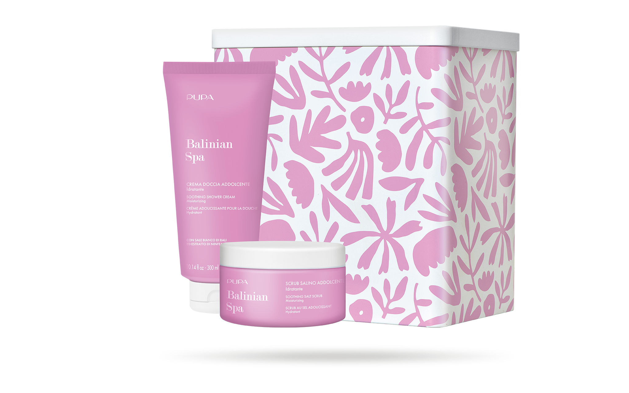
The packaging is a rectangular rigid box with a thick construction, featuring a decorative floral pattern in pink and white. The box has a smooth surface finish, likely coated for a premium feel. The top of the box is adorned with a pink band that includes product information in a clean, modern font. The overall design conveys a luxurious aesthetic suitable for cosmetic or spa products.
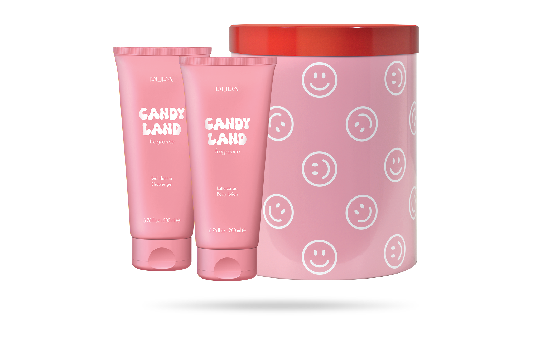
The packaging consists of a cylindrical rigid box with a glossy finish. The box is predominantly pink with a repeating smiley face pattern. It features a red lid that contrasts with the pink body. The box is designed to hold two cosmetic tubes, which are also pink and labeled with 'CANDY LAND fragrance' in white text. The tubes have a smooth, flat surface and are sealed at the top.
About the Brand
Pupa Milano is an established European beauty brand focused on delivering innovative beauty and body care solutions to a broad consumer base. Their packaging strategy prioritizes premium presentation, strong brand visibility, and trend-led aesthetics to appeal to younger demographics.
With a product portfolio spanning face, body, and fitness categories, Pupa Milano integrates high-impact packaging formats such as rigid boxes and luxury gift sets to support both retail and e-commerce channels. The company’s packaging consistently features bold color palettes and decorative patterns, aligning with their commitment to an engaging unboxing experience and high perceived value. Efforts toward sustainability are present, though the primary focus remains on visual impact and structural durability.
Key Differentiator: Pupa Milano differentiates itself through cohesive, visually striking packaging that amplifies brand recognition and delivers a memorable unboxing experience, leveraging rigid box structures and consistent use of brand elements.
Design System
Visual Style
Pupa Milano utilizes bold, sans-serif typography paired with a saturated color palette dominated by red, pink, gold, and white. Decorative elements such as floral motifs and graphic patterns reinforce a modern, playful aesthetic.
Brand Identity
The brand consistently applies its logo and company name in prominent positions on all packaging. Iconography is minimal, focusing instead on pattern and color for differentiation, with strict adherence to visual consistency across product lines.
Packaging Design
Material selection favors rigid paperboard for structural strength, often with glossy or coated finishes. Design philosophy prioritizes form and function, ensuring product protection while maximizing shelf appeal and gift-worthiness.
User Experience
The packaging experience is crafted to deliver high emotional impact at unboxing, with tactile finishes, layered presentation, and easy-open structures. This supports positive brand associations and encourages social sharing, aligning with modern beauty consumer behaviors.
Company Metrics
Business insights for Pupa Milano based on available data
Market Positioning
Brand Values & Focus
Key Competitors
Target Market: Primarily women aged 18-40 seeking trendy, effective beauty and wellness products in Europe and internationally via e-commerce.
Packaging Assessment
Overall Grade
Visual appeal and presentation quality
Packaging durability and protection
Eco-friendliness and recyclable materials
Cost efficiency and value for money
Packaging assessment for Pupa Milano based on industry standards and best practices
Frequently Asked Questions
What types of packaging does Pupa Milano primarily use?
Pupa Milano mainly uses rigid boxes with decorative finishes, often designed as luxury gift sets for cosmetic and body care products. These structures are chosen for their durability, premium appearance, and ability to support branded, high-visibility graphics.
How does Pupa Milano balance visual design and logistics safety in packaging?
The brand employs thick-walled, sturdy packaging formats that ensure protection during transit while maintaining a high standard of visual presentation. This dual focus helps safeguard products and uphold the brand’s premium positioning.
Is sustainability a key consideration in Pupa Milano’s packaging?
Sustainability is an expressed value for Pupa Milano, with indications of recyclable materials and a preference for durable, reusable packaging. However, the strongest emphasis is placed on design impact and consumer experience.
Discover other Beauty & Fitness companies
Explore more companies in the beauty & fitness industry and their packaging strategies
Cultiv Cosmetique
Beauty & Fitness
Cultiv Cosmetique is a French skincare brand that provides organic and eco-friendly beauty products inspired by nature. They focus on effective skincare solutions for various skin concerns.
Pure Altitude
Beauty & Fitness
Pure Altitude specializes in high-quality beauty and skincare products that leverage the expertise of spa treatments to enhance daily routines. The brand offers a diverse range of products tailored for both facial and body care.
Institut Karité Paris
Beauty & Fitness
Institut Karité Paris specializes in luxury beauty products made with natural Shea Butter, offering a wide range of skincare and body care solutions. The brand combines Parisian heritage with a commitment to quality and creativity in its offerings.