PUCA - Pure & Care packaging
PUCA - Pure & Care, a Denmark-based skincare brand, delivers a broad range of beauty solutions with a focus on natural ingredients. Their packaging strategy leverages flexible pouches and carton boxes, combining visual consistency with practical consumer usability.
Packaging Portfolio
PUCA - Pure & Care employs a mix of flexible packaging (flat and resealable pouches) and single-layer carton boxes tailored for lightweight skincare products. The flexible pouches, used for items such as sheet masks and wet wipes, feature heat-sealed edges and glossy finishes, promoting portability and product freshness. Carton boxes for specialized treatments utilize smooth paperboard without fluted layers, optimizing for retail display. The brand maintains consistent visual branding across all formats, utilizing color-coded systems and clear labeling to differentiate product lines and maximize consumer recognition.
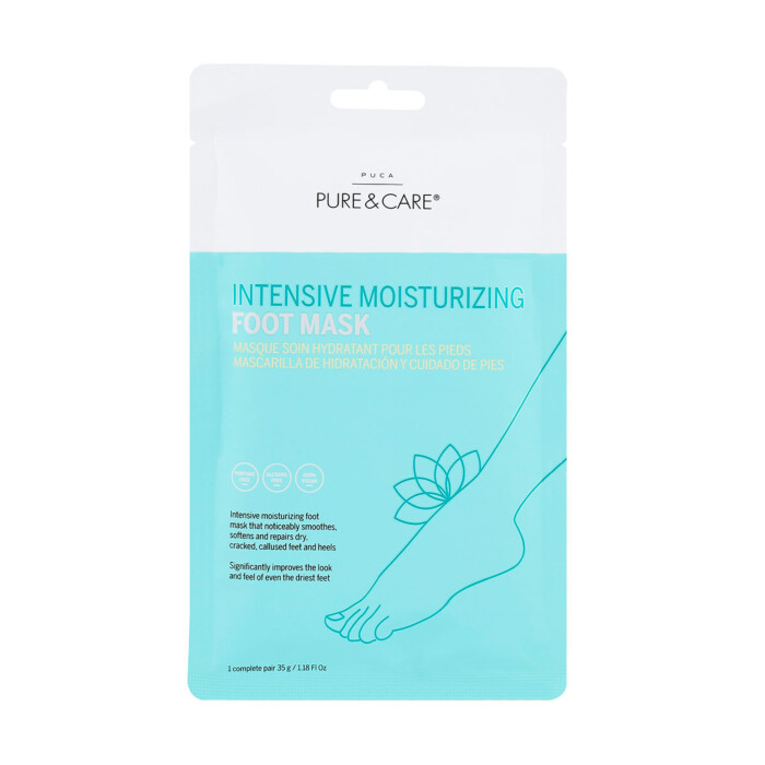
The packaging is a flat, flexible pouch designed for retail display. It features a smooth, single-layer construction without any visible fluted layers. The front side showcases a light blue and white color scheme with an illustration of a foot and a lotus flower, indicating a focus on foot care. The text is printed in both English and French, detailing the product's purpose as an intensive moisturizing foot mask. The edges are clean and precise, with no visible wear or damage.

The packaging consists of several flexible pouches containing makeup remover face wipes. Each pouch is rectangular with rounded edges and is made from a thin, flexible material. The surface is smooth and has a glossy finish, which gives it a clean appearance. The pouches are primarily turquoise with white text and graphics. The front displays the product name, 'HYALURONIC ACID MAKEUP REMOVER FACE WIPES,' along with icons indicating product features. The back of the pouches likely contains usage instructions and ingredient information, although this is not visible in the image.

The packaging is a flat pouch with a smooth, single-layer construction. It features a light teal and white color scheme with a glossy finish. The front displays the product name 'INTENSIVE MOISTURIZING FOOT MASK' in bold, clear typography, along with a graphic of a foot. The edges are clean and precise, indicating a well-constructed fold. The back of the pouch likely contains product information and instructions, although not visible in this image.

The packaging is a flexible pouch with a smooth, flat construction. It features a predominantly teal background with a white top section. The front displays a graphic of a foot, indicating the product's use, along with product information in clear, legible text. The edges are sealed, and the overall appearance is lightweight and easy to handle.
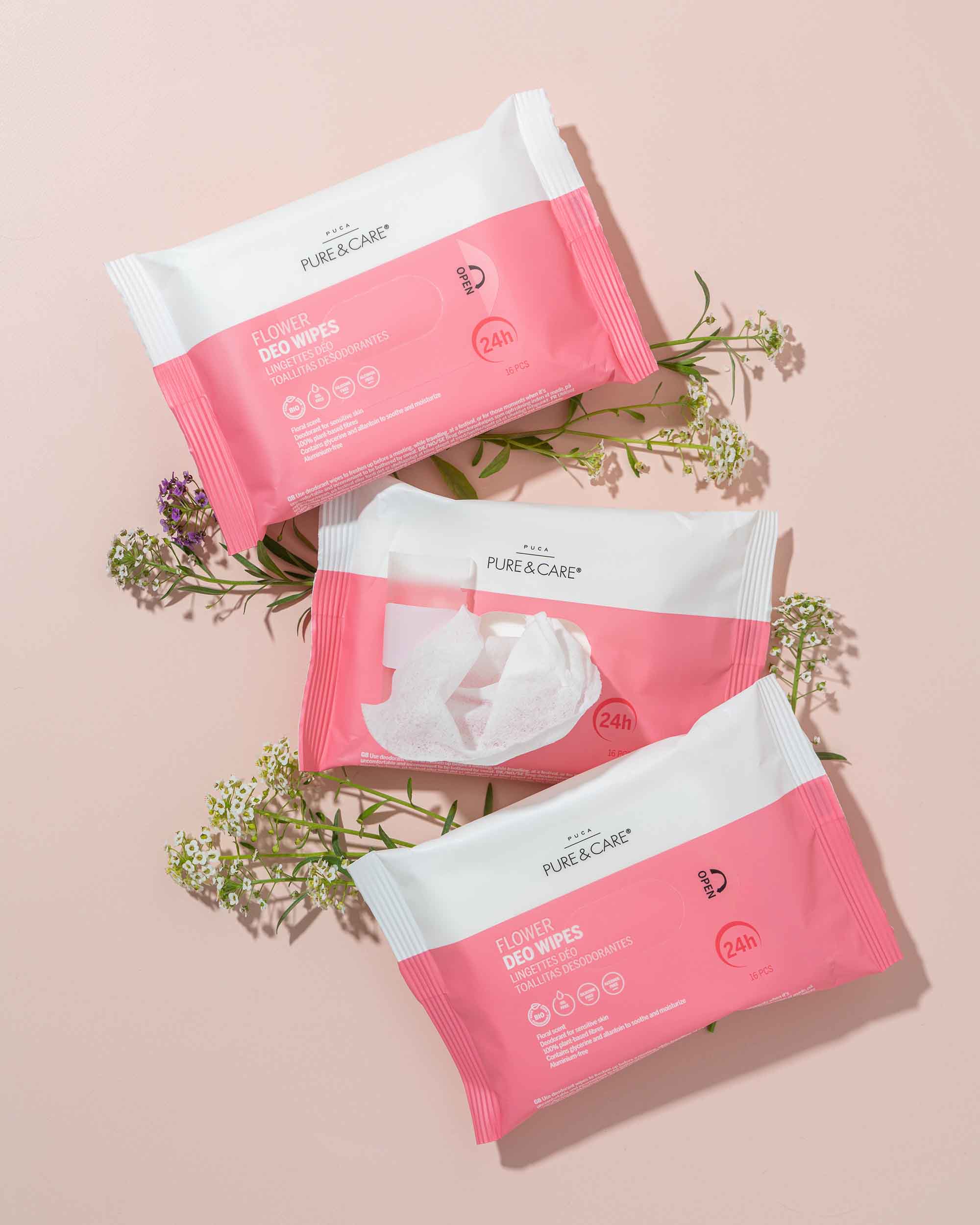
The packaging consists of a flexible, resealable pouch designed for wet wipes. The pouch is predominantly pink with white accents, featuring a clear plastic opening at the top for easy access to the wipes. The front displays a large logo and product information, while the back contains additional details and instructions. The edges are sealed, and the overall shape is rectangular with rounded corners.

The packaging includes a variety of products, primarily featuring a prominent rectangular carton for a sheet mask. The carton has a smooth, flat construction without visible fluted layers, indicating it is made from single-layer paperboard. The surface is predominantly blue with white accents, showcasing a clean design. The edges are precise, and the folds are well-defined. Other products include a bottle, a jar, and wipes, all featuring similar color schemes and design aesthetics.
About the Brand
PUCA - Pure & Care specializes in high-quality skincare products, emphasizing natural formulations and customer satisfaction. Their packaging reflects a balance between modern design, functional packaging formats, and clear brand communication.
Operating with a direct-to-consumer model, PUCA - Pure & Care addresses diverse skincare needs through thoughtfully designed product lines. The brand adopts flexible packaging and single-layer cartons, focusing on lightweight materials and cohesive branding. Their use of color, typography, and product imagery ensures recognizability and supports the user experience across all touchpoints.
Key Differentiator: Distinctive use of flexible, visually cohesive packaging that prioritizes brand visibility, consumer convenience, and alignment with natural beauty market trends.
Design System
Visual Style
The design system leverages sans-serif typography, a calming palette of teal, blue, white, and pink, and minimalist graphic elements. The aesthetic is clean, modern, and approachable, aligning with contemporary skincare trends.
Brand Identity
Logo usage is prominent and consistent across all packaging, with the 'PURE & CARE' brand mark typically placed at the top or center. Iconography and illustrations are simple, reinforcing product benefits and usage. Consistency in color and layout ensures strong shelf presence.
Packaging Design
Material choices focus on lightweight, flexible plastics for pouches and single-layer paperboard for cartons, balancing durability and cost-effectiveness. The structural philosophy emphasizes ease of use, resealability where necessary, and efficient storage and shipping.
User Experience
Packaging is designed to facilitate an intuitive customer journey, with clear product information, visual hierarchy, and accessible opening mechanisms. The unboxing process is streamlined for convenience, supporting positive brand perception and repeat engagement.
Company Metrics
Business insights for PUCA - Pure & Care based on available data
Market Positioning
Brand Values & Focus
Key Competitors
Target Market: Modern, ingredient-conscious skincare consumers seeking effective, natural beauty products with premium yet accessible branding.
Packaging Assessment
Overall Grade
Visual appeal and presentation quality
Packaging durability and protection
Eco-friendliness and recyclable materials
Cost efficiency and value for money
Packaging assessment for PUCA - Pure & Care based on industry standards and best practices
Frequently Asked Questions
What types of packaging does PUCA - Pure & Care primarily use?
The brand predominantly utilizes flexible pouches for single-use and wet wipe products, complemented by carton boxes for select items such as face masks. These packaging formats are chosen for their lightweight properties and strong visual branding.
How does PUCA - Pure & Care address sustainability in its packaging?
PUCA - Pure & Care incorporates eco-friendly packaging elements such as recyclable materials, especially within their wet wipes and flexible pouch lines. However, the degree of sustainability varies by product type and material selection.
How effective is PUCA - Pure & Care’s packaging in protecting products during shipment?
The packaging provides adequate protection for lightweight skincare products, with sealed pouches and sturdy cartons minimizing risk of leakage or damage. For fragile items, additional secondary packaging may be required.
How does the packaging design contribute to the overall customer experience?
Consistent color palettes, clear typography, and prominent branding enhance shelf appeal and reinforce PUCA - Pure & Care’s identity, supporting a positive and memorable unboxing experience.
Discover other Beauty & Fitness companies
Explore more companies in the beauty & fitness industry and their packaging strategies
Cultiv Cosmetique
Beauty & Fitness
Cultiv Cosmetique is a French skincare brand that provides organic and eco-friendly beauty products inspired by nature. They focus on effective skincare solutions for various skin concerns.
Institut Karité Paris
Beauty & Fitness
Institut Karité Paris specializes in luxury beauty products made with natural Shea Butter, offering a wide range of skincare and body care solutions. The brand combines Parisian heritage with a commitment to quality and creativity in its offerings.
Big Moustache
Beauty & Fitness
Big Moustache specializes in shaving and grooming products tailored for men, providing a hassle-free subscription service for razor blades and skincare essentials.