Protein Package packaging
Protein Package is a UK-based e-commerce platform specializing in protein-rich foods and supplements for health-focused consumers. The company employs branded carton boxes and retail bags, emphasizing visual consistency and user experience in its packaging approach.
Packaging Portfolio
Protein Package employs a combination of branded carton boxes, kraft paperboard shipping containers, and retail paper bags. The structure of their packaging is dominated by single-layer folding cartons designed for both product protection and retail presentation, with an emphasis on lightweight materials to optimize logistics. Branding is consistently applied across all formats, utilizing bold colors and prominent logos to ensure shelf visibility and brand recall. The packaging portfolio supports both direct shipping and in-store experiences, reflecting a balance between e-commerce functionality and retail aesthetics.

The packaging is a flat, rectangular shipping box made of single-layer paperboard. It features a smooth, clean construction with precise edges and folds. The exterior is a light brown color, typical of kraft paper, and has a matte finish. The box is adorned with a circular blue logo that reads 'PROTEIN PACKAGE' in white font, prominently displayed on the top surface. The box appears to be in good condition, with no visible signs of wear or damage.

The packaging is a flat, rectangular folding carton made of single-layer paperboard. It features a smooth, clean construction with precise edges and folds. The exterior is a light brown color with a matte finish, showcasing a circular logo in the center. The design is simple and modern, with no visible fluted layers, indicating it is not corrugated. The carton is lightweight and appears to be used for retail purposes, likely containing protein-related products.
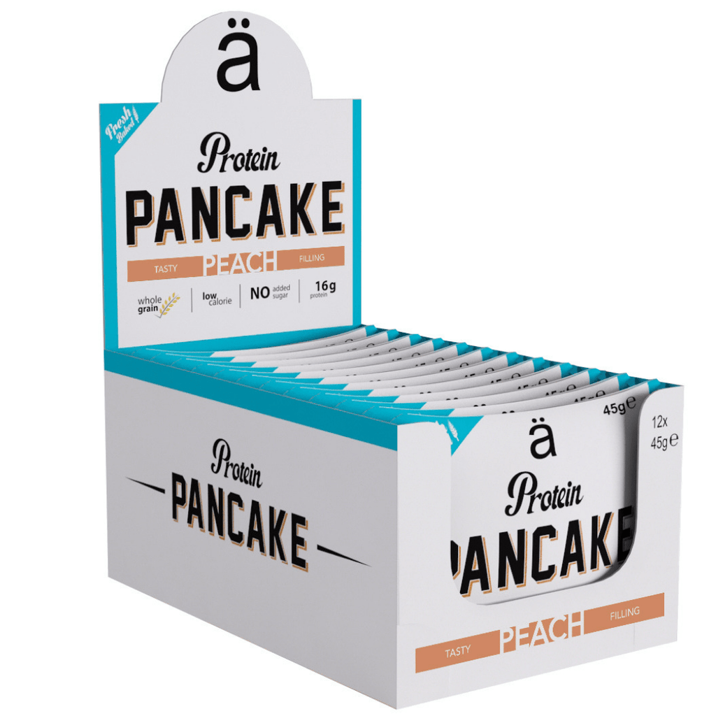
The packaging is a retail display box designed to hold individual protein pancake servings. It features a smooth, flat construction typical of paperboard, with clean edges and folds. The box is predominantly white with colorful graphics, including a prominent logo and product name. The top flap is slightly taller, allowing for visibility of the product inside. The box is designed to be displayed on a shelf, with a cut-out front for easy access to the individual packets.
The packaging consists of a flat, smooth, single-layer paperboard box with clean edges and precise folds. It features a colorful design with a bright blue background and playful graphics. The box is primarily white with vibrant colors used for text and images. The overall appearance is lightweight and suitable for retail display.
The image shows several retail shopping bags made of paper, likely with a smooth finish. The bags are white with a blue circular logo prominently displayed on the front. They have sturdy handles for carrying. In the foreground, there are also various food items packaged in colorful wrappers, including protein snacks and candy, displayed in a cardboard box. The overall setting appears to be a retail environment, with a clean and organized presentation.
About the Brand
Protein Package operates as a direct-to-consumer retailer in the health industry, offering a broad selection of protein foods and supplements. The company has built a strong online presence with a focus on personalized product bundles and custom order experiences.
Their packaging strategy leverages custom-branded carton boxes and paper shopping bags, designed to reinforce brand identity and ensure product safety during transit. The use of lightweight, single-layer paperboard and kraft materials aligns with industry standards for retail display and e-commerce shipping, providing both shelf appeal and logistical efficiency. Visual branding consistency is maintained across all packaging touchpoints, supporting both consumer trust and product recognition.
Key Differentiator: Protein Package's distinctive 'Pick & Mix' offering, combined with consistent branded packaging, enables a personalized unboxing experience and positions the brand to potentially expand into further custom packaging solutions.
Design System
Visual Style
The visual system employs bold, modern typography and a color palette centered around blue, white, and accent colors for differentiation. Designs are playful yet clean, supporting the active and health-oriented brand positioning.
Brand Identity
Logo usage is prominent, with a blue circular 'PROTEIN PACKAGE' mark anchoring most packaging. Iconography is minimal but effective, supporting easy brand recognition and clear product categorization. Design is applied consistently across all packaging types.
Packaging Design
Material choices prioritize recyclable paperboard and kraft paper, with an emphasis on lightweight, single-layer cartons for cost and logistics efficiency. Structural design favors foldable, flat-packed boxes and sturdy retail bags, supporting both protection and presentation.
User Experience
The packaging design supports a seamless customer journey by enhancing unboxing satisfaction, ensuring protection during transit, and reinforcing the brand through every touchpoint. The 'Pick & Mix' model is well-supported by modular packaging formats, enabling customization and engagement.
Company Metrics
Business insights for Protein Package based on available data
Market Positioning
Brand Values & Focus
Key Competitors
Target Market: Health-conscious individuals, fitness enthusiasts, and consumers seeking personalized nutrition solutions in the UK and broader e-commerce markets.
Packaging Assessment
Overall Grade
Visual appeal and presentation quality
Packaging durability and protection
Eco-friendliness and recyclable materials
Cost efficiency and value for money
Packaging assessment for Protein Package based on industry standards and best practices
Frequently Asked Questions
What packaging materials does Protein Package primarily use?
Protein Package primarily utilizes single-layer paperboard cartons and kraft paper bags, with a focus on lightweight, recyclable materials suited for both retail display and e-commerce shipments.
How does Protein Package balance branding and sustainability in its packaging?
The company integrates prominent branding elements, such as logos and color schemes, while opting for recyclable materials like paperboard and kraft paper to help minimize environmental impact.
What is unique about Protein Package's packaging approach?
The brand delivers a consistently branded unboxing experience, particularly through its custom 'Pick & Mix' orders, and applies design principles that emphasize both visual appeal and practical protection.
Discover other Health companies
Explore more companies in the health industry and their packaging strategies
Comvita
Health
Comvita is a New Zealand-based company specializing in high-quality Mānuka honey and natural health products. Established in 1974, it aims to connect people with the healing power of nature.
Bio-Synergy
Health
Bio-Synergy is a UK-based company specializing in health and fitness products, including nutritional supplements and DNA testing kits. Their mission is to support individuals in achieving their health and fitness goals through innovative products and personalized insights.
EVO Nutrition
Health
EVO Nutrition specializes in premium health supplements, providing a wide range of vitamins and nutritional products to support well-being.