Polskin packaging
Polskin, a French men's skincare brand, employs a direct-to-consumer model and prioritizes high-quality, sustainable packaging solutions. Their approach focuses on recyclable materials, minimalistic design, and clear product communication, supporting both brand identity and environmental responsibility.
Packaging Portfolio
Polskin’s packaging portfolio features a combination of folding carton boxes for primary retail display, white plastic cylindrical containers for supplements, and minimalistic labeling that maintains brand consistency. Materials are selected for recyclability and durability, with a matte finish that supports a premium, modern aesthetic. The structural designs emphasize product protection and clear communication of product attributes, optimizing both shelf impact and shipping resilience. Limited use of flexible packaging is observed, mainly for non-core items, with a focus on product visibility and freshness.

The packaging consists of a clear plastic bag with a twist tie closure at the top. The bag is filled with sliced bread, and the front features a prominent label. The label has a red and white color scheme with a stylized chicken graphic and the brand name 'POLSKI' prominently displayed. The overall design is clean and modern, with a focus on the product's freshness.

The packaging is a cylindrical container with a smooth, white plastic exterior. The lid is also white and features a simple twist-off design. The container has a matte finish with a clean, modern aesthetic. The front label displays the product name 'SKIN BOOSTER HOMME' prominently, with a dark teal background and white text. The top right corner features a circular badge stating 'ANTI-ÂGE' in white font on a teal background, indicating the product's purpose. The overall design is minimalistic, focusing on clarity and readability.
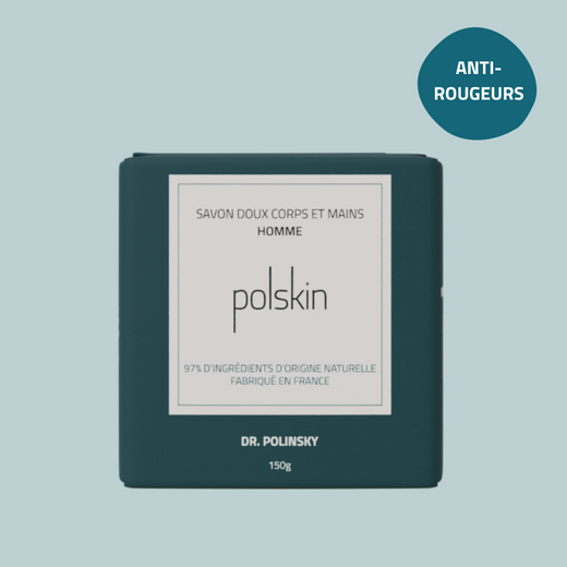
The packaging is a flat, square folding carton made of smooth, single-layer paperboard. It has a clean, precise construction with sharp edges and folds. The exterior is a dark teal color, with a matte finish that gives it a premium appearance. The front features a white rectangular label with black text, indicating the product name and brand. The overall design is minimalistic and modern, suitable for retail display.

The packaging consists of clear plastic bags with a twist tie closure at the top. Each bag features a prominent label with a red and white color scheme, showcasing the brand name 'POLSKI' in bold letters. The bags are filled with different types of bread, each identified by a distinct label color and design, indicating the type of bread inside. The overall appearance is clean and modern, with a focus on freshness.
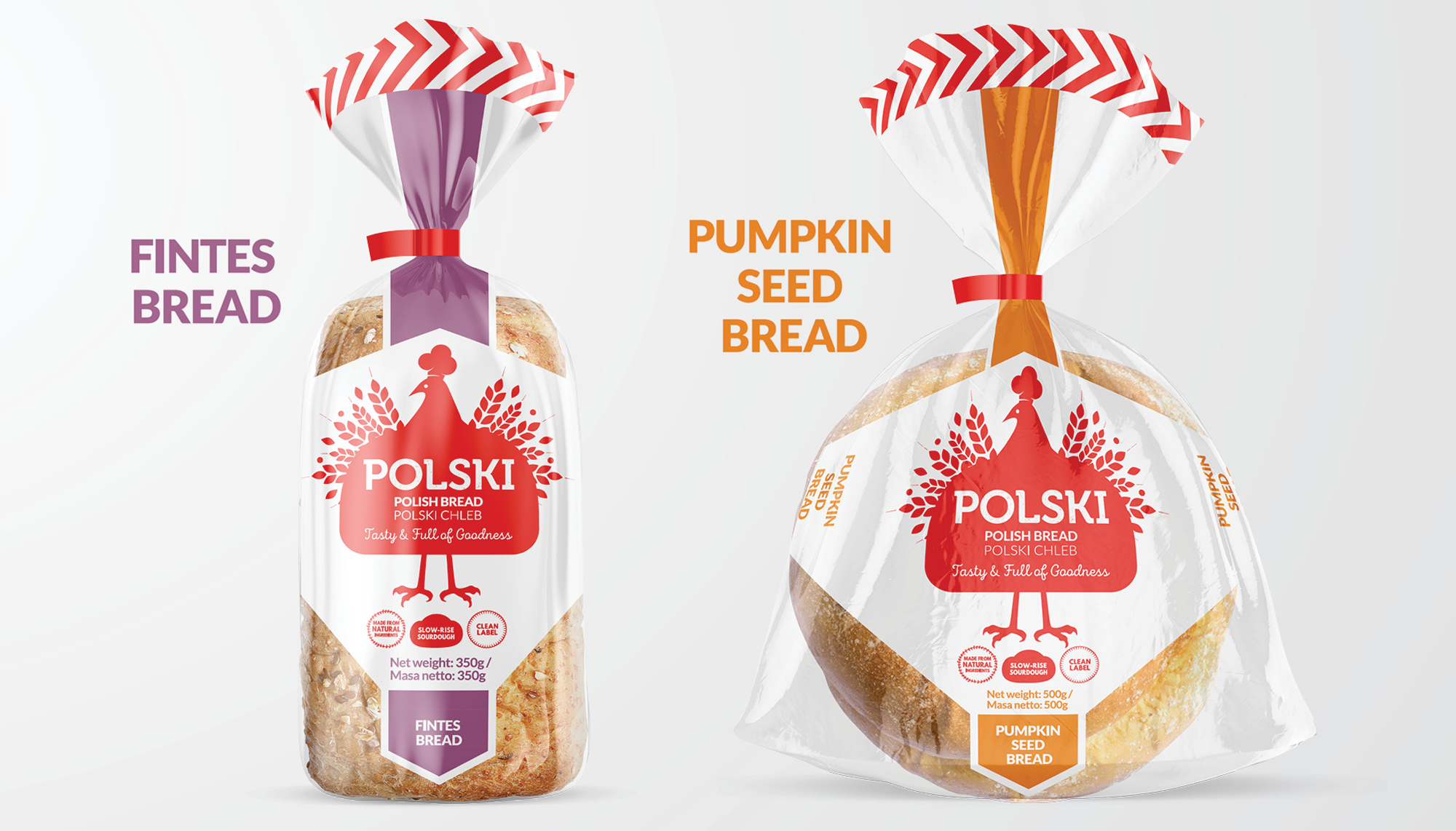
The packaging consists of two clear plastic bags, each containing a loaf of bread. The bags are sealed at the top with a twist tie, and they feature a colorful header card that displays the product name and branding. The bags are transparent, allowing visibility of the bread inside. The header card has a zigzag pattern along the top edge and contains bold text indicating the type of bread. The overall design is clean and modern, with a focus on the product.
About the Brand
Polskin specializes in men's skincare, leveraging unique formulations with natural ingredients and a commitment to sustainability across its packaging and operations. The brand operates out of Lunéville, France, maintaining close oversight of production quality and packaging consistency.
The company utilizes a direct-to-consumer model, enabling greater control over the customer experience and packaging quality. Packaging choices reflect a focus on recyclable materials, eco-friendly inks, and a clean visual language that aligns with contemporary consumer expectations in the beauty sector. Polskin’s small team structure allows for agile adaptation to sustainability trends and evolving market demands.
Key Differentiator: Polskin’s integration of sustainability, exclusive product formulations, and a cohesive, modern packaging design distinguishes it in the men’s skincare segment.
Design System
Visual Style
Polskin adopts a minimalistic design approach with sans-serif typography, a dark teal and white color palette, and matte finishes to convey a clean, contemporary aesthetic.
Brand Identity
The logo and company name are consistently displayed on all packaging, supported by clear iconography and structured label layouts. Visual consistency is maintained through uniform typography, color application, and restrained use of graphic elements.
Packaging Design
Material selection prioritizes recyclable paperboard and plastics, with structural choices that balance display appeal and protective function. The philosophy centers on simplicity, sustainability, and functionality.
User Experience
Packaging is designed for intuitive unboxing, clear product identification, and alignment with customer expectations for quality and eco-friendliness. The approach supports a seamless customer journey from online purchase to product use, reinforcing trust and brand loyalty.
Company Metrics
Business insights for Polskin based on available data
Market Positioning
Brand Values & Focus
Key Competitors
Target Market: Environmentally conscious male consumers seeking premium, effective skincare solutions in the European direct-to-consumer beauty market.
Packaging Assessment
Overall Grade
Visual appeal and presentation quality
Packaging durability and protection
Eco-friendliness and recyclable materials
Cost efficiency and value for money
Packaging assessment for Polskin based on industry standards and best practices
Frequently Asked Questions
What types of packaging materials does Polskin use?
Polskin primarily utilizes recyclable paperboard cartons and plastic containers with a matte finish, integrating environmentally friendly inks and minimalistic labeling for clear communication.
How does Polskin ensure packaging sustainability?
The company selects recyclable packaging materials and works with local production partners to minimize environmental impact, supporting its sustainability ethos.
Does the packaging design enhance the customer experience?
Yes, the packaging employs a premium, minimalistic aesthetic and clear labeling, contributing to a positive unboxing experience and reinforcing the brand’s positioning.
Discover other Beauty & Fitness companies
Explore more companies in the beauty & fitness industry and their packaging strategies
Institut Karité Paris
Beauty & Fitness
Institut Karité Paris specializes in luxury beauty products made with natural Shea Butter, offering a wide range of skincare and body care solutions. The brand combines Parisian heritage with a commitment to quality and creativity in its offerings.
Owari
Beauty & Fitness
Owari specializes in 100% natural beauty and fitness products, designed to enhance health and wellness. The company proudly offers its products made in France, emphasizing quick delivery and customer support.
Big Moustache
Beauty & Fitness
Big Moustache specializes in shaving and grooming products tailored for men, providing a hassle-free subscription service for razor blades and skincare essentials.