Pink Gellac packaging
Pink Gellac specializes in gel nail polishes and nail care products, focusing on at-home salon-quality solutions for consumers. The brand utilizes visually distinctive, branded packaging formats that emphasize product protection, retail appeal, and strong brand recognition.
Packaging Portfolio
Pink Gellac employs a mix of rigid boxes and high-gloss folding cartons, tailored for both multi-product starter kits and individual nail care items. Materials are predominantly thick-walled paperboard and rigid board, with custom inserts ensuring product stability and presentation integrity. Branding is consistently applied via color schemes, logos, and product-specific graphics, supporting retail differentiation and consumer recognition. Packaging formats are selected to balance visual impact, shelf appeal, and efficient logistics for direct-to-consumer delivery.

The packaging is a flat, rectangular box with a smooth, single-layer paperboard construction. It features clean, precise edges and folds, indicative of a folding carton. The exterior has a glossy finish with a light color palette, predominantly featuring pastel shades. The design includes circular graphics resembling nail polish colors, enhancing its appeal for cosmetic retail. The box is lightweight and designed for retail display.

The packaging consists of several retail cartons and a product display. The cartons are made of smooth, flat paperboard with clean edges and folds, typically featuring a glossy finish. The colors are predominantly pink and white, with vibrant graphics and branding elements prominently displayed. Each carton appears to house individual nail polish bottles, with clear labeling and product information visible. The overall arrangement is visually appealing, designed for retail presentation.

The packaging consists of a sturdy, thick-walled box with a premium appearance. The box features a decorative outer layer with a glossy finish and a vibrant color scheme, predominantly in shades of pink and white. The front of the box has a clear window displaying the contents, which are five nail polish bottles. The box is elegantly designed with rounded edges and a clean, precise construction.
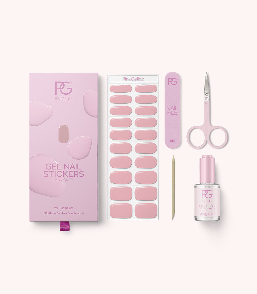
The packaging consists of a smooth, flat construction with a single-layer paperboard. The box is predominantly pink with a glossy finish, featuring rounded edges and precise folds. The front displays a large logo and product name, while the interior includes a tray holding various nail stickers, a nail file, scissors, and a cuticle oil bottle.

The packaging consists of a sturdy, thick-walled box with a premium appearance. It features intricate patterns and a decorative exterior, indicative of high-quality construction. The box has a magnetic closure and is designed to hold multiple nail polish bottles securely. The overall shape is rectangular, and the dimensions appear to accommodate the bottles snugly, ensuring they are well-protected.
About the Brand
Pink Gellac is a cosmetics company headquartered in the Netherlands, offering an extensive range of gel nail polishes, starter kits, and nail care accessories through a direct-to-consumer model. Its packaging approach emphasizes both premium presentation and functional product protection, aligning with its focus on quality and customer experience.
Established in 2013, Pink Gellac caters to beauty enthusiasts seeking vegan, HEMA- and TPO-free nail products. The company leverages robust digital marketing and a well-developed e-commerce platform to deliver products efficiently. Packaging solutions are carefully selected to reflect the brand's visual identity, provide secure logistics, and deliver a compelling unboxing experience that resonates with their target demographic.
Key Differentiator: Pink Gellac's commitment to vegan formulations, strong branding, and visually cohesive packaging sets it apart in the DIY nail care segment, with a particular focus on accessibility and sustainability.
Design System
Visual Style
The visual design emphasizes soft, pastel color palettes dominated by pinks and whites, complemented by clean, modern typography with sans-serif fonts. Aesthetic choices favor glossy finishes, rounded edges, and minimalist layouts, creating an elegant and approachable look.
Brand Identity
Logo usage is prominent and consistent, typically positioned front-and-center on packaging. Iconography is minimal, focusing on product imagery and simple graphic elements. Visual consistency is maintained through strict adherence to brand colors, logo scaling, and clear product naming conventions.
Packaging Design
Material selection prioritizes rigid and folding carton board for strength and premium feel. Structural designs favor compact, rectangular forms with magnetic closures or secure trays for multi-item kits. The approach emphasizes product protection, retail presence, and unboxing appeal, with custom die-cuts and inserts for organization.
User Experience
Packaging is optimized for a premium direct-to-consumer unboxing experience, supporting customer satisfaction and social sharing. Easy-open features, clear product visibility, and logical arrangement enhance usability, while branding supports recall and loyalty throughout the customer journey.
Company Metrics
Business insights for Pink Gellac based on available data
Market Positioning
Brand Values & Focus
Key Competitors
Target Market: Consumers seeking high-quality, vegan, and at-home nail care products, typically within the European cosmetics and beauty retail segment.
Packaging Assessment
Overall Grade
Visual appeal and presentation quality
Packaging durability and protection
Eco-friendliness and recyclable materials
Cost efficiency and value for money
Packaging assessment for Pink Gellac based on industry standards and best practices
Frequently Asked Questions
What types of packaging does Pink Gellac use for its products?
Pink Gellac primarily utilizes rigid boxes for multi-item kits and folding carton boxes for individual products, both designed for premium presentation and product safety. These structures often feature glossy finishes, high-impact branding, and custom inserts tailored to nail care products.
How does Pink Gellac address sustainability in its packaging?
While the brand stresses vegan and chemical-free formulations, its packaging relies on recyclable paperboard and rigid materials. However, there is limited public data on post-consumer recycled content or advanced eco-design, suggesting sustainability practices are present but could be further developed.
How does Pink Gellac’s packaging enhance the customer experience?
The packaging is engineered to deliver a premium unboxing experience through cohesive color palettes, branded visuals, and secure product placement, supporting both retail shelf impact and positive consumer perception during at-home use.
Discover other Beauty & Fitness companies
Explore more companies in the beauty & fitness industry and their packaging strategies
Orris Paris
Beauty & Fitness
Orris Paris specializes in creating artisanal skincare products that combine potent botanical ingredients with modern cleansing rituals. The company emphasizes natural, holistic practices in its formulations.
Institut Karité Paris
Beauty & Fitness
Institut Karité Paris specializes in luxury beauty products made with natural Shea Butter, offering a wide range of skincare and body care solutions. The brand combines Parisian heritage with a commitment to quality and creativity in its offerings.
Big Moustache
Beauty & Fitness
Big Moustache specializes in shaving and grooming products tailored for men, providing a hassle-free subscription service for razor blades and skincare essentials.