Pierre Guillaume Paris packaging
Pierre Guillaume Paris is an independent French perfume house specializing in luxury fragrances, body care, and scented candles. Their packaging strategy leverages premium materials, sophisticated structural formats, and a strong visual identity to reinforce the brand’s artisanal and contemporary positioning.
Packaging Portfolio
Pierre Guillaume Paris employs a diverse range of packaging formats, including rigid luxury boxes for gift sets, single-layer retail cartons for fragrances and candles, and specialty cartons with custom closures. Materials are primarily premium paperboard and rigid box boards, finished with either matte or glossy coatings to enhance tactile and visual appeal. Distinctive features such as branded ribbons, gold foiling, and intricate botanical illustrations contribute to a cohesive luxury aesthetic. Packaging structures are engineered for both product protection and an elevated consumer experience, balancing visual elegance with functional durability.
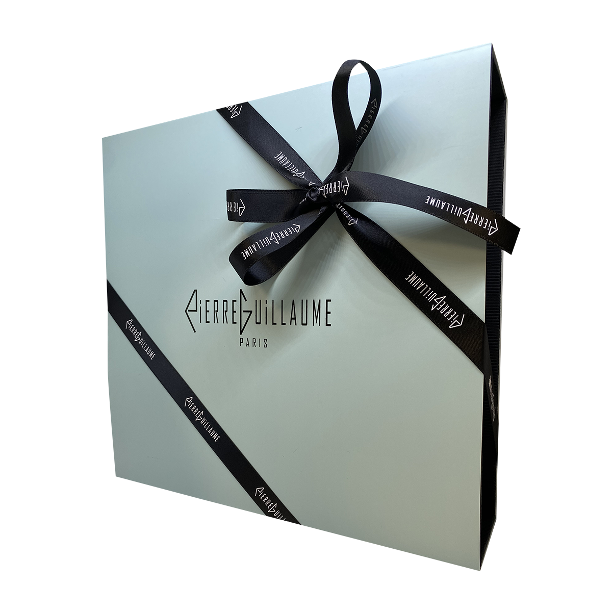
The packaging is a luxury gift box with a thick, sturdy construction, featuring a smooth exterior finish. The box is predominantly a soft pastel color, likely a light mint or pale blue, giving it a sophisticated appearance. It has a clean, elegant design with a large brand logo prominently displayed in a bold, contrasting color. The box is tied with a black ribbon that has the brand name printed in white, adding a premium touch.
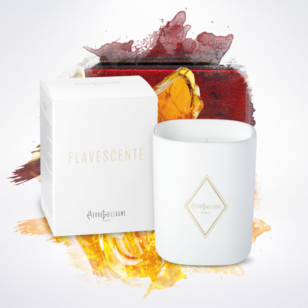
The packaging consists of a smooth, flat white paperboard carton with clean edges and folds. The box is designed to hold a candle, featuring a minimalist aesthetic with a gold diamond logo and product name printed on the front. The overall appearance is sleek and modern, suitable for retail display. The box has a tuck-top closure, ensuring easy access to the product inside.
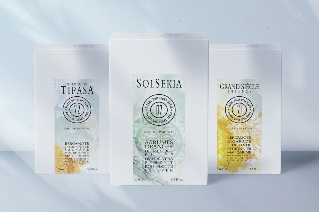
The packaging consists of three individual folding cartons, each featuring a smooth, flat construction without any visible fluted layers. The boxes are primarily white with colorful graphics and text on the front. Each carton has clean, precise edges and folds, indicating a well-constructed design. The surface appears to have a matte finish, giving it a premium look. The graphics include botanical illustrations and vibrant colors, enhancing the visual appeal.
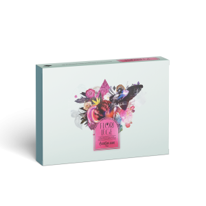
The packaging is a flat, rectangular box with a smooth, single-layer paperboard construction. It features a light blue exterior with vibrant floral graphics and a prominent pink label. The edges are clean and well-defined, indicating precise folding. The box has a glossy finish, enhancing the visual appeal and making the colors pop. There are no visible corrugated edges, confirming it is not a corrugated box. The design includes a central graphic with colorful flowers and a decorative element that draws attention.
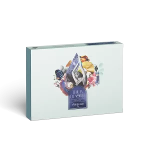
The packaging features a sturdy construction with thick walls, indicative of a rigid box. It has a smooth, matte finish with a soft pastel color, likely a light blue or mint green. The front displays a vibrant graphic design with floral elements and a central image that appears to be a luxury product, possibly food or confectionery. The edges are clean and well-defined, suggesting high-quality manufacturing. There are no visible flaps or tabs, indicating a lid or magnetic closure system.
About the Brand
Pierre Guillaume Paris focuses on crafting unique, high-quality fragrances with an emphasis on artistic presentation and luxury consumer experience. The brand maintains direct control over design and production, ensuring packaging aligns with its creative and ethical values.
Operating as a niche D2C fragrance brand, Pierre Guillaume Paris deploys a packaging approach that combines rigid luxury boxes, premium retail cartons, and minimalist candle cartons. Their packaging is characterized by high-grade paperboard, refined finishing techniques, and visually cohesive branding elements. Attention to detail is evident in the use of specialty closures, branded ribbons, and illustrative graphics, which contribute to a premium unboxing experience and align with luxury market expectations.
Key Differentiator: Pierre Guillaume Paris distinguishes itself through the integration of artisanal design, luxury materials, and consistent brand storytelling across both primary and secondary packaging.
Design System
Visual Style
Sophisticated typography with serif and sans-serif pairings, pastel and neutral color palettes (mint, pale blue, white, gold), and botanical or artistic graphic accents. The overall aesthetic is modern, elegant, and distinctly European.
Brand Identity
Consistent use of a prominent brand logo, clean brand name placement, and minimalistic iconography. Visual consistency is maintained through repeated motifs, such as floral graphics and signature color schemes, across all packaging types.
Packaging Design
Preference for high-quality, recyclable paperboard and rigid box construction. Emphasis on luxury finishes (matte/glossy, gold foil), precision folding, custom closures, and branded ribbons to reinforce exclusivity and craftsmanship.
User Experience
The packaging design enhances the customer journey by delivering a tactile, visually rich unboxing moment. Attention to detail in structure and finish supports brand storytelling and deepens consumer engagement, reinforcing the perception of quality from first touch to product use.
Company Metrics
Business insights for Pierre Guillaume Paris based on available data
Market Positioning
Brand Values & Focus
Key Competitors
Target Market: Affluent fragrance enthusiasts, luxury beauty consumers, and niche perfume collectors seeking unique olfactory experiences with high-end presentation.
Packaging Assessment
Overall Grade
Visual appeal and presentation quality
Packaging durability and protection
Eco-friendliness and recyclable materials
Cost efficiency and value for money
Packaging assessment for Pierre Guillaume Paris based on industry standards and best practices
Frequently Asked Questions
How does Pierre Guillaume Paris ensure packaging quality aligns with its luxury positioning?
Pierre Guillaume Paris employs premium rigid boxes, high-quality carton constructions, and detailed finishing such as branded ribbons and glossy or matte coatings. This approach supports both product protection and an elevated consumer experience, reflecting the brand’s commitment to luxury and artistry.
What sustainability measures are present in Pierre Guillaume Paris packaging?
While the brand utilizes recyclable paperboard and adheres to European regulations, the focus on premium finishes and rigid structures may impact overall sustainability. However, their controlled production model allows for responsible sourcing and minimized waste.
Discover other Beauty & Fitness companies
Explore more companies in the beauty & fitness industry and their packaging strategies
Pure Altitude
Beauty & Fitness
Pure Altitude specializes in high-quality beauty and skincare products that leverage the expertise of spa treatments to enhance daily routines. The brand offers a diverse range of products tailored for both facial and body care.
Cultiv Cosmetique
Beauty & Fitness
Cultiv Cosmetique is a French skincare brand that provides organic and eco-friendly beauty products inspired by nature. They focus on effective skincare solutions for various skin concerns.
Owari
Beauty & Fitness
Owari specializes in 100% natural beauty and fitness products, designed to enhance health and wellness. The company proudly offers its products made in France, emphasizing quick delivery and customer support.