Phizz packaging
Phizz specializes in science-led hydration solutions, delivering effervescent tablets designed for optimal health and performance. Their packaging leverages branded cylindrical tubes and retail cartons, combining strong shelf presence with a focus on sustainability and consumer convenience.
Packaging Portfolio
Phizz’s packaging portfolio centers on cylindrical paperboard tubes with snap-on caps, optimized for effervescent tablet protection and consumer portability. The tubes are often assembled into retail carton boxes, constructed from single-layer paperboard with matte or glossy finishes. All packaging formats prioritize recyclability and efficient stacking, supporting both logistics and sustainability objectives. The bold color palette and large, legible typography communicate product features and align with the brand’s health-forward positioning.

The packaging consists of a flat, rectangular base with six cylindrical tubes arranged vertically. Each tube is labeled with a bold design featuring the brand name 'PHIZZ' prominently displayed in white and orange colors. The base of the packaging is a smooth, flat construction without fluted layers, indicative of single-layer paperboard. The overall appearance is clean and modern, with a matte finish. The tubes have a black cap and feature vibrant graphics that highlight the product's benefits, including hydration and energy.

The packaging consists of three cylindrical tubes, each containing effervescent tablets. The tubes are made of a smooth, single-layer paperboard with a glossy finish. Each tube features a black cap and a predominantly black and orange color scheme. The design is clean and modern, with clear labeling and vibrant colors. The front of each tube displays the product name 'Daily Energy' prominently, along with key features such as 'Hydration', 'Caffeine', 'Electrolytes', and 'Vitamins'. The back of the tubes likely contains additional product information, though not visible in the image.

The image features a collection of clear plastic containers and bottles, with a prominent yellow cylindrical container labeled 'PHIZZ' positioned upright atop the pile. The containers vary in shape and size, with some having screw-on caps and others appearing to be open or partially filled. The background is a vibrant yellow, enhancing the visibility of the plastic materials.

The packaging is a cylindrical tube container with a bright orange exterior and a white cap. The tube is designed to hold effervescent tablets, likely for hydration purposes. The surface is smooth with a matte finish, and the overall appearance is sleek and modern. The front of the tube features bold black text that reads 'PHIZZ' prominently, along with additional product information in smaller text below. The design is minimalistic yet eye-catching, aimed at conveying a sense of health and vitality.
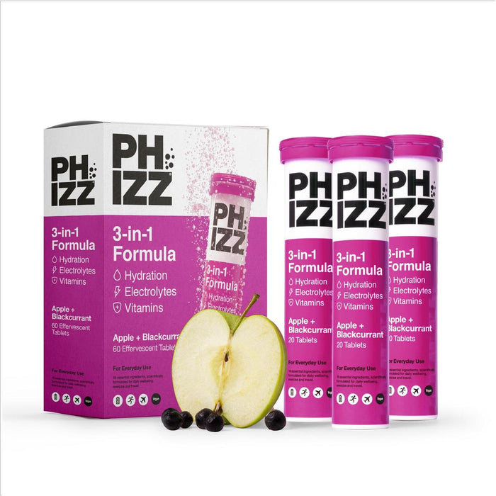
The packaging consists of a retail carton box that houses three cylindrical tubes. The carton is primarily white with vibrant pink accents. It features a smooth, flat construction without fluted layers, indicative of paperboard. The front displays a large logo and product information, while the sides have additional details about the product. The inner tubes are cylindrical and made of a similar paperboard material, each labeled with the product name and flavor.
About the Brand
Phizz develops hydration and nutritional supplements targeting athletes and health-conscious consumers, utilizing direct-to-consumer channels. Their product range is anchored by effervescent tablets, with packaging engineered for portability, shelf impact, and clear communication of product benefits.
Founded in 2015, Phizz has established itself in the hydration supplement market, emphasizing scientific credibility and environmental responsibility. The brand’s packaging strategy integrates bold visual branding with recyclable materials, supporting both product integrity and sustainability claims. Consistent use of vibrant, modern design elements enhances brand recognition across retail and e-commerce environments.
Key Differentiator: Phizz's unique value lies in its integration of science-backed formulations with a visible sustainability commitment, reinforced by recyclable packaging and plastic waste collection initiatives.
Design System
Visual Style
Utilizes bold sans-serif typography, a vibrant color palette (notably orange, black, white, and yellow), and minimalist, high-contrast layouts. The aesthetic is modern, energetic, and health-oriented.
Brand Identity
Consistent use of the PHIZZ logo, prominent product naming, and clear iconography ensure strong visual recognition. Branding elements are applied uniformly across all packaging formats to maintain coherence and shelf impact.
Packaging Design
Focuses on recyclable paperboard tubes and cartons, with structural integrity to protect tablets and facilitate easy stacking. Packaging design balances material efficiency with consumer usability, prioritizing lightweight, robust formats.
User Experience
Design choices support a straightforward, positive customer journey: easy-to-read labels, portable containers, and an engaging, vibrant unboxing experience that reinforces brand values and product functionality.
Company Metrics
Business insights for Phizz based on available data
Market Positioning
Brand Values & Focus
Key Competitors
Target Market: Health-conscious consumers, athletes, and busy professionals seeking science-backed hydration and nutritional supplements with a focus on convenience and sustainability.
Packaging Assessment
Overall Grade
Visual appeal and presentation quality
Packaging durability and protection
Eco-friendliness and recyclable materials
Cost efficiency and value for money
Packaging assessment for Phizz based on industry standards and best practices
Frequently Asked Questions
What types of packaging does Phizz use for its products?
Phizz employs cylindrical paperboard tubes for effervescent tablets, often housed within retail carton boxes. These materials are chosen for their durability, portability, and ability to showcase bold branding, while also supporting recyclability.
How does Phizz address sustainability in its packaging?
Phizz incorporates recyclable paperboard materials and partners with plastic waste collection programs. The company’s packaging strategy is designed to minimize environmental impact while ensuring product safety and consumer convenience.
What is the visual style of Phizz’s packaging?
The packaging features a modern, energetic aesthetic with bold typography, high-contrast color schemes (notably orange, black, and white), and clear product labeling to enhance consumer recognition and shelf appeal.
Discover other Health companies
Explore more companies in the health industry and their packaging strategies
Comvita
Health
Comvita is a New Zealand-based company specializing in high-quality Mānuka honey and natural health products. Established in 1974, it aims to connect people with the healing power of nature.
Bio-Synergy
Health
Bio-Synergy is a UK-based company specializing in health and fitness products, including nutritional supplements and DNA testing kits. Their mission is to support individuals in achieving their health and fitness goals through innovative products and personalized insights.
EVO Nutrition
Health
EVO Nutrition specializes in premium health supplements, providing a wide range of vitamins and nutritional products to support well-being.