Phen24 packaging
Phen24 specializes in direct-to-consumer weight loss supplements and employs a dual-bottle packaging system to support its 24-hour formula. The brand leverages visually distinct, rigid and carton packaging formats to enhance product differentiation and reinforce its health-focused positioning.

Packaging Portfolio
Phen24’s packaging portfolio comprises rigid HDPE or PET bottles for primary containment, paired with single-layer paperboard folding cartons for retail and shipping. The rigid bottles offer high impact resistance and product protection, while the cartons provide additional branding real estate and logistical stacking stability. Color segmentation enhances SKU differentiation, and modern label design supports regulatory compliance. Material choices align with industry standards for supplement safety, though with moderate sustainability performance due to plastic reliance.
The packaging is a clear plastic bottle with a white screw-on cap. The bottle is cylindrical in shape and contains capsules inside, which are visible through the transparent material. The label wraps around the bottle, featuring a predominantly white background with blue and green accents. The label includes product information and branding elements.
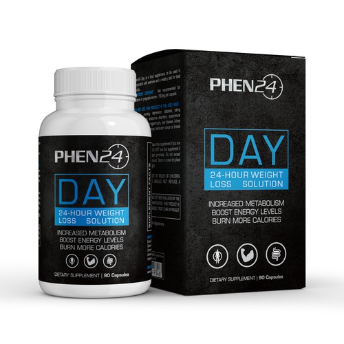
The packaging consists of a folding carton made from a single layer of paperboard. It features smooth, flat construction with clean edges and folds. The exterior is predominantly black with vibrant blue and white text, creating a striking contrast. The front displays the product name 'PHEN24 DAY' prominently, along with descriptors like '24-Hour Weight Loss Solution' and additional product information. The carton has a matte finish, giving it a sleek appearance. The sides include nutritional information and usage instructions, printed in a smaller font. The overall shape is rectangular, designed to stand upright.
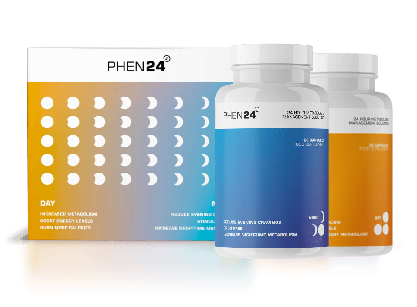
The packaging consists of a flat carton box with a smooth, single-layer paperboard construction. The box features a vibrant gradient color scheme transitioning from blue to orange, with a modern design aesthetic. It contains two cylindrical bottles, one white and one orange, each with a screw-on cap. The bottles are labeled with clear product information and branding. The carton has clean edges and folds, indicating precise construction.

The packaging consists of two rigid bottles, each with a thick, sturdy construction typical of premium supplement packaging. The bottles are made of opaque plastic with a smooth surface finish. The caps are white and feature a secure twist-off design. Each bottle has a distinct color scheme, with one in orange and the other in blue, both prominently displaying the brand name 'PHEN24' on the front. The labels are cleanly applied with precise edges, and the overall appearance is sleek and modern.
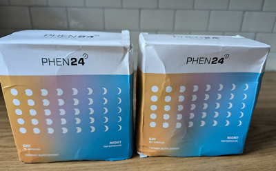
The packaging consists of two folding cartons, each with a smooth, flat construction. The boxes are primarily white with a gradient color transition from blue to orange at the bottom. The front features a series of small, circular icons representing phases or types, arranged in a grid pattern. The text is printed in a clear, modern font, indicating 'DAY' and 'NIGHT' along with 'DIETARY SUPPLEMENT'. The edges are clean and precise, typical of retail packaging.
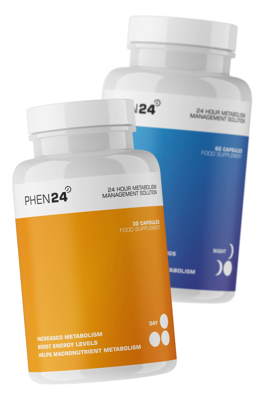
The packaging consists of two rigid bottles, one orange and one blue, each containing capsules. The bottles have a smooth, glossy finish with a rounded shape and a wide neck. The labels are printed with vibrant colors and clear text, indicating the product name and benefits. The overall design is sleek and modern, appealing to health-conscious consumers.
About the Brand
Phen24 operates in the health supplement sector with a focus on weight management, offering a two-part solution for round-the-clock metabolic support. Their packaging strategy centers on clear visual differentiation between day and night products, using rigid bottles and retail cartons to ensure both functional integrity and strong brand presence.
The packaging architecture employs color coding (orange for day, blue for night) and robust rigid bottle construction housed within gradient-printed cartons. This dual-format system is designed for visual clarity, tamper resistance, and efficient storage, aiming to meet both consumer and logistics requirements. Packaging consistently displays regulatory, ingredient, and usage information—critical for health product compliance.
Key Differentiator: Phen24’s packaging uniquely supports a 24-hour supplement regimen through color-segmented, dual-bottle systems, emphasizing distinction, compliance, and consumer trust.
Design System
Visual Style
Modern sans-serif typography, a color palette featuring blue, orange, and white gradients, and clean, minimalistic layouts for clear information hierarchy.
Brand Identity
Consistent use of the Phen24 logo, day/night iconography, and color-coded elements ensure immediate brand and product recognition. Visual consistency is maintained across all touchpoints via standardized fonts, color schemes, and icon usage.
Packaging Design
Material selection prioritizes product integrity with rigid plastic bottles and recyclable paperboard cartons. Structural design focuses on tamper resistance, secure closures, and efficient shelf presence.
User Experience
Design choices—such as color coding, clear labeling, and ergonomic bottle shapes—facilitate intuitive product selection and reinforce the 24-hour regimen concept, supporting a seamless and trustworthy customer journey from unboxing to daily use.
Company Metrics
Business insights for Phen24 based on available data
Market Positioning
Brand Values & Focus
Key Competitors
Target Market: Health-conscious adults seeking comprehensive, natural weight management support, primarily in Tier I markets such as the UK and Europe.
Packaging Assessment
Overall Grade
Visual appeal and presentation quality
Packaging durability and protection
Eco-friendliness and recyclable materials
Cost efficiency and value for money
Packaging assessment for Phen24 based on industry standards and best practices
Frequently Asked Questions
What types of packaging does Phen24 use for its supplements?
Phen24 utilizes a combination of rigid plastic bottles for product containment and paperboard carton boxes for retail presentation and shipping. Each product variant—day and night—features distinct color schemes and branding for easy consumer identification.
How does Phen24's packaging contribute to the user experience?
The packaging design employs color differentiation, clear labeling, and modern aesthetics, which enhance product identification and reinforce the 24-hour support concept, contributing to a streamlined and informative unboxing experience.
Is Phen24’s packaging environmentally friendly?
While the use of recyclable paperboard for cartons aligns with sustainability best practices, the rigid plastic bottles, though durable, present moderate recyclability. Overall, the packaging demonstrates moderate commitment to sustainability.
Discover other Health companies
Explore more companies in the health industry and their packaging strategies
Lily & Loaf
Health
Lily & Loaf specializes in high-quality health and nutrition products, offering a range of supplements and vitamins aimed at supporting an active lifestyle. The company focuses on providing natural solutions for health and beauty.
EVO Nutrition
Health
EVO Nutrition specializes in premium health supplements, providing a wide range of vitamins and nutritional products to support well-being.
Smart Protein
Health
Smart Protein is dedicated to transforming nutrition by providing a range of health and wellness products focused on protein supplements and vitamins.