PERS Skincare packaging
PERS Skincare is a direct-to-consumer beauty brand specializing in streamlined skincare solutions with a focus on ingredient transparency and product efficacy. Their packaging strategy emphasizes minimalist design, premium materials, and consistent branding to reinforce a modern, high-quality consumer experience.
Packaging Portfolio
PERS Skincare employs a packaging portfolio dominated by minimalist folding carton boxes, rigid glass containers, and cosmetic tubes. Materials such as single-layer paperboard and glass are selected for their premium tactile qualities and recyclability, while envelope-style cartons and retail-ready inserts enhance presentation for discovery kits and sampling. The use of clean, precise folds and matte or gloss finishes contributes to a cohesive, modern retail presence, aligning both with consumer expectations in the beauty segment and sustainability benchmarks.

The packaging consists of a smooth, flat white envelope-style carton with a pointed flap closure. Inside, there are two product cards displayed prominently, each featuring distinct graphics and text. The overall appearance is clean and modern, with a minimalist aesthetic. The envelope is designed to hold the product cards securely, suggesting a focus on presentation and branding.

The packaging is a flat, rectangular folding carton designed for retail display. It features a smooth, white paperboard construction with clean, precise edges and folds. The front displays a large graphic of a dropper bottle, with the brand name 'PERS' prominently featured at the top. The carton includes a color accent in orange, which frames the product information. The overall design is minimalist and modern, with a matte finish that gives it a premium feel.

The packaging consists of multiple white folding cartons arranged in a visually appealing manner. Each carton features a smooth, flat construction without visible fluted layers, indicating they are made from single-layer paperboard. The edges are clean and precise, suggesting high-quality manufacturing. The cartons are primarily white with minimalistic black text, which enhances the modern and elegant aesthetic. The design includes product names and descriptions in a clear, sans-serif font, contributing to a cohesive brand identity.

The image features various skincare products, each housed in distinct packaging. The containers include glass bottles and jars with thick walls, indicative of premium construction. The surfaces are smooth and glossy, enhancing their luxury appearance. The packaging is predominantly black and white with some colored elements, such as yellow and orange, which are used for specific product lines. The labels are clean and feature clear text, with some products showcasing a matte finish while others have a shiny gloss.
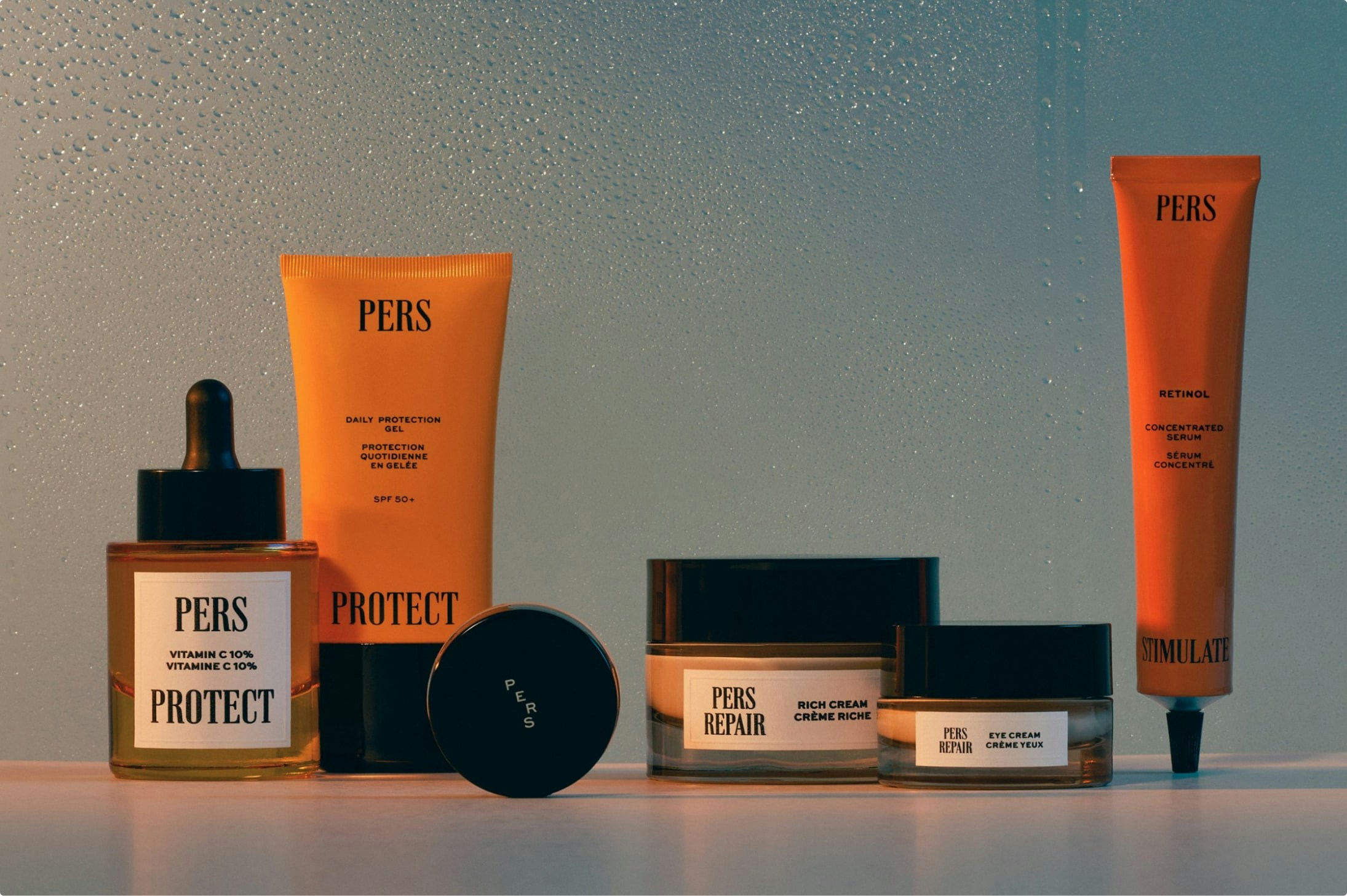
The packaging consists of various cosmetic containers and tubes, primarily made from paperboard and plastic. The products are arranged in a visually appealing manner, showcasing their labels and branding. The containers include a dropper bottle, tubes, and jars, all with clean lines and smooth surfaces. The color scheme is predominantly white and orange, with black text for branding and product information. The labels are well-finished, suggesting a retail-ready appearance.

The packaging consists of a rectangular folding carton and a tube. The carton is made of smooth, flat paperboard with clean edges and folds, featuring a glossy finish. The tube is a standard cosmetic container with a tapered end and a screw cap. The overall design is minimalist, with a white background and black text. The carton displays the product name 'STIMULATE' prominently, along with the ingredient 'RETINOL' and the volume of the product.
About the Brand
PERS Skincare operates in the beauty and fitness industry, delivering targeted skincare products formulated with clinically proven ingredients. The brand's packaging approach leverages minimalist carton boxes and rigid containers, combining visual clarity with product protection.
With a compact range of serums, creams, and sun protection solutions, PERS Skincare utilizes folding cartons, rigid boxes, and cosmetic tubes, prioritizing clean lines and precise finishing. Packaging materials predominantly include single-layer paperboard and glass, chosen for both premium feel and recyclability. The consistent use of white, black, and accent colors in packaging design reinforces the brand’s identity and appeals to a contemporary, ingredient-conscious audience.
Key Differentiator: PERS Skincare’s unique value lies in its integration of minimalist, high-quality packaging with a commitment to natural, vegan, and dermatologically tested formulations, aligning product presentation with ingredient transparency and sustainability.
Design System
Visual Style
The visual design system consists of sans-serif typography, a predominantly white and black color palette with selective use of orange and yellow accents, and a strong minimalist aesthetic. Packaging layouts prioritize whitespace and legible text, supporting clean product communication.
Brand Identity
Brand identity is maintained through prominent and consistent logo placement, uniform iconography for product lines, and a cohesive application of color and type across all packaging. Visual consistency is ensured with standardized font sizes and clear product naming conventions.
Packaging Design
Material selection focuses on recyclable paperboard and glass, with structural choices favoring folding cartons, rigid boxes, and tubes for optimal product protection and shelf appeal. The design philosophy emphasizes simplicity, durability, and premium finishing.
User Experience
The packaging system is designed to create a seamless unboxing experience, supporting brand perception through tactile quality and visual clarity. Easy-to-read information, intuitive opening mechanisms, and consistent visual cues facilitate product discovery and enhance consumer trust.
Company Metrics
Business insights for PERS Skincare based on available data
Market Positioning
Brand Values & Focus
Key Competitors
Target Market: Ingredient-conscious and sustainability-oriented consumers seeking premium, minimalist skincare products in European and global D2C markets.
Packaging Assessment
Overall Grade
Visual appeal and presentation quality
Packaging durability and protection
Eco-friendliness and recyclable materials
Cost efficiency and value for money
Packaging assessment for PERS Skincare based on industry standards and best practices
Frequently Asked Questions
What types of packaging formats does PERS Skincare use?
PERS Skincare employs folding carton boxes, rigid boxes, glass bottles, cosmetic tubes, and envelope-style cartons, all featuring minimalist branding and premium finishes.
How does PERS Skincare address sustainability in its packaging?
The brand uses recyclable materials like paperboard and glass for most packaging, and its design choices prioritize material efficiency and environmental impact.
What is the primary focus of PERS Skincare’s packaging design?
Their packaging focuses on clarity, simplicity, and consistency, using minimalist layouts and high-quality materials to reinforce brand integrity and user trust.
Discover other Beauty & Fitness companies
Explore more companies in the beauty & fitness industry and their packaging strategies
Pure Altitude
Beauty & Fitness
Pure Altitude specializes in high-quality beauty and skincare products that leverage the expertise of spa treatments to enhance daily routines. The brand offers a diverse range of products tailored for both facial and body care.
Orris Paris
Beauty & Fitness
Orris Paris specializes in creating artisanal skincare products that combine potent botanical ingredients with modern cleansing rituals. The company emphasizes natural, holistic practices in its formulations.
Owari
Beauty & Fitness
Owari specializes in 100% natural beauty and fitness products, designed to enhance health and wellness. The company proudly offers its products made in France, emphasizing quick delivery and customer support.