Parfümerie Ruthe packaging
Parfümerie Ruthe operates as an online retailer in the beauty and personal care sector, offering a curated range of fragrances and body care products. The company employs premium rigid and carton packaging, with a strong focus on branded unboxing experiences and seasonal visual themes.
Packaging Portfolio
Parfümerie Ruthe’s packaging portfolio is dominated by rigid boxes for gift sets and premium fragrances, complemented by structurally sound folding cartons for individual products. Materials include thick chipboard and coated paperboard, offering both tactile luxury and product protection. Window cut-outs, high-gloss coatings, and thematic graphics are frequently employed to enhance shelf presence and seasonal appeal. Branding is prominent, with consistent use of logos and product names, while clear plastic windows and decorative motifs are integrated for consumer engagement and product visibility.

The packaging is a rigid box with a sturdy construction, featuring a high-quality finish. It has a smooth, flat surface with a light blue color scheme. The box is rectangular in shape and appears to be designed for retail display. The edges are clean and precise, indicating a premium build. The box has a glossy finish, enhancing its visual appeal.

The packaging features a sturdy, thick chipboard construction with a premium appearance. It has a decorative exterior with a black background adorned with gold floral patterns. The front has a clear plastic window that showcases the product inside, which includes a hand and nail cream and a skull necklace. The edges are clean and precise, emphasizing its high-quality finish. The box is designed to be opened from the top, revealing the contents inside.

The packaging consists of sleek, smooth paperboard boxes designed for individual fragrance bottles. Each box features a clean, flat construction with precise edges and folds, indicative of a folding carton. The exterior is likely coated for a glossy finish, enhancing visual appeal. The boxes are predominantly white with elegant gold and black accents, showcasing the brand name and product line prominently.
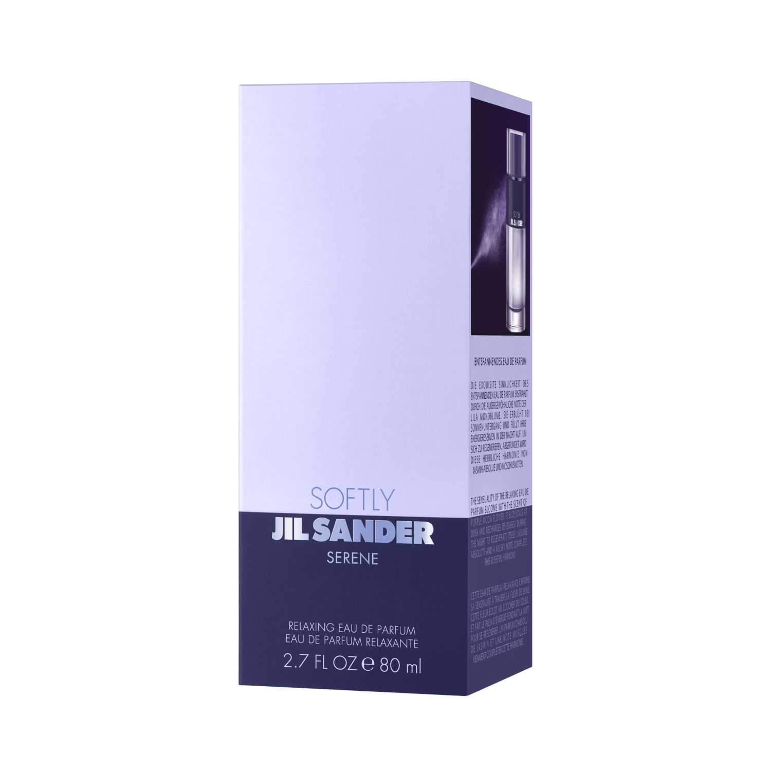
The packaging is a rectangular folding carton made of smooth, single-layer paperboard. The box features a predominantly white exterior with a glossy finish, accented by a dark purple base and bold black text. The edges are clean and precise, with sharp folds. The front displays the product name 'SOFTLY JIL SANDER' in large, prominent lettering, while the lower section includes additional product information in smaller font. The overall design is sleek and modern, typical of retail packaging for cosmetics or fragrances.
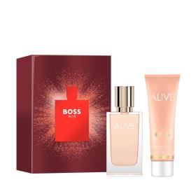
The packaging consists of a sturdy, thick-walled box with a premium appearance. It features a vibrant red exterior with a glossy finish, showcasing a central graphic of a perfume bottle silhouette. The box is designed to hold both a perfume bottle and a cream tube, indicating a gift set. The edges are clean and precise, with a luxurious feel.
About the Brand
Parfümerie Ruthe specializes in the online distribution of beauty, fragrance, and personal care products, leveraging a diverse product mix and targeted seasonal offerings. Their packaging strategy emphasizes premium materials and visually compelling structures to reinforce product positioning in the competitive beauty market.
The company utilizes a combination of rigid gift boxes and custom folding cartons, often featuring brand-specific graphics, glossy finishes, and decorative elements. Emphasis is placed on seasonal design integration, particularly for holiday-themed collections, which enhances shelf differentiation and consumer engagement. Packaging is sourced from reputable suppliers and typically aligns with luxury retail standards, balancing visual appeal with functional protection.
Key Differentiator: Parfümerie Ruthe stands out for its focus on seasonally driven packaging and curated unboxing experiences that reinforce brand value while addressing logistics and display needs for high-end beauty products.
Design System
Visual Style
Typography is modern and bold, utilizing sans-serif fonts for readability and brand impact. The color palette frequently features strong contrasts—such as reds, blacks, golds, and whites—with glossy or matte finishes to evoke luxury and seasonality. Visuals are both festive and refined, aligning with gift and holiday themes.
Brand Identity
Brand logos and product names are consistently prominent on primary packaging panels. Iconography, such as skull motifs for seasonal lines, and visual consistency across product ranges support strong brand recall. Packaging design maintains alignment with luxury and contemporary beauty aesthetics.
Packaging Design
Material selection favors rigid chipboard for durability and premium feel, as well as coated paperboard for folding cartons. Structural design emphasizes clean edges, window features for product display, and secure closures to protect product integrity during transit and retail handling.
User Experience
The design system prioritizes a compelling unboxing experience, with tactile and visual cues that reinforce product value. Packaging layouts facilitate easy access, while seasonal graphics and display windows enhance gifting appeal and customer satisfaction at each touchpoint.
Company Metrics
Business insights for Parfümerie Ruthe based on available data
Market Positioning
Brand Values & Focus
Key Competitors
Target Market: End consumers seeking premium beauty and personal care products, with a focus on seasonal shoppers and gift buyers in the German and broader European online retail market.
Packaging Assessment
Overall Grade
Visual appeal and presentation quality
Packaging durability and protection
Eco-friendliness and recyclable materials
Cost efficiency and value for money
Packaging assessment for Parfümerie Ruthe based on industry standards and best practices
Frequently Asked Questions
What types of packaging does Parfümerie Ruthe use for its products?
The company employs a mix of rigid boxes for premium gift sets and customized folding cartons for individual fragrance and body care products, prioritizing brand alignment and visual differentiation.
How does Parfümerie Ruthe's packaging support the unboxing experience?
Packaging is designed with high-quality finishes, precise structural integrity, and clear branding elements to deliver a memorable and premium unboxing experience, particularly for gift and seasonal items.
What is the sustainability approach in Parfümerie Ruthe's packaging?
While the packaging portfolio emphasizes quality and durability, there is moderate integration of recyclable materials, with a focus on premium paperboard and chipboard substrates; however, use of glossy coatings and mixed materials may limit recyclability.
Discover other Beauty & Fitness companies
Explore more companies in the beauty & fitness industry and their packaging strategies
Institut Karité Paris
Beauty & Fitness
Institut Karité Paris specializes in luxury beauty products made with natural Shea Butter, offering a wide range of skincare and body care solutions. The brand combines Parisian heritage with a commitment to quality and creativity in its offerings.
Big Moustache
Beauty & Fitness
Big Moustache specializes in shaving and grooming products tailored for men, providing a hassle-free subscription service for razor blades and skincare essentials.
Orris Paris
Beauty & Fitness
Orris Paris specializes in creating artisanal skincare products that combine potent botanical ingredients with modern cleansing rituals. The company emphasizes natural, holistic practices in its formulations.