Ozone Coffee packaging
Ozone Coffee is a UK-based specialty coffee roaster focused on quality, sustainability, and direct-to-consumer delivery. Their packaging strategy emphasizes modern flexible solutions that balance brand visibility, consumer engagement, and logistical performance.
Packaging Portfolio
Ozone Coffee’s packaging portfolio is centered on flexible, stand-up pouches constructed from multi-layer films with matte or kraft paper finishes, supporting both barrier protection and brand storytelling. Resealable closures and heat seals enhance product freshness and consumer convenience. Minimalist labeling with bold typography and color-coded accents provides clear differentiation between blends and origins, while the use of natural kraft and recyclable materials signals sustainability intent. Structural simplicity is prioritized for efficient packing, shipping, and shelf presence, aligning with both e-commerce and specialty retail requirements.

The packaging is a flexible pouch made of a multi-layer film. It features a matte finish with a smooth texture. The front displays a large, bold logo 'OZONE' in uppercase letters, prominently placed at the top. Below the logo, there is a description of the coffee's flavor profile, printed in a smaller font. The background is primarily white, with a colored label in purple that contains additional product details. The edges of the pouch are sealed, and there is a tear notch for easy opening.
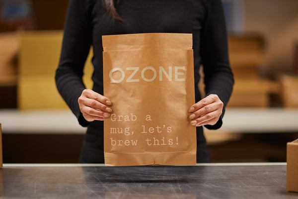
The packaging is a flat, paper bag held by a person. It has a kraft brown exterior with a smooth finish. The bag features a simple design with the word 'OZONE' prominently displayed in large, white, uppercase letters at the top. Below, in smaller white text, it reads 'Grab a mug, let's brew this!'. The edges of the bag are clean and well-folded, indicating a retail packaging style. The bag does not have any visible closures or structural elements like flaps or handles.

The packaging is a flat, stand-up pouch made from a flexible material, likely a composite of plastic and foil. The front features a glossy finish with a white background, prominently displaying the brand name 'OZONE' in bold black letters at the top. Below the brand name, there is a colorful label with an orange background that contains product information, including tasting notes and weight. The edges are sealed, and the top has a resealable zipper feature.

The packaging is a flat, stand-up pouch made from a flexible material. It features a matte finish with a smooth texture. The front of the bag has a large, bold logo in black, reading 'OZONE,' and a peach-colored label that contains product information. The bag is sealed at the top with a heat seal, and the bottom is gusseted to allow it to stand upright. The overall shape is rectangular, with rounded corners.
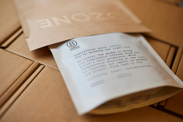
The packaging consists of a flexible coffee bag that is partially opened, revealing a white inner layer with printed text. The outer layer is a kraft paper finish with the brand name 'OZONE' prominently displayed in a bold, uppercase font. The bag has a smooth, flat construction without any fluted layers, indicating it is made from a single-layer material. The edges are clean and precise, typical of retail coffee packaging. The bag appears to have a resealable feature at the top, allowing for easy access and preservation of freshness.
About the Brand
Ozone Coffee operates as a specialty coffee roaster, prioritizing direct sourcing, ethical practices, and freshness through daily roasting. Their packaging reflects an emphasis on minimalism, clear brand identity, and practical user features such as resealable closures.
By leveraging flexible, stand-up pouches with matte and kraft finishes, Ozone Coffee ensures both product freshness and strong on-shelf presence. Distinctive labeling highlights blend, origin, and tasting notes, supporting consumer education. The brand’s approach blends modern retail aesthetics with practical considerations for e-commerce and in-store sales, focusing on customer experience from unboxing to brewing.
Key Differentiator: Ozone Coffee’s unique differentiation lies in its daily roasted, specialty-grade coffee, integrated with clean, brand-forward packaging that fuses sustainability initiatives and a minimalist visual strategy.
Design System
Visual Style
Modern, minimalist typography (bold sans-serif), clean layouts, and restrained color palettes that rely on white, kraft brown, and accent colors for blend differentiation.
Brand Identity
Consistent use of the 'OZONE' brand name in uppercase, minimal iconography, and a focus on clear, readable product details. Visual consistency is maintained across all SKUs and channels.
Packaging Design
Material choices favor multi-layer flexible films and kraft papers for barrier performance and eco-perception. Structural design features include stand-up bases and resealable closures for user functionality.
User Experience
Design supports a seamless customer journey: clear labeling and tactile finishes enhance the unboxing ritual, resealable features ensure product longevity, and minimalist branding reinforces premium positioning and recognizability.
Company Metrics
Business insights for Ozone Coffee based on available data
Market Positioning
Brand Values & Focus
Key Competitors
Target Market: Specialty coffee consumers in the UK and Europe seeking ethically sourced, high-quality coffee delivered through e-commerce and retail channels.
Packaging Assessment
Overall Grade
Visual appeal and presentation quality
Packaging durability and protection
Eco-friendliness and recyclable materials
Cost efficiency and value for money
Packaging assessment for Ozone Coffee based on industry standards and best practices
Frequently Asked Questions
What packaging formats does Ozone Coffee use?
Ozone Coffee primarily utilizes flexible stand-up pouches with resealable closures, matte and kraft finishes, and custom-printed brand elements. These formats are chosen for optimal freshness, shipping protection, and retail presentation.
How sustainable is Ozone Coffee's packaging?
Ozone Coffee’s packaging incorporates recyclable materials and minimalistic design, though full recyclability and compostability vary by product line. The brand demonstrates a commitment to reducing environmental impact within specialty coffee sector norms.
How does Ozone Coffee ensure product safety during shipping?
Packaging is designed with multi-layer barriers and heat-sealed or resealable closures to preserve freshness and protect against physical damage during transport, offering robust protection throughout the supply chain.
Discover other Food & Drink companies
Explore more companies in the food & drink industry and their packaging strategies
Teegschwendner GmbH
Food & Drink
Teegschwendner GmbH is a specialty tea company based in Germany, offering a wide selection of high-quality teas and tea-related accessories. They focus on providing unique tea experiences through carefully sourced and curated products.
ruf lebensmittelwerk kg
Food & Drink
RUF Lebensmittelwerk KG is a German food production company specializing in a variety of baking mixes and drink products. Founded in 1920, the company is known for its high-quality ingredients and innovative food solutions.
Thés de la Pagode
Food & Drink
Thés de la Pagode is a French company specializing in organic teas and infusions, focusing on health and well-being. Established in 1987, they prioritize sustainable practices and high-quality ingredients sourced through fair trade.