Onekind packaging
Onekind is a Los Angeles-based skincare brand delivering D2C beauty products that balance inclusivity with high-performance formulations. Their packaging strategy leverages minimalistic, modern tubes and cartons designed to reinforce brand identity and ensure product integrity throughout the customer journey.
Packaging Portfolio
Onekind's packaging portfolio centers on the use of flexible plastic squeeze tubes and rigid single-layer paperboard cartons, both chosen for their protective qualities and consistent aesthetic. Tubes are finished in matte or glossy coatings, with a range of subdued color palettes and gold or white typography for clear product differentiation. The use of flip-top or screw-on caps provides convenience and product safety, while outer cartons enhance retail presentation and shipping durability. Packaging structures are simple yet robust, reflecting a balance between premium shelf presence and cost efficiency.
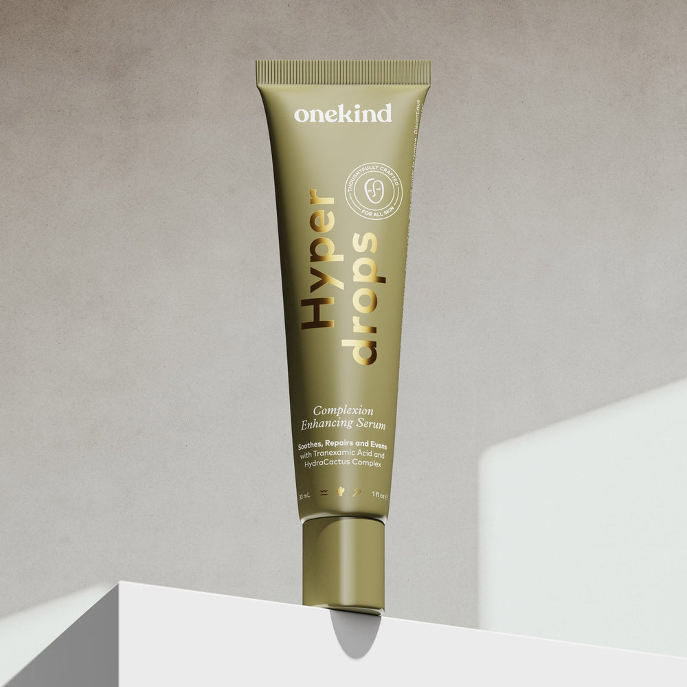
The packaging is a cosmetic tube with a cylindrical shape, featuring a tapered end for easy dispensing. The surface is smooth with a matte finish, predominantly in a muted gold color. The tube has a clean, modern aesthetic with minimalistic design elements. The text is printed in a contrasting color, likely white or light, with a clear focus on the product name 'Hyper drops' and additional product information. The cap is likely a twist-off or flip-top design for convenient access.

The packaging is a squeeze tube designed for cosmetic products. It features a cylindrical shape with a tapered end for dispensing. The tube is predominantly light blue with a glossy finish, and the surface is smooth without any visible fluted layers, indicating it is made from a flexible plastic material. The front of the tube displays the product name 'Youth drops' in bold, gold lettering, along with a logo for onekind.us. The overall design is modern and clean, with a minimalistic approach.
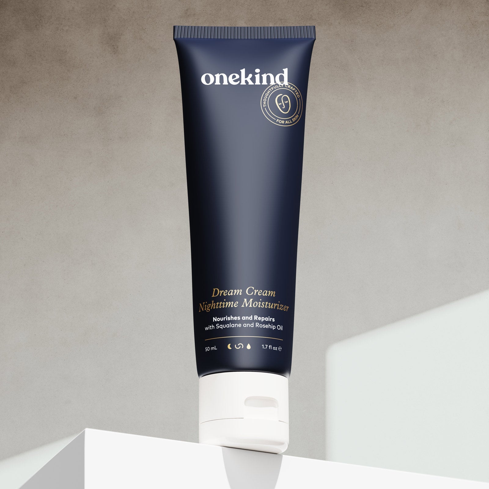
The packaging is a squeeze tube made of flexible plastic with a cylindrical shape. The tube has a dark navy blue color with a matte finish, featuring a white flip-top cap at the bottom. The design is sleek and modern, with minimalistic branding elements. The front of the tube displays the product name and description in gold lettering, while the back contains additional product information in smaller white text.
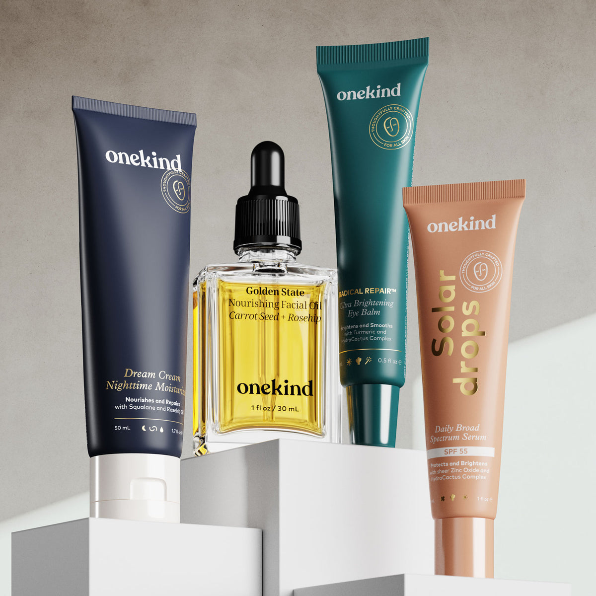
The image features a variety of cosmetic products displayed on a neutral background. The packaging includes a tube for 'Dream Cream Nighttime Moisturizer', a bottle for 'Golden State Nourishing Facial Oil', a tube for 'Solar Drops Daily Broad Spectrum Serum', and a tube for 'Medical Repair Eye Cream'. The tubes are cylindrical with smooth, flat surfaces and clean edges, showcasing a modern design aesthetic. The colors are predominantly navy blue, green, and beige with contrasting text and logos.
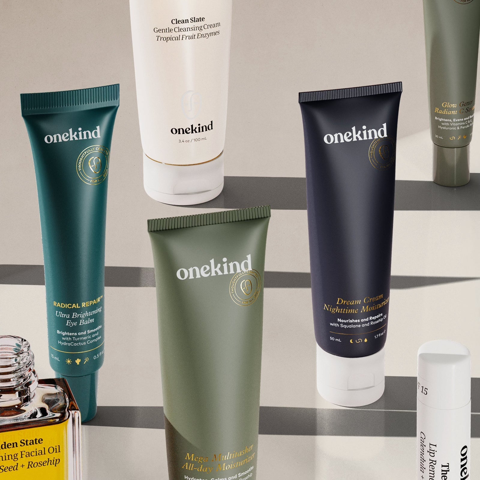
The image features several cosmetic tubes arranged aesthetically. Each tube has a distinct color palette, with some in dark green, navy blue, and white. The tubes have a smooth, flat construction without fluted layers, indicating they are made from single-layer paperboard. The caps are typically screw-on or flip-top, providing easy access to the product inside. The overall design is sleek and modern, appealing to a beauty-conscious audience.
About the Brand
Onekind operates in the beauty and skincare sector, offering a targeted range of moisturizers, serums, cleansers, facial oils, and sunscreens. Their packaging approach features cohesive visual branding, with an emphasis on sleek, functional tube formats and rigid cartons designed for shelf appeal and protection.
Founded in 2010 by siblings with deep industry experience, Onekind has cultivated a loyal customer base with a focus on community engagement and product transparency. Their packaging integrates premium aesthetics and user-friendly formats, utilizing color differentiation and matte or glossy finishes to support both retail display and at-home use. As a D2C brand, their packaging must also meet logistical demands for safe delivery and memorable unboxing.
Key Differentiator: Onekind distinguishes itself through its commitment to inclusivity, strong visual brand consistency across formats, and a direct-to-consumer model that prioritizes both customer experience and packaging quality.
Design System
Visual Style
A modern, minimalistic design language using sans-serif typography, deep navy, muted green, beige, and light blue color palettes, with accent gold or white lettering. Finishes alternate between matte and gloss to signal product lines or usage occasions.
Brand Identity
Prominent logo and product name placement, consistent typographical hierarchy, and uniform iconography create strong visual cohesion. Brand elements are applied systematically across tubes and cartons to maintain high recognizability.
Packaging Design
Material selection prioritizes flexible plastics for tubes (balancing durability and ease of use) and recyclable paperboard for cartons. Structural choices emphasize simplicity, protection during transit, and low material waste, supporting efficient D2C fulfillment.
User Experience
Packaging design supports a seamless customer journey, from clear shelf navigation to a visually appealing unboxing. Touchpoints such as tactile finishes, accessible closures, and clear labeling contribute to a premium, inclusive experience aligned with Onekind's brand values.
Company Metrics
Business insights for Onekind based on available data
Market Positioning
Brand Values & Focus
Key Competitors
Target Market: Digitally engaged, ingredient-conscious skincare consumers seeking premium, inclusive beauty solutions with an emphasis on quality and brand transparency.
Packaging Assessment
Overall Grade
Visual appeal and presentation quality
Packaging durability and protection
Eco-friendliness and recyclable materials
Cost efficiency and value for money
Packaging assessment for Onekind based on industry standards and best practices
Frequently Asked Questions
What types of packaging does Onekind primarily use for its skincare products?
Onekind predominantly utilizes flexible plastic squeeze tubes and rigid paperboard cartons for their skincare products, optimizing for both product protection and visual shelf impact.
How does Onekind approach sustainability in its packaging?
While Onekind employs recyclable paperboard cartons and streamlined tube designs, there is room for further adoption of sustainable materials or refillable solutions to enhance their environmental profile.
How does Onekind's packaging reinforce their brand identity?
Their packaging consistently features the Onekind logo, cohesive color palettes, and modern typography, creating a unified brand experience across all product lines.
Discover other Beauty & Fitness companies
Explore more companies in the beauty & fitness industry and their packaging strategies
Cultiv Cosmetique
Beauty & Fitness
Cultiv Cosmetique is a French skincare brand that provides organic and eco-friendly beauty products inspired by nature. They focus on effective skincare solutions for various skin concerns.
Institut Karité Paris
Beauty & Fitness
Institut Karité Paris specializes in luxury beauty products made with natural Shea Butter, offering a wide range of skincare and body care solutions. The brand combines Parisian heritage with a commitment to quality and creativity in its offerings.
Big Moustache
Beauty & Fitness
Big Moustache specializes in shaving and grooming products tailored for men, providing a hassle-free subscription service for razor blades and skincare essentials.