Odiba packaging
Odiba is a Gelsenkirchen-based D2C company specializing in gourmet coffee and popcorn, emphasizing sustainability and creative brand expression. Their packaging strategy leverages kraft paper stand-up pouches with artistic labeling, designed to reinforce a premium, visually distinctive unboxing experience.
Packaging Portfolio
Odiba’s packaging solutions are built around kraft paper stand-up pouches with resealable closures, optimizing both shelf presence and freshness retention. The selection of natural, matte-finish materials supports a sustainable brand narrative, while vibrant, limited-edition art labels create strong visual differentiation. Structural features such as flat bottoms and tear notches enhance stability and usability. The combination of recyclable substrates and premium graphic design positions Odiba’s packaging as both functional and brand-forward within the specialty coffee and snack sector.

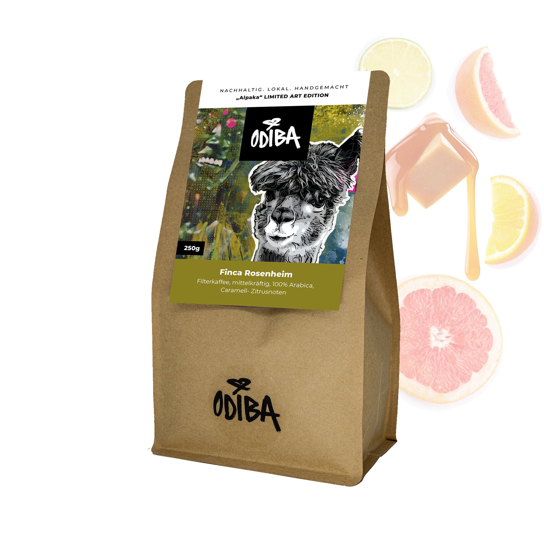
The packaging is a stand-up pouch made of kraft paper with a resealable top. It features a matte finish with a glossy label on the front. The bag has a rectangular shape, tapering slightly towards the bottom, allowing it to stand upright. The front label includes vibrant graphics, showcasing a stylized image of a rabbit and colorful elements, likely representing the coffee's origin and flavor profile.
The packaging is a stand-up pouch made of kraft paper with a glossy front panel. It features a resealable top and is designed to hold coffee. The front showcases vibrant graphics with a colorful artistic design, along with product information and branding elements. The back is plain kraft with some text and possibly nutritional information.
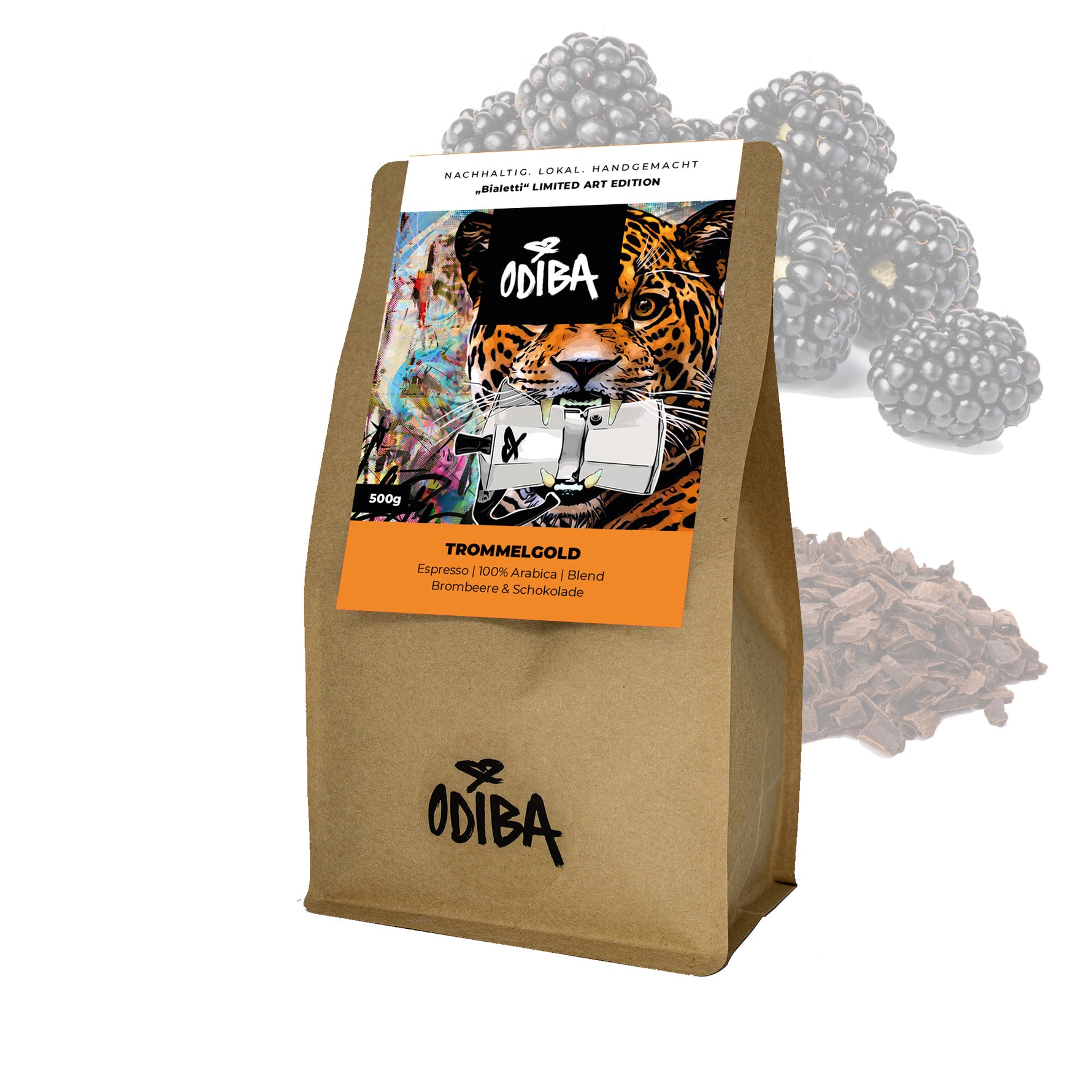
The packaging is a stand-up pouch made of a brown kraft paper exterior with a smooth finish. It features a resealable top with a tear notch for easy opening. The front showcases a vibrant graphic design with a tiger and colorful abstract elements, prominently displaying the brand name 'ODIBA' and product name 'TROMMELGOLD'. The back of the pouch likely contains product information and nutritional details, though not visible in the image.
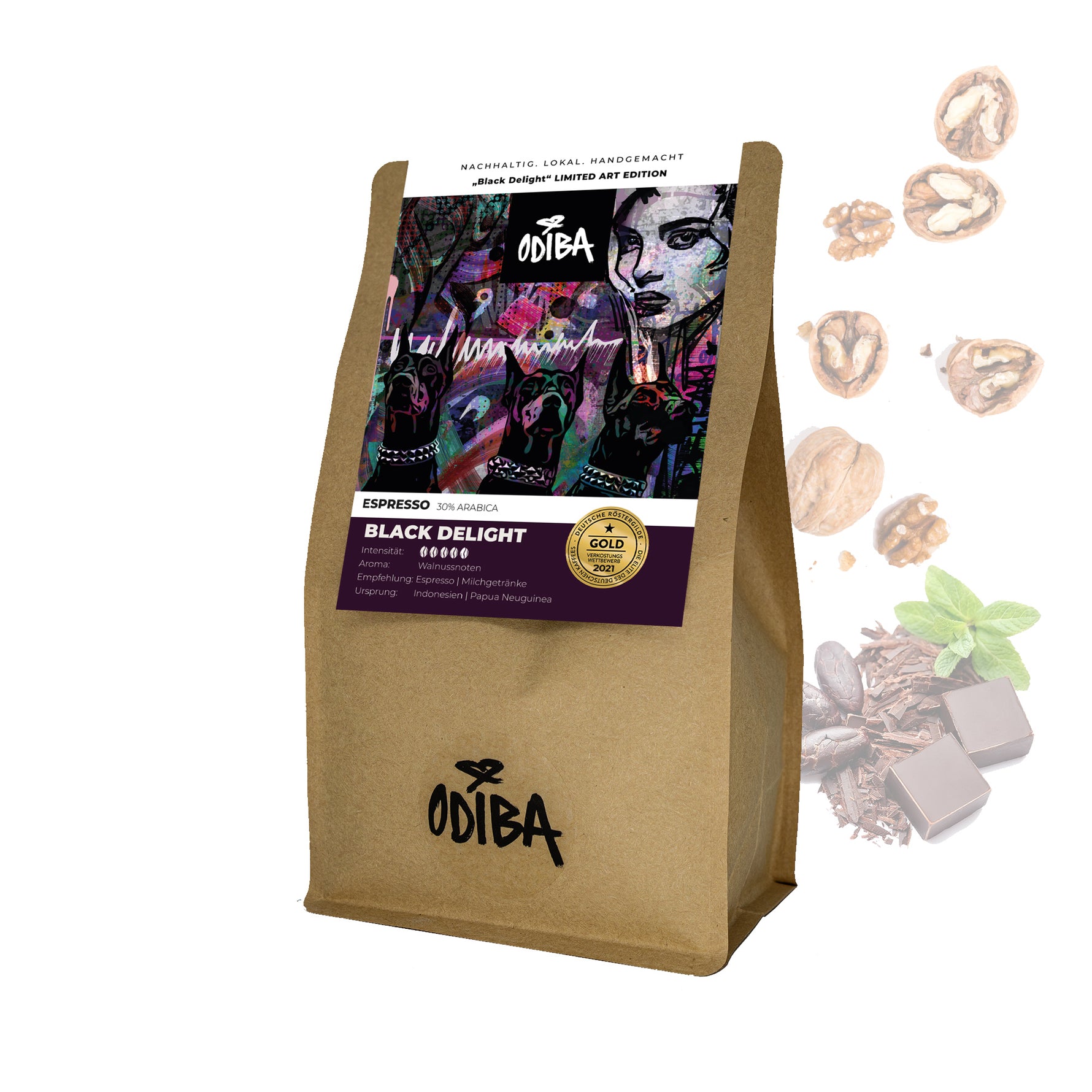
The packaging is a stand-up coffee bag made from kraft paper with a flat bottom. It features a resealable top and a prominent label on the front. The bag has a natural brown color with a smooth texture, indicating a paper-based material. The label is colorful and includes graphics and text that highlight the product details.

The packaging is a stand-up pouch made from a kraft paper exterior with a resealable top. The front features a vibrant, artistic label with a colorful design, showcasing the product name 'Sidamo' prominently. The label includes product information such as weight (250g) and a note about being a limited art edition. The back of the pouch likely contains additional product details and nutritional information. The overall shape is rectangular with a flat bottom for stability.
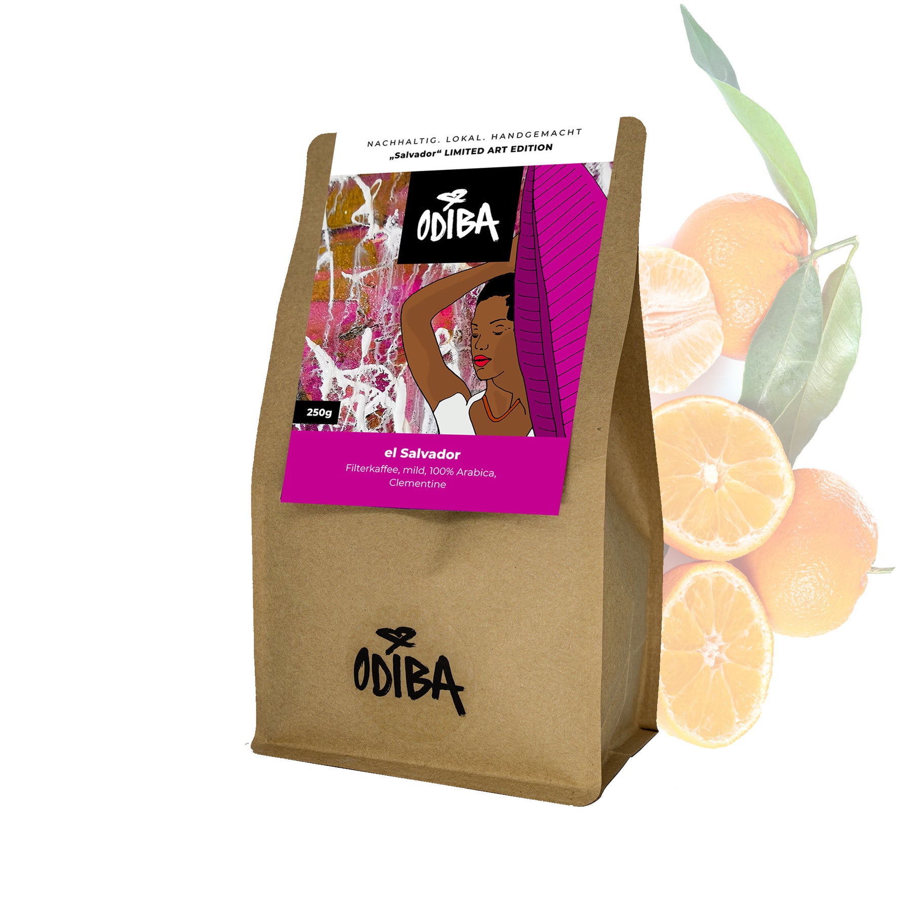
The packaging is a flat-bottom coffee bag made from kraft paper with a colorful front label. The bag features a resealable top, allowing for easy access and preservation of freshness. The front showcases a vibrant graphic design with a woman and bright colors, while the back is plain kraft. The bag has a matte finish with a smooth texture.
About the Brand
Odiba operates within the gourmet food and beverage sector, focusing on specialty coffee, popcorn, and snacks. Their packaging approach features resealable kraft paper pouches with vibrant, art-driven labels, aligning with their brand values of creativity, quality, and sustainability.
The company’s packaging portfolio reflects a consistent use of eco-friendly materials and limited art editions, supporting both product freshness and aesthetic differentiation. The focus on resealable structures enhances usability and maintains product integrity, while the graphic-forward label designs underscore Odiba’s commitment to customer engagement and brand storytelling.
Key Differentiator: Odiba’s integration of limited art editions and sustainable kraft materials establishes strong brand recognition and appeals to environmentally conscious consumers seeking premium, experiential food products.
Design System
Visual Style
Contemporary typography with bold, sans-serif fonts; an earthy, natural color palette anchored by kraft brown, complemented by vivid accent colors on labels; overall aesthetic emphasizes artistic, handcrafted qualities.
Brand Identity
Consistent use of the ODIBA logo and product names on all packaging; iconography and graphics are unique to each product but adhere to a cohesive visual language reflecting creativity and quality; high visual consistency across SKUs.
Packaging Design
Preference for kraft paper materials with resealable, stand-up pouch formats; structural design prioritizes freshness, convenience, and environmental responsibility; limited art editions reinforce brand exclusivity and customer engagement.
User Experience
Design elements support a premium, tactile unboxing experience; resealable closures and clear information architecture enhance usability; artistic labels provide an emotional connection, reinforcing brand storytelling and encouraging repeat purchase.
Company Metrics
Business insights for Odiba based on available data
Market Positioning
Brand Values & Focus
Key Competitors
Target Market: Odiba targets quality-conscious consumers in Germany seeking premium, ethically sourced coffee and gourmet snacks, with a focus on direct-to-consumer online and café-based experiences.
Packaging Assessment
Overall Grade
Visual appeal and presentation quality
Packaging durability and protection
Eco-friendliness and recyclable materials
Cost efficiency and value for money
Packaging assessment for Odiba based on industry standards and best practices
Frequently Asked Questions
What packaging materials does Odiba use for its coffee and snacks?
Odiba primarily utilizes stand-up kraft paper pouches with resealable closures and artistic, branded labels for its coffee and popcorn products.
How does Odiba’s packaging enhance the customer experience?
The packaging combines visual artistry with functional features like resealable tops, supporting product freshness and delivering a memorable, premium unboxing experience.
Is Odiba’s packaging sustainable?
Odiba employs kraft paper-based materials and emphasizes recyclability and reduced environmental impact throughout its packaging design.
Discover other Food & Drink companies
Explore more companies in the food & drink industry and their packaging strategies
Teegschwendner GmbH
Food & Drink
Teegschwendner GmbH is a specialty tea company based in Germany, offering a wide selection of high-quality teas and tea-related accessories. They focus on providing unique tea experiences through carefully sourced and curated products.
PrepMyMeal
Food & Drink
PrepMyMeal is a food production company specializing in high-protein meal delivery services. They offer a variety of natural, nutritious meals designed for fitness enthusiasts and those seeking convenience in meal preparation.
ruf lebensmittelwerk kg
Food & Drink
RUF Lebensmittelwerk KG is a German food production company specializing in a variety of baking mixes and drink products. Founded in 1920, the company is known for its high-quality ingredients and innovative food solutions.