Nutristrength packaging
Nutristrength specializes in premium nutritional supplements and health foods, targeting fitness enthusiasts and health-conscious consumers. Their packaging strategy emphasizes resealable, visually branded solutions, balancing product freshness, consumer appeal, and logistics efficiency.
Packaging Portfolio
Nutristrength employs a packaging portfolio dominated by flexible stand-up pouches with resealable zip closures for powders, as well as rigid cylindrical containers for select products. These structures are chosen for their balance of product protection, shelf stability, and user convenience. Visual execution emphasizes high-impact graphics, ingredient imagery, and clear information hierarchy, supporting strong brand recognition. Material selection favors multilayer flexible films for barrier performance, with rigid board or composite tubes used for premium product lines. Branding is consistently applied across all formats, ensuring cohesion throughout the range.

The packaging is a stand-up pouch made from a flexible material that allows it to maintain an upright position. The front features a large, clear window displaying the product inside, which is a pea protein powder. The background has a wood-like texture with images of green peas and vanilla pods, emphasizing the natural ingredients. The top of the pouch has a resealable zipper closure, and the sides are slightly crinkled, indicating the flexible nature of the material.
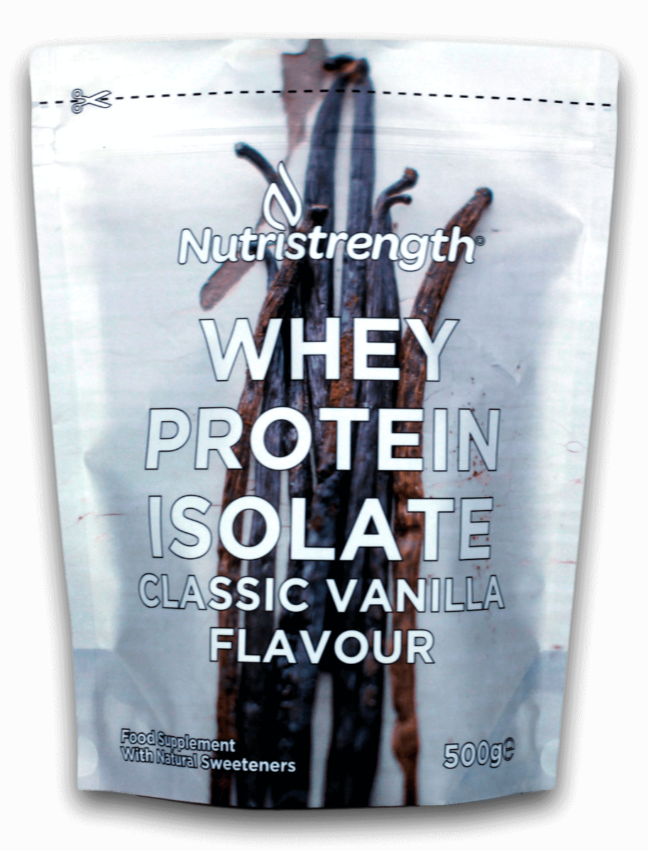
The packaging is a stand-up pouch made from a flexible material that allows it to maintain an upright position. It features a smooth surface with a glossy finish, predominantly white in color with a large graphic of vanilla pods. The front displays the product name 'Whey Protein Isolate' in bold, modern typography, with 'Classic Vanilla Flavour' prominently featured below. The bottom section includes a smaller text indicating the net weight of 500g and a note about natural sweeteners.
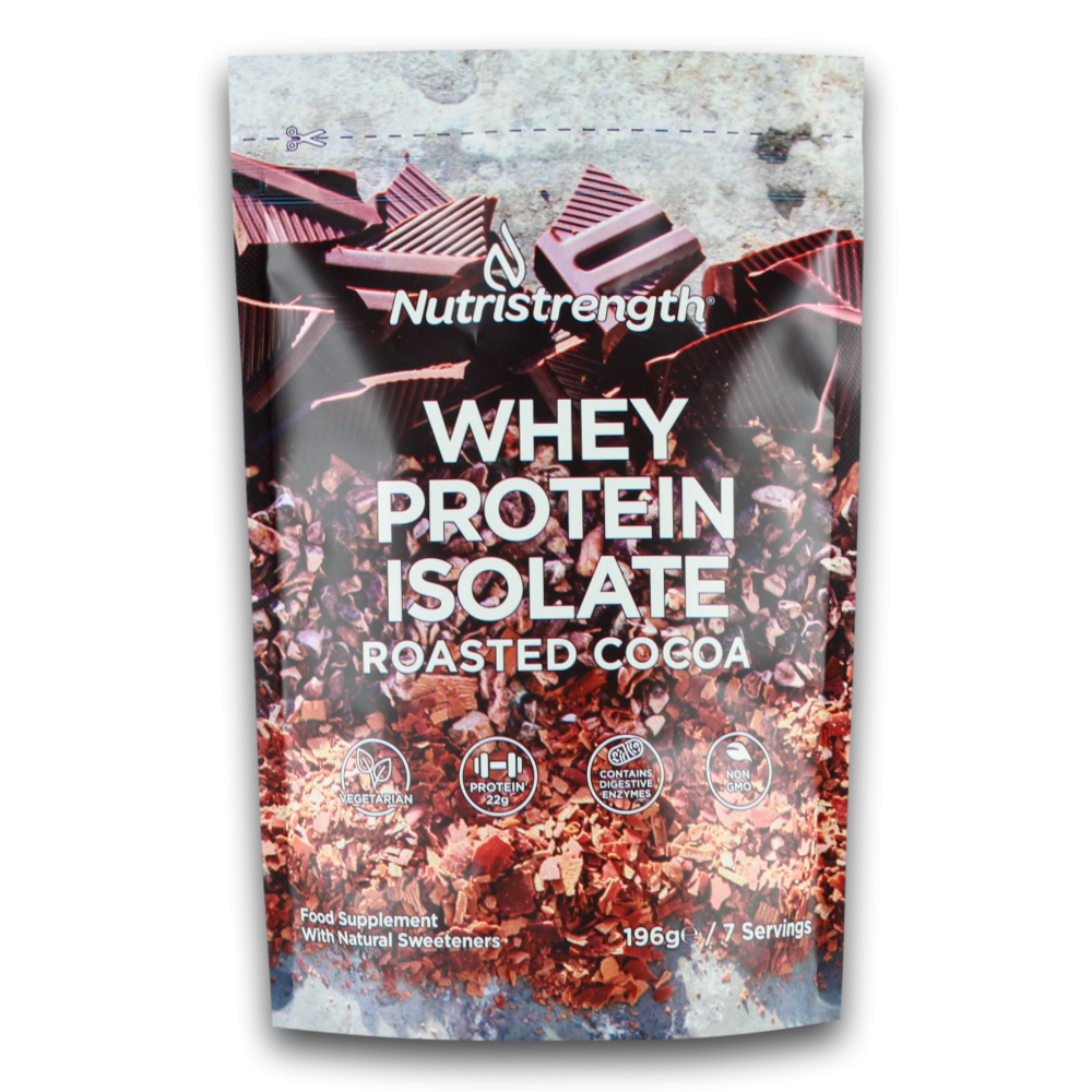
The packaging is a stand-up pouch made of a flexible material that allows it to maintain an upright position. It features a resealable zipper at the top, which is common for convenience and freshness. The front of the pouch is adorned with vibrant graphics, showcasing the product name 'Whey Protein Isolate' prominently, along with a flavor descriptor 'Roasted Cocoa'. The background includes images of cocoa beans and nuts, enhancing the visual appeal. The overall design is colorful and eye-catching, aimed at attracting consumers in a retail environment.
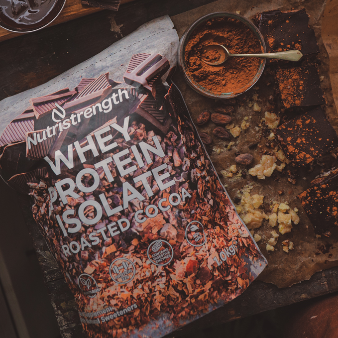
The packaging is a stand-up pouch made from a flexible material that allows it to maintain an upright position. The front features a glossy finish with vibrant colors, prominently displaying the product name 'Whey Protein Isolate' in bold white lettering against a dark background. The background includes an image of cocoa pieces, adding visual appeal. The top of the pouch has a resealable zipper closure, ensuring product freshness. The sides of the pouch are smooth and flat, with no visible fluted layers, indicating it is not corrugated or rigid. The overall shape is rectangular with rounded edges, typical of flexible pouches.

The packaging is a cylindrical container made of thick, sturdy chipboard. It features a smooth, matte finish with vibrant graphics of green peas and a kiwi, emphasizing the product's flavor. The top of the container is sealed with a lid that fits snugly, and the overall design is visually appealing, aimed at attracting health-conscious consumers.

The packaging is a cylindrical container made of thick, sturdy material. It features a smooth, matte finish with a predominantly white exterior. The top is slightly domed, and there are no visible flaps or tabs, indicating a sealed design. The container has a clean and modern aesthetic, with minimalistic text and a subtle texture that gives it a premium feel.
About the Brand
Nutristrength operates within the health and nutrition industry, offering a diverse portfolio of protein supplements and functional foods. The brand is committed to high-quality, natural ingredients and emphasizes transparency in sourcing and product formulation.
Based in the UK, Nutristrength manufactures all products in a modern facility, catering to a range of dietary needs including vegan options. Their business model is direct-to-consumer (D2C), with a digital-first approach to sales and customer engagement. Packaging is a core part of their brand expression, used to communicate quality and ingredient integrity, while supporting logistics and consumer convenience.
Key Differentiator: Nutristrength differentiates itself through its focus on natural, premium ingredients, a visually cohesive packaging system, and a strong commitment to transparency and customer experience.
Design System
Visual Style
Typography leans towards modern sans-serif fonts for clarity and approachability, with a color palette anchored in whites, earthy neutrals, and vibrant accent colors that reflect natural ingredients. The overall aesthetic is clean, minimal, and health-oriented.
Brand Identity
Logo usage is prominent on all packages, often paired with distinctive product names and flavor icons. Visual consistency is maintained through uniform placement, color blocking, and recurring ingredient imagery, reinforcing the brand’s trust and transparency positioning.
Packaging Design
Material choices prioritize flexible, multilayer films for pouches to optimize barrier protection and resealability, while rigid chipboard containers are used for select SKUs to enhance perceived value. Structural design emphasizes tamper evidence, ease of use, and space efficiency for both storage and shipping.
User Experience
Design supports the customer journey through intuitive resealable closures, clear product labeling, and visually engaging ingredient callouts. The packaging experience aligns with the D2C model, aiming for positive first impressions and repeat purchase incentives through both aesthetics and functionality.
Company Metrics
Business insights for Nutristrength based on available data
Market Positioning
Brand Values & Focus
Key Competitors
Target Market: Fitness enthusiasts, health-conscious consumers, and individuals seeking high-quality, natural nutrition products in the UK and broader European markets.
Packaging Assessment
Overall Grade
Visual appeal and presentation quality
Packaging durability and protection
Eco-friendliness and recyclable materials
Cost efficiency and value for money
Packaging assessment for Nutristrength based on industry standards and best practices
Frequently Asked Questions
What types of packaging materials does Nutristrength use?
Nutristrength primarily utilizes flexible stand-up pouches and rigid cylindrical containers, with an emphasis on resealable closures and visually branded finishes to balance product protection and consumer appeal.
Does Nutristrength focus on sustainable packaging?
While Nutristrength incorporates some eco-conscious elements such as resealable pouches to reduce waste, the available data does not indicate widespread use of recycled or biodegradable materials. Sustainability appears to be a moderate focus relative to industry peers.
How effective is Nutristrength's packaging in protecting products during shipping?
Nutristrength's packaging demonstrates high integrity in logistics, leveraging sturdy rigid containers and multi-layer flexible pouches to safeguard product freshness and minimize damage risk throughout distribution.
Discover other Health companies
Explore more companies in the health industry and their packaging strategies
EVO Nutrition
Health
EVO Nutrition specializes in premium health supplements, providing a wide range of vitamins and nutritional products to support well-being.
Comvita
Health
Comvita is a New Zealand-based company specializing in high-quality Mānuka honey and natural health products. Established in 1974, it aims to connect people with the healing power of nature.
Bio-Synergy
Health
Bio-Synergy is a UK-based company specializing in health and fitness products, including nutritional supplements and DNA testing kits. Their mission is to support individuals in achieving their health and fitness goals through innovative products and personalized insights.