Nutrimuscle packaging
Nutrimuscle develops and sells dietary supplements focused on athletic performance and wellness, distributing primarily through a direct-to-consumer e-commerce model. Their packaging strategy emphasizes clean, modern visual design and robust product protection, tailored for the health and fitness sector.
Packaging Portfolio
Nutrimuscle’s packaging portfolio consists primarily of rigid cylindrical chipboard and paperboard containers for powders and capsules, complemented by carton boxes for bundled offerings and starter packs. The use of screw-top lids and thick-walled structures enhances durability and product integrity, while the minimalist label designs ensure clear brand recognition and regulatory compliance. This approach balances shelf appeal, logistics safety, and information clarity, but there is room for increased sustainability through alternative materials or reduction of plastic content.
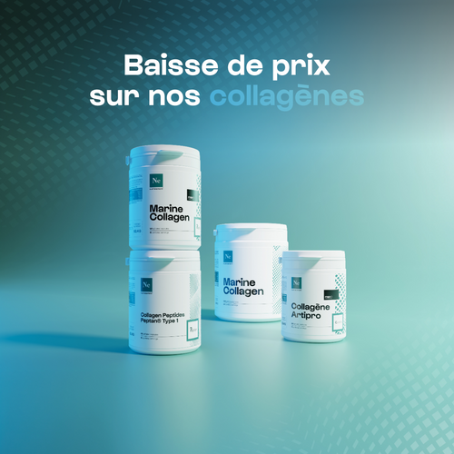
The packaging consists of several cylindrical containers with a smooth, flat construction. Each container is made of white paperboard, featuring clean edges and folds. The containers have a glossy finish, enhancing their visual appeal. They are stacked in a way that showcases their labels prominently. The labels feature a modern design with a light blue gradient background and contrasting black text, indicating product details and branding.
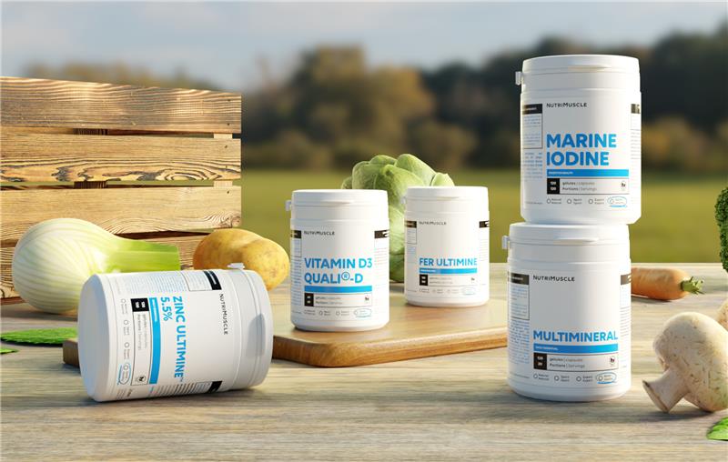
The packaging consists of several cylindrical containers made of thick, sturdy chipboard, each with a clean, smooth surface. The containers have a premium appearance, featuring a white base with colorful labels. The labels are designed with a modern aesthetic, displaying product names and nutritional information clearly. Each container has a screw-on lid, ensuring secure closure. The overall design is consistent and visually appealing, suitable for retail display.
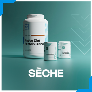
The image features three containers of varying sizes, all with a smooth, cylindrical shape. The largest container is a protein blend with a white base and a clean, modern design. The smaller containers are also white, with a similar aesthetic. Each container has a flat lid and a label that wraps around the body, providing a cohesive look. The overall presentation is sleek and professional, suitable for retail display.
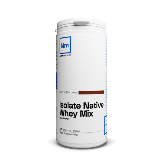
The packaging is a cylindrical container with a smooth, white exterior. It features a screw-on lid at the top and a label wrapped around the body. The label includes product information and branding elements. The container has a clean and modern design with a matte finish.

The image features two containers for L-Citrulline supplements. The larger container has a cylindrical shape with a wide mouth, designed for easy access to the product inside. It is predominantly white with a clean, modern design. The smaller container is similar in shape but more compact. Both containers have a smooth, matte finish with a slightly glossy cap. The labels are well-printed with clear graphics and text, emphasizing the product's name and benefits.
About the Brand
Nutrimuscle is a specialized provider in the beauty and fitness industry, delivering scientifically-formulated supplements to a health-conscious consumer base. Their packaging system leverages rigid containers and carton boxes, prioritizing brand consistency, product safety, and shelf appeal within the competitive supplement sector.
The company’s packaging approach integrates durable cylindrical containers and high-quality carton structures, each featuring minimalist branding and clear product information. Nutrimuscle’s visual identity is reflected in uniform label designs and cohesive color schemes, supporting both logistics efficiency and consumer trust. The inclusion of detailed nutritional labeling and brand elements optimizes both regulatory compliance and consumer engagement.
Key Differentiator: Nutrimuscle distinguishes itself through a combination of transparent ingredient sourcing, direct-to-consumer sales, and a packaging system engineered for both visual consistency and physical protection.
Design System
Visual Style
The visual design utilizes sans-serif typography, a predominantly white color palette with blue and black accents, and a clean, minimalist aesthetic. High contrast and clarity support readability and a modern health-focused image.
Brand Identity
Brand logos are consistently positioned on all packaging surfaces, paired with clear product names and concise icons where appropriate. Visual consistency is maintained across different product lines, reinforcing brand recognition and trust.
Packaging Design
Material selection favors rigid paperboard and chipboard for primary packaging, with a structural focus on cylindrical forms for ergonomic handling and product protection. Carton boxes are employed for multipacks, emphasizing stackability and transit efficiency.
User Experience
Design choices support a seamless customer journey by enabling easy product identification, secure unboxing, and straightforward recycling. The packaging reinforces Nutrimuscle’s brand promises of quality and transparency at each consumer touchpoint.
Company Metrics
Business insights for Nutrimuscle based on available data
Market Positioning
Brand Values & Focus
Key Competitors
Target Market: Health-conscious consumers, athletes, and fitness enthusiasts seeking premium dietary supplements via direct e-commerce channels.
Packaging Assessment
Overall Grade
Visual appeal and presentation quality
Packaging durability and protection
Eco-friendliness and recyclable materials
Cost efficiency and value for money
Packaging assessment for Nutrimuscle based on industry standards and best practices
Frequently Asked Questions
What packaging formats does Nutrimuscle use for its supplement products?
Nutrimuscle primarily uses rigid cylindrical containers made from chipboard or paperboard for powders and capsules, complemented by carton boxes for bundle or multipack offerings. Labels are highly standardized, with prominent brand logos and clear nutritional information.
How does Nutrimuscle approach sustainability in packaging?
While the company utilizes recyclable paperboard and chipboard materials, there is limited evidence of advanced eco-friendly practices such as use of bioplastics or post-consumer recycled content. The minimalist design reduces unnecessary materials, but further sustainability enhancements could be explored.
How effective is Nutrimuscle’s packaging in protecting products during shipping?
The rigid structure of the containers and secure screw-on lids offer strong protection against physical damage and contamination during logistics, reflecting a high standard of transit safety for supplements.
Discover other Beauty & Fitness companies
Explore more companies in the beauty & fitness industry and their packaging strategies
Orris Paris
Beauty & Fitness
Orris Paris specializes in creating artisanal skincare products that combine potent botanical ingredients with modern cleansing rituals. The company emphasizes natural, holistic practices in its formulations.
Institut Karité Paris
Beauty & Fitness
Institut Karité Paris specializes in luxury beauty products made with natural Shea Butter, offering a wide range of skincare and body care solutions. The brand combines Parisian heritage with a commitment to quality and creativity in its offerings.
Big Moustache
Beauty & Fitness
Big Moustache specializes in shaving and grooming products tailored for men, providing a hassle-free subscription service for razor blades and skincare essentials.