no coffee packaging
No Coffee specializes in premium decaffeinated coffee products, leveraging a direct-to-consumer model with a strong emphasis on sustainability. Their packaging combines modern design with functional features, aiming to preserve freshness and deliver a consistent brand experience.
Packaging Portfolio
No Coffee deploys a packaging portfolio dominated by flexible stand-up pouches composed of composite laminates, offering resealable zippers and one-way degassing valves for optimal coffee preservation. These are complemented by minimalist, flat-fold carton boxes for sample and gift sets. The focus on matte finishes, clear labeling, and selective use of color blocking enhances both shelf presence and logistical efficiency. The material choice reflects a balance between product protection, sustainability goals, and cost management, with a visible commitment to recyclable substrates and reduced packaging mass.
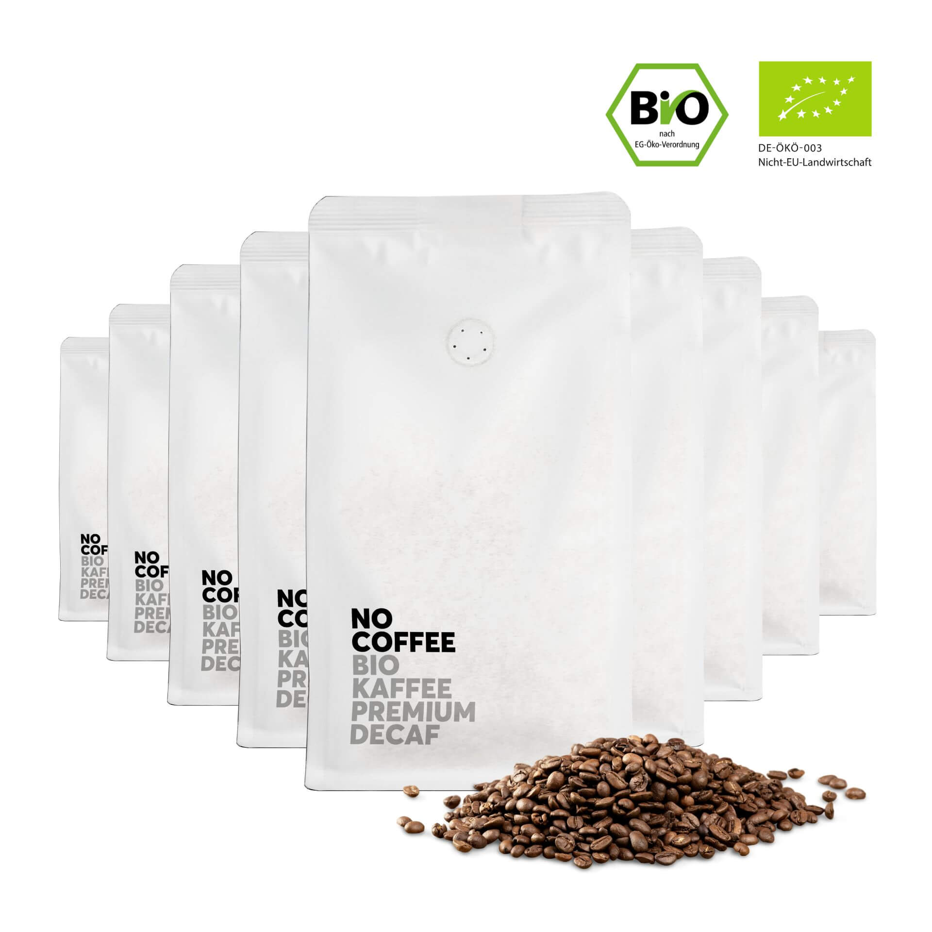
The packaging consists of multiple white bags, each containing coffee beans. The bags have a sleek, smooth surface with a matte finish. Each bag features a small one-way valve, allowing gases to escape while preventing air from entering. The front of the bags prominently displays the brand name 'NO COFFEE' in bold black letters, along with additional product information in smaller text. The bags are uniform in size and shape, with a rectangular form that tapers slightly at the top.
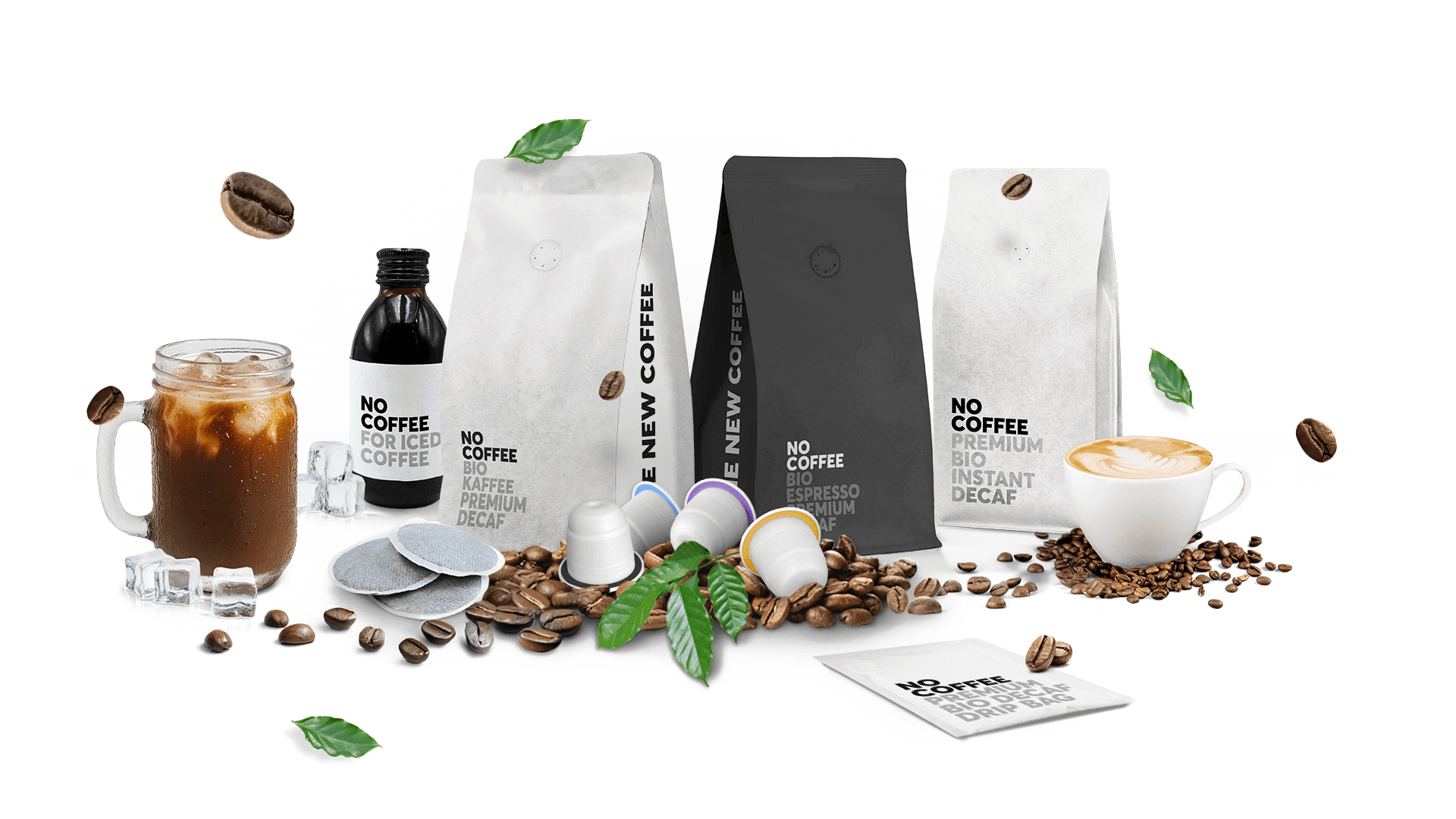
The image features several coffee packaging bags, including a black bag labeled 'NO COFFEE' and a white bag labeled 'NEW COFFEE'. The bags have a flat, smooth appearance with clean edges and folds, indicating they are made from a single-layer paperboard or similar material. The bags are designed for retail display, showcasing a modern aesthetic with minimalistic design elements. The black bag has a matte finish, while the white bag appears to have a glossy or semi-gloss finish. Both bags are adorned with bold typography and minimal graphics, emphasizing the brand name and product type. The arrangement includes coffee beans, a glass of iced coffee, a cup of coffee, and coffee capsules, enhancing the overall coffee theme.
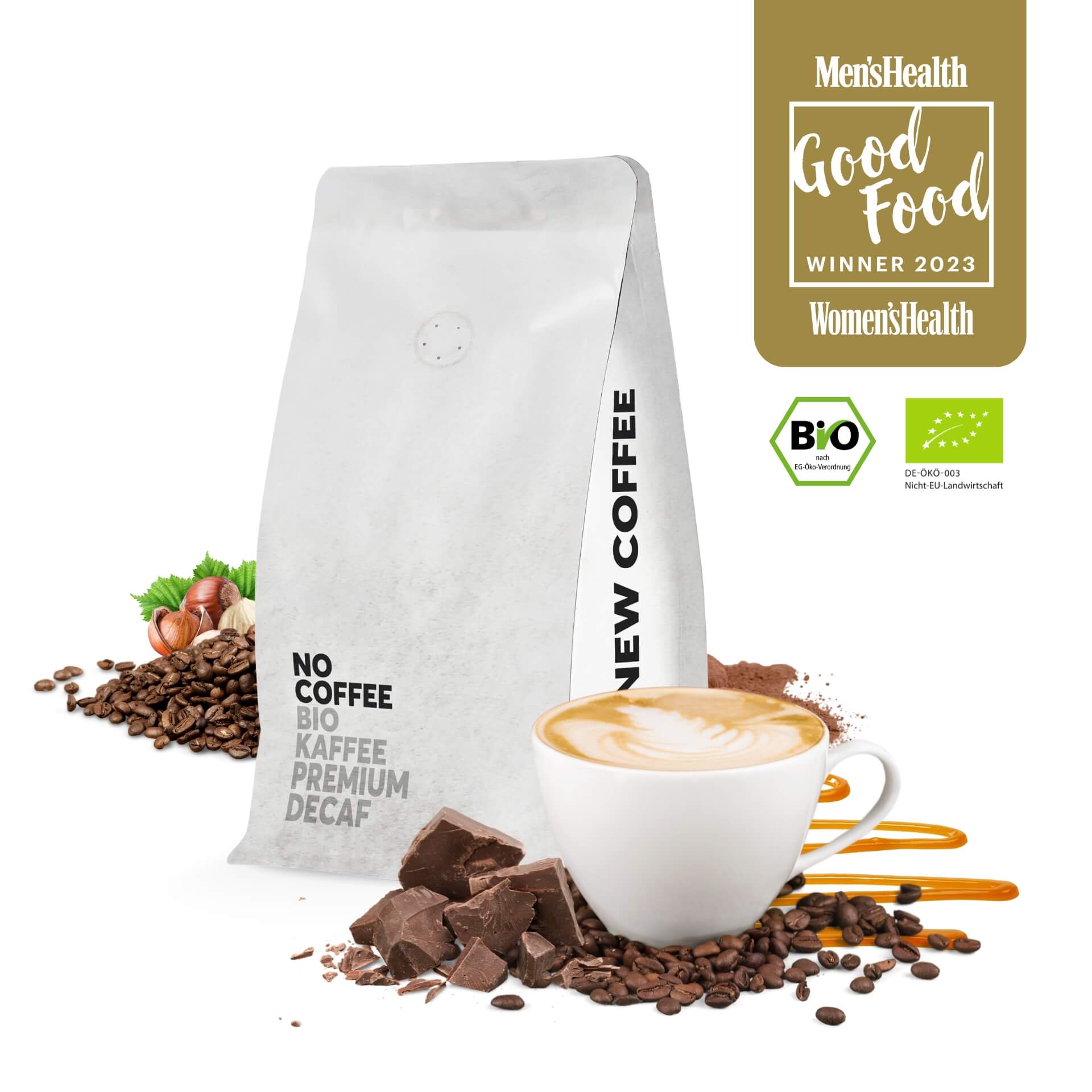
The packaging is a stand-up pouch made from a flexible material, likely a composite of plastic and foil. The bag has a white exterior with a matte finish and features a rounded bottom for stability when standing. The top of the bag has a resealable zipper closure, and there is a one-way valve visible, which allows gases to escape while preventing air from entering. The front of the bag prominently displays the product name 'NO COFFEE' in bold, black letters, along with additional text indicating it is 'BIO Kaffe Premium Decaf'. The design includes images of coffee beans, nuts, and chocolate, enhancing the visual appeal.
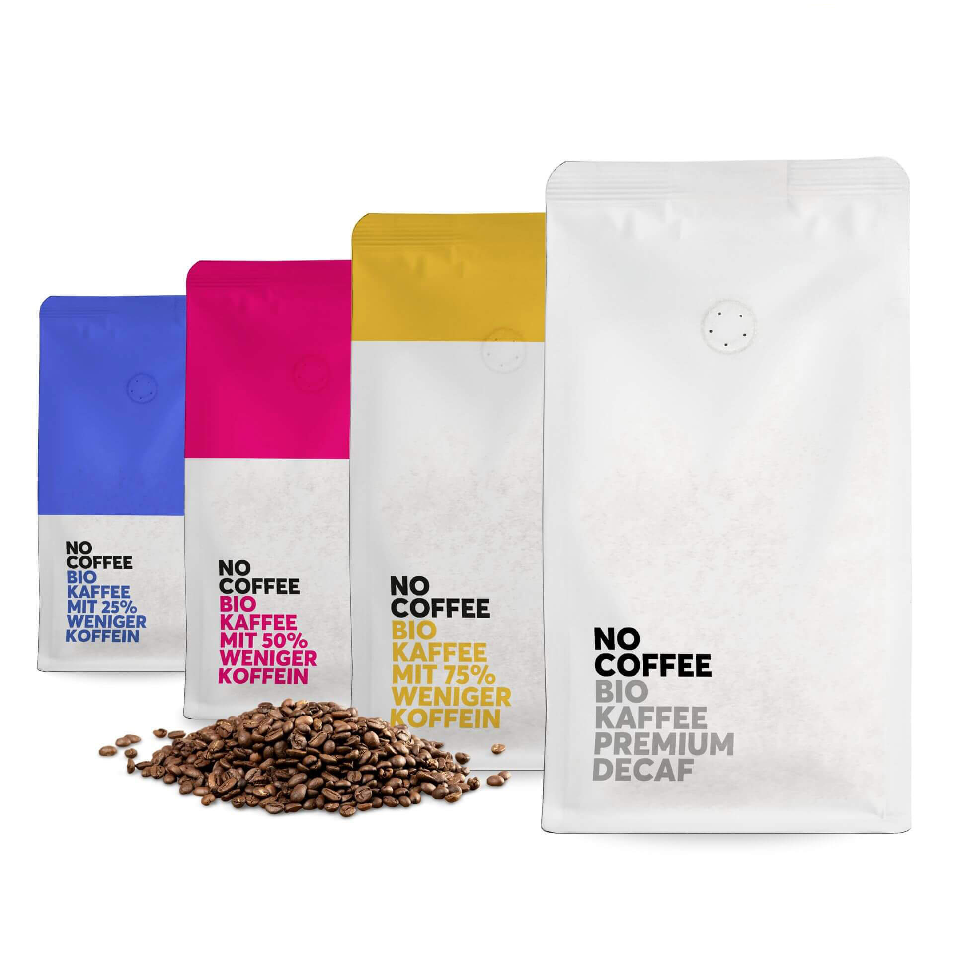
The packaging consists of four stand-up pouches, each with a matte finish. The bags are primarily white with colored accents at the top (blue, pink, yellow) and feature a clear window to showcase the coffee beans inside. The design is minimalist, with bold black text indicating the product name and details. Each pouch has a resealable top and a one-way valve for freshness.
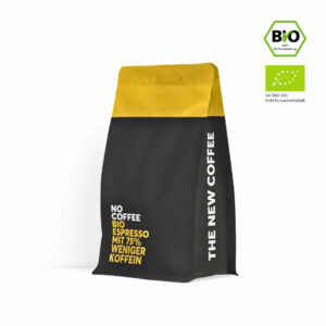
The packaging is a stand-up pouch designed for coffee, featuring a distinctive two-tone color scheme with a yellow top and a black body. The bag is made from a flexible material that allows it to stand upright, with a flat bottom and a sealed top. The front displays bold white text and a logo, while the back is likely plain or contains additional product information. The overall design is modern and minimalistic, aimed at attracting attention on retail shelves.
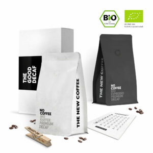
The image features a combination of a retail carton and a flexible pouch. The carton is white with a clean, minimalist design, showcasing a smooth, flat construction without fluted layers. The flexible pouch is black, with a matte finish, and features a resealable top. Both packaging types include modern typography and a simple layout, emphasizing the product name and attributes.
About the Brand
No Coffee is a German-based D2C brand focused on high-quality, caffeine-free coffee alternatives using organic and fair-trade beans. The company utilizes a water-based decaffeination process and prioritizes sustainability in both sourcing and packaging.
Founded in 2020 in Erfurt, No Coffee operates with a small but specialized team and has established a strong market presence in the organic decaf segment. Their packaging approach aligns with their brand values, employing flexible pouches and carton solutions that support logistics efficiency and product integrity. The use of resealable features, one-way valves, and minimalist branding helps reinforce product freshness and a premium positioning.
Key Differentiator: No Coffee's unique selling proposition lies in their water-based decaffeination process, organic certification, and consistent use of functional, visually cohesive packaging tailored for freshness and sustainability.
Design System
Visual Style
The visual design employs bold sans-serif typography, a predominantly monochrome palette accented with muted colors (yellow, blue, pink), and a minimalist aesthetic. The layout favors clean lines and uncluttered surfaces, supporting premium positioning.
Brand Identity
Logo usage is consistent, with the 'NO COFFEE' mark dominant on all primary packs. Iconography is minimal, with certification badges (e.g., BIO) and awards integrated into the design. Visual consistency is maintained across formats through uniform type treatment and restrained color use.
Packaging Design
Material choices prioritize flexible, multilayer pouches for freshness and weight reduction, supplemented by rigid cartons for multipacks. Structural design focuses on resealability, stand-up stability, and protection from moisture and oxygen, in line with specialty coffee packaging best practices.
User Experience
Packaging is engineered for easy opening and resealing, supporting freshness and repeat use. The minimalist graphics and clear information hierarchy enhance the customer journey both online and at shelf, while sustainability messaging is seamlessly integrated to reinforce brand trust.
Company Metrics
Business insights for no coffee based on available data
Market Positioning
Brand Values & Focus
Key Competitors
Target Market: Health-conscious consumers, coffee enthusiasts seeking decaffeinated options, and environmentally aware buyers in Germany and broader European markets.
Packaging Assessment
Overall Grade
Visual appeal and presentation quality
Packaging durability and protection
Eco-friendliness and recyclable materials
Cost efficiency and value for money
Packaging assessment for no coffee based on industry standards and best practices
Frequently Asked Questions
What types of packaging formats does No Coffee use?
No Coffee primarily utilizes flexible stand-up pouches with resealable closures and one-way valves, as well as minimalist carton boxes for gift or sampler sets.
How does No Coffee address sustainability in its packaging?
No Coffee integrates sustainability by using recyclable materials where possible, choosing lightweight flexible packaging to reduce transportation emissions, and highlighting organic and fair-trade certifications on-pack.
What is the focus of No Coffee's packaging design?
The design emphasizes clarity, modern aesthetics, and strong brand visibility, with bold typography and minimal graphics to support both shelf impact and online presentation.
Discover other Food & Drink companies
Explore more companies in the food & drink industry and their packaging strategies
PrepMyMeal
Food & Drink
PrepMyMeal is a food production company specializing in high-protein meal delivery services. They offer a variety of natural, nutritious meals designed for fitness enthusiasts and those seeking convenience in meal preparation.
Teegschwendner GmbH
Food & Drink
Teegschwendner GmbH is a specialty tea company based in Germany, offering a wide selection of high-quality teas and tea-related accessories. They focus on providing unique tea experiences through carefully sourced and curated products.
Terres de Café
Food & Drink
Terres de Café is a specialty coffee retailer based in Paris, France, known for its commitment to sustainability and high-quality coffee sourcing.