Neutonic packaging
Neutonic delivers cognitive enhancement products, including nootropic drinks, powders, and capsules, through a direct-to-consumer model. Their packaging strategy emphasizes vibrant visual branding, multi-format functionality, and shelf impact, aligning with health-focused, premium positioning.
Packaging Portfolio
Neutonic’s packaging portfolio spans aluminum beverage cans, paperboard retail cartons, display containers, and flexible single-serve stick packs. The use of aluminum ensures product protection and recyclability, while paperboard cartons offer structural support for multipacks and e-commerce shipments. Flexible laminate sachets are optimized for portability and dosing accuracy but present moderate sustainability challenges. Across all formats, visual branding is consistent and prominent, leveraging color, iconography, and typography for immediate shelf recognition and user engagement.

The packaging consists of a retail carton designed to hold multiple cans of a productivity drink. The carton features a bright orange background with a large, stylized eye graphic prominently displayed. The text 'FUEL YOUR FOCUS' is printed in bold, contrasting colors. The carton is structured to hold 12 cans, with clear labeling on the front and sides indicating the product quantity and branding. The edges are cleanly folded and the construction appears sturdy enough for retail display.
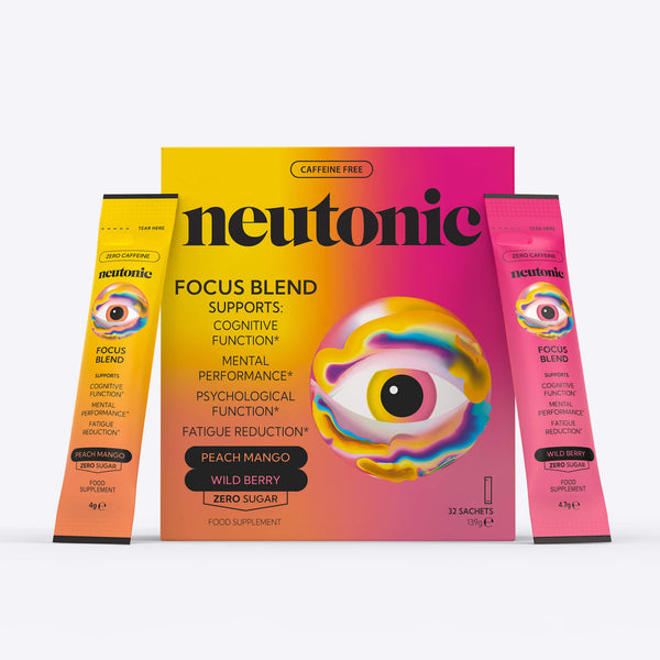
The packaging consists of a flat, smooth, single-layer paperboard carton that houses multiple individual sachets. The exterior features vibrant colors, predominantly pink and yellow, with a glossy finish. The front displays a large, stylized eye graphic, accompanied by the brand name 'neutonic' in bold, black lettering. The sachets are visible on the sides, indicating the product type and flavors.
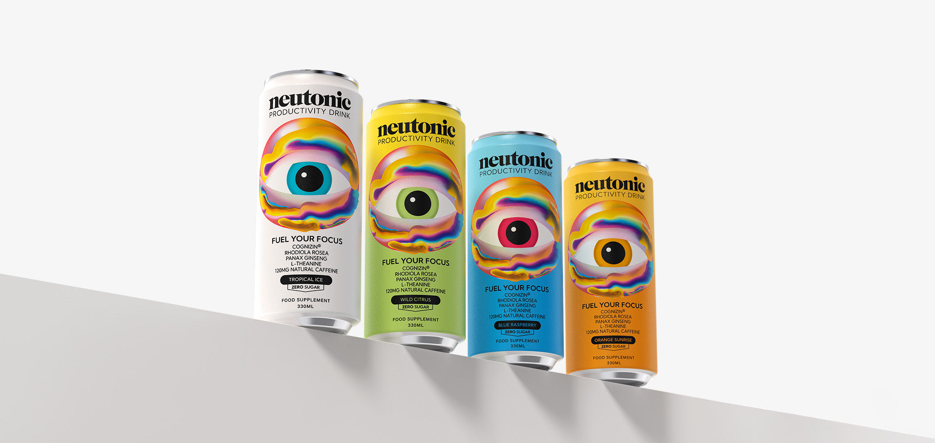
The image features four cylindrical cans of a productivity drink, each displaying a vibrant design. The cans are arranged in a staggered formation on a flat surface, showcasing their colorful graphics. Each can has a distinct color scheme, with swirling patterns and an eye graphic prominently featured. The text on the cans includes the product name and tagline, emphasizing the drink's focus-enhancing properties.
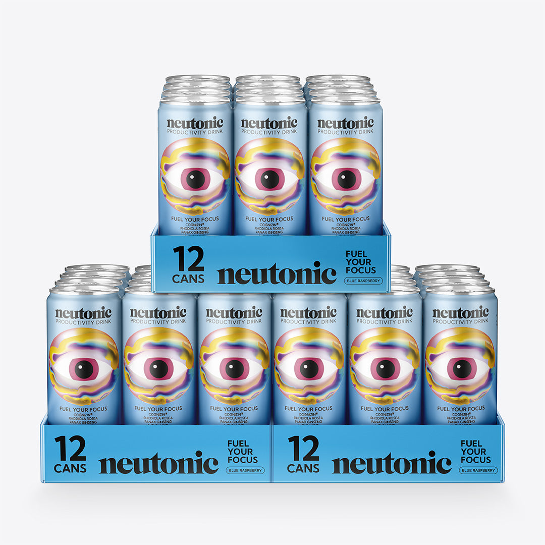
The packaging consists of a display unit for beverage cans, featuring multiple rows of cans arranged in a tiered structure. The cans are cylindrical, made of aluminum, and are grouped in a way that showcases the product. The display has a flat base with a cardboard backing for stability. The overall design is colorful and eye-catching, with vibrant graphics and product information prominently displayed.

The packaging consists of four aluminum cans, each with a cylindrical shape and a pull-tab top. The cans feature vibrant, colorful graphics that include an eye design and the product name 'neutonic PRODUCTIVITY DRINK'. Each can has a different color scheme, with a consistent design theme across all four. The labels are printed directly onto the aluminum surface, showcasing various colors and a glossy finish.
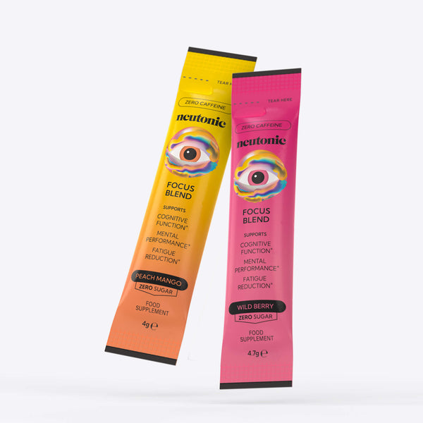
The packaging consists of two stick packs, one in a peach mango flavor and the other in wild berry flavor. Each pack is elongated and narrow, designed for single servings. The surface is smooth with a matte finish, featuring vibrant colors that correspond to the flavors. The packs have a tear strip at the top for easy opening and are sealed on the sides. The overall design is sleek and modern, appealing to a health-conscious audience.
About the Brand
Neutonic is a UK-based health and wellness company specializing in nootropic beverages and supplements. Its approach to packaging centers on high-visibility aluminum cans, flexible stick packs, and custom cartons, designed to reinforce brand recognition and optimize consumer convenience.
Operating with a lean team, Neutonic has scaled its packaging to support both e-commerce and retail channels. The company employs a consistent visual language—saturated colors, bold iconography, and prominent typography—across various packaging types including cans, cartons, and flexible sachets. The packaging portfolio demonstrates a strategic balance between visual impact, logistics efficiency, and user-friendly structures, supporting both product protection and brand storytelling throughout the customer journey.
Key Differentiator: Neutonic’s packaging is distinguished by its cohesive, high-impact visual identity and its use of diverse, format-appropriate structures that enhance both shelf presence and user convenience.
Design System
Visual Style
Bold, modern typography paired with a saturated color palette—vivid oranges, blues, and pinks—creates high shelf visibility. The aesthetic is energetic and contemporary, reflecting cognitive performance themes.
Brand Identity
Consistent use of the Neutonic logo, the signature eye graphic, and concise product messaging across all packaging. Visual consistency is maintained through standardized color schemes and icon placement.
Packaging Design
Material choices prioritize aluminum and recyclable paperboard for core formats, with flexible laminates for stick packs. Structural designs are functional, supporting both retail display and safe transit, with easy-open features for consumer convenience.
User Experience
Packaging is engineered for intuitive interaction, with clear product information and easy access. Visual cues and flavor differentiation enhance the customer journey from unboxing to consumption, supporting a premium direct-to-consumer experience.
Company Metrics
Business insights for Neutonic based on available data
Market Positioning
Brand Values & Focus
Key Competitors
Target Market: Health-conscious consumers seeking cognitive enhancement, including students, professionals, and active individuals in the UK and global D2C markets.
Packaging Assessment
Overall Grade
Visual appeal and presentation quality
Packaging durability and protection
Eco-friendliness and recyclable materials
Cost efficiency and value for money
Packaging assessment for Neutonic based on industry standards and best practices
Frequently Asked Questions
What packaging materials does Neutonic primarily use?
Neutonic predominantly uses aluminum for beverage cans, paperboard for retail cartons, and flexible laminate films for single-serve stick packs and sachets.
How does Neutonic ensure product safety during shipping?
Products are housed in structurally robust cartons and display containers, providing protection against impact and ensuring product integrity throughout the logistics chain.
Does Neutonic use sustainable packaging?
Neutonic’s use of recyclable aluminum cans and paperboard cartons supports sustainability; however, flexible stick packs may have limited recyclability depending on local facilities.
Discover other Health companies
Explore more companies in the health industry and their packaging strategies
EVO Nutrition
Health
EVO Nutrition specializes in premium health supplements, providing a wide range of vitamins and nutritional products to support well-being.
Smart Protein
Health
Smart Protein is dedicated to transforming nutrition by providing a range of health and wellness products focused on protein supplements and vitamins.
Bio-Synergy
Health
Bio-Synergy is a UK-based company specializing in health and fitness products, including nutritional supplements and DNA testing kits. Their mission is to support individuals in achieving their health and fitness goals through innovative products and personalized insights.