Nature's Finest Foods packaging
Nature's Finest Foods specializes in personalized nutritional supplements, leveraging advanced technology to deliver tailored health solutions. Their packaging approach employs modern, cylindrical containers emphasizing clear branding, product differentiation, and consumer trust.
Packaging Portfolio
Nature's Finest Foods utilizes a range of cylindrical cans, tubes, and rigid containers constructed from metal and thick paperboard, selected for their protective qualities and premium shelf presence. The packaging structures are designed for product stability, featuring secure closures such as screw-on or snap-on lids that enhance safety during shipping. Visual differentiation is achieved through vibrant color palettes and botanical graphics, supporting SKU distinction and reinforcing health claims. The use of recyclable materials is evident, although the overall sustainability profile is moderated by the choice of multi-material formats and decorative finishes.
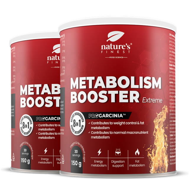
The packaging consists of cylindrical containers with a smooth surface, featuring a prominent red color scheme. The containers are designed for retail display, showcasing the product name 'METABOLISM BOOSTER Extreme' in bold white lettering against the red background. The design includes flames graphics to suggest energy and vitality. The lids are likely screw-on or snap-on, providing a secure closure. The overall appearance is clean and modern, appealing to health-conscious consumers.
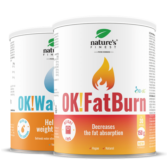
The packaging consists of cylindrical containers with a smooth surface, typically made of metal or sturdy paperboard. The containers have a clean, polished appearance with a glossy finish. The top and bottom of the containers are flat, and they feature a pull-tab or screw-on lid for easy access. The design includes vibrant colors with a prominent flame graphic, indicating a focus on weight loss and fat absorption.
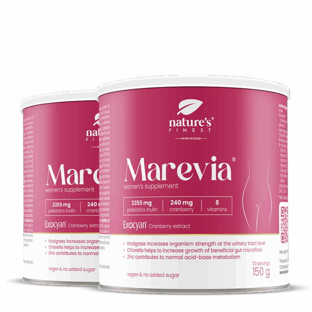
The packaging consists of cylindrical containers with a smooth, rigid surface. The containers are predominantly pink with white and dark pink accents. The top has a flat lid, and the body features a label that wraps around the entire surface. The label includes product information, nutritional details, and branding elements.
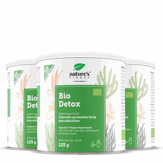
The packaging consists of cylindrical containers with a smooth, flat surface. Each container features a clean design with a predominantly white background and colorful botanical illustrations. The containers are topped with a flat lid that appears to be metal or a similar sturdy material. The overall appearance is sleek and modern, suitable for health-focused products.
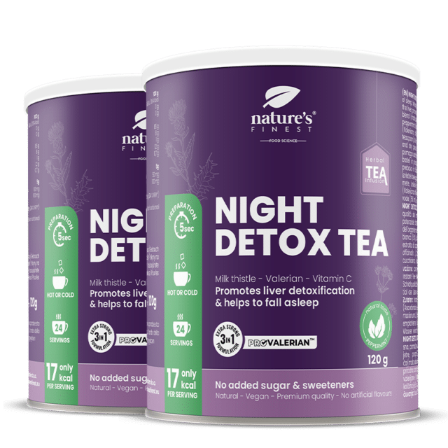
The packaging consists of cylindrical canisters made of a sturdy material, likely metal or thick paperboard, designed to hold tea. The canisters have a smooth surface with a glossy finish, showcasing vibrant colors and graphics. The primary color is purple, with white and gold accents. The front features the brand name 'Nature's Finest' prominently displayed, along with product information such as 'Night Detox Tea', ingredients, and nutritional details. The design includes a clean layout with easy-to-read fonts and a visually appealing arrangement of elements.
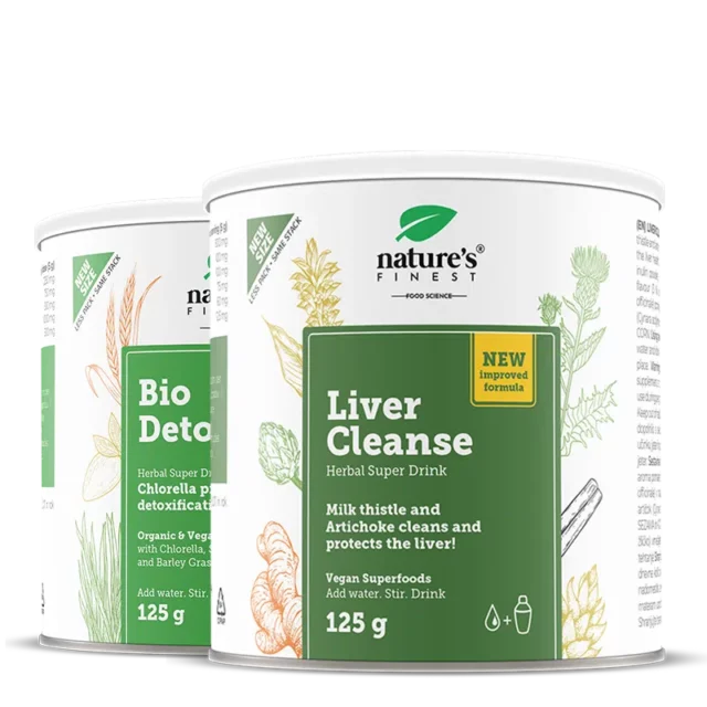
The packaging consists of cylindrical containers made from metal, featuring a smooth surface with a glossy finish. The containers have a white base color with green botanical illustrations and text printed on them. The lids appear to be flat and metallic, likely designed for easy opening. The overall design is clean and modern, with a focus on natural ingredients.
About the Brand
Nature's Finest Foods operates in the health and wellness sector, focusing on direct-to-consumer personalized supplements and vitamins. The brand integrates scientific insights and natural ingredients to address individual wellness needs, as reflected in its product and packaging strategies.
The company utilizes cylindrical cans, tubes, and rigid containers as primary packaging formats, optimized for both product safety and shelf appeal. The consistent use of botanical illustrations, clean layouts, and color differentiation signals a commitment to both brand recognition and user experience. Their packaging supports rapid logistics, shelf stability, and visual clarity, enhancing the consumer journey from purchase to use.
Key Differentiator: Nature's Finest Foods differentiates itself through advanced personalization, seamless e-commerce integration, and packaging that visually communicates natural, science-backed formulations.
Design System
Visual Style
Clean, modern typography paired with a harmonious color palette featuring whites, greens, reds, pinks, and purples. The aesthetic emphasizes minimalism, vibrant accent colors, and consistent use of botanical illustrations.
Brand Identity
Brand logos and company names are prominently placed on all packaging, supported by clear iconography and uniform label layouts. Visual consistency is maintained through standardized fonts, color coding for product categories, and recurring graphical motifs.
Packaging Design
Material selection prioritizes durability and perceived quality, primarily using metal and rigid paperboard. Structural design favors cylindrical forms with wide openings and secure lids to ensure both user convenience and product integrity.
User Experience
Packaging design enhances the customer journey by providing intuitive access, strong shelf appeal, and a visually reassuring unboxing process. Clear labeling and color differentiation support ease of use, while premium material choices reinforce brand trust and product value.
Company Metrics
Business insights for Nature's Finest Foods based on available data
Market Positioning
Brand Values & Focus
Key Competitors
Target Market: Health-conscious consumers seeking personalized nutritional supplements, primarily in the D2C e-commerce segment across Germany and other Tier I European markets.
Packaging Assessment
Overall Grade
Visual appeal and presentation quality
Packaging durability and protection
Eco-friendliness and recyclable materials
Cost efficiency and value for money
Packaging assessment for Nature's Finest Foods based on industry standards and best practices
Frequently Asked Questions
What types of packaging formats does Nature's Finest Foods use?
The company primarily utilizes cylindrical cans, tubes, and rigid containers made from metal or sturdy paperboard, designed to ensure product integrity and a premium unboxing experience.
How does Nature's Finest Foods integrate branding into their packaging?
Branding is consistently applied through prominent logo placement, product-specific color schemes, and botanical illustrations that reinforce the company's health and wellness positioning.
Is the packaging eco-friendly?
While the company uses recyclable materials such as metal and paperboard, the overall sustainability impact depends on the specific material mix and recycling infrastructure available to customers.
Discover other Health companies
Explore more companies in the health industry and their packaging strategies
EVO Nutrition
Health
EVO Nutrition specializes in premium health supplements, providing a wide range of vitamins and nutritional products to support well-being.
Lily & Loaf
Health
Lily & Loaf specializes in high-quality health and nutrition products, offering a range of supplements and vitamins aimed at supporting an active lifestyle. The company focuses on providing natural solutions for health and beauty.
Smart Protein
Health
Smart Protein is dedicated to transforming nutrition by providing a range of health and wellness products focused on protein supplements and vitamins.