Naturecan packaging
Naturecan delivers natural health and nutrition products with a focus on transparency and quality. Their packaging strategy integrates eco-friendly materials and functional formats that support both sustainability initiatives and consumer expectations for a premium unboxing experience.
Packaging Portfolio
Naturecan’s packaging portfolio demonstrates a strong preference for kraft paper stand-up pouches with resealable features and clear windows, optimizing both sustainability and product visibility. The use of cylindrical glass bottles and paperboard tubes for supplements and wellness items further enhances protection and shelf appeal. All formats are designed for easy handling, efficient storage, and minimal environmental impact, while branding elements across packaging remain consistent with the natural, premium positioning of the brand.

The packaging consists of a cylindrical tube and a flat pouch. The cylindrical tube is made of smooth paperboard, featuring a clean, flat construction with precise edges and folds. It has a light blue color with a white label displaying the brand name and product information. The flat pouch is made of kraft paper, with a matte finish and a simple design, also displaying the brand name and product details. The overall appearance is clean and modern, suitable for retail display.

The image features two distinct packaging types: a cylindrical bottle and a flat pouch. The cylindrical bottle is made of dark glass with a black screw-on lid, showcasing a sleek and modern design. The label is matte black with white text indicating the product name and details. The flat pouch is made of kraft paper, featuring a resealable top and a clear window displaying the tea bags inside. The pouch has a simple design with a white label that includes the product name and branding elements.

The packaging consists of a stand-up pouch for the protein powder and a plastic bottle for the creatine monohydrate. The pouch has a smooth, flat construction with a matte finish, featuring a resealable top. The bottle is made of opaque plastic with a screw-on lid. The overall design is clean and modern, with a focus on product visibility and branding.
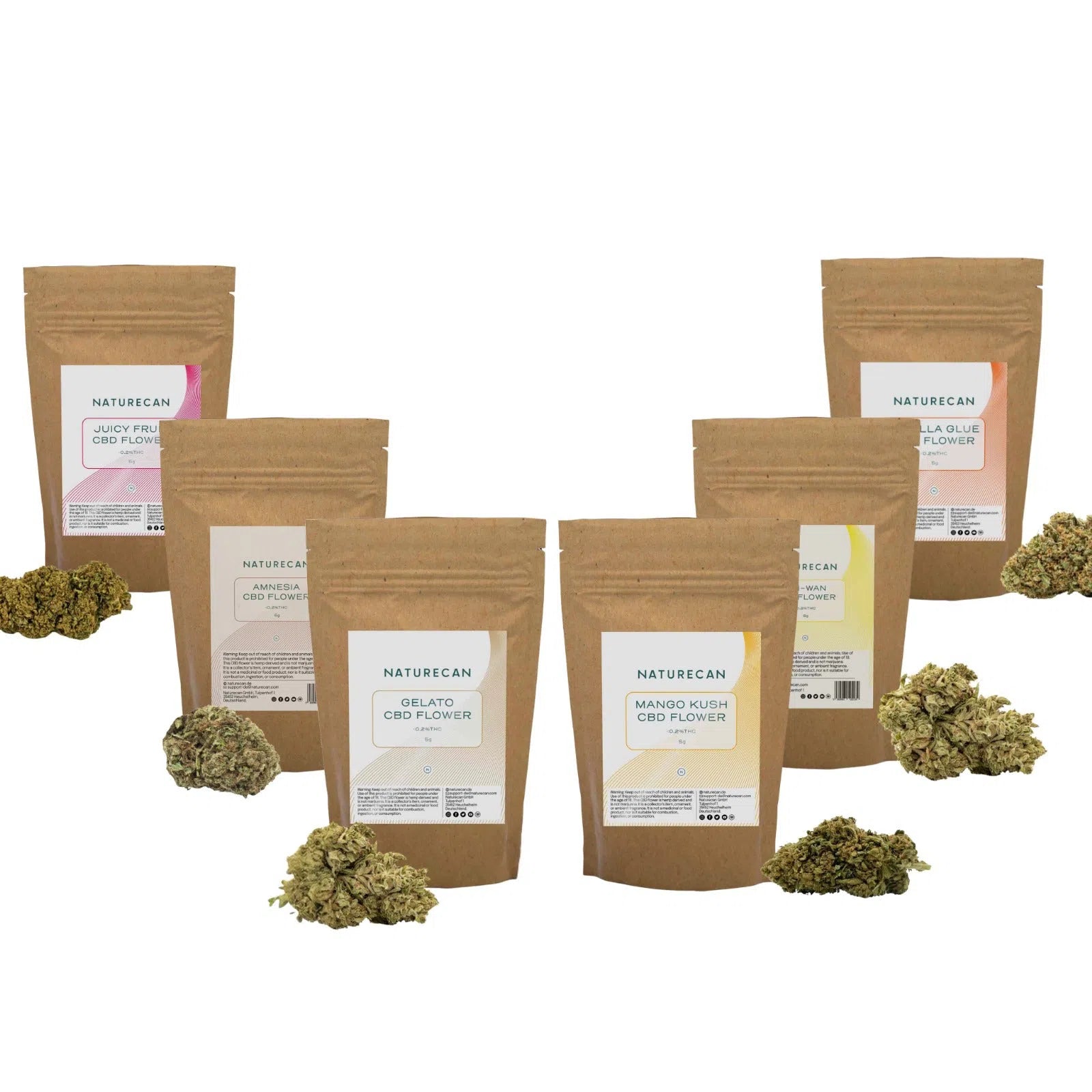
The packaging consists of multiple stand-up pouches made from a brown kraft paper material. Each pouch has a flat bottom allowing it to stand upright. The pouches feature a resealable zipper at the top, which is common for maintaining product freshness. The front of each pouch has a clear window that allows visibility of the contents inside, while the back is plain brown. The pouches have a matte finish, giving them a natural look.

The packaging consists of a stand-up pouch made from kraft paper with a smooth finish. It features a resealable top and a clear window on the front, allowing visibility of the product inside. The pouch has a flat bottom, enabling it to stand upright on shelves. The overall shape is rectangular with rounded edges, and the design is minimalistic with a focus on the product.
About the Brand
Naturecan operates in the health sector, specializing in vitamins, dietary supplements, and wellness products, distributed primarily through an e-commerce model. Their packaging approach aligns with market demand for sustainable, branded solutions that protect product integrity while supporting a natural brand image.
Naturecan’s packaging utilizes a blend of kraft paper pouches, cylindrical bottles, and paperboard tubes, with a consistent focus on resealability, product visibility, and minimalistic graphics. This approach is designed to maximize both logistical efficiency and shelf appeal, reflecting the brand’s commitment to balancing operational needs with environmental responsibility. Packaging choices are informed by the need for product freshness, consumer convenience, and alignment with the natural health segment’s visual codes.
Key Differentiator: Distinctive use of natural materials, clear product windows, and minimal, earthy branding positions Naturecan as a leader in integrating sustainability and premium presentation in the wellness sector.
Design System
Visual Style
Naturecan employs clean, sans-serif typography, earthy and muted color palettes (such as kraft brown, greens, and whites), and a minimalistic aesthetic to reinforce a natural and trustworthy image.
Brand Identity
Logo placement is prominent but restrained, with consistent use of the Naturecan logo, concise product descriptions, and simple iconography. Visual consistency is maintained across formats through repetition of color schemes and layout structure.
Packaging Design
Material choices prioritize renewable and recyclable substrates, with a structural design philosophy that favors resealability, product protection, and consumer convenience. Stand-up pouches and cylindrical bottles support both retail and e-commerce needs.
User Experience
Packaging is designed to support an intuitive customer journey, from first visual contact to unsealing and resealing. Clear windows, easy-open features, and minimal clutter enhance both the tactile and emotional aspects of the unboxing experience, reinforcing trust and satisfaction post-purchase.
Company Metrics
Business insights for Naturecan based on available data
Market Positioning
Brand Values & Focus
Key Competitors
Target Market: Health-conscious consumers seeking premium, natural supplements and wellness products through direct-to-consumer e-commerce channels in Tier I markets.
Packaging Assessment
Overall Grade
Visual appeal and presentation quality
Packaging durability and protection
Eco-friendliness and recyclable materials
Cost efficiency and value for money
Packaging assessment for Naturecan based on industry standards and best practices
Frequently Asked Questions
What types of packaging does Naturecan use for its products?
Naturecan employs stand-up kraft paper pouches with clear windows, cylindrical glass or plastic bottles, and paperboard tubes for various product lines. These formats offer resealability, product protection, and a natural aesthetic aligned with wellness industry standards.
How does Naturecan address sustainability in its packaging?
The brand prioritizes recyclable and renewable materials, such as kraft paper and glass, and designs packaging for reusability and minimal environmental impact. Resealable features and minimalistic printing further reduce waste and resource consumption.
Is Naturecan’s packaging suitable for e-commerce logistics?
Yes. Packaging structures are chosen for durability and product security during shipping, with flat-bottom pouches and robust bottles minimizing the risk of damage and supporting efficient fulfillment operations.
Discover other Health companies
Explore more companies in the health industry and their packaging strategies
Comvita
Health
Comvita is a New Zealand-based company specializing in high-quality Mānuka honey and natural health products. Established in 1974, it aims to connect people with the healing power of nature.
Lily & Loaf
Health
Lily & Loaf specializes in high-quality health and nutrition products, offering a range of supplements and vitamins aimed at supporting an active lifestyle. The company focuses on providing natural solutions for health and beauty.
EVO Nutrition
Health
EVO Nutrition specializes in premium health supplements, providing a wide range of vitamins and nutritional products to support well-being.