Natura Sanata packaging
Natura Sanata provides integrative health services with a focus on holistic well-being, blending medical and psychological therapies. Their packaging strategy reflects an emphasis on sustainable materials and visual coherence, aligning with their natural and wellness-driven brand positioning.
Packaging Portfolio
Natura Sanata utilizes a mix of folding carton boxes and rigid boxes, primarily constructed from recyclable paperboard and chipboard. The packaging features clean edges, flat constructions, and window cutouts for product visibility, with consistent use of earthy color palettes and botanical graphics. This approach balances visual appeal, product protection, and sustainability, but is best suited for small-scale, premium health products or curated sets rather than high-volume distribution.
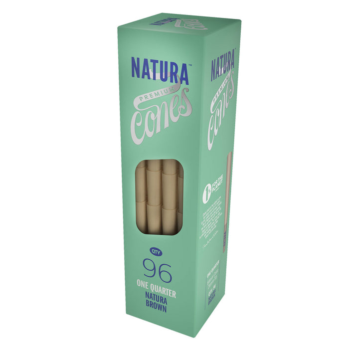
The packaging is a tall, rectangular box made of smooth, single-layer paperboard. It features a clean, flat construction with precise edges and folds. The box is predominantly mint green with a glossy finish, showcasing a large transparent window on one side that displays the contents inside. The top and bottom flaps are neatly folded and secured, creating a sturdy structure suitable for retail display.

The packaging is a rigid box with a sturdy construction, featuring a thick chipboard material. The box has a smooth, flat surface with a decorative design on one side, incorporating earthy tones and abstract patterns. The box is primarily kraft-colored with an orange accent along the edge, giving it a premium look. It contains three bottles of products, which are visible through a cut-out in the design. The overall shape is rectangular, and the box appears to have a lid that lifts off, typical of rigid boxes.
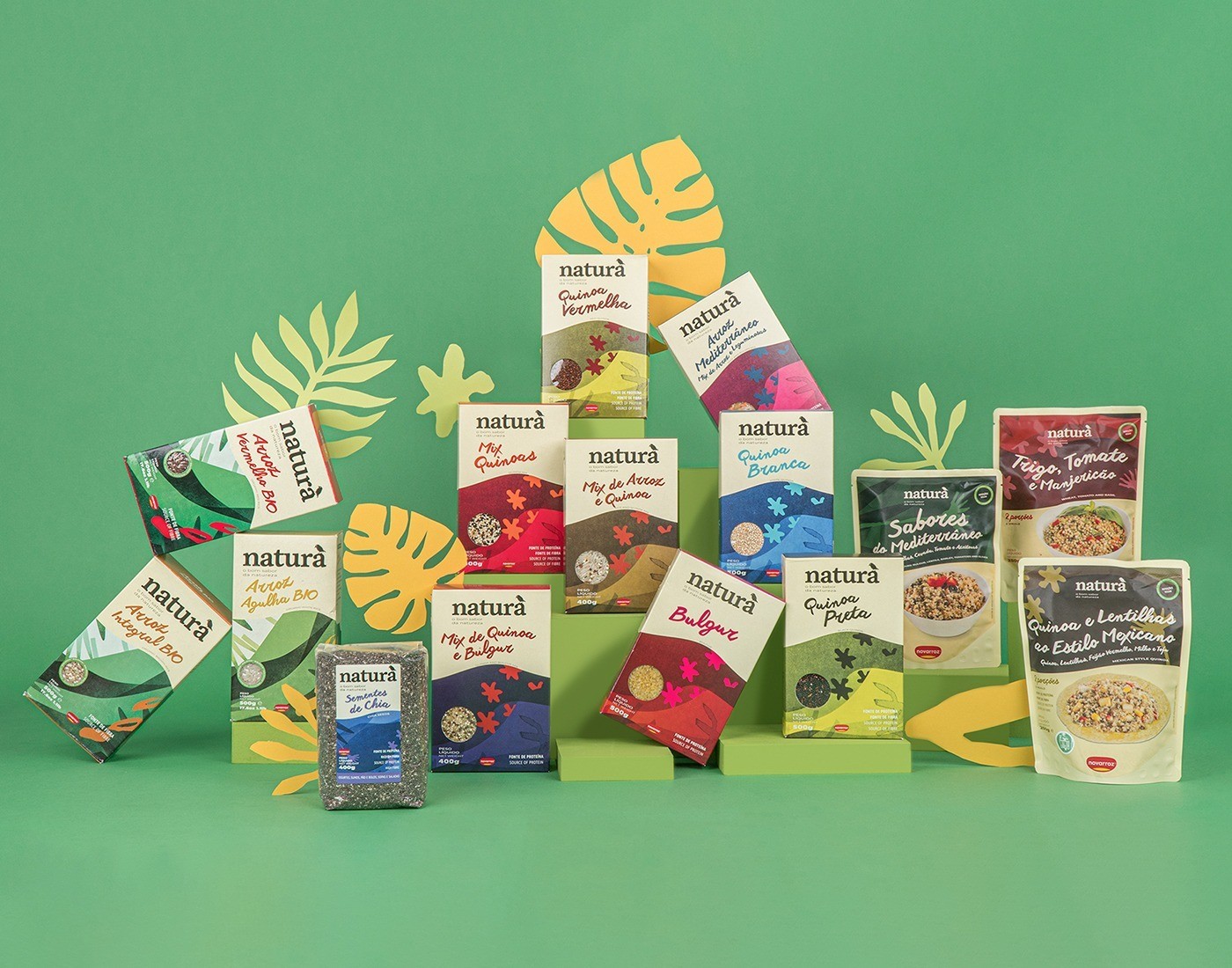
The image showcases a variety of retail packaging for food products, primarily in the form of folding cartons. Each box features a smooth, flat construction without visible fluted layers, indicating they are made from single-layer paperboard. The cartons are predominantly colorful, with vibrant graphics and distinct branding elements. The edges are clean and precise, suggesting high-quality manufacturing. The boxes are arranged in a visually appealing manner, with some featuring window cutouts for product visibility.
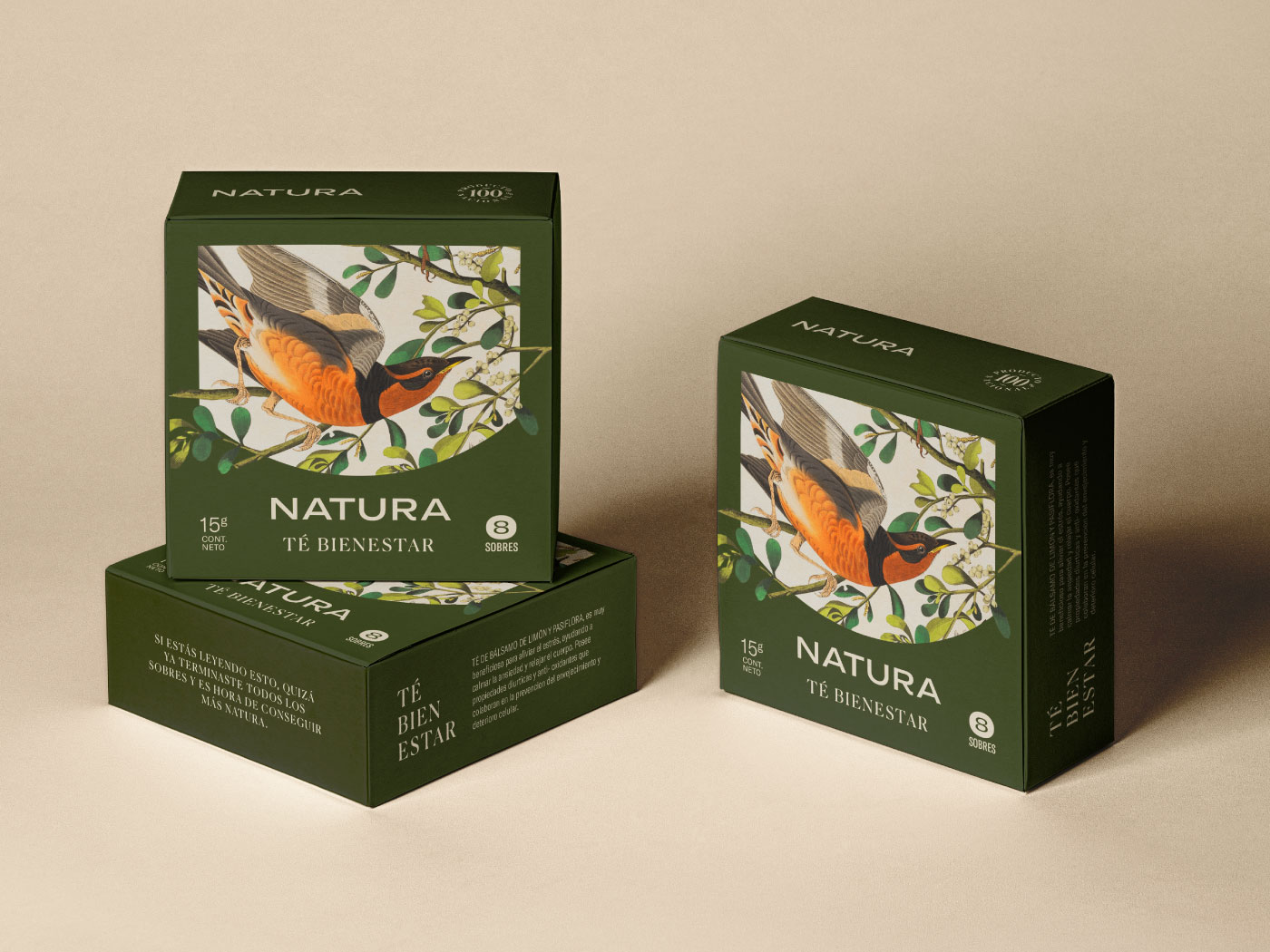
The packaging consists of a smooth, flat construction made from a single layer of paperboard, featuring clean edges and precise folds. The box is predominantly green with a vibrant illustration of a bird surrounded by leaves, indicative of a natural theme. The front displays the brand name 'NATURA' prominently, along with the product name 'TÉ BIENESTAR' in a contrasting color. The overall design is visually appealing and aligns with a wellness or herbal tea product.

The packaging consists of a retail carton box featuring a smooth, flat construction without any visible fluted layers. The box is predominantly kraft-colored with green botanical graphics that align with a natural aesthetic. The edges are clean and precise, indicating a well-constructed folding carton. The overall design is minimalistic yet visually appealing, suitable for retail display. The box contains a bottle and a smaller vial, suggesting it is designed for cosmetic or personal care products.
About the Brand
Natura Sanata specializes in holistic health solutions, offering personalized therapies and consultations that bridge medical and psychological disciplines. The company's packaging approach leverages paper-based cartons and rigid boxes, employing natural motifs and eco-friendly materials to reinforce brand values.
Packaging used by Natura Sanata is primarily constructed from single-layer paperboard and rigid chipboard, with an emphasis on clean folding, precise edges, and minimalistic yet vibrant graphics. These choices support product safety and retail presentation, while the use of earthy colors and nature-inspired imagery ensures visual alignment with the holistic and eco-conscious ethos of the brand.
Key Differentiator: Natura Sanata's packaging stands out for its consistent integration of natural aesthetics and sustainability, directly reflecting the center’s holistic health philosophy.
Design System
Visual Style
Typography emphasizes clarity and approachability, with sans-serif fonts paired with natural, earthy color palettes such as greens, browns, and muted tones. The overall aesthetic is minimalistic, focusing on calm and wellness-oriented visuals.
Brand Identity
Logo usage is prominent and consistently integrated with product names and nature-inspired iconography. Visual consistency is maintained through repeated color schemes and botanical illustrations, reinforcing brand recognition.
Packaging Design
Material selection favors recyclable paperboard and rigid chipboard, with an emphasis on fold-flat structures and durability. Design philosophy prioritizes sustainability, clean construction, and window features for select products.
User Experience
The packaging design supports a positive customer journey by ensuring both tactile quality and visual harmony on unboxing, enhancing perceived value and reinforcing holistic brand messaging throughout the customer interaction.
Company Metrics
Business insights for Natura Sanata based on available data
Market Positioning
Brand Values & Focus
Key Competitors
Target Market: Individuals and organizations seeking integrative health and wellness services in Germany, with a focus on clients valuing sustainable and personalized approaches.
Packaging Assessment
Overall Grade
Visual appeal and presentation quality
Packaging durability and protection
Eco-friendliness and recyclable materials
Cost efficiency and value for money
Packaging assessment for Natura Sanata based on industry standards and best practices
Frequently Asked Questions
What types of packaging materials does Natura Sanata use?
Natura Sanata primarily uses single-layer paperboard for carton boxes and rigid chipboard for premium packaging, ensuring recyclability and supporting their sustainability goals.
How does Natura Sanata’s packaging align with its brand values?
The packaging incorporates earthy colors, botanical motifs, and clean design elements, underscoring the brand’s commitment to natural wellness and environmental responsibility.
What is the focus of Natura Sanata’s packaging design?
The design prioritizes eco-friendly materials, visual coherence with holistic themes, and structural integrity to support both product protection and a positive unboxing experience.
Discover other Health companies
Explore more companies in the health industry and their packaging strategies
Comvita
Health
Comvita is a New Zealand-based company specializing in high-quality Mānuka honey and natural health products. Established in 1974, it aims to connect people with the healing power of nature.
Bio-Synergy
Health
Bio-Synergy is a UK-based company specializing in health and fitness products, including nutritional supplements and DNA testing kits. Their mission is to support individuals in achieving their health and fitness goals through innovative products and personalized insights.
EVO Nutrition
Health
EVO Nutrition specializes in premium health supplements, providing a wide range of vitamins and nutritional products to support well-being.