mymuesli packaging
mymuesli is a German direct-to-consumer brand specializing in customizable organic breakfast foods, with a strong focus on sustainability and personalization. Their packaging strategy integrates branded, recyclable formats that support both product protection and elevated consumer experience.
Packaging Portfolio
mymuesli’s packaging portfolio is composed of custom cylindrical paperboard containers, rigid gift boxes, and branded corrugated shipping cartons. The cylindrical containers are engineered for product freshness and shelf impact, utilizing high-quality paperboard with glossy or matte finishes and vibrant, seasonal designs. Corrugated boxes are optimized for e-commerce shipping, featuring repetitive branding patterns for strong visual recognition and robust construction for logistics safety. Gift sets and limited-edition formats use rigid boxes with specialized inserts, enhancing perceived value and supporting premium unboxing experiences. All packaging is designed with recyclability and material efficiency in mind.

The packaging consists of cylindrical containers, each featuring vibrant, colorful designs. The containers are made of a smooth, rigid material, likely a type of paperboard or lightweight metal. Each container has a seamless appearance with no visible fluted layers, indicating a non-corrugated construction. The designs include a variety of patterns and colors, with some containers showcasing fruit illustrations and bold typography. The overall aesthetic is playful and modern, appealing to a health-conscious audience.
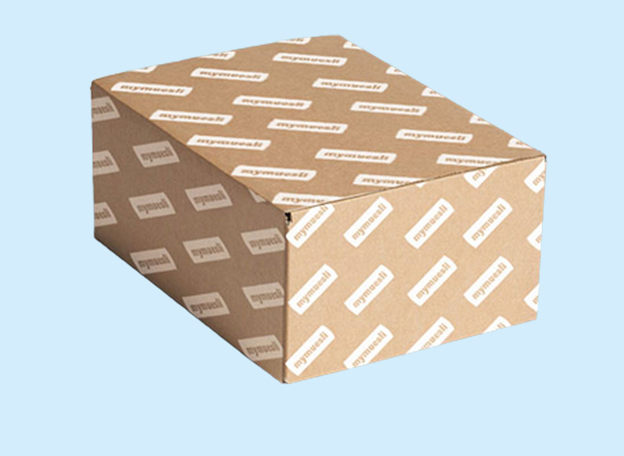
The packaging is a rectangular shipping box made from corrugated cardboard. It features a kraft brown exterior with a repeating pattern of the brand name 'mymuesli' printed in white. The box has visible fluted edges when viewed from the side, indicating its corrugated construction. The edges are slightly rounded, and the box appears sturdy, suitable for shipping. There are no visible signs of wear or damage.

The packaging is a cylindrical cup with a removable lid. The cup is primarily pink in color with a glossy finish, featuring a circular lid that has a cut-out design. The front of the cup displays the product name 'BERRY' in bold white letters, along with a visual representation of berries. The overall design is vibrant and appealing, aimed at attracting consumers.
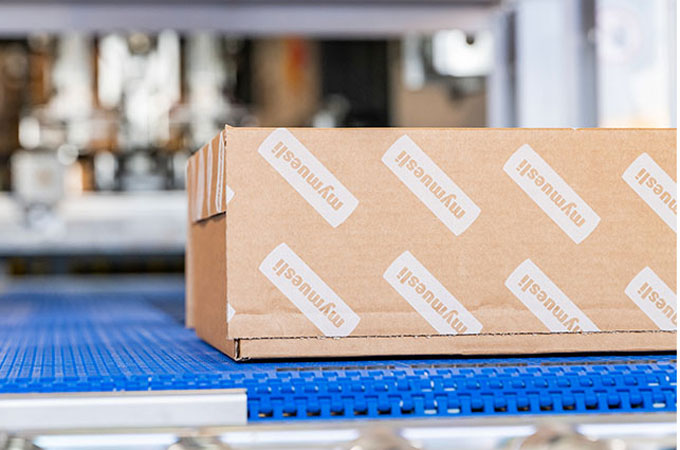
The packaging is a brown corrugated box with visible fluted layers when viewed from the side. It has a sturdy construction suitable for shipping. The box features a smooth exterior with printed branding elements. The edges are slightly rounded, indicating a folding style typical for shipping boxes. The box is placed on a blue conveyor belt, suggesting it is part of a packaging or shipping process.
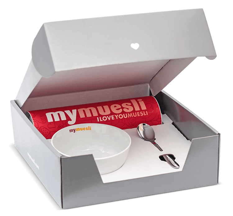
The packaging is a rigid box with a sturdy construction, featuring a smooth, matte finish in a light gray color. The box has a hinged lid that opens to reveal a white interior. Inside, there is a cylindrical container with a bright red exterior, labeled 'my muesli' with a playful design. A small white bowl and a spoon are also included in the packaging.

The packaging consists of cylindrical containers made from a sturdy paperboard material. Each container features a smooth, flat construction without any visible fluted layers, indicating a single-layer paperboard design. The containers are adorned with vibrant, colorful graphics that include various floral and abstract patterns, as well as the brand name prominently displayed in bold, white font. The overall appearance is clean and modern, with a glossy finish that enhances the visual appeal.
About the Brand
mymuesli delivers organic, customizable muesli and breakfast products to consumers, emphasizing ingredient quality and brand-driven packaging. Their approach leverages a combination of rigid containers, corrugated shipping boxes, and visually distinctive graphics to reinforce brand identity and ensure product safety during transit.
Founded in 2007, mymuesli has established itself as a leader within the European organic breakfast market, utilizing custom cylindrical paperboard containers and branded corrugated boxes. The company’s packaging portfolio is designed to withstand e-commerce logistics while maintaining a cohesive, vibrant visual presentation. Packaging formats are optimized for both sustainability and consumer engagement, reflecting the brand’s commitment to eco-conscious practices and premium unboxing experiences.
Key Differentiator: mymuesli’s core differentiation lies in the seamless integration of personalized product selection with highly branded, eco-friendly packaging solutions tailored for direct-to-consumer fulfillment.
Design System
Visual Style
Clean, modern typography with bold sans-serif fonts; a palette featuring white, bright pinks, reds, and natural tones; playful, high-contrast graphics and frequent use of fruit and ingredient illustrations.
Brand Identity
Consistent application of the mymuesli logo in both horizontal and stacked formats, with high brand visibility across all packaging. Iconography includes stylized fruit and grain motifs, and visual consistency is achieved through uniform color schemes and repeated graphic elements.
Packaging Design
Preference for recyclable paperboard and corrugated materials, cylindrical and rectangular structures, and minimal use of plastics. Structural design prioritizes rigidity, stackability, and product protection, with a focus on supporting D2C logistics and shelf appeal.
User Experience
Packaging is designed to reinforce the personalized and premium nature of the product, with easy-to-open formats, engaging graphics, and clear labeling. The unboxing journey emphasizes both emotional impact and product safety, supporting positive brand associations and repeat purchases.
Company Metrics
Business insights for mymuesli based on available data
Market Positioning
Brand Values & Focus
Key Competitors
Target Market: Health-conscious, eco-aware consumers seeking premium, customizable organic breakfast options in Germany and broader EU D2C markets.
Packaging Assessment
Overall Grade
Visual appeal and presentation quality
Packaging durability and protection
Eco-friendliness and recyclable materials
Cost efficiency and value for money
Packaging assessment for mymuesli based on industry standards and best practices
Frequently Asked Questions
What packaging materials does mymuesli primarily use?
mymuesli primarily utilizes cylindrical paperboard containers for product packaging, complemented by branded corrugated cardboard shipping boxes. These materials are selected for their balance of durability, visual appeal, and recyclability.
How does mymuesli address sustainability in its packaging?
Sustainability is addressed through the use of recyclable and FSC-certified paperboard and corrugated materials, alongside minimalistic design approaches that reduce excess waste. Branding emphasizes the eco-friendly nature of these packaging choices.
What is the unboxing experience like for mymuesli customers?
The unboxing experience is designed to be visually engaging, featuring vibrant graphics and consistent branding across primary and secondary packaging. Rigid containers and gift sets further enhance presentation and perceived value.
How does mymuesli’s packaging compare to industry competitors?
mymuesli’s packaging demonstrates higher emphasis on customization, visual branding, and sustainability compared to generic breakfast food packaging, positioning it competitively within the premium organic segment.
Discover other Food & Drink companies
Explore more companies in the food & drink industry and their packaging strategies
Terres de Café
Food & Drink
Terres de Café is a specialty coffee retailer based in Paris, France, known for its commitment to sustainability and high-quality coffee sourcing.
PrepMyMeal
Food & Drink
PrepMyMeal is a food production company specializing in high-protein meal delivery services. They offer a variety of natural, nutritious meals designed for fitness enthusiasts and those seeking convenience in meal preparation.
ruf lebensmittelwerk kg
Food & Drink
RUF Lebensmittelwerk KG is a German food production company specializing in a variety of baking mixes and drink products. Founded in 1920, the company is known for its high-quality ingredients and innovative food solutions.