My Pebbles packaging
My Pebbles delivers personalized gemstone gifts, emphasizing emotional resonance and user-driven customization. Their packaging approach utilizes carton boxes geared towards both brand expression and functional protection.
Packaging Portfolio
My Pebbles’ packaging portfolio centers on single-layer folding carton boxes constructed from paperboard, optimized for lightweight protection and efficient retail display. The visual language includes vibrant, modern graphics and clear brand identification, supporting both shelf presence and gifting occasions. Structural formats are primarily rectangular with tuck tab closures for ease of access and security. While material choices are standard for the market, the emphasis on graphic design and personalization options is notable, aligning with the brand’s emotionally driven product positioning.
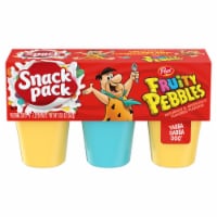
The packaging consists of a rectangular folding carton that contains three individual cups of Fruity Pebbles snack. The carton is primarily red with colorful graphics featuring a cartoon character, likely Fred Flintstone, holding a spoon. The front displays the product name 'Snack Pack' prominently, with a white, bubbly background suggesting a dairy or dessert theme. The sides of the carton are smooth and flat, with clean edges and folds, indicative of a single-layer paperboard construction. The top has a perforated opening for easy access to the cups inside.

The packaging is a folding carton made of single-layer paperboard. It features a smooth, flat construction with clean edges and folds. The exterior is primarily kraft brown with vibrant green and blue circular designs, creating a modern and appealing aesthetic. The front displays the product name 'ROCK ROSE & LAVENDER' in bold, clear typography, complemented by floral graphics. The carton opens from the top with a tuck tab closure, allowing easy access to the contents inside. The overall shape is rectangular, designed to hold a bar of soap or similar product.

The packaging is a rectangular folding carton made from single-layer paperboard. It features a smooth, flat construction without any visible fluted layers. The exterior is predominantly brown with vibrant colors used for graphics. The edges are clean and precise, and the carton has a glossy finish that enhances its visual appeal. The front displays a large, colorful illustration of cartoon characters, along with the product name and size prominently featured.
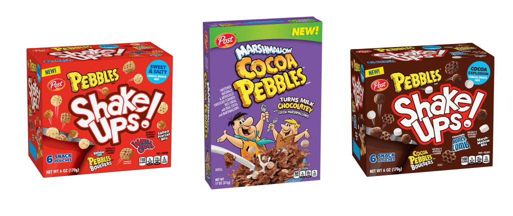
The packaging consists of three distinct folding cartons, each made from a single-layer paperboard. The boxes are brightly colored with a glossy finish, featuring smooth, flat surfaces without any visible fluted layers. Each box has clean, precise edges and folds, typical of retail packaging. The front of each carton prominently displays the product name and branding, with vibrant graphics and images of the product inside. The overall shape is rectangular, designed for standing on retail shelves.
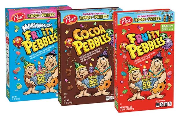
The packaging consists of three distinct folding cartons, each made from a single layer of paperboard. The cartons are brightly colored with vibrant graphics featuring cartoon characters and product images. Each box has a smooth, flat construction with clean edges and folds, indicative of a retail packaging style. The front of each carton displays the product name prominently, along with playful graphics and promotional elements.
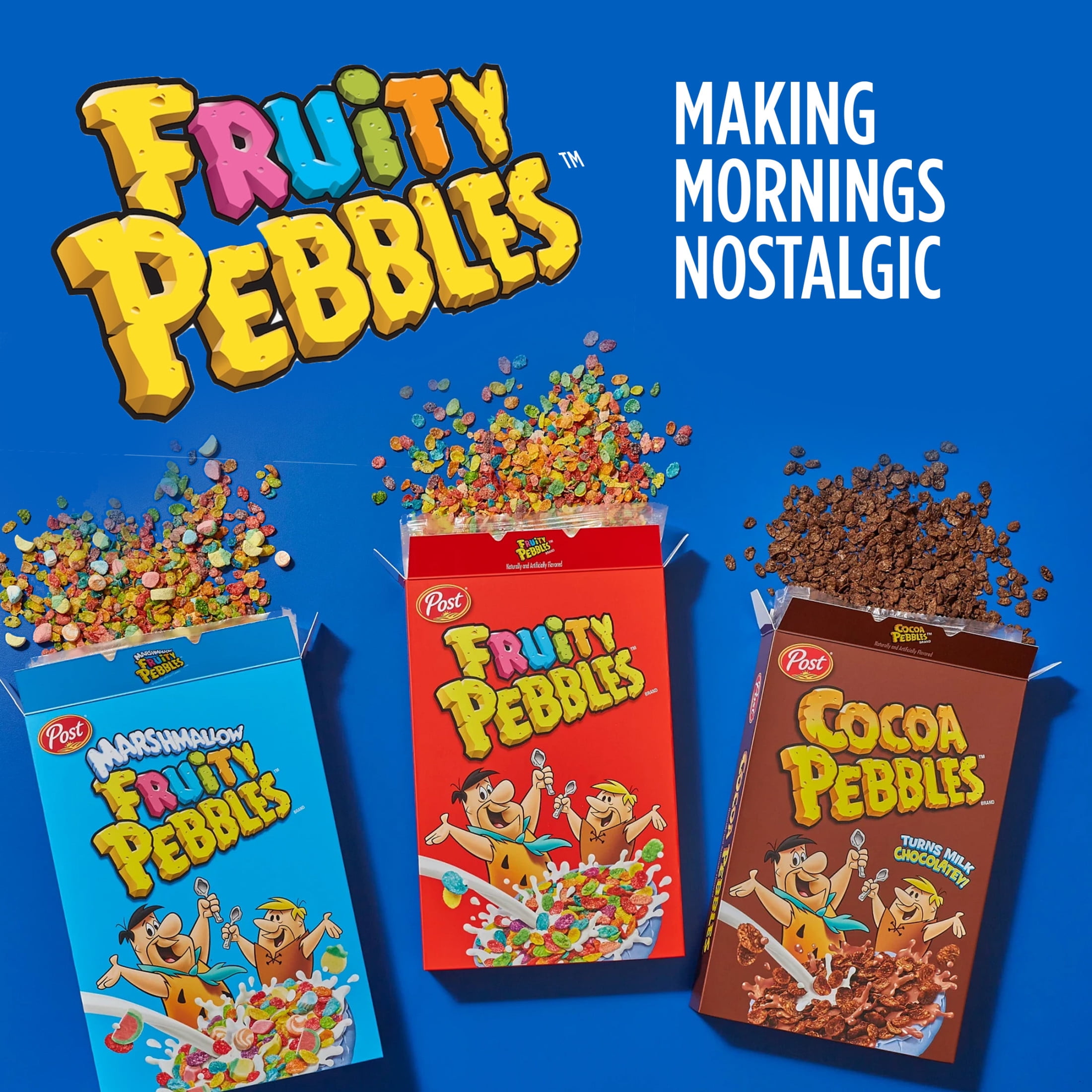
The image features three retail cereal boxes, each made of single-layer paperboard with a smooth, flat construction. The boxes are brightly colored, with distinct graphics and logos. The edges are clean and precise, typical of folding cartons. Each box has a top flap that is folded down, indicating a tuck closure. The overall appearance is lightweight and designed for retail display.
About the Brand
My Pebbles operates in the customizable gifting sector, producing engraved gemstone items for diverse occasions. Their direct-to-consumer model is anchored by a robust online platform and interactive configurator, allowing for high personalization.
The company’s product line includes customizable gemstones, keychains, pocket pebbles, and deluxe heart-shaped items. Packaging is an extension of their brand story, aiming to enhance the emotional impact of gift-giving while ensuring products arrive safely. Sourcing and presentation practices reflect a blend of quality assurance and market competitiveness.
Key Differentiator: The key differentiator is the integration of emotional storytelling with customizable products, supported by a user-focused e-commerce experience and attention to responsible sourcing.
Design System
Visual Style
Modern sans-serif typography paired with a vibrant color palette—greens, blues, and natural kraft tones—creates a contemporary and approachable aesthetic. Graphics incorporate circular motifs and floral elements to reinforce product themes.
Brand Identity
Consistent logo application and prominent product names, supported by decorative iconography and clear, legible type. Visual consistency is maintained through color and motif repetition across packaging and digital touchpoints.
Packaging Design
Material selection prioritizes single-layer paperboard for cost-effectiveness and recyclability. Structural design favors rectangular, foldable cartons with clean edges, focusing on protecting small, delicate items while facilitating straightforward unboxing.
User Experience
Packaging design is optimized for gifting, enhancing emotional resonance at the moment of unboxing. The structure supports a seamless transition from purchase to presentation, bolstering customer satisfaction and reinforcing brand storytelling.
Company Metrics
Business insights for My Pebbles based on available data
Market Positioning
Brand Values & Focus
Key Competitors
Target Market: Consumers seeking personalized, emotionally resonant gifts for special occasions, with a focus on the European D2C e-commerce segment.
Packaging Assessment
Overall Grade
Visual appeal and presentation quality
Packaging durability and protection
Eco-friendliness and recyclable materials
Cost efficiency and value for money
Packaging assessment for My Pebbles based on industry standards and best practices
Frequently Asked Questions
What type of packaging does My Pebbles use for its products?
My Pebbles primarily utilizes single-layer paperboard carton boxes featuring modern, branded graphics. These structures offer lightweight protection and are designed for ease of unboxing and retail display.
How does My Pebbles ensure packaging aligns with its brand values?
Their packaging incorporates vibrant graphics, clear typography, and brand logos, reinforcing emotional and aesthetic brand messaging while supporting the gifting experience.
What is the environmental approach to My Pebbles’ packaging?
The use of recyclable paperboard indicates a moderate commitment to sustainability, though there is limited information on the use of recycled content or advanced eco-friendly materials.
How does packaging impact the customer experience?
Packaging is designed to enhance the emotional impact of gifting, with visually engaging graphics and intuitive unboxing, supporting the brand’s focus on emotional connection.
Discover other Gifts & Special Events companies
Explore more companies in the gifts & special events industry and their packaging strategies
Bunnies By The Bay Inc.
Gifts & Special Events
Bunnies By The Bay is a company that specializes in creating high-quality, personalized baby gifts and plush toys designed to bring joy and comfort to children.
Sheila Fleet Jewellery
Gifts & Special Events
Sheila Fleet Jewellery specializes in handcrafted silver, gold, and platinum jewelry inspired by the beauty of Orkney, Scotland.
Get Digital
Gifts & Special Events
Get Digital is a niche e-commerce retailer specializing in unique gadgets, nerd-themed apparel, and merchandise for fans and enthusiasts. They offer a wide range of products tailored to the interests of nerds and geeks.